

transform function in CSS3

Transform is an attribute in CSS3. This article mainly introduces the transformation function in CSS3 - the transform function. I think it is quite good. Now I will share it with you and give it as a reference. Let’s follow the editor to take a look, I hope it can help everyone.
Transformation function in CSS3: In CSS3, you can use the transform function to realize four types of deformation functions: rotation, scaling, tilting, and movement of text or images.
1. How to use the transform function:
(1) Implement the transform function through the transform attribute in CSS3:
(2) Transform function Usage:
transform:function;
-ms-transform:function;/*IE9*/
-moz-transform:function;/*Firefox*/
-webkit-transform:function; /*Safari and chrome*/
-o-transform: function;/*Opera*/
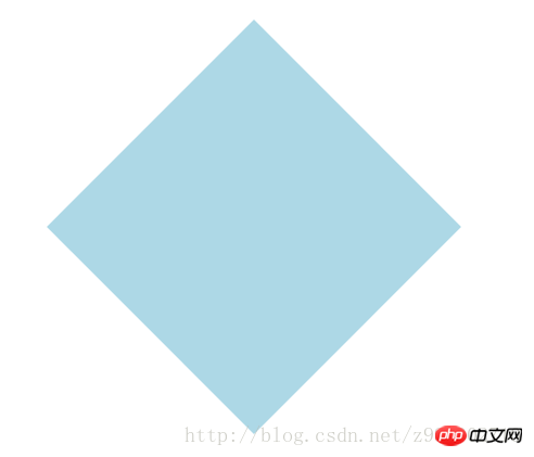
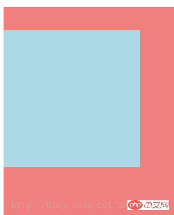
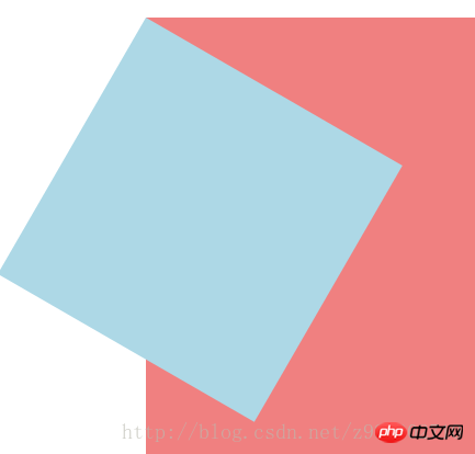
2. rotate, specify the angle in the parameter (rotate means clockwise rotation, deg is the angle unit in CSS3):
(1) How to use:
-ms-transform:rotate(angle);/*IE9*/
-moz-transform: rotate(angle);/*Firefox*/
-webkit-transform:rotate(angle);/*Safari and chrome*/
-o-transform:rotate(angle);/*Opera*/
(2)rotate rotation application:
1) HTML code:
<p></p>
2) CSS code:
p{
    width: 300px;
    height: 300px;
    background-color: lightblue;
    -ms-transform:rotate(45deg);/*IE9*/
    -moz-transform:rotate(45deg);/*Firefox*/
    -webkit-transform:rotate(45deg);/*Safari和chrome*/
    -o-transform:rotate(45deg);/*Opera*/
}3) The rendering is as follows:
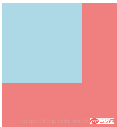
3. Scale scaling conversion:
( 1) How to use: transform:scale(value), its value is the specified zoom ratio, for example, 0.5 means zooming by 50%, 1 means zooming by 100%, 1.5 means zooming by 150%;
-ms-transform :scale(value);/*IE9*/
-moz-transform:scale(value);/*Firefox*/
-webkit-transform:scale(value);/*Safari and chrome*/
-o-transform:scale(value);/*Opera*/
(2) Possible values:
1) scale(x,y) makes the element X axis and Y axis The axes are scaled at the same time;
2) scale(x) makes the element scale only on the X axis;
3) scale(y) makes the element scale only on the Y axis;
(3) Application of scale scaling transformation :
1) HTML code:
<p></p>
2) CSS code:
p{
    width: 300px;
    height: 300px;
    background-color: lightblue;
    /*缩放值X与Y为正整数时*/
    -ms-transform:scale(2,2);/*IE9*/
    -moz-transform:scale(2,2);/*Firefox*/
    -webkit-transform:scale(2,2);/*Safari和chrome*/
    -o-transform:scale(2,2);/*Opera*/

    /*缩放值X与Y均为小于1的浮点数时*/
    /*-ms-transform:scale(0.5,0.5);*//*IE9*/
    /*-moz-transform:scale(0.5,0.5);*//*Firefox*/
    /*-webkit-transform:scale(0.5,0.5);*//*Safari和chrome*/
    /*-o-transform:scale(0.5,0.5);*//*Opera*/

    /*缩放值仅X为小于1的浮点数时*/
    /*-ms-transform:scaleX(0.5);*//*IE9*/
    /*-moz-transform:scaleX(0.5);*//*Firefox*/
    /*-webkit-transform:scaleX(0.5);*//*Safari和chrome*/
    /*-o-transform:scaleX(0.5);*//*Opera*/

    /*缩放值仅Y为小于1的浮点数时*/
    /*-ms-transform:scaleY(0.5);*//*IE9*/
    /*-moz-transform:scaleY(0.5);*//*Firefox*/
    /*-webkit-transform:scaleY(0.5);*//*Safari和chrome*/
    /*-o-transform:scaleY(0.5);*//*Opera*/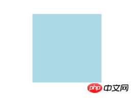
}3 ) The rendering is as follows:
① The rendering without scaling:

② The rendering when the scaling values X and Y are positive integers:
③The rendering when the scaling values X and Y are both floating point numbers less than 1:
④The scaling value is only The rendering when
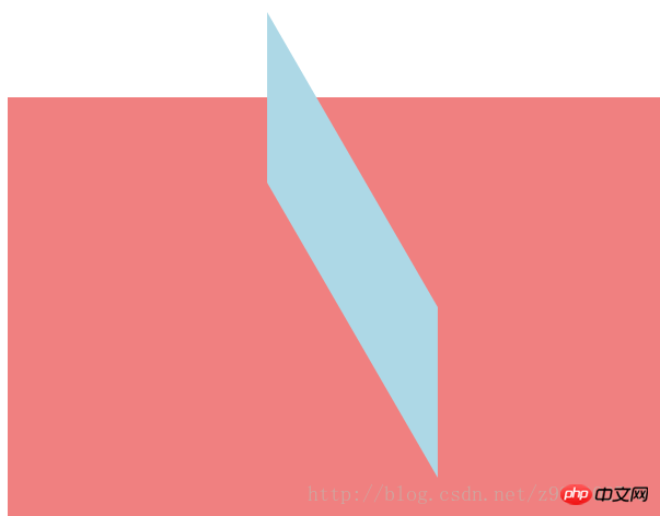
 ##4. Skew:
 transform:skew(angle); Its value is the angle;
-moz-transform:skew(angle);/*Firefox*/-webkit-transform:skew(angle);/ *Safari and chrome*/-o-transform:skew(angle);/*Opera*/
(2) Possible values:
1) skew(x,y ) causes the element to twist in the horizontal and vertical directions at the same time (the X-axis and the Y-axis are twisted and deformed according to a certain angle value at the same time). When there is only one parameter, it is only tilted in the horizontal direction;
2) skewX(x) only Make the element distort in the horizontal direction (X-axis distortion)
3) skewY(y) Only make the element distort in the vertical direction (Y-axis distortion)
(3) Skew skew Application:
1) HTML code:
<p></p>
p{
    width: 300px;
    height: 300px;
    background-color: lightblue;

    /*X轴与Y轴均倾斜*/
    -ms-transform:skew(30deg,30deg);
    -moz-transform:skew(30deg,30deg);
    -webkit-transform:skew(30deg,30deg);
    -o-transform:skew(30deg,30deg);

    /*设置一个值相当于仅X轴倾斜*/
    /*-ms-transform:skew(30deg);*//*IE9*/
    /*-moz-transform:skew(30deg);*//*Firefox*/
    /*-webkit-transform:skew(30deg);*//*Safari和chrome*/
    /*-o-transform:skew(30deg);*//*Opera*/

    /*仅X轴倾斜*/
    /*-ms-transform:skewX(30deg);*//*IE9*/
    /*-moz-transform:skewX(30deg);*//*Firefox*/
    /*-webkit-transform:skewX(30deg);*//*Safari和chrome*/
    /*-o-transform:skewX(30deg);*//*Opera*/

    /*仅Y轴倾斜*/
    /*-ms-transform:skewY(30deg);*//*IE9*/
    /*-moz-transform:skewY(30deg);*//*Firefox*/
    /*-webkit-transform:skewY(30deg);*//*Safari和chrome*/
    /*-o-transform:skewY(30deg);*//*Opera*/
} 3) The renderings are as follows:
③Set a value equivalent to the rendering of only the X-axis tilt: 
④The rendering of only the X-axis tilt: 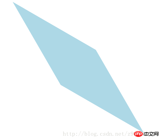
⑤The rendering of Y-axis tilt only: 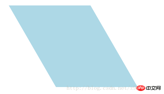
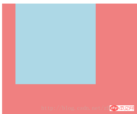
5、移动translate:
(1)使用方法:
transform:translate(值);它的值是指定移动的距离;
-ms-transform:translate(值);/*IE9*/
-moz-transform:translate(值);/*Firefox*/
-webkit-transform:translate(值);/*Safari和chrome*/
-o-transform:translate(值);/*Opera*/
(2)可能的值:
1)translate(x,y)水平方向与垂直方向同时移动(也就是X轴和Y轴同时移动)只有一个参数的时候,只在水平方向上移动;
2)translateX(x)仅水平方向(X轴移动)
3)translateY(y)仅垂直方向(Y轴移动)
(3)移动translate的应用:
1)HTML代码:
<p class="main">
    <p class="p"></p>
</p>2)CSS代码:
.main{
    width: 100%;
    height: 500px;
    background-color: lightcoral;
}
.p{
    width: 300px;
    height: 300px;
    background-color: lightblue;

    /*在X轴与Y轴上均移动*/
    -ms-transform:translate(50px,50px);/*IE9*/
    -moz-transform:translate(50px,50px);/*Firefox*/
    -webkit-transform:translate(50px,50px);/*Safari和chrome*/
    -o-transform:translate(50px,50px);/*Opera*/

    /*设置一个值相当于仅在X轴上移动*/
    /*-ms-transform:translate(50px);*//*IE9*/
    /*-moz-transform:translate(50px);*//*Firefox*/
    /*-webkit-transform:translate(50px);*//*Safari和chrome*/
    /*-o-transform:translate(50px);*//*Opera*/

    /*仅在X轴上移动*/
    /*-ms-transform:translateX(50px);*//*IE9*/
    /*-moz-transform:translateX(50px);*//*Firefox*/
    /*-webkit-transform:translateX(50px);*//*Safari和chrome*/
    /*-o-transform:translateX(50px);*//*Opera*/

    /*仅在Y轴上移动*/
    /*-ms-transform:translateY(50px);*//*IE9*/
    /*-moz-transform:translateY(50px);*//*Firefox*/
    /*-webkit-transform:translateY(50px);*//*Safari和chrome*/
    /*-o-transform:translateY(50px);*//*Opera*/
}3)效果图如下:
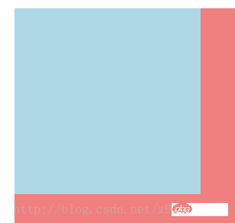
①未移动的效果图:

②在X轴与Y轴上均移动时的效果图:
③设置一个值相当于仅在X轴上移动时的效果图:

④仅在X轴上移动时的效果图:
⑤仅在Y轴上移动时的效果图:
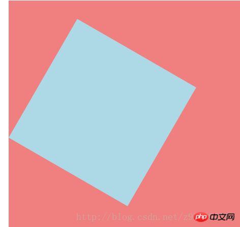
6、对一个元素使用多种变形方法:(同样的方法只能使用一次)
(1)使用方法:
transform:方法1 方法2 方法3 方法4;
-ms-transform:方法1 方法2 方法3 方法4;/*IE9*/
-moz-transform:方法1 方法2 方法3 方法4;/*Firefox*/
-webkit-transform:方法1 方法2 方法3 方法4;/*Safari和chrome*/
-o-transform:方法1 方法2 方法3 方法4;/*Opera*/
(2)对一个元素使用多种变形方法的应用:
1)HTML代码:
<p class="main">
    <p class="p"></p>
</p>2)CSS代码:
.main{
    width: 100%;
    height: 500px;
    background-color: lightcoral;
}
.p{
    width: 300px;
    height: 300px;
    background-color: lightblue;
    -ms-transform:translateX(200px) rotate(30deg) skew(30deg,30deg) scaleY(0.5);/*IE9*/
    -moz-transform:translateX(200px) rotate(30deg) skew(30deg,30deg) scaleY(0.5);/*Firefox*/
    -webkit-transform:translateX(200px) rotate(30deg) skew(30deg,30deg) scaleY(0.5);/*Safari和chrome*/
    -o-transform:translateX(200px) rotate(30deg) skew(30deg,30deg) scaleY(0.5);/*Opera*/
}3)效果图如下:
①未添加方法时的效果图:
②添加了多种方法时的效果图:
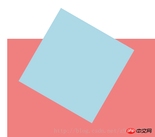
7、改变元素基点transform-origin:
(1)可能的值:
| top left | top | right top |
| left | center | right |
| bottom left | bottom | bottom right |
(2)默认情况下transform属性变化的基点是center,但是可以通过transform-origin改变transform属性变化的基点;
(3)改变元素基点transform-origin的应用:
1)HTML代码:
<p class="main">
    <p class="p"></p>
</p>2)CSS代码:
.main{
    width: 100%;
    height: 500px;
    background-color: lightcoral;
    margin-left: 140px;
    margin-top: 180px;
}
.p{
    width: 300px;
    height: 300px;
    background-color: lightblue;
    -ms-transform:rotate(30deg);/*IE9*/
    -moz-transform:rotate(30deg);/*Firefox*/
    -webkit-transform:rotate(30deg);/*Safari和chrome*/
    -o-transform:rotate(30deg);/*Opera*/

    transform-origin: center;
    /*transform-origin: top;*/
    /*transform-origin: top left;*/
    /*transform-origin: right top;*/
    /*transform-origin: left;*/
    /*transform-origin: right;*/
    /*transform-origin: bottom left;*/
    /*transform-origin: bottom;*/
    /*transform-origin: bottom right;*/
}3)效果图如下:
①未添加变形功能的效果图:
②添加旋转功能的效果图:

③以center为基点旋转的效果图:
④以top为基点旋转的效果图:

⑤以top left为基点旋转的效果图:
⑥以right top为基点旋转的效果图:

⑦以left为基点旋转的效果图:

⑧以right为基点旋转的效果图:

⑨以bottom left为基点旋转的效果图:
⑩以bottom为基点旋转的效果图:

⑪以bottom right为基点旋转的效果图:
相关推荐:
全面对比CSS3与动画有关的属性transition、animation、transform
The above is the detailed content of transform function in CSS3. For more information, please follow other related articles on the PHP Chinese website!

Hot AI Tools

Undresser.AI Undress
AI-powered app for creating realistic nude photos

AI Clothes Remover
Online AI tool for removing clothes from photos.

Undress AI Tool
Undress images for free

Clothoff.io
AI clothes remover

Video Face Swap
Swap faces in any video effortlessly with our completely free AI face swap tool!

Hot Article
Hot Tools

Notepad++7.3.1
Easy-to-use and free code editor

SublimeText3 Chinese version
Chinese version, very easy to use

Zend Studio 13.0.1
Powerful PHP integrated development environment

Dreamweaver CS6
Visual web development tools

SublimeText3 Mac version
God-level code editing software (SublimeText3)
Hot Topics


 How to use bootstrap in vue
Apr 07, 2025 pm 11:33 PM
How to use bootstrap in vue
Apr 07, 2025 pm 11:33 PM
Using Bootstrap in Vue.js is divided into five steps: Install Bootstrap. Import Bootstrap in main.js. Use the Bootstrap component directly in the template. Optional: Custom style. Optional: Use plug-ins.
 The Roles of HTML, CSS, and JavaScript: Core Responsibilities
Apr 08, 2025 pm 07:05 PM
The Roles of HTML, CSS, and JavaScript: Core Responsibilities
Apr 08, 2025 pm 07:05 PM
HTML defines the web structure, CSS is responsible for style and layout, and JavaScript gives dynamic interaction. The three perform their duties in web development and jointly build a colorful website.
 Understanding HTML, CSS, and JavaScript: A Beginner's Guide
Apr 12, 2025 am 12:02 AM
Understanding HTML, CSS, and JavaScript: A Beginner's Guide
Apr 12, 2025 am 12:02 AM
WebdevelopmentreliesonHTML,CSS,andJavaScript:1)HTMLstructurescontent,2)CSSstylesit,and3)JavaScriptaddsinteractivity,formingthebasisofmodernwebexperiences.
 How to set up the framework for bootstrap
Apr 07, 2025 pm 03:27 PM
How to set up the framework for bootstrap
Apr 07, 2025 pm 03:27 PM
To set up the Bootstrap framework, you need to follow these steps: 1. Reference the Bootstrap file via CDN; 2. Download and host the file on your own server; 3. Include the Bootstrap file in HTML; 4. Compile Sass/Less as needed; 5. Import a custom file (optional). Once setup is complete, you can use Bootstrap's grid systems, components, and styles to create responsive websites and applications.
 How to write split lines on bootstrap
Apr 07, 2025 pm 03:12 PM
How to write split lines on bootstrap
Apr 07, 2025 pm 03:12 PM
There are two ways to create a Bootstrap split line: using the tag, which creates a horizontal split line. Use the CSS border property to create custom style split lines.
 How to insert pictures on bootstrap
Apr 07, 2025 pm 03:30 PM
How to insert pictures on bootstrap
Apr 07, 2025 pm 03:30 PM
There are several ways to insert images in Bootstrap: insert images directly, using the HTML img tag. With the Bootstrap image component, you can provide responsive images and more styles. Set the image size, use the img-fluid class to make the image adaptable. Set the border, using the img-bordered class. Set the rounded corners and use the img-rounded class. Set the shadow, use the shadow class. Resize and position the image, using CSS style. Using the background image, use the background-image CSS property.
 How to use bootstrap button
Apr 07, 2025 pm 03:09 PM
How to use bootstrap button
Apr 07, 2025 pm 03:09 PM
How to use the Bootstrap button? Introduce Bootstrap CSS to create button elements and add Bootstrap button class to add button text
 How to resize bootstrap
Apr 07, 2025 pm 03:18 PM
How to resize bootstrap
Apr 07, 2025 pm 03:18 PM
To adjust the size of elements in Bootstrap, you can use the dimension class, which includes: adjusting width: .col-, .w-, .mw-adjust height: .h-, .min-h-, .max-h-
