

Detailed explanation of examples of several tips in css

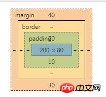
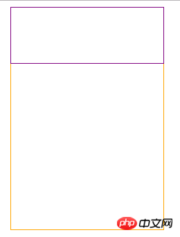
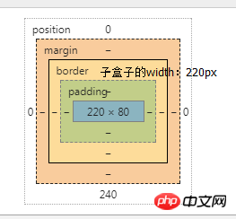
1.When the margin-top, margin-bottom and padding-top, padding-bottom of the element use percentage as the unit, they are relative to the width of the parent element. width, rather than height as we imagine; as shown in the figure
<style type="text/css">
        .parent{
            outline: 1px solid orange;
            width: 200px;
            height: 300px;
            padding: 10px;
            margin: 10px;
        }
        .child{
            outline: 1px solid purple;
            width: 200px;
            height: 80px;
            padding-top: 10%;      /*20px = 父容器的width值200px * 10% */
            padding-bottom: 5%;     /*10px = 200px * 5% */
            margin-top: 20%;      /*40px = 200px * 20%*/
            margin-bottom: 15%;    /*30px = 200px * 15%*/
        }<body>
    <p class="parent">
        <p class="child"></p>
    </p>
</body>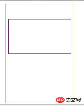
The sub-box parameters are as follows:
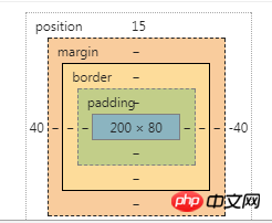
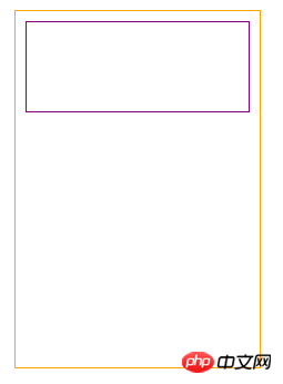
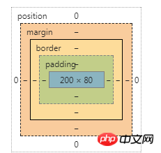
2. Elements containing positioning attributes, their top and bottom units When it is a percentage, the percentage is relative to the height of the parent element. left and right are relative to the width of the parent element.
<span   style="max-width:90%">.parent{
            outline: 1px solid orange;
            width: 200px;
            height: 300px;
            padding: 0px;
            margin: 0px;
            position: relative;
        }
        .child{
            outline: 1px solid purple;
            width: 200px;
            height: 80px;
            position: absolute;
            top: 5%;  /* 15px = 300px * 5% 上边框离父盒子上边框15px的距离*/
            left: 20%;  /*  40px = 200px * 20% 左边框离父盒子左边框40px的距离  <br/>                   也就是子盒子左上角的坐标为x=15,y=40(父盒子左上角为原点)  */

        }</span>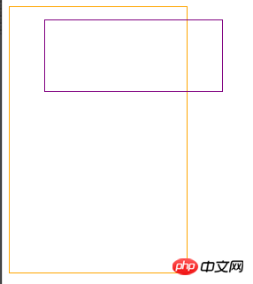
3. Border width Cannot be expressed as a percentage
4.width:100%
4.1 When there is an absolutely positioned child element in the parent container, the child element is setwidth:100% Actually Refers to the width of padding+content relative to the parent container.
rAs shown in the figure:
<style type="text/css">
    .parent{
        outline: 1px solid orange;
        width: 200px;
        height: 300px;
        padding: 10px;
        margin: 10px;
        position: relative;
    }
    .child{
        outline: 1px solid purple;
        width: 100%;  /* width = 220px = 父容器的padding+content*/
        height: 80px;
        position: absolute;
        top: 0;
        left: 0;
    }
</style>
When the child element is non-absolute When the element is positioned (it can be relative positioning), or if it is not positioned, width:100% refers to the content of the child element, which is equal to the content width of the parent element.
.parent{
    outline: 1px solid orange;
    width: 200px;
    height: 300px;
    padding: 10px;
    margin: 10px;
}
.child{
    outline: 1px solid purple;
    width: 100%;  /* width:200px = 父盒子的content*/
    height: 80px;
}.parent{
outline: 1px solid orange;
width: 200px;
height: 300px;
padding: 10px;
margin: 10px;
position: relative;
}
.child{
outline: 1px solid purple;
width: 100%;
height: 80px;
position: relative;
}
The above is the detailed content of Detailed explanation of examples of several tips in css. For more information, please follow other related articles on the PHP Chinese website!

Hot AI Tools

Undresser.AI Undress
AI-powered app for creating realistic nude photos

AI Clothes Remover
Online AI tool for removing clothes from photos.

Undress AI Tool
Undress images for free

Clothoff.io
AI clothes remover

Video Face Swap
Swap faces in any video effortlessly with our completely free AI face swap tool!

Hot Article
Hot Tools

Notepad++7.3.1
Easy-to-use and free code editor

SublimeText3 Chinese version
Chinese version, very easy to use

Zend Studio 13.0.1
Powerful PHP integrated development environment

Dreamweaver CS6
Visual web development tools

SublimeText3 Mac version
God-level code editing software (SublimeText3)
Hot Topics


 How to use bootstrap in vue
Apr 07, 2025 pm 11:33 PM
How to use bootstrap in vue
Apr 07, 2025 pm 11:33 PM
Using Bootstrap in Vue.js is divided into five steps: Install Bootstrap. Import Bootstrap in main.js. Use the Bootstrap component directly in the template. Optional: Custom style. Optional: Use plug-ins.
 The Roles of HTML, CSS, and JavaScript: Core Responsibilities
Apr 08, 2025 pm 07:05 PM
The Roles of HTML, CSS, and JavaScript: Core Responsibilities
Apr 08, 2025 pm 07:05 PM
HTML defines the web structure, CSS is responsible for style and layout, and JavaScript gives dynamic interaction. The three perform their duties in web development and jointly build a colorful website.
 How to write split lines on bootstrap
Apr 07, 2025 pm 03:12 PM
How to write split lines on bootstrap
Apr 07, 2025 pm 03:12 PM
There are two ways to create a Bootstrap split line: using the tag, which creates a horizontal split line. Use the CSS border property to create custom style split lines.
 Understanding HTML, CSS, and JavaScript: A Beginner's Guide
Apr 12, 2025 am 12:02 AM
Understanding HTML, CSS, and JavaScript: A Beginner's Guide
Apr 12, 2025 am 12:02 AM
WebdevelopmentreliesonHTML,CSS,andJavaScript:1)HTMLstructurescontent,2)CSSstylesit,and3)JavaScriptaddsinteractivity,formingthebasisofmodernwebexperiences.
 How to set up the framework for bootstrap
Apr 07, 2025 pm 03:27 PM
How to set up the framework for bootstrap
Apr 07, 2025 pm 03:27 PM
To set up the Bootstrap framework, you need to follow these steps: 1. Reference the Bootstrap file via CDN; 2. Download and host the file on your own server; 3. Include the Bootstrap file in HTML; 4. Compile Sass/Less as needed; 5. Import a custom file (optional). Once setup is complete, you can use Bootstrap's grid systems, components, and styles to create responsive websites and applications.
 How to insert pictures on bootstrap
Apr 07, 2025 pm 03:30 PM
How to insert pictures on bootstrap
Apr 07, 2025 pm 03:30 PM
There are several ways to insert images in Bootstrap: insert images directly, using the HTML img tag. With the Bootstrap image component, you can provide responsive images and more styles. Set the image size, use the img-fluid class to make the image adaptable. Set the border, using the img-bordered class. Set the rounded corners and use the img-rounded class. Set the shadow, use the shadow class. Resize and position the image, using CSS style. Using the background image, use the background-image CSS property.
 How to use bootstrap button
Apr 07, 2025 pm 03:09 PM
How to use bootstrap button
Apr 07, 2025 pm 03:09 PM
How to use the Bootstrap button? Introduce Bootstrap CSS to create button elements and add Bootstrap button class to add button text
 How to resize bootstrap
Apr 07, 2025 pm 03:18 PM
How to resize bootstrap
Apr 07, 2025 pm 03:18 PM
To adjust the size of elements in Bootstrap, you can use the dimension class, which includes: adjusting width: .col-, .w-, .mw-adjust height: .h-, .min-h-, .max-h-
