
 Web Front-end
CSS Tutorial
Detailed explanation of examples of line-height and vertical-align properties in css
Web Front-end
CSS Tutorial
Detailed explanation of examples of line-height and vertical-align properties in css
Detailed explanation of examples of line-height and vertical-align properties in css

Line-height, font-size, and vertical-align are key attributes for setting the layout of inline elements. These three properties are interdependent, and changing the distance between lines, setting vertical alignment, etc. all require their cooperation. The related content of font-size has been introduced in detail in CSS fonts. This article will mainly introduce line-height and vertical-align.
line-height
Definition
Line-height refers to The distance between the baselines of lines of text. Line-height actually only affects inline elements and other inline content, and does not directly affect block-level elements. You can also set line-height for a block-level element, but this value only applies to the inline content of the block-level element. Only then will it have an impact. Declaring line-height on a block-level element will set a minimum line box height for the content of the block-level element
Values:
Initial value: normal
Applies to: all elements
Inheritance: Yes
Percentage: relative to the element's font-size
Terminology
To deeply understand line-height, you need to understand the common terminology about line box construction.
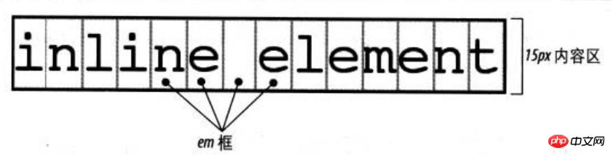
Content area
For inline non-replaced elements or a portion of anonymous text, font-size and font-family determine the height of the content area. In the case of Song Dynasty, if the font-size of an inline element is 15px, the height of the content area is 15px; in the case of other fonts, the height of the content area is not equal to the font size
Inline box
The content area plus line spacing equals the inline box. If the font-size of an inline non-replaced element is 15px and the line-height is 21px, the difference is 6px. The user agent splits these 6 pixels in half and applies one half to the top and bottom of the content area, resulting in an inline box
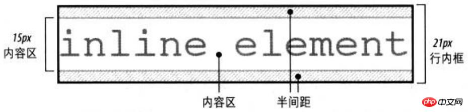
When line-height is less than When font-size is used, the inline box is actually smaller than the content area

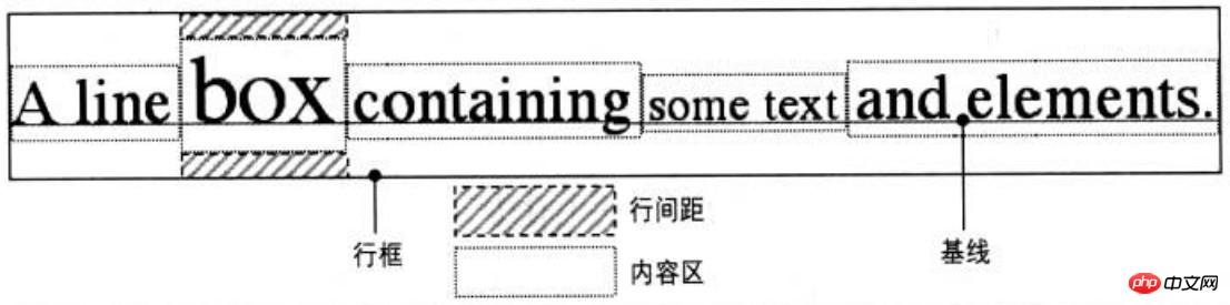
line box
The line box is defined as the highest inline box in the line The distance from the top to the bottom of the lowest inline box, and the top of each line box is next to the bottom of the previous line box
Box properties
Padding, margins and borders do not affect the height of the line box, that is, they do not affect the line height
The border boundaries of inline elements are controlled by font-size instead of line-height
Margins will not be applied to the top and bottom of inline non-replaced elements
Margin-left, padding-left, and border-left are applied to the beginning of the element; while margin-right and padding-right , border-right is applied to the end of the element
Replacement element
Inline replacement elements need to use the line-height value to align vertically elements can be positioned correctly. Because the percentage value of vertical-align is calculated relative to the line-height of the element. For vertical alignment, the height of the image itself does not matter, the key is the value of line-height
By default, inline replacement elements are located on the baseline. If you add bottom padding, margins, or borders to the replaced element, the content area moves up. The baseline of the replaced element is the baseline of the last line box in normal flow. Unless the content of the replacement element is empty or its overflow attribute value is not visible, in which case the baseline is the bottom edge of the margin
vertical-align
Definition
Vertical-align is used to set the vertical alignment. All vertically aligned elements will affect the row height
Values: baseline | sub | super | top | text-top | middle | bottom | text-bottom |
Initial value: baseline
Applies to: inline elements, replacement elements, tables Cell
Inheritance: None
Percentage: Relative to the line-height of the element line-height
[Note] The percentage value of vertical-align in IE7-browser is not the same It supports decimal line heights, and the display effect is different from the standard browser when taking values such as baseline, middle, text-bottom, etc. The common solution is to set the inline element to display:inline-block
vertical-align:baselinebaseline(元素的基线与父元素的基线对齐)
vertical-align:sub(降低元素的基线到父元素合适的下标位置)
vertical-align:super(升高元素的基线到父元素合适的上标位置)
vertical-align:bottombottom(把对齐的子元素的底端与行框底端对齐)
vertical-align:text-bottom(把元素的底端与父元素内容区域的底端对齐)
vertical-align:top(把对齐的子元素的顶端与行框顶端对齐)
vertical-align:text-top(把元素的顶端与父元素内容区域的顶端对齐)
vertical-align:middle(元素的中垂点与父元素的基线加1/2父元素中字母X的高度对齐)
vertical-align:(+-n)px(元素相对于基线上下偏移npx)
vertical-align:x%(相对于元素的line-height值)
vertical-align:inherit(从父元素继承vertical-align属性的值)
[Note] and carry the style vertical-align:sub/super
##inline-block bottom gap# by default. ## inline-block元素在块级元素中留空隙就是因为图像的默认垂直对齐方式是基线对齐(基线对齐在原理上图像底边与匿名文本大写英文字母X的底边对齐);而匿名文本是有行高的,所以X的底边距离行框有一段距离,这段距离就是图像留出的空隙 于是,解决这个问题有以下几个解决办法 [1]display:block 因为垂直对齐方式只能作用于替换元素和行内元素,更改为块级元素,会使垂直对齐方式失效 [2]父级的line-height: 0 这样使匿名文本与行框的距离为0 [3]vertical-align: top/middle/bottom 应用 【1】单行文本水平垂直居中 [注意]好多地方都写着单行文本垂直居中是将高度和行高设置成一样的值,但高度其实是没有必要设置的。仅仅设置行高就可以,文字在一行中本身就是垂直居中显示 【2】图片近似垂直居中 由于字符X在em框中并不是垂直居中的,且各个字体的字符X的高低位置不一致。所以,当字体大小较大时,这种差异就更明显 [注意]IE7浏览器在写块级元素包含行内元素时一定要写成换行写法,而不要写在一行 【3】图片完全垂直居中 在方法2的基础上设置块级元素的font-size为0,则可以设置图片完全垂直居中 【4】多行文本水平垂直居中 由于方法3设置font-size为0的局限性,块级元素里面无法放置文本。方法4主要通过新增元素来实现垂直居中效果,该方法也可用于图片的水平垂直居中 【5】图标和文本对齐 <方法一>使用长度负值 根据实践经验,20*20像素的图标后面跟14px的文字,vertical-align设置为-5px可以达到比较好的对齐效果 <方法二>使用文本底部对齐 使用baseline会使图标偏上;使用top/bottom会受到其他行内元素影响造成定位偏差;使用middle需要恰好的字体大小且兼容性不高;使用text-bottom较合适,不受行高及其他内联元素影响。 The above is the detailed content of Detailed explanation of examples of line-height and vertical-align properties in css. For more information, please follow other related articles on the PHP Chinese website!p{
line-height: 100px;
width: 100px;
text-align: center;
border: 1px solid black;
}
<p>测试文字</p>p{
line-height: 200px;
text-align: center;
}
img{
vertical-align: middle;
}
<p>
<img src="#" alt="#">
</p>//正确1<p> <img src="#" alt="#"></p>
//正确2<p><img src="#" alt="#"><!-- 这里要折行或空格 --></p>
//错误<p><img src="#" alt="#"></p>
p{ line-height: 200px; text-align: center; font-size: 0;}img{ vertical-align: middle;}<p> <img src="#" alt="#"></p>
p{
    height: 100px;
    width: 200px;
    background-color: pink;
    text-align: center;
}
span{
    display:inline-block;
    vertical-align: middle;
    line-height: 20px;
    width: 100px;
}
i{
    display: inline-block;
    height: 100%;
    vertical-align: middle;
}<p>
<i></i><span>我是特别长的特别长的特别长的特别长的多行文字</span>
</p>
img{ vertical-align: -5px;}img{ vertical-align: text-bottom;}

Hot AI Tools

Undresser.AI Undress
AI-powered app for creating realistic nude photos

AI Clothes Remover
Online AI tool for removing clothes from photos.

Undress AI Tool
Undress images for free

Clothoff.io
AI clothes remover

Video Face Swap
Swap faces in any video effortlessly with our completely free AI face swap tool!

Hot Article
Hot Tools

Notepad++7.3.1
Easy-to-use and free code editor

SublimeText3 Chinese version
Chinese version, very easy to use

Zend Studio 13.0.1
Powerful PHP integrated development environment

Dreamweaver CS6
Visual web development tools

SublimeText3 Mac version
God-level code editing software (SublimeText3)
Hot Topics


 How to use bootstrap in vue
Apr 07, 2025 pm 11:33 PM
How to use bootstrap in vue
Apr 07, 2025 pm 11:33 PM
Using Bootstrap in Vue.js is divided into five steps: Install Bootstrap. Import Bootstrap in main.js. Use the Bootstrap component directly in the template. Optional: Custom style. Optional: Use plug-ins.
 The Roles of HTML, CSS, and JavaScript: Core Responsibilities
Apr 08, 2025 pm 07:05 PM
The Roles of HTML, CSS, and JavaScript: Core Responsibilities
Apr 08, 2025 pm 07:05 PM
HTML defines the web structure, CSS is responsible for style and layout, and JavaScript gives dynamic interaction. The three perform their duties in web development and jointly build a colorful website.
 Understanding HTML, CSS, and JavaScript: A Beginner's Guide
Apr 12, 2025 am 12:02 AM
Understanding HTML, CSS, and JavaScript: A Beginner's Guide
Apr 12, 2025 am 12:02 AM
WebdevelopmentreliesonHTML,CSS,andJavaScript:1)HTMLstructurescontent,2)CSSstylesit,and3)JavaScriptaddsinteractivity,formingthebasisofmodernwebexperiences.
 How to set up the framework for bootstrap
Apr 07, 2025 pm 03:27 PM
How to set up the framework for bootstrap
Apr 07, 2025 pm 03:27 PM
To set up the Bootstrap framework, you need to follow these steps: 1. Reference the Bootstrap file via CDN; 2. Download and host the file on your own server; 3. Include the Bootstrap file in HTML; 4. Compile Sass/Less as needed; 5. Import a custom file (optional). Once setup is complete, you can use Bootstrap's grid systems, components, and styles to create responsive websites and applications.
 How to write split lines on bootstrap
Apr 07, 2025 pm 03:12 PM
How to write split lines on bootstrap
Apr 07, 2025 pm 03:12 PM
There are two ways to create a Bootstrap split line: using the tag, which creates a horizontal split line. Use the CSS border property to create custom style split lines.
 How to insert pictures on bootstrap
Apr 07, 2025 pm 03:30 PM
How to insert pictures on bootstrap
Apr 07, 2025 pm 03:30 PM
There are several ways to insert images in Bootstrap: insert images directly, using the HTML img tag. With the Bootstrap image component, you can provide responsive images and more styles. Set the image size, use the img-fluid class to make the image adaptable. Set the border, using the img-bordered class. Set the rounded corners and use the img-rounded class. Set the shadow, use the shadow class. Resize and position the image, using CSS style. Using the background image, use the background-image CSS property.
 How to use bootstrap button
Apr 07, 2025 pm 03:09 PM
How to use bootstrap button
Apr 07, 2025 pm 03:09 PM
How to use the Bootstrap button? Introduce Bootstrap CSS to create button elements and add Bootstrap button class to add button text
 How to resize bootstrap
Apr 07, 2025 pm 03:18 PM
How to resize bootstrap
Apr 07, 2025 pm 03:18 PM
To adjust the size of elements in Bootstrap, you can use the dimension class, which includes: adjusting width: .col-, .w-, .mw-adjust height: .h-, .min-h-, .max-h-
