

Share some commonly used latest css3 properties

Here are 4 new properties of CSS3 recommended to you. They are very practical. Examples are attached. Friends in need can study them carefully. When working on projects,
css3 has just been launched. Although most css3 properties are not supported in many popular browsers, I personally feel that we should try our best to slowly start to understand and use css3 ( And html5), because I think this is a trend and it is a standard that has been developed. I am not specifically doing front-end work, I just sometimes have to write these things myself, and sometimes I like to study them. All the above are just my personal opinions.
1. Before, I wanted to make a rounded frame with a border on the page. It seemed that I needed to write a lot of css code (maybe I didn’t know a better way). There was an attribute created in css3. Rounding corners is very easy. You can also create a circle by setting the angle
border-radius:
css Code:
The code is as follows:
#test
{
text-align:center;
padding:10px 40px;
background:gray;
width:350px;
border-radius:10px;
-moz-border-radius:10px; /* 为了让老的 Firefox版本支持 */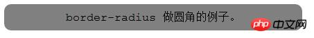
}html code:
The code is as follows:
<body>
<p>border-radius 做圆角的例子。</p>
</body>
2. CSS3 border Shadow, before I used picture directly to achieve the effect of background. I can also use the box-shadow attribute in css3 to achieve
box-shadow:
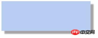
css code:
The code is as follows:
#test1
{
box-shadow: 10px 10px 5px #A5A5A5;
width:300px;
height:100px;
}html code:
The code is as follows:
3. CSS3 supports background images. Use multiple images
CSS3 multiple background images
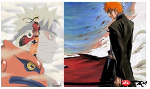
##The code is as follows:
.box
{
width:464px;
height:300px;
background:url(test1.jpg) 0 0 no-repeat,url(test2.jpg) 100% 0 no-repeat;
}
</style>
</head>
<body>
<p></p>
</body>4,
text-overflow attribute specifies what happens when text overflows the containing element.
This property supports the feature of cutting off the text in the container and giving an ellipsis when the text overflows.
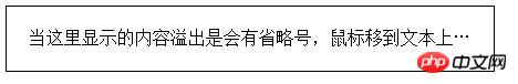
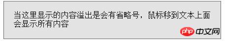
<em>.test3 {<br/>text-overflow:ellipsis;<br/>overflow:hidden;<br/>white-space<br/>:nowrap;<br/>border: 1px solid black;<br/>width: 400px;<br/>padding: 20px;<br/>cursor: pointer;<br/>}<br/>#test3<br/>:hover<br/> {<br/>white-space: normal;<br/>color: rgba(0,0,0,1);<br/>background: #e3e3e3;<br/>border: 1px solid #666;<br/>}<br/></style><br/></head><br/><body><br/><p>当这里显示的内容溢出是会有省略号,鼠标移到文本上面会显示所有内容</p><br/></body><br/></em>
5, Transition effect
, through CSS3, we can change the element from Adds effects to elements when one style transforms into another. The effect is difficult to express with textures. If you are interested in running the following code yourself: The code is as follows:
<style>
p
{
width:100px;
height:100px;
background:blue;
transition:width 2s, height 2s;
-moz-transition:width 2s, height 2s, -moz-trans
for
m 2s; /* 可以支持Firefox 4 */
-webkit-transition:width 2s, height 2s, -webkit-transform 2s; /* 可以支持Safari and
Chr
ome */
-o-transition:width 2s, height 2s, -o-transform 2s; /* 可以支持Opera */
}
p:hover
{
width:200px;
height:200px;
transform:rotate(180deg);
-moz-transform:rotate(180deg); /* 可以支持Firefox 4 */
-webkit-transform:rotate(180deg); /* 可以支持Safari and Chrome */
-o-transform:rotate(180deg); /* 可以支持Opera */
}
</style>
</head>
<body>
<p>把鼠标放上该区域,来查看过渡效果。</p>
</body>[Related recommendations]
1.
CSS3 Free Video Tutorial2.
Use CSS to create chat box small sharp corners and bubble effectsBrowser implements high-performance css3 animation on mobile terminalh5+css3 code example to implement image fly-in and fade-in and fade-out effectsTeach you how to use CSS3 to create 8 types of Loading animationsThe above is the detailed content of Share some commonly used latest css3 properties. For more information, please follow other related articles on the PHP Chinese website!

Hot AI Tools

Undresser.AI Undress
AI-powered app for creating realistic nude photos

AI Clothes Remover
Online AI tool for removing clothes from photos.

Undress AI Tool
Undress images for free

Clothoff.io
AI clothes remover

Video Face Swap
Swap faces in any video effortlessly with our completely free AI face swap tool!

Hot Article
Hot Tools

Notepad++7.3.1
Easy-to-use and free code editor

SublimeText3 Chinese version
Chinese version, very easy to use

Zend Studio 13.0.1
Powerful PHP integrated development environment

Dreamweaver CS6
Visual web development tools

SublimeText3 Mac version
God-level code editing software (SublimeText3)
Hot Topics


 How to achieve wave effect with pure CSS3? (code example)
Jun 28, 2022 pm 01:39 PM
How to achieve wave effect with pure CSS3? (code example)
Jun 28, 2022 pm 01:39 PM
How to achieve wave effect with pure CSS3? This article will introduce to you how to use SVG and CSS animation to create wave effects. I hope it will be helpful to you!
 Use CSS skillfully to realize various strange-shaped buttons (with code)
Jul 19, 2022 am 11:28 AM
Use CSS skillfully to realize various strange-shaped buttons (with code)
Jul 19, 2022 am 11:28 AM
This article will show you how to use CSS to easily realize various weird-shaped buttons that appear frequently. I hope it will be helpful to you!
 How to hide elements in css without taking up space
Jun 01, 2022 pm 07:15 PM
How to hide elements in css without taking up space
Jun 01, 2022 pm 07:15 PM
Two methods: 1. Using the display attribute, just add the "display:none;" style to the element. 2. Use the position and top attributes to set the absolute positioning of the element to hide the element. Just add the "position:absolute;top:-9999px;" style to the element.
 How to implement lace borders in css3
Sep 16, 2022 pm 07:11 PM
How to implement lace borders in css3
Sep 16, 2022 pm 07:11 PM
In CSS, you can use the border-image attribute to achieve a lace border. The border-image attribute can use images to create borders, that is, add a background image to the border. You only need to specify the background image as a lace style; the syntax "border-image: url (image path) offsets the image border width inward. Whether outset is repeated;".
 How to enlarge the image by clicking the mouse in css3
Apr 25, 2022 pm 04:52 PM
How to enlarge the image by clicking the mouse in css3
Apr 25, 2022 pm 04:52 PM
Implementation method: 1. Use the ":active" selector to select the state of the mouse click on the picture; 2. Use the transform attribute and scale() function to achieve the picture magnification effect, the syntax "img:active {transform: scale(x-axis magnification, y Axis magnification);}".
 It turns out that text carousel and image carousel can also be realized using pure CSS!
Jun 10, 2022 pm 01:00 PM
It turns out that text carousel and image carousel can also be realized using pure CSS!
Jun 10, 2022 pm 01:00 PM
How to create text carousel and image carousel? The first thing everyone thinks of is whether to use js. In fact, text carousel and image carousel can also be realized using pure CSS. Let’s take a look at the implementation method. I hope it will be helpful to everyone!
 How to set animation rotation speed in css3
Apr 28, 2022 pm 04:32 PM
How to set animation rotation speed in css3
Apr 28, 2022 pm 04:32 PM
In CSS3, you can use the "animation-timing-function" attribute to set the animation rotation speed. This attribute is used to specify how the animation will complete a cycle and set the speed curve of the animation. The syntax is "element {animation-timing-function: speed attribute value;}".
 Does css3 animation effect have deformation?
Apr 28, 2022 pm 02:20 PM
Does css3 animation effect have deformation?
Apr 28, 2022 pm 02:20 PM
The animation effect in css3 has deformation; you can use "animation: animation attribute @keyframes ..{..{transform: transformation attribute}}" to achieve deformation animation effect. The animation attribute is used to set the animation style, and the transform attribute is used to set the deformation style. .
