

Detailed explanation of linear-gradient examples in CSS3

The previous article of "CSS3 Classic Tutorial Series" introduced you in detail the usage of text-shadow text-shadow feature. Let's take a look at this article today CSS3 The specific usage of the Gradient attribute to achieve the gradient effect. In the past, gradient effects, like shadow and rounded corner effects, were all made into pictures and could be achieved by writing CSS code directly.
Related articles you may be interested in
-
Recommended must-read articles for Web developers and designers
20 Brilliant CSS3 Feature Application Demonstrations
35 Astonishing CSS3 AnimationsEffect Demonstrations
Recommended 12 beautiful CSS3 ButtonsImplementation plan
- ##24 very practical CSS3 tools ultimate collection
IE browser).
This article ignores IE as usual. We mainly look at the applications under Mozilla, Webkit, and Opera. Of course, it can also be implemented under IE. It needs to be implemented through IE-specific filters, which will be listed later. The syntax for using filters will not be introduced in detail. If you are interested, you cansearch related technical documents.
1. Application of linear gradient under Mozilla
Syntax:
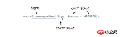
-moz-linear-gradient( [<point> || <angle>,]? <stop>, <stop> [, <stop>]* )
Parameters: It has three parameters. The first parameter represents the direction of the linear gradient. top is from top to bottom, left is from left to right. If it is defined as left top, it is from the upper left corner to the lower right corner. The second and third parameters are the start color and end color respectively. You can also insert more parameters between them to represent gradients of multiple colors. As shown in the figure:
HTML:
<p class="example example1"></p>
CSS:
.example {
   width: 150px;
   height: 80px;
}.example1 {
background: -moz-linear-gradient( top,#ccc,#000);
}
2. Linear gradient Application under Webkit
Syntax:
-webkit-linear-gradient( [<point> || <angle>,]? <stop>, <stop> [, <stop>]* )//最新发布书写语法
-webkit-gradient(<type>, <point> [, <radius>]?, <point> [, <radius>]? [, <stop>]*) //老式语法书写规则
Parameters: -webkit-gradient is the implementation parameter of gradient by webkit engine. There are five in total. The first parameter represents the gradient type (type), which can be linear (linear gradient) or radial (radial gradient). The second parameter and the third parameter are both a pair of values, representing the starting point and end point of the gradient respectively. This pair of values can be expressed in the form of coordinates or key values, such as left top (upper left corner) and left bottom (lower left corner). The fourth and fifth parameters are two color-stopfunctions respectively. The color-stop function accepts two parameters. The first one represents the position of the gradient, 0 is the starting point, 0.5 is the midpoint, and 1 is the end point; the second one represents the color of the point. As shown in the picture:


background: -webkit-gradient(linear,center top,center bottom,from(#ccc), to(#000));
-webkit-linear-gradient(top,#ccc,#000);
3. Application of linear gradient in Opera
Syntax:
-o-linear-gradient([<point> || <angle>,]? <stop>, <stop> [, <stop>]); /* Opera 11.10+ */
参数:-o-linear-gradient 有三个参数。第一个参数表示线性渐变的方向,top 是从上到下、left 是从左到右,如果定义成 left top,那就是从左上角到右下角。第二个和第三个参数分别是起点颜色和终点颜色。你还可以在它们之间插入更多的参数,表示多种颜色的渐变。(注:Opera 支持的版本有限,本例测试都是在 Opera11.1 版本下,后面不在提示),如图所示:

示例代码:
background: -o-linear-gradient(top,#ccc, #000);
效果如图所示:
四、线性渐变在 Trident (IE) 下的应用
语法:
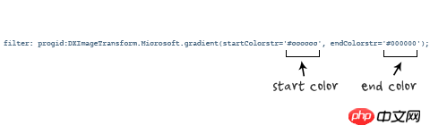
filter: progid:DXImageTransform.Microsoft.gradient(GradientType=0, startColorstr=#1471da, endColorstr=#1C85FB);/*IE<9>*/
-ms-filter: "progid:DXImageTransform.Microsoft.gradient (GradientType=0, startColorstr=#1471da, endColorstr=#1C85FB)";/*IE8+*/
IE依靠滤镜实现渐变。startColorstr表示起点的颜色,endColorstr 表示终点颜色。GradientType 表示渐变类型,0 为缺省值,表示垂直渐变,1 表示水平渐变。如图所示:
上面我们主要介绍了线性渐变在上述四大核心模块下的实现方法,接着我们主要针对线性渐变在 Mozilla、Webkit、Opera 三大模块下实现各种不同线性渐变实例:
从上面的语法中我们可以很清楚的知道,要创建一个线性渐变,我们需要创建一个起点和一个渐变方向(或角度),定义一个起始色:
-moz-linear-gradient( [<point> || <angle>,]? <stop>, <stop> [, <stop>]* ) -webkit-linear-gradient( [|| ,]? , [, ]* ) -o-linear-gradient( [ || ,]? , [, ]* )
具体应用如下:
background:-moz-linear-gradient(left,#ace,#f96);/*Mozilla*/
background:-webkit-gradient(linear,0 50%,100% 50%,from(#ace),to(#f96));/*Old gradient for webkit*/
background:-webkit-linear-gradient(left,#ace,#f96);/*new gradient for Webkit*/
background:-o-linear-gradient(left,#ace,#f96); /*Opera11*/
效果如下:

起始点(Starting Point)的工作方式类似于 background position。您可以设置水平和垂直位置为百分比,或以像素为单位,或在水平方向上可以使用left/center/right,在垂直方向上可以使用top/center/bottom。位置起始于左上角。如果你不指定水平或垂直位置,它将默认为center。其工作方式主要包含:Top → Bottom、Left → Right、bottom → top、right → left等,接着我们主要一种一种来看其实现的效果:
1、开始于center(水平方向)和top(垂直方向)也就是Top → Bottom:
/* Firefox 3.6+ */
background: -moz-linear-gradient(top, #ace, #f96);
/* Safari 4-5, Chrome 1-9 */
/* -webkit-gradient(,  [, ]?,  [, ]? [, ]*) */
background: -webkit-gradient(linear,top,from(#ace),to(#f96));
/* Safari 5.1+, Chrome 10+ */
background: -webkit-linear-gradient(top, #ace, #f96);
/* Opera 11.10+ */
background: -o-linear-gradient(top, #ace, #f96);
效果:

2、始于left(水平方向)和center(垂直方向)也是就Left → Right:
/* Firefox 3.6+ */
background: -moz-linear-gradient(left, #ace, #f96);
/* Safari 5.1+, Chrome 10+ */
background: -webkit-linear-gradient(left, #ace, #f96);
/* Opera 11.10+ */
background: -o-linear-gradient(left, #ace, #f96);
效果如下:

3、起始于left(水平方向)和top(垂直方向):
background: -moz-linear-gradient(left top, #ace, #f96);
background: -webkit-linear-gradient(left top, #ace, #f96);
background: -o-linear-gradient(left top, #ace, #f96);
效果如下:

4、Linear Gradient (with Even Stops):
/* Firefox 3.6+ */
background: -moz-linear-gradient(left, #ace, #f96, #ace, #f96, #ace);
/* Safari 4-5, Chrome 1-9 */
background: -webkit-gradient(linear, left top, right top, from(#ace), color-stop(0.25, #f96), color-stop(0.5, #ace), color-stop(0.75, #f96), to(#ace));
/* Safari 5.1+, Chrome 10+ */
background: -webkit-linear-gradient(left, #ace, #f96, #ace, #f96, #ace);
/* Opera 11.10+ */
background: -o-linear-gradient(left, #ace, #f96, #ace, #f96, #ace);
效果如下:

5、with Specified Arbitrary Stops:
/* Firefox 3.6+ */
 background: -moz-linear-gradient(left, #ace, #f96 5%, #ace, #f96 95%, #ace);
 /* Safari 4-5, Chrome 1-9 */
 background: -webkit-gradient(linear, left top, right top, from(#ace), color-stop(0.05, #f96), color-stop(0.5, #ace), color-stop(0.95, #f96), to(#ace));
 /* Safari 5.1+, Chrome 10+ */
 background: -webkit-linear-gradient(left, #ace, #f96 5%, #ace, #f96 95%, #ace);
 /* Opera 11.10+ */
 background: -o-linear-gradient(left, #ace, #f96 5%, #ace, #f96 95%, #ace);
效果如下:

6、角度(Angle):
正如上面看到的示例,如果您不指定一个角度,它会根据起始位置自动定义。如果你想更多的控制渐变的方向,您不妨设置角度试试。例如,下面的两个渐变具有相同的起点left center,但是加上一个30度的角度。
没有角度的示例代码:
background: -moz-linear-gradient(left, #ace, #f96);
background: -webkit-linear-gradient(left,#ace,#f96);
background: -o-linear-gradient(left, #ace, #f96);
加上30度的角度代码:
background: -moz-linear-gradient(left 30deg, #ace, #f96);
background: -webkit-gradient(linear, 0 0, 100% 100%, from(#ace),to(#f96));
background: -o-linear-gradient(30deg, #ace, #f96);
效果图如下:


当指定的角度,请记住,它是一个由水平线与渐变线产生的的角度,逆时针方向。因此,使用0deg将产生一个左到右横向梯度,而90度将创建一个从底部到顶部的垂直渐变。我来看看你核心代码:
background: -moz-linear-gradient(<angle>, #ace, #f96);
background: -webkit-gradient(<type>,<angle>, from(#ace), to(#f96));
background: -webkit-linear-gradient(<angle>, #ace, #f96);
background: -o-linear-gradient(<angle>, #ace, #f96);
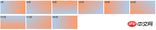
我们来看看各角度的区别:
.deg0 {
  background: -moz-linear-gradient(0deg, #ace, #f96);
  background: -webkit-gradient(linear,0 50%,100% 50%,from(#ace),to(#f96));
  background: -webkit-linear-gradient(0deg, #ace, #f96);
  background: -o-linear-gradient(0deg, #ace, #f96);
}

.deg45 {
  background: -moz-linear-gradient(45deg, #ace, #f96);
  background: -webkit-gradient(linear,0 100%,100% 0%,from(#ace),to(#f96));
  background: -webkit-linear-gradient(45deg, #ace, #f96);
  background: -o-linear-gradient(45deg, #ace, #f96);
}
.deg90 {
  background: -moz-linear-gradient(90deg, #ace, #f96);
  background: -webkit-gradient(linear,50% 100%,50% 0%,from(#ace),to(#f96));
  background: -webkit-linear-gradient(90deg, #ace, #f96);
  background: -o-linear-gradient(90deg, #ace, #f96);
}
.deg135 {
  background: -moz-linear-gradient(135deg, #ace, #f96);
  background: -webkit-gradient(linear,100% 100%,0 0,from(#ace),to(#f96));
  background: -webkit-linear-gradient(135deg, #ace, #f96);
  background: -o-linear-gradient(135deg, #ace, #f96);
}
.deg180 {
  background: -moz-linear-gradient(180deg, #ace, #f96);
  background: -webkit-gradient(linear,100% 50%,0 50%,from(#ace),to(#f96));
  background: -webkit-linear-gradient(180deg, #ace, #f96);
  background: -o-linear-gradient(180deg, #ace, #f96);
}
.deg225 {
  background: -moz-linear-gradient(225deg, #ace, #f96);
  background: -webkit-gradient(linear,100% 0%,0 100%,from(#ace),to(#f96));
  background: -webkit-linear-gradient(225deg, #ace, #f96);
  background: -o-linear-gradient(225deg, #ace, #f96);
}
.deg270 {
  background: -moz-linear-gradient(270deg, #ace, #f96);
  background: -webkit-gradient(linear,50% 0%,50% 100%,from(#ace),to(#f96));
  background: -webkit-linear-gradient(270deg, #ace, #f96);
  background: -o-linear-gradient(270deg, #ace, #f96);
}
.deg315 {
  background: -moz-linear-gradient(315deg, #ace, #f96);
  background: -webkit-gradient(linear,0% 0%,100% 100%,from(#ace),to(#f96));
  background: -webkit-linear-gradient(315deg, #ace, #f96);
  background: -o-linear-gradient(315deg, #ace, #f96);
}
.deg360 {
  background: -moz-linear-gradient(360deg, #ace, #f96);
  background: -webkit-gradient(linear,0 50%,100% 50%,from(#ace),to(#f96));
  background: -webkit-linear-gradient(360deg, #ace, #f96);
  background: -o-linear-gradient(360deg, #ace, #f96);
}效果如下:
除了起始位置和角度,你应该指定起止颜色。起止颜色是沿着渐变线,将会在指定位置(以百分比或长度设定)含有指定颜色的点。色彩的起止数是无限的。如果您使用一个百分比位置,0%代表起点和100%是终点,但区域外的值可以被用来达到预期的效果。 这也是通过CSS3 Gradient制作渐变的一个关键所在,其直接影响了你的设计效果,像我们这里的示例都不是完美的效果,只是为了能给大家展示一个渐变的效果,大家就这样先用着吧。我们接着看一下不同的起址色的示例:
background: -moz-linear-gradient(top, #ace, #f96 80%, #f96);
background: -webkit-linear-gradient(top,#ace,#f96 80%,#f96);
background: -o-linear-gradient(top, #ace, #f96 80%, #f96);
效果如下:

如果没有指定位置,颜色会均匀分布。如下面的示例:
background: -moz-linear-gradient(left, red, #f96, yellow, green, #ace);
background: -webkit-linear-gradient(left,red,#f96,yellow,green,#ace);
background: -o-linear-gradient(left, red, #f96, yellow, green, #ace);
效果如下

7、渐变上应用透明度(Transparency):
透明渐变对于制作一些特殊的效果是相当有用的,例如,当堆叠多个背景时。这里是两个背景的结合:一张图片,一个白色到透明的线性渐变。我们来看一个官网的示例吧:
background: -moz-linear-gradient(right, rgba(255,255,255,0), rgba(255,255,255,1)),url(http://demos.hacks.mozilla.org/openweb/resources/images/patterns/flowers-pattern.jpg);
background: -webkit-linear-gradient(right, rgba(255,255,255,0), rgba(255,255,255,1)),url(http://demos.hacks.mozilla.org/openweb/resources/images/patterns/flowers-pattern.jpg);
background: -o-linear-gradient(right, rgba(255,255,255,0), rgba(255,255,255,1)),url(http://demos.hacks.mozilla.org/openweb/resources/images/patterns/flowers-pattern.jpg);
接着看看效果吧

大家可以时入这里和原图做一下比较,是不是很神奇呀。如果想体会的话,快点动手跟我一起做吧。
【相关推荐】
1. CSS3免费视频教程
2. 详解CSS3中lineaer-gradient使用方法
3. 深入详解CSS3中斜向线性渐变lineaer-gradient
4. 关于CSS3中linear-gradient参数的详解
5. CSS linear-gradient() 的语法详解
The above is the detailed content of Detailed explanation of linear-gradient examples in CSS3. For more information, please follow other related articles on the PHP Chinese website!

Hot AI Tools

Undresser.AI Undress
AI-powered app for creating realistic nude photos

AI Clothes Remover
Online AI tool for removing clothes from photos.

Undress AI Tool
Undress images for free

Clothoff.io
AI clothes remover

Video Face Swap
Swap faces in any video effortlessly with our completely free AI face swap tool!

Hot Article
Hot Tools

Notepad++7.3.1
Easy-to-use and free code editor

SublimeText3 Chinese version
Chinese version, very easy to use

Zend Studio 13.0.1
Powerful PHP integrated development environment

Dreamweaver CS6
Visual web development tools

SublimeText3 Mac version
God-level code editing software (SublimeText3)
Hot Topics


 How to achieve wave effect with pure CSS3? (code example)
Jun 28, 2022 pm 01:39 PM
How to achieve wave effect with pure CSS3? (code example)
Jun 28, 2022 pm 01:39 PM
How to achieve wave effect with pure CSS3? This article will introduce to you how to use SVG and CSS animation to create wave effects. I hope it will be helpful to you!
 Use CSS skillfully to realize various strange-shaped buttons (with code)
Jul 19, 2022 am 11:28 AM
Use CSS skillfully to realize various strange-shaped buttons (with code)
Jul 19, 2022 am 11:28 AM
This article will show you how to use CSS to easily realize various weird-shaped buttons that appear frequently. I hope it will be helpful to you!
 How to hide elements in css without taking up space
Jun 01, 2022 pm 07:15 PM
How to hide elements in css without taking up space
Jun 01, 2022 pm 07:15 PM
Two methods: 1. Using the display attribute, just add the "display:none;" style to the element. 2. Use the position and top attributes to set the absolute positioning of the element to hide the element. Just add the "position:absolute;top:-9999px;" style to the element.
 How to implement lace borders in css3
Sep 16, 2022 pm 07:11 PM
How to implement lace borders in css3
Sep 16, 2022 pm 07:11 PM
In CSS, you can use the border-image attribute to achieve a lace border. The border-image attribute can use images to create borders, that is, add a background image to the border. You only need to specify the background image as a lace style; the syntax "border-image: url (image path) offsets the image border width inward. Whether outset is repeated;".
 How to enlarge the image by clicking the mouse in css3
Apr 25, 2022 pm 04:52 PM
How to enlarge the image by clicking the mouse in css3
Apr 25, 2022 pm 04:52 PM
Implementation method: 1. Use the ":active" selector to select the state of the mouse click on the picture; 2. Use the transform attribute and scale() function to achieve the picture magnification effect, the syntax "img:active {transform: scale(x-axis magnification, y Axis magnification);}".
 It turns out that text carousel and image carousel can also be realized using pure CSS!
Jun 10, 2022 pm 01:00 PM
It turns out that text carousel and image carousel can also be realized using pure CSS!
Jun 10, 2022 pm 01:00 PM
How to create text carousel and image carousel? The first thing everyone thinks of is whether to use js. In fact, text carousel and image carousel can also be realized using pure CSS. Let’s take a look at the implementation method. I hope it will be helpful to everyone!
 How to set animation rotation speed in css3
Apr 28, 2022 pm 04:32 PM
How to set animation rotation speed in css3
Apr 28, 2022 pm 04:32 PM
In CSS3, you can use the "animation-timing-function" attribute to set the animation rotation speed. This attribute is used to specify how the animation will complete a cycle and set the speed curve of the animation. The syntax is "element {animation-timing-function: speed attribute value;}".
 Does css3 animation effect have deformation?
Apr 28, 2022 pm 02:20 PM
Does css3 animation effect have deformation?
Apr 28, 2022 pm 02:20 PM
The animation effect in css3 has deformation; you can use "animation: animation attribute @keyframes ..{..{transform: transformation attribute}}" to achieve deformation animation effect. The animation attribute is used to set the animation style, and the transform attribute is used to set the deformation style. .
