
 Web Front-end
CSS Tutorial
Share an example code of CSS3 rounded corners and gradient functions
Web Front-end
CSS Tutorial
Share an example code of CSS3 rounded corners and gradient functions
Share an example code of CSS3 rounded corners and gradient functions

This article mainly introduces relevant information on the detailed explanation of two commonly used functions of CSS3 rounded corners and gradients. Friends in need can refer to the following
Css3 rounded corners explanation: I believe everyone is familiar with pictures and background rounded corners. You are familiar with it,
Fillet syntax: border-radius: fillet value;
Advantages of CSS3 rounded corners
The traditional rounded corner generation scheme must use multiple pictures as background patterns. The emergence of CSS3 means that we no longer have to waste time creating these images, and there are many other advantages:
* Reduce the workload of maintenance. The work of generating, updating image files, and writing web page code is no longer necessary.
* Improve web page performance. Web pages will load faster because there are no more unnecessary HTTP requests.
* Increase visual reliability. Under certain circumstances (network congestion, server error, slow network speed, etc.), the background image may fail to download, resulting in poor visual effects. This doesn't happen with CSS3.
This value can be used: em, ex, pt, px, percentage;
Border-radius is similar to margin and padding
Border-radius: lefttop, righttop, rightbottom, leftbottom.
The code is as follows:
<p class="box1">
</p>
.box1{width:200px;height:100px;border-radius:30px 5px;background:#f66f17;margin-top:30px;}
<p class="box2"></p>
.box2{width:200px;height:100px;border-radius:30px 20px 10px 0px;background:#f66f17;margin-top:30px;}
It should be easy to understand the rounded corners. .
For percentages: The safest approach at present is to set the style and width of each rounded border to the same value and avoid using percentage values.
IE9 and below do not support this attribute
Linear gradient: background: linear-gradient (set the gradient form, the first color starting point, the position of the middle color point, the end point color) ;
Linear: Type of gradient (linear gradient);
Form of gradient: There are two ways to select optional parameters - 1. Set the rotation angle, 0 degrees means horizontally from left to right, 90 degrees means from top to bottom Come on, start from 0 degrees and change counterclockwise.
2. Use keywords, left means from left to right, top means from top to bottom, similarly right means from right to left, lefttop - from sitting up to right bottom, and similarly leftbottom, righttop, rightbottom.
The middle color and middle color position are optional parameters.
But we need to consider browser compatibility, let’s write it like this:
-webkit-gradient(linear,0 0,0 100%,from(起始颜色,to(结束颜色)); /*for Safari4+,Chrome 2+*/
-webkit-linear-gradient(起始颜色, 结束颜色); /*for Safari 5.1+,Chrome 10+*/
-moz-linear-gradient(起始颜色, 结束颜色); /*for firefox*/
-o-linear-gradient(起始颜色, 结束颜色); /*Opera*/
linear-gradient(起始颜色, 结束颜色); /*标准属性*/
对于IE来说是个麻烦事,老办法
Filter:progid:DXImageTransform.Microsoft.gradient(startColorstr=’ 起始颜色’,endColorstr=” 结束颜色”); /*IE6,IE 7*/
-ms-linear-gradient(起始颜色, 结束颜色); /*IE8*/
<p class="content1"></p>
.content1{width:500px;height:
300
px;border-radius:10%;background:#ade691;
background:-webkit-linear-gradient(left,#88cfc3,#329e8c 30%,#096e5d);background:-moz-linear-gradient(left,#88cfc3,#329e8c 30%,#096e5d);background:filter: progid:DXImageTransform.Microsoft.gradient(startColorstr='#88cfc3', endColorstr='#096e5d'); /* IE6,IE7 */-ms-filter: "progid:DXImageTransform.Microsoft.gradient(startColorstr='#88cfc3', endColorstr='#096e5d')";background:linear-gradient(lleft,#88cfc3,#329e8c 30%,#096e5d;
float
:left;}
.tit1{
font-size
:3em;
font-weight
: bold;color:#f00;}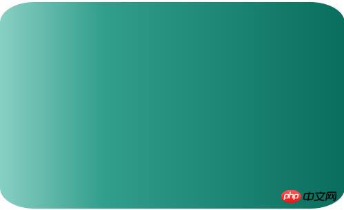
Repeating linear gradient: repeating-linear-gradient attribute instead Linear gradient linear-gradient;
<p class="content2"></p>
.content2{width:500px;height:200px;
background-image
: -webkit-repeating-linear-gradient(red,green 40px, o
range
 80px);
background-image: repeating-linear-gradient(red,green 40px, orange 80px);}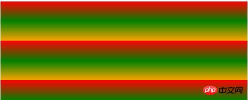
Radial gradient: radial-gradient (set the center of the gradient, gradient shape gradient size, starting color value , middle color value, middle color position, end color)
Gradient center, optional parameters, such as 30px 20px refers to 30px from the left and 20px from the top. It can be pixels, percentages, or keywords. The default is Central location.
Gradient shape, optional parameter, can take the value circle or eclipse[Default]
Gradient size, can loop Parameter, can take the value
closest-side :
Specify the radius length of the radial gradient from the center of the circle to the side closest to the center
closest-corner:
Specify the radius length of the radial gradient from the center of the circle to the corner closest to the center
farthest -side:
Specify the radius length of the radial gradient from the center of the circle to the farthest side from the center
farthest-corner:
Specify the radius length of the radial gradient from the center of the circle to the farthest corner from the center
contain:
Contains, specifying the radius length of the radial gradient from the center of the circle to the point closest to the center of the circle. Similar to closest-side
cover:
Cover, specifying the radius length of the radial gradient from the center of the circle to the point farthest from the center of the circle. Similar to farthest-corner
circle farthest-corner circular gradient, ellipse farthest-corner elliptical gradient
<p class="content3"></p>
.content3{width:500px;height:200px;
background-image: -webkit-radial-gradient(circle,hsla(120,70%,60%,.9),hsla(360,60%,60%,.9));
background-image: radial-gradient(circle,hsla(120,70%,60%,.9),hsla(360,60%,60%,.9));margin-top:20px;}
[Related recommendations]
1. Free css online video tutorial
3. php.cnDugujiujian( 2)-css video tutorial
The above is the detailed content of Share an example code of CSS3 rounded corners and gradient functions. For more information, please follow other related articles on the PHP Chinese website!

Hot AI Tools

Undresser.AI Undress
AI-powered app for creating realistic nude photos

AI Clothes Remover
Online AI tool for removing clothes from photos.

Undress AI Tool
Undress images for free

Clothoff.io
AI clothes remover

Video Face Swap
Swap faces in any video effortlessly with our completely free AI face swap tool!

Hot Article
Hot Tools

Notepad++7.3.1
Easy-to-use and free code editor

SublimeText3 Chinese version
Chinese version, very easy to use

Zend Studio 13.0.1
Powerful PHP integrated development environment

Dreamweaver CS6
Visual web development tools

SublimeText3 Mac version
God-level code editing software (SublimeText3)
Hot Topics


 SVM examples in Python
Jun 11, 2023 pm 08:42 PM
SVM examples in Python
Jun 11, 2023 pm 08:42 PM
Support Vector Machine (SVM) in Python is a powerful supervised learning algorithm that can be used to solve classification and regression problems. SVM performs well when dealing with high-dimensional data and non-linear problems, and is widely used in data mining, image classification, text classification, bioinformatics and other fields. In this article, we will introduce an example of using SVM for classification in Python. We will use the SVM model from the scikit-learn library
 Guide to modifying win11 window corners to rounded corners
Dec 31, 2023 pm 08:35 PM
Guide to modifying win11 window corners to rounded corners
Dec 31, 2023 pm 08:35 PM
After updating the win11 system, many friends found that the win11 interface window adopts a new rounded corner design. But some people don’t like this rounded corner design and want to modify it to the previous interface, but they don’t know how to modify it. Let’s take a look below. How to modify rounded corners in win11 1. The rounded corner design of win11 is a built-in system setting that cannot be modified at present. 2. So if you don’t like using the rounded corner design of win11, you can wait for Microsoft to provide a modification method. 3. If you are really not used to it, you can also choose to return to the previous win10 system. 4. If you don’t know how to roll back, you can check out the tutorials provided on this site. 5. If you cannot go back using the tutorial above, you can still
 Detailed example of how to solve the problem of CSS gradient aliasing!
Nov 25, 2022 pm 04:43 PM
Detailed example of how to solve the problem of CSS gradient aliasing!
Nov 25, 2022 pm 04:43 PM
This article will introduce to you how to solve the aliasing problem caused by using gradient graphics. The so-called CSS gradient aliasing disappearing technique can be done once you know it. Let's take a look at how to achieve it~ I hope it will be helpful to everyone. !
 How to achieve transparency gradient effect using CSS properties
Nov 18, 2023 pm 05:28 PM
How to achieve transparency gradient effect using CSS properties
Nov 18, 2023 pm 05:28 PM
The method of implementing the transparency gradient effect using CSS properties requires specific code examples. In web design, the transparency gradient effect can add a soft and beautiful transition effect to the page. Through the setting of CSS properties, we can easily achieve the transition effect on transparency of different elements. Today we will introduce some common methods and specific code examples. Use the opacity attribute. The Opacity attribute can set the transparency of an element. The value ranges from 0 to 1. 0 means completely transparent and 1 means completely opaque. we can pass
 How to adjust the rounded corners of win10 search box
Jan 15, 2024 pm 03:12 PM
How to adjust the rounded corners of win10 search box
Jan 15, 2024 pm 03:12 PM
There has been news about the rounded corners of the win10 search box for a long time, but it has never been implemented. We can generally use the registry to experience the rounded corners of the win10 search box. So let's take a look at the tutorial on the rounded corners of the win10 search box. Bar. Win10 search box variable rounded corners: 1. Open the search box, enter regedit, and enter the registry. 2. Find this path in Computer\HKEY_CURRENT_USER\Software\Microsoft\Windows\CurrentVersion\Search. 3. In the blank space, select New - DWORD (32-bit) value - Name the new key ImmersiveSearch - Number
 VUE3 Getting Started Example: Making a Simple Video Player
Jun 15, 2023 pm 09:42 PM
VUE3 Getting Started Example: Making a Simple Video Player
Jun 15, 2023 pm 09:42 PM
As the new generation of front-end frameworks continues to emerge, VUE3 is loved as a fast, flexible, and easy-to-use front-end framework. Next, let's learn the basics of VUE3 and make a simple video player. 1. Install VUE3 First, we need to install VUE3 locally. Open the command line tool and execute the following command: npminstallvue@next Then, create a new HTML file and introduce VUE3: <!doctypehtml>
 How to use the PS Gradient Tool - How to use the PS Gradient Tool
Mar 05, 2024 pm 06:28 PM
How to use the PS Gradient Tool - How to use the PS Gradient Tool
Mar 05, 2024 pm 06:28 PM
PS software is a software that many people use in their office work, so do you know how to use the PS gradient tool? The following is the method of using the PS gradient tool brought to you by the editor. Interested users can come and take a look below. 1. Open or create a new document: First, open Photoshop software and create a new document, or open an existing image file. Select the Gradient Tool: On the left side of the toolbar, locate the Gradient Tool (between the Rectangular Marquee Tool and the Paint Bucket Tool), and click to select it. 3. Set the gradient type: In the tool options bar, you can choose different gradient types. There are linear gradient, radial gradient, angular gradient and other options to choose from. Click the Gradient Type drop-down menu and select the gradient type you want. 4
 Learn best practice examples of pointer conversion in Golang
Feb 24, 2024 pm 03:51 PM
Learn best practice examples of pointer conversion in Golang
Feb 24, 2024 pm 03:51 PM
Golang is a powerful and efficient programming language that can be used to develop various applications and services. In Golang, pointers are a very important concept, which can help us operate data more flexibly and efficiently. Pointer conversion refers to the process of pointer operations between different types. This article will use specific examples to learn the best practices of pointer conversion in Golang. 1. Basic concepts In Golang, each variable has an address, and the address is the location of the variable in memory.
