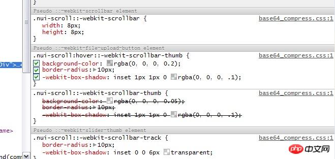
Illustration of steps to set scroll bar style in css
Because the company's recent projects require the use of scroll bars (the project runs under the webkit platform), we studied the CSS of the scroll bar.
The browser's default scroll bar looks too silly, so you have to do it yourself. I remember that IE browser has several styles for setting scroll bars, but they are relatively useless. They can only set colors and the like, and webkit does not support them. I accidentally saw that the scroll bar of NetEase mailbox looks very good. At first, I thought it was simulated with div. But after looking at it, it is exactly what I want. It is set up using CSS and it is for webkit browser.

You have to study these attributes carefully before you can transform them yourself.
Webkit browser css setting scroll bar
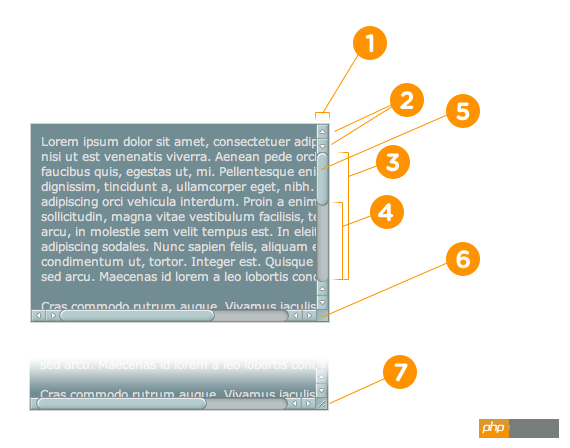
Mainly has the following 7 attributes
::-webkit-scrollbar The entire part of the scroll bar can be set Width or something
::-webkit-scrollbar-button The buttons at both ends of the scroll bar
::-webkit-scrollbar-track Outer layer Track
::-webkit-scrollbar-track-piece Inner scroll groove
::-webkit-scrollbar-thumb Scroll slide Block
::-webkit-scrollbar-corner Corner
::-webkit-resizer Define the style of the drag block in the lower right corner
The specific reference is as shown in the legend

The above are the main setting properties of the scroll bar, as well as more detailed CSS properties
:horizontal Horizontal scroll bar
:vertical Vertical scroll bar
:decrement Applies to buttons and inner track pieces. It is used to indicate whether the button or inner track will reduce the position of the window (for example, above the vertical scroll bar, to the left of the horizontal scroll bar.)
:increment decrement is similar, used to indicate the button or inner track Whether the track will increase the position of the viewport (for example, below the vertical scroll bar and to the right of the horizontal scroll bar.)
:start Pseudo-class also applies to buttons and sliders. It is used to define whether the object is placed in front of the slider.
:end is similar to the start pseudo-class, identifying whether the object is placed behind the slider.
:double-button This pseudo-class is used for buttons and inner tracks. Used to determine whether a button is one of a pair of buttons placed at the same end of the scroll bar. For inner tracks, this indicates whether the inner track is next to a pair of buttons.
:single-button is similar to the double-button pseudo-class. For buttons, it is used to determine whether a button is independently in a section of the scroll bar. For inner tracks, it indicates whether the inner track is next to a single-button.
:no-button is used for the inner track, indicating whether the inner track should be scrolled to the end of the scroll bar, for example, when there are no buttons at both ends of the scroll bar.
:corner-present is used for all scroll bar tracks, indicating whether the scroll bar rounded corners are displayed.
:window-inactive is used for all scroll bar tracks, indicating whether a page container (element) to which the scroll bar is applied is currently activated. (In the latest version of webkit, this pseudo-class can also be used for the ::selection pseudo-element. The webkit team plans to extend it and promote it to become a standard pseudo-class)
Write an example demo (please check in View it under webkit browser), you can’t just talk without practicing. CSS is also very simple.
/* 设置滚动条的样式 */::-webkit-scrollbar {width: 12px;}/* 滚动槽 */::-webkit-scrollbar-track {-webkit-box-shadow: inset 0 0 6px rgba(0,0,0,0.3);border-radius: 10px;}/* 滚动条滑块 */::-webkit-scrollbar-thumb {border-radius: 10px;background: rgba(0,0,0,0.1);-webkit-box-shadow: inset 0 0 6px rgba(0,0,0,0.5);}::-webkit-scrollbar-thumb:window-inactive {background: rgba(255,0,0,0.4);}CSS scroll bar setting under IE
It is relatively simple under IE. There are fewer customized items, all of which are colors.
scrollbar-arrow-color: color; /*The color of the triangular arrow*/
scrollbar-face-color: color; /* The color of the three-dimensional scroll bar (including the background color of the arrow part)*/
scrollbar-3dlight-color: color; /*The color of the bright edge of the three-dimensional scroll bar*/
scrollbar-highlight-color: color; /*Scroll bar highlight color (left shadow?)*/
scrollbar-shadow-color: color ; /*The color of the shadow of the three-dimensional scroll bar*/
scrollbar-darkshadow-color: color; /*The color of the outer shadow of the three-dimensional scroll bar*/
scrollbar-track-color: color; /*Three-dimensional scroll bar background color*/
scrollbar-base-color:color; /*Scroll bar base color*/
The above is the detailed content of Illustration of steps to set scroll bar style in css. For more information, please follow other related articles on the PHP Chinese website!

Hot AI Tools

Undresser.AI Undress
AI-powered app for creating realistic nude photos

AI Clothes Remover
Online AI tool for removing clothes from photos.

Undress AI Tool
Undress images for free

Clothoff.io
AI clothes remover

Video Face Swap
Swap faces in any video effortlessly with our completely free AI face swap tool!

Hot Article

Hot Tools

Notepad++7.3.1
Easy-to-use and free code editor

SublimeText3 Chinese version
Chinese version, very easy to use

Zend Studio 13.0.1
Powerful PHP integrated development environment

Dreamweaver CS6
Visual web development tools

SublimeText3 Mac version
God-level code editing software (SublimeText3)

Hot Topics
 How to use bootstrap in vue
Apr 07, 2025 pm 11:33 PM
Using Bootstrap in Vue.js is divided into five steps: Install Bootstrap. Import Bootstrap in main.js. Use the Bootstrap component directly in the template. Optional: Custom style. Optional: Use plug-ins.
 The Roles of HTML, CSS, and JavaScript: Core Responsibilities
Apr 08, 2025 pm 07:05 PM
HTML defines the web structure, CSS is responsible for style and layout, and JavaScript gives dynamic interaction. The three perform their duties in web development and jointly build a colorful website.
 Understanding HTML, CSS, and JavaScript: A Beginner's Guide
Apr 12, 2025 am 12:02 AM
WebdevelopmentreliesonHTML,CSS,andJavaScript:1)HTMLstructurescontent,2)CSSstylesit,and3)JavaScriptaddsinteractivity,formingthebasisofmodernwebexperiences.
 How to write split lines on bootstrap
Apr 07, 2025 pm 03:12 PM
There are two ways to create a Bootstrap split line: using the tag, which creates a horizontal split line. Use the CSS border property to create custom style split lines.
 How to insert pictures on bootstrap
Apr 07, 2025 pm 03:30 PM
There are several ways to insert images in Bootstrap: insert images directly, using the HTML img tag. With the Bootstrap image component, you can provide responsive images and more styles. Set the image size, use the img-fluid class to make the image adaptable. Set the border, using the img-bordered class. Set the rounded corners and use the img-rounded class. Set the shadow, use the shadow class. Resize and position the image, using CSS style. Using the background image, use the background-image CSS property.
 How to use bootstrap button
Apr 07, 2025 pm 03:09 PM
How to use the Bootstrap button? Introduce Bootstrap CSS to create button elements and add Bootstrap button class to add button text
 How to set up the framework for bootstrap
Apr 07, 2025 pm 03:27 PM
To set up the Bootstrap framework, you need to follow these steps: 1. Reference the Bootstrap file via CDN; 2. Download and host the file on your own server; 3. Include the Bootstrap file in HTML; 4. Compile Sass/Less as needed; 5. Import a custom file (optional). Once setup is complete, you can use Bootstrap's grid systems, components, and styles to create responsive websites and applications.
 How to resize bootstrap
Apr 07, 2025 pm 03:18 PM
To adjust the size of elements in Bootstrap, you can use the dimension class, which includes: adjusting width: .col-, .w-, .mw-adjust height: .h-, .min-h-, .max-h-


