

Teach you how to play with the 3D effects of CSS3
Starting with 3D in css3
To play with 3D in css3, you must understand a few words, namely perspective (perspective), rotation (rotate) and move(translate). Perspective is to look at 2D things on the screen from a realistic perspective to show the 3D effect. Rotation is no longer a rotation on a 2D plane, but a rotation of a three-dimensional coordinate system, including X-axis, Y-axis, and Z-axis rotation. TranslationSimilarly.
Of course I will explain it theoretically, but I guess you still don’t understand it. Below are 3 gifs:
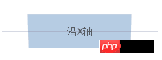
Rotate along the X-axis

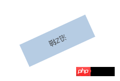
Rotate along the Y-axis
Rotate along the Z axis

#Rotation should be no problem, then it will be easier to understand translation , that is, moving on the X-axis, Y-axis, and Z-axis.
You may say that perspective is difficult to understand. Let me introduce several properties of perspective.
perspective
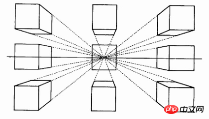
perspectiveThe English name is perspective. Without this thing, there is no way to form a 3D effect, but how does this thing allow us to browse? To create a 3D effect, you can look at the picture below. In fact, those who have studied painting should know the perspective relationship, and this is the truth here.
But in css it has a numerical value, for example perspective: 1000pxWhat does this represent? We can understand it this way. If we look directly at an object, the object will be super large and occupy our line of sight. As we get farther and farther away from it, it will become smaller and the three-dimensional feeling will come out, right? In fact, this numerical structure By determining the distance between our eyes and the screen, a virtual 3D illusion is constructed.
perspective-origin
From the above we understand perspective, and after adding this origin, we What I mentioned earlier is the distance between the eye and the object, and this is the line of sight of the eye. The different positions of our viewpoint determine the different scenes we see. The default is the center, which is perspectice-origin: 50% 50% , the first value is the X-axis on which the 3D element is based, and the second value is defined as the position on the y-axis
When the perspective-origin attribute is defined for an element, its child elements will Get the perspective effect, not the element itself. Must be used with the perspective attribute, and only affects 3D transform elements. (W3school)
##transform-style
perspectiveHere we go again, that’s right, It is the key to 3D in css. transform-styleThe default is flat. If you want to have a 3D effect on the element, you must use transform-style: preserve -3d, otherwise it is just a plane transformation, not a 3D transformation
Take you step by step to play with css3-3d
Above we have a little understanding of the concept, Let’s start the actual combat! Let’s see an effect, is it cool~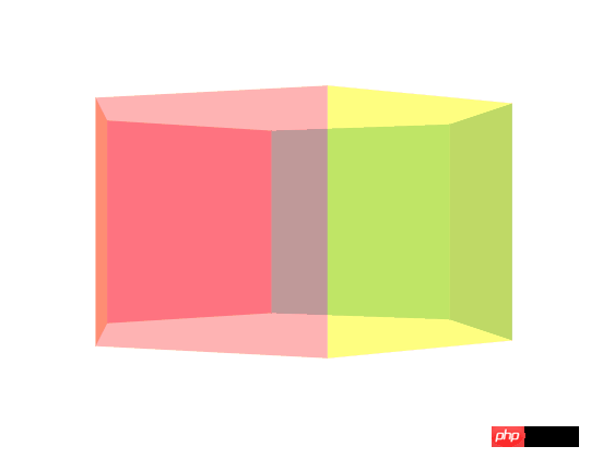
If the image cannot be loaded, just visit https://bupt- hjm.github.io/css3-3d/, if you think it is possible, remember to star it hh
The first step: html structure
is a very simple one The container wraps apiece-box
<p class="container">
    <p class="piece-box">
        <p class="piece piece-1"></p>
        <p class="piece piece-2"></p>
        <p class="piece piece-3"></p>
        <p class="piece piece-4"></p>
        <p class="piece piece-5"></p>
        <p class="piece piece-6"></p>
    </p>
</p>. Step 2: Add necessary 3D attributes and enter the 3D world
Through the above explanation, you should be familiar withperspective,
/*容器*/
.container {
    -webkit-perspective: 1000px;
    -moz-perspective: 1000px;
    -ms-perspective: 1000px;
    perspective: 1000px;
}
/*piece盒子*/
 .piece-box {
        perspective-origin: 50% 50%;
        -webkit-transform-style: preserve-3d;
        -moz-transform-style: preserve-3d;
        -ms-transform-style: preserve-3d;
        transform-style: preserve-3d;
}Step 3: Add the necessary styles/*容器*/
.container {
-webkit-perspective: 1000px;
-moz-perspective: 1000px;
-ms-perspective: 1000px;
perspective: 1000px;
}
/*piece盒子*/
.piece-box {
position: relative;
width: 200px;
height: 200px;
margin: 300px auto;
perspective-origin: 50% 50%;
-webkit-transform-style: preserve-3d;
-moz-transform-style: preserve-3d;
-ms-transform-style: preserve-3d;
transform-style: preserve-3d;
}
/*piece通用样式*/
.piece {
position: absolute;
width: 200px;
height: 200px;
background: red;
opacity: 0.5;
}
.piece-1 {
background: #FF6666;
}
.piece-2 {
background: #FFFF00;
}
.piece-3 {
background: #006699;
}
.piece-4 {
background: #009999;
}
.piece-5 {
background: #FF0033;
}
.piece-6 {
background: #FF6600;
}Copy after login
Of course, after you complete this step, you still only see a square, which is our /*容器*/
.container {
-webkit-perspective: 1000px;
-moz-perspective: 1000px;
-ms-perspective: 1000px;
perspective: 1000px;
}
/*piece盒子*/
.piece-box {
position: relative;
width: 200px;
height: 200px;
margin: 300px auto;
perspective-origin: 50% 50%;
-webkit-transform-style: preserve-3d;
-moz-transform-style: preserve-3d;
-ms-transform-style: preserve-3d;
transform-style: preserve-3d;
}
/*piece通用样式*/
.piece {
position: absolute;
width: 200px;
height: 200px;
background: red;
opacity: 0.5;
}
.piece-1 {
background: #FF6666;
}
.piece-2 {
background: #FFFF00;
}
.piece-3 {
background: #006699;
}
.piece-4 {
background: #009999;
}
.piece-5 {
background: #FF0033;
}
.piece-6 {
background: #FF6600;
}piece-6, because our 3Dtransform has not started yet

The fourth step: 3D transformation is coming
The first thing is to realize the revolving lantern. Let’s not let it go first. Let’s realize the light part first. . How to achieve it? Because to form a circle, the circle is 360 degrees, and we have 6 pieces, then it is easy to think that we need torotateY for each piece in increments of 60 degrees, which becomes the following
 How to pull them away from the center?
这里我们还要注意一点,在我们使元素绕Y轴旋转以后,其实X轴和Z轴也会跟着旋转,所所以正方体的每个面的垂直线还是Z轴,我们就只需要改变下
translateZ的值,而当translateZ为正的时候,就朝着我们的方向走来,这样就可以拉开了
但是拉开的距离如何衡量?
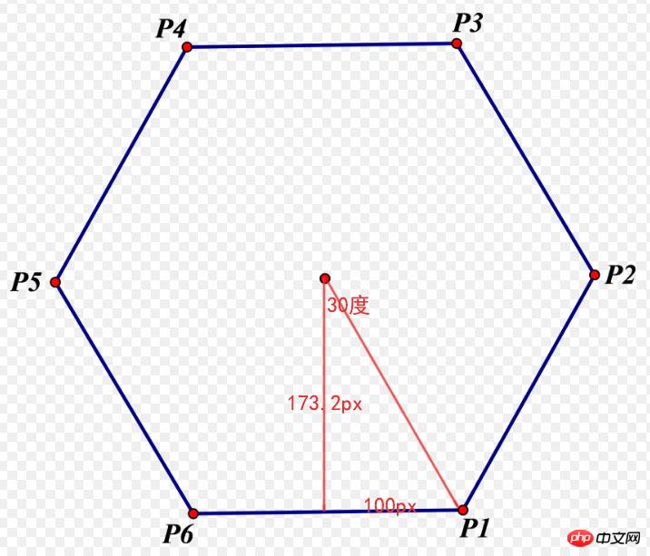
是不是一目了然了~
下面我们再修改下css
.piece-1 {
    background: #FF6666;
    -webkit-transform: rotateY(0deg) translateZ(173.2px);
    -ms-transform: rotateY(0deg) translateZ(173.2px);
    -o-transform: rotateY(0deg) translateZ(173.2px);
    transform: rotateY(0deg) translateZ(173.2px);

}
.piece-2 {
    background: #FFFF00;
    -webkit-transform: rotateY(60deg) translateZ(173.2px);
    -ms-transform: rotateY(60deg) translateZ(173.2px);
    -o-transform: rotateY(60deg) translateZ(173.2px);
    transform: rotateY(60deg) translateZ(173.2px);
}
.piece-3 {
    background: #006699;
    -webkit-transform: rotateY(120deg) translateZ(173.2px);
    -ms-transform: rotateY(120deg) translateZ(173.2px);
    -o-transform: rotateY(120deg) translateZ(173.2px);
    transform: rotateY(120deg) translateZ(173.2px);
}
.piece-4 {
    background: #009999;
    -webkit-transform: rotateY(180deg) translateZ(173.2px);
    -ms-transform: rotateY(180deg) translateZ(173.2px);
    -o-transform: rotateY(180deg) translateZ(173.2px);
    transform: rotateY(180deg) translateZ(173.2px);
}
.piece-5 {
    background: #FF0033;
    -webkit-transform: rotateY(240deg) translateZ(173.2px);
    -ms-transform: rotateY(240deg) translateZ(173.2px);
    -o-transform: rotateY(240deg) translateZ(173.2px);
    transform: rotateY(240deg) translateZ(173.2px);
}
.piece-6 {
    background: #FF6600;
    -webkit-transform: rotateY(300deg) translateZ(173.2px);
    -ms-transform: rotateY(300deg) translateZ(173.2px);
    -o-transform: rotateY(300deg) translateZ(173.2px);
    transform: rotateY(300deg) translateZ(173.2px);
}是不是已经实现了走马灯了?
第五步:animation让3D动起来
要实现走马灯动,其实很简单,我们只要在piece-box上加上旋转动画就行了,5s完成动画,从0度旋转到360度
/*piece盒子*/
.piece-box {
    position: relative;
    width: 200px;
    height: 200px;
    margin: 300px auto;
    perspective-origin: 50% 50%;
    -webkit-transform-style: preserve-3d;
    -moz-transform-style: preserve-3d;
    -ms-transform-style: preserve-3d;
    transform-style: preserve-3d;
    animation: pieceRotate 5s;
    -moz-animation: pieceRotate 5s; /* Firefox */
    -webkit-animation: pieceRotate 5s; /* Safari and Chrome */
    -o-animation: pieceRotate 5s ; /* Opera */
}
/*走马灯动画*/
@keyframes pieceRotate
{
0%   {-webkit-transform: rotateY(0deg);
        -ms-transform: rotateY(0deg);
        -o-transform: rotateY(0deg);
        transform: rotateY(0deg);}
100% {-webkit-transform: rotateY(360deg);
        -ms-transform: rotateY(360deg);
        -o-transform: rotateY(360deg);
        transform: rotateY(360deg);}
}
/* Firefox */
@-moz-keyframes pieceRotate
{
0%   {-webkit-transform: rotateY(0deg);
        -ms-transform: rotateY(0deg);
        -o-transform: rotateY(0deg);
        transform: rotateY(0deg);}
100% {-webkit-transform: rotateY(360deg);
        -ms-transform: rotateY(360deg);
        -o-transform: rotateY(360deg);
        transform: rotateY(360deg);}
}
/* Safari and Chrome */
@-webkit-keyframes pieceRotate
{
0%   {-webkit-transform: rotateY(0deg);
        -ms-transform: rotateY(0deg);
        -o-transform: rotateY(0deg);
        transform: rotateY(0deg);}
100% {-webkit-transform: rotateY(360deg);
        -ms-transform: rotateY(360deg);
        -o-transform: rotateY(360deg);
        transform: rotateY(360deg);}
}
/* Opera */
@-o-keyframes pieceRotate
{
0%   {-webkit-transform: rotateY(0deg);
        -ms-transform: rotateY(0deg);
        -o-transform: rotateY(0deg);
        transform: rotateY(0deg);}
100% {-webkit-transform: rotateY(360deg);
        -ms-transform: rotateY(360deg);
        -o-transform: rotateY(360deg);
        transform: rotateY(360deg);}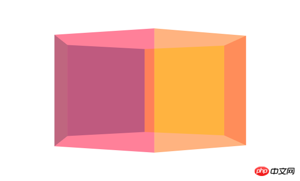
}这里就不放gif了~hhh是不是实现了酷炫的效果,还没结束哦~更酷炫的正方体组装
正方体,其实也不难实现,我这里就不很详细说了,你首先可以想象一个面,然后去拓展其他面如何去实现,比如我们把正方体的前面
translateZ(100px)让它靠近我们100px,然后后面translateZ(-100px)让它远离我们100px,左边是先translateX(-100px再rotateY(90deg),右边就是translateX(100px)再rotateY(90deg),上面是先translateY(-100px),rotateX(90deg),下面是先translateY(100px),rotateX(90deg),只要我们写进动画,一切就大功告成。
css就为如下,以下就只放piece1,其他读者可以自己类比实现,或者看我github的源码
.piece-1 {
     background: #FF6666;
     -webkit-transform: rotateY(0deg) translateZ(173.2px);
     -ms-transform: rotateY(0deg) translateZ(173.2px);
     -o-transform: rotateY(0deg) translateZ(173.2px);
     transform: rotateY(0deg) translateZ(173.2px);
     animation: piece1Rotate 5s 5s;
     -moz-animation: piece1Rotate 5s 5s; /* Firefox */
     -webkit-animation: piece1Rotate 5s 5s; /* Safari and Chrome */
     -o-animation: piece1Rotate 5s 5s; /* Opera */
     -webkit-animation-fill-mode: forwards; /* Chrome, Safari, Opera */
      animation-fill-mode: forwards;
 }
/*front*/
 @keyframes piece1Rotate
 {
 0%   {-webkit-transform: rotateY(0deg) translateZ(173.2px);
     -ms-transform: rotateY(0deg) translateZ(173.2px);
     -o-transform: rotateY(0deg) translateZ(173.2px);
     transform: rotateY(0deg) translateZ(173.2px);}
 100% {-webkit-transform: rotateY(0deg)  translateZ(100px);
     -ms-transform:  rotateY(0deg) translateZ(100px);
     -o-transform: rotateY(0deg)  translateZ(100px);
     transform:  rotateY(0deg) translateZ(100px);}
 }
 /* Firefox */
 @-moz-keyframes piece1Rotate
 {
 0%   {-webkit-transform: rotateY(0deg) translateZ(173.2px);
     -ms-transform: rotateY(0deg) translateZ(173.2px);
     -o-transform: rotateY(0deg) translateZ(173.2px);
     transform: rotateY(0deg) translateZ(173.2px);}
 100% {-webkit-transform: rotateY(0deg)  translateZ(100px);
     -ms-transform:  rotateY(0deg) translateZ(100px);
     -o-transform: rotateY(0deg)  translateZ(100px);
     transform:  rotateY(0deg) translateZ(100px);}
 }
 /* Safari and Chrome */
 @-webkit-keyframes piece1Rotate
 {
 0%   {-webkit-transform: rotateY(0deg) translateZ(173.2px);
     -ms-transform: rotateY(0deg) translateZ(173.2px);
     -o-transform: rotateY(0deg) translateZ(173.2px);
     transform: rotateY(0deg) translateZ(173.2px);}
 100% {-webkit-transform: rotateY(0deg)  translateZ(100px);
     -ms-transform:  rotateY(0deg) translateZ(100px);
     -o-transform: rotateY(0deg)  translateZ(100px);
     transform:  rotateY(0deg) translateZ(100px);}
 }
 /* Opera */
 @-o-keyframes piece1Rotate
 {
 0%   {-webkit-transform: rotateY(0deg) translateZ(173.2px);
     -ms-transform: rotateY(0deg) translateZ(173.2px);
     -o-transform: rotateY(0deg) translateZ(173.2px);
     transform: rotateY(0deg) translateZ(173.2px);}
 100% {-webkit-transform: rotateY(0deg)  translateZ(100px);
     -ms-transform:  rotateY(0deg) translateZ(100px);
     -o-transform: rotateY(0deg)  translateZ(100px);
     transform:  rotateY(0deg) translateZ(100px);}
}细心的读者可以发现我用了一个
animation-fill-mode: forwards;,这个其实就是让这些piece保持动画最后的效果,也就是正方体的效果,读者可以不加试试看,那还是会恢复原样。
最后就是正方体的旋转了,前面我们的容器已经用过animation了,读者可能会想我再加个class放animaiton不就行了,hhh,animaiton会覆盖掉前面的,那前面的走马灯的动画就没了,所以在html结构中,我再加了一个box包裹piece, 如下
<p class="container">
    <p class="piece-box">
        <p class="piece-box2"><!--新加的容器-->
            <p class="piece piece-1"></p>
            <p class="piece piece-2"></p>
            <p class="piece piece-3"></p>
            <p class="piece piece-4"></p>
            <p class="piece piece-5"></p>
            <p class="piece piece-6"></p>
        </p>
    </p>
</p>在动画上我们可以控制正方体动画的延时时间,就是等到正方体组装完成后再开始动画
animation: boxRotate 5s 10s infinite;第一个5s是动画时长,第二个10s是延时时间,然后我们让正方体的旋转,绕X轴从0度到360度,绕Y轴也0到Y轴360度。
.piece-box2 {
    -webkit-transform-style: preserve-3d;
    -moz-transform-style: preserve-3d;
    -ms-transform-style: preserve-3d;
    transform-style: preserve-3d;
    animation: boxRotate 5s 10s infinite;
    -moz-animation: boxRotate 5s 10s infinite; /* Firefox */
    -webkit-animation: boxRotate 5s 10s infinite; /* Safari and Chrome */
    -o-animation: boxRotate 5s 10s infinite; /* Opera */
}
/*正方体旋转动画*/
@keyframes boxRotate
{
0%   {-webkit-transform: rotateX(0deg) rotateY(0deg););
    -ms-transform: rotateX(0deg) rotateY(0deg););
    -o-transform: rotateX(0deg) rotateY(0deg););
    transform: rotateX(0deg) rotateY(0deg););}
100% {-webkit-transform: rotateX(360deg) rotateY(360deg);
    -ms-transform: rotateX(360deg) rotateY(360deg);
    -o-transform: rotateX(360deg) rotateY(360deg);
    transform: rotateX(360deg) rotateY(360deg);}
}
/* Firefox */
@-moz-keyframes boxRotate
{
0%   {-webkit-transform: rotateX(0deg) rotateY(0deg););
    -ms-transform: rotateX(0deg) rotateY(0deg););
    -o-transform: rotateX(0deg) rotateY(0deg););
    transform: rotateX(0deg) rotateY(0deg););}
100% {-webkit-transform: rotateX(360deg) rotateY(360deg);
    -ms-transform: rotateX(360deg) rotateY(360deg);
    -o-transform: rotateX(360deg) rotateY(360deg);
    transform: rotateX(360deg) rotateY(360deg);}
}
/* Safari and Chrome */
@-webkit-keyframes boxRotate
{
0%   {-webkit-transform: rotateX(0deg) rotateY(0deg););
    -ms-transform: rotateX(0deg) rotateY(0deg););
    -o-transform: rotateX(0deg) rotateY(0deg););
    transform: rotateX(0deg) rotateY(0deg););}
100% {-webkit-transform: rotateX(360deg) rotateY(360deg);
    -ms-transform: rotateX(360deg) rotateY(360deg);
    -o-transform: rotateX(360deg) rotateY(360deg);
    transform: rotateX(360deg) rotateY(360deg);}
}
/* Opera */
@-o-keyframes boxRotate
{
0%   {-webkit-transform: rotateX(0deg) rotateY(0deg););
    -ms-transform: rotateX(0deg) rotateY(0deg););
    -o-transform: rotateX(0deg) rotateY(0deg););
    transform: rotateX(0deg) rotateY(0deg););}
100% {-webkit-transform: rotateX(360deg) rotateY(360deg);
    -ms-transform: rotateX(360deg) rotateY(360deg);
    -o-transform: rotateX(360deg) rotateY(360deg);
    transform: rotateX(360deg) rotateY(360deg);}
}最后效果,大功告成!

The above is the detailed content of Teach you how to play with the 3D effects of CSS3. For more information, please follow other related articles on the PHP Chinese website!

Hot AI Tools

Undresser.AI Undress
AI-powered app for creating realistic nude photos

AI Clothes Remover
Online AI tool for removing clothes from photos.

Undress AI Tool
Undress images for free

Clothoff.io
AI clothes remover

Video Face Swap
Swap faces in any video effortlessly with our completely free AI face swap tool!

Hot Article
Hot Tools

Notepad++7.3.1
Easy-to-use and free code editor

SublimeText3 Chinese version
Chinese version, very easy to use

Zend Studio 13.0.1
Powerful PHP integrated development environment

Dreamweaver CS6
Visual web development tools

SublimeText3 Mac version
God-level code editing software (SublimeText3)
Hot Topics


 Why is Gaussian Splatting so popular in autonomous driving that NeRF is starting to be abandoned?
Jan 17, 2024 pm 02:57 PM
Why is Gaussian Splatting so popular in autonomous driving that NeRF is starting to be abandoned?
Jan 17, 2024 pm 02:57 PM
Written above & the author’s personal understanding Three-dimensional Gaussiansplatting (3DGS) is a transformative technology that has emerged in the fields of explicit radiation fields and computer graphics in recent years. This innovative method is characterized by the use of millions of 3D Gaussians, which is very different from the neural radiation field (NeRF) method, which mainly uses an implicit coordinate-based model to map spatial coordinates to pixel values. With its explicit scene representation and differentiable rendering algorithms, 3DGS not only guarantees real-time rendering capabilities, but also introduces an unprecedented level of control and scene editing. This positions 3DGS as a potential game-changer for next-generation 3D reconstruction and representation. To this end, we provide a systematic overview of the latest developments and concerns in the field of 3DGS for the first time.
 Learn about 3D Fluent emojis in Microsoft Teams
Apr 24, 2023 pm 10:28 PM
Learn about 3D Fluent emojis in Microsoft Teams
Apr 24, 2023 pm 10:28 PM
You must remember, especially if you are a Teams user, that Microsoft added a new batch of 3DFluent emojis to its work-focused video conferencing app. After Microsoft announced 3D emojis for Teams and Windows last year, the process has actually seen more than 1,800 existing emojis updated for the platform. This big idea and the launch of the 3DFluent emoji update for Teams was first promoted via an official blog post. Latest Teams update brings FluentEmojis to the app Microsoft says the updated 1,800 emojis will be available to us every day
 Choose camera or lidar? A recent review on achieving robust 3D object detection
Jan 26, 2024 am 11:18 AM
Choose camera or lidar? A recent review on achieving robust 3D object detection
Jan 26, 2024 am 11:18 AM
0.Written in front&& Personal understanding that autonomous driving systems rely on advanced perception, decision-making and control technologies, by using various sensors (such as cameras, lidar, radar, etc.) to perceive the surrounding environment, and using algorithms and models for real-time analysis and decision-making. This enables vehicles to recognize road signs, detect and track other vehicles, predict pedestrian behavior, etc., thereby safely operating and adapting to complex traffic environments. This technology is currently attracting widespread attention and is considered an important development area in the future of transportation. one. But what makes autonomous driving difficult is figuring out how to make the car understand what's going on around it. This requires that the three-dimensional object detection algorithm in the autonomous driving system can accurately perceive and describe objects in the surrounding environment, including their locations,
 CLIP-BEVFormer: Explicitly supervise the BEVFormer structure to improve long-tail detection performance
Mar 26, 2024 pm 12:41 PM
CLIP-BEVFormer: Explicitly supervise the BEVFormer structure to improve long-tail detection performance
Mar 26, 2024 pm 12:41 PM
Written above & the author’s personal understanding: At present, in the entire autonomous driving system, the perception module plays a vital role. The autonomous vehicle driving on the road can only obtain accurate perception results through the perception module. The downstream regulation and control module in the autonomous driving system makes timely and correct judgments and behavioral decisions. Currently, cars with autonomous driving functions are usually equipped with a variety of data information sensors including surround-view camera sensors, lidar sensors, and millimeter-wave radar sensors to collect information in different modalities to achieve accurate perception tasks. The BEV perception algorithm based on pure vision is favored by the industry because of its low hardware cost and easy deployment, and its output results can be easily applied to various downstream tasks.
 Get a virtual 3D wife in 30 seconds with a single card! Text to 3D generates a high-precision digital human with clear pore details, seamlessly connecting with Maya, Unity and other production tools
May 23, 2023 pm 02:34 PM
Get a virtual 3D wife in 30 seconds with a single card! Text to 3D generates a high-precision digital human with clear pore details, seamlessly connecting with Maya, Unity and other production tools
May 23, 2023 pm 02:34 PM
ChatGPT has injected a dose of chicken blood into the AI industry, and everything that was once unthinkable has become basic practice today. Text-to-3D, which continues to advance, is regarded as the next hotspot in the AIGC field after Diffusion (images) and GPT (text), and has received unprecedented attention. No, a product called ChatAvatar has been put into low-key public beta, quickly garnering over 700,000 views and attention, and was featured on Spacesoftheweek. △ChatAvatar will also support Imageto3D technology that generates 3D stylized characters from AI-generated single-perspective/multi-perspective original paintings. The 3D model generated by the current beta version has received widespread attention.
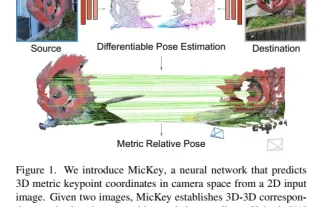 The latest from Oxford University! Mickey: 2D image matching in 3D SOTA! (CVPR\'24)
Apr 23, 2024 pm 01:20 PM
The latest from Oxford University! Mickey: 2D image matching in 3D SOTA! (CVPR\'24)
Apr 23, 2024 pm 01:20 PM
Project link written in front: https://nianticlabs.github.io/mickey/ Given two pictures, the camera pose between them can be estimated by establishing the correspondence between the pictures. Typically, these correspondences are 2D to 2D, and our estimated poses are scale-indeterminate. Some applications, such as instant augmented reality anytime, anywhere, require pose estimation of scale metrics, so they rely on external depth estimators to recover scale. This paper proposes MicKey, a keypoint matching process capable of predicting metric correspondences in 3D camera space. By learning 3D coordinate matching across images, we are able to infer metric relative
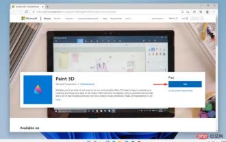 Paint 3D in Windows 11: Download, Installation, and Usage Guide
Apr 26, 2023 am 11:28 AM
Paint 3D in Windows 11: Download, Installation, and Usage Guide
Apr 26, 2023 am 11:28 AM
When the gossip started spreading that the new Windows 11 was in development, every Microsoft user was curious about how the new operating system would look like and what it would bring. After speculation, Windows 11 is here. The operating system comes with new design and functional changes. In addition to some additions, it comes with feature deprecations and removals. One of the features that doesn't exist in Windows 11 is Paint3D. While it still offers classic Paint, which is good for drawers, doodlers, and doodlers, it abandons Paint3D, which offers extra features ideal for 3D creators. If you are looking for some extra features, we recommend Autodesk Maya as the best 3D design software. like
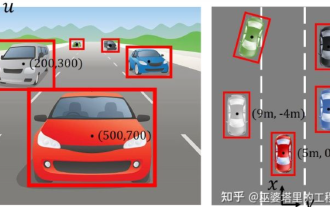 An in-depth interpretation of the 3D visual perception algorithm for autonomous driving
Jun 02, 2023 pm 03:42 PM
An in-depth interpretation of the 3D visual perception algorithm for autonomous driving
Jun 02, 2023 pm 03:42 PM
For autonomous driving applications, it is ultimately necessary to perceive 3D scenes. The reason is simple. A vehicle cannot drive based on the perception results obtained from an image. Even a human driver cannot drive based on an image. Because the distance of objects and the depth information of the scene cannot be reflected in the 2D perception results, this information is the key for the autonomous driving system to make correct judgments on the surrounding environment. Generally speaking, the visual sensors (such as cameras) of autonomous vehicles are installed above the vehicle body or on the rearview mirror inside the vehicle. No matter where it is, what the camera gets is the projection of the real world in the perspective view (PerspectiveView) (world coordinate system to image coordinate system). This view is very similar to the human visual system,
