 Web Front-end
 JS Tutorial
 Angular learning using Tooltip as an example to understand custom instructions
Angular learning using Tooltip as an example to understand custom instructions
This article will help you continue learning angular, taking Tooltip as an example to learn about custom instructions, I hope it will be helpful to everyone!

In the previous article, we have given an overview of Angular related content. In the part of custom instructions, we have been able to write them, but in actual scenarios, we still need standardized management.
Angular is an upgraded version of Angular.js. [Related tutorial recommendations: "angular tutorial"]
So, in this article, we will use Tooltip to explain the content of custom instructions.
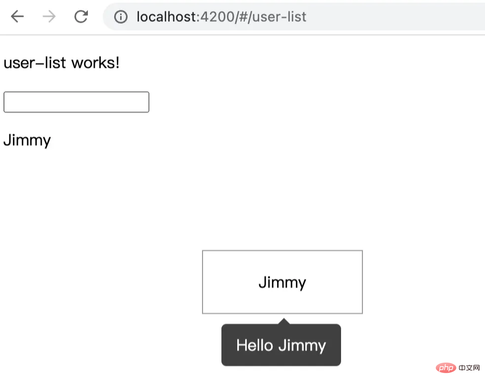
Online renderings, as follows:

Directory structure
is above Based on the code project implemented in an article, execute the command line:
1 2 3 4 5 6 7 8 9 10 11 12 13 14 |
|
After executing the above command line, you will get the file directory structure of app/directive/tooltip as follows:
1 2 3 4 5 6 7 8 |
|
Well, here I put the components at the same level as tooltip, mainly to facilitate management. Of course, this varies from person to person, you can put it in the public components components folder.
Write tooltip component
In the html file, there are:
1 2 |
|
In the style file .scss, there are:
1 2 3 4 5 6 7 8 9 10 11 12 13 14 15 16 17 18 19 20 21 22 23 24 25 26 27 28 29 30 31 32 33 34 35 36 |
|
Well~,
cssis a magical thing, I will arrange an article to explain it latersassRelated content...
Then, in the javascript file tooltip.component.ts the content is as follows:
1 2 3 4 5 6 7 8 9 10 11 12 13 14 15 16 17 18 19 20 21 22 23 24 25 26 27 28 29 30 31 32 33 34 35 36 37 38 39 40 41 42 43 44 45 46 47 48 49 50 51 |
|
Writing tooltip instructions
This is the focus of this article. I will mark the specific instructions on the code~
Related filestooltip.directive.ts The content is as follows:
1 2 3 4 5 6 7 8 9 10 11 12 13 14 15 16 17 18 19 20 21 22 23 24 25 26 27 28 29 30 31 32 33 34 35 36 37 38 39 40 41 42 43 44 45 46 47 48 49 50 51 52 53 54 55 56 57 58 59 60 61 62 63 64 65 66 67 68 69 70 71 |
|
At this point, 99% functions have been completed. Now we can call it on the page. Call
on the page
We add the following content on user-list.component.html:
1 2 3 4 5 6 7 |
|
TooltipDirective We have declared this directive on app.module.ts, we can call it directly. The current effect is as follows:

The tooltip we implemented is a bottom-centered display, which is what we usually use the framework, such as angular ant design# The bottom attribute of tooltip in ##. For other attributes, if readers are interested, they can be expanded.
Introduction to Programming! !
The above is the detailed content of Angular learning using Tooltip as an example to understand custom instructions. For more information, please follow other related articles on the PHP Chinese website!

Hot AI Tools

Undresser.AI Undress
AI-powered app for creating realistic nude photos

AI Clothes Remover
Online AI tool for removing clothes from photos.

Undress AI Tool
Undress images for free

Clothoff.io
AI clothes remover

Video Face Swap
Swap faces in any video effortlessly with our completely free AI face swap tool!

Hot Article

Hot Tools

Notepad++7.3.1
Easy-to-use and free code editor

SublimeText3 Chinese version
Chinese version, very easy to use

Zend Studio 13.0.1
Powerful PHP integrated development environment

Dreamweaver CS6
Visual web development tools

SublimeText3 Mac version
God-level code editing software (SublimeText3)

Hot Topics
 1677
1677
 14
14
 1430
1430
 52
52
 1333
1333
 25
25
 1278
1278
 29
29
 1257
1257
 24
24
 How to install Angular on Ubuntu 24.04
Mar 23, 2024 pm 12:20 PM
Angular.js is a freely accessible JavaScript platform for creating dynamic applications. It allows you to express various aspects of your application quickly and clearly by extending the syntax of HTML as a template language. Angular.js provides a range of tools to help you write, update and test your code. Additionally, it provides many features such as routing and form management. This guide will discuss how to install Angular on Ubuntu24. First, you need to install Node.js. Node.js is a JavaScript running environment based on the ChromeV8 engine that allows you to run JavaScript code on the server side. To be in Ub
 An article exploring server-side rendering (SSR) in Angular
Dec 27, 2022 pm 07:24 PM
Do you know Angular Universal? It can help the website provide better SEO support!
 A brief analysis of how to use monaco-editor in angular
Oct 17, 2022 pm 08:04 PM
How to use monaco-editor in angular? The following article records the use of monaco-editor in angular that was used in a recent business. I hope it will be helpful to everyone!
 Detailed explanation of angular learning state manager NgRx
May 25, 2022 am 11:01 AM
This article will give you an in-depth understanding of Angular's state manager NgRx and introduce how to use NgRx. I hope it will be helpful to you!
 Angular + NG-ZORRO quickly develop a backend system
Apr 21, 2022 am 10:45 AM
This article will share with you an Angular practical experience and learn how to quickly develop a backend system using angualr combined with ng-zorro. I hope it will be helpful to everyone!
 How to use PHP and Angular for front-end development
May 11, 2023 pm 04:04 PM
With the rapid development of the Internet, front-end development technology is also constantly improving and iterating. PHP and Angular are two technologies widely used in front-end development. PHP is a server-side scripting language that can handle tasks such as processing forms, generating dynamic pages, and managing access permissions. Angular is a JavaScript framework that can be used to develop single-page applications and build componentized web applications. This article will introduce how to use PHP and Angular for front-end development, and how to combine them
 Token-based authentication with Angular and Node
Sep 01, 2023 pm 02:01 PM
Authentication is one of the most important parts of any web application. This tutorial discusses token-based authentication systems and how they differ from traditional login systems. By the end of this tutorial, you will see a fully working demo written in Angular and Node.js. Traditional Authentication Systems Before moving on to token-based authentication systems, let’s take a look at traditional authentication systems. The user provides their username and password in the login form and clicks Login. After making the request, authenticate the user on the backend by querying the database. If the request is valid, a session is created using the user information obtained from the database, and the session information is returned in the response header so that the session ID is stored in the browser. Provides access to applications subject to
 What should I do if the project is too big? How to split Angular projects reasonably?
Jul 26, 2022 pm 07:18 PM
The Angular project is too large, how to split it reasonably? The following article will introduce to you how to reasonably split Angular projects. I hope it will be helpful to you!


