
 Web Front-end
JS Tutorial
Detailed explanation of the steps to use Chart.js lightweight HTML5 chart drawing tool library
Web Front-end
JS Tutorial
Detailed explanation of the steps to use Chart.js lightweight HTML5 chart drawing tool library
Detailed explanation of the steps to use Chart.js lightweight HTML5 chart drawing tool library
This time I will bring you a detailed explanation of the steps for using the Chart.js lightweight HTML5 chart drawing tool library. What are the precautions when using the Chart.js lightweight HTML5 chart drawing tool library? The following are Let’s take a look at practical cases.
Chart.js: Visualize your data in different ways. Each chart type is animated and looks great, even on a retina screen. Based on HTML5 canvas technology, Chart.js does not rely on any external tool libraries and is lightweight (only 4.5k after compression). Worth learning!
GitHub source code: https://github.com/nnnick/Chart.js
Chart.js documentation: http://www.bootcss.com/p/chart.js/
Steps:
html part:
<canvas id="myChart" width="400" height="400"></canvas>
javascript part:
Introduce the Chart.js file;
Create a chart: Instantiate the Chart object (get the DOM node and obtain the 2d context environment and instantiate it);
After instantiating the Chart object, continue to create a specific type of chart;
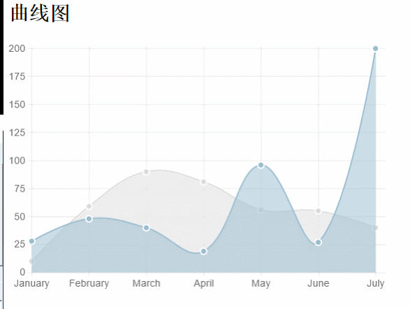
Line chart:
html:
<canvas id="myChart" width="600" height="400"></canvas>
javascript: (Introduction and two ways of use)
<script src="js/Chart.min.js"></script>
<script type="text/javascript">
 //方式一:
 var ctx = document.getElementById("myChart").getContext("2d");;
 var MyNewChart = new Chart(ctx).Line(data); //这种方式是只加载数据集,(缺省options)不修改默认参数(简称法一)
 //数据结构(数据参数设置)
 var data = {
 //折线图需要为每个数据点设置一标签。这是显示在X轴上。
 labels: ["January", "February", "March", "April", "May", "June", "July"],
 //数据集(y轴数据范围随数据集合中的data中的最大或最小数据而动态改变的)
 datasets: [{
   fillColor: "rgba(220,220,220,0.5)", //背景填充色
   strokeColor: "rgba(220,220,220,1)", //路径颜色
   pointColor: "rgba(220,220,220,1)", //数据点颜色
   pointStrokeColor: "#fff", //数据点边框颜色
   data: [10, 59, 90, 81, 56, 55, 40] //对象数据
  }, {
   fillColor: "rgba(151,187,205,0.5)",
   strokeColor: "rgba(151,187,205,1)",
   pointColor: "rgba(151,187,205,1)",
   pointStrokeColor: "#fff",
   data: [28, 48, 40, 19, 96, 27, 200]
  }]
  };
</script>Data structure:
//数据结构(数据参数设置)
 var data = {
 //折线图需要为每个数据点设置一标签。这是显示在X轴上。
 labels: ["January", "February", "March", "April", "May", "June", "July"],
 //数据集(y轴数据范围随数据集合中的data中的最大或最小数据而动态改变的)
 datasets: [{
   fillColor: "rgba(220,220,220,0.5)", //背景填充色
   strokeColor: "rgba(220,220,220,1)", //路径颜色
   pointColor: "rgba(220,220,220,1)", //数据点颜色
   pointStrokeColor: "#fff", //数据点边框颜色
   data: [10, 59, 90, 81, 56, 55, 40] //对象数据
  }, {
   fillColor: "rgba(151,187,205,0.5)",
   strokeColor: "rgba(151,187,205,1)",
   pointColor: "rgba(151,187,205,1)",
   pointStrokeColor: "#fff",
   data: [28, 48, 40, 19, 96, 27, 200]
  }]
};Icon parameters:
Line.defaults = {
  //网格线是否在数据线的上面
  scaleOverlay : false,
  //是否用硬编码重写y轴网格线
  scaleOverride : false,
  //** Required if scaleOverride is true **
  //y轴刻度的个数
  scaleSteps : null,
  //y轴每个刻度的宽度
  scaleStepWidth : 20,
  // Y 轴的起始值
  scaleStartValue : null,
  // Y/X轴的颜色
  scaleLineColor: "rgba(0,0,0,.1)",
  // X,Y轴的宽度
  scaleLineWidth: 1,
  // 刻度是否显示标签, 即Y轴上是否显示文字
  scaleShowLabels: true,
  // Y轴上的刻度,即文字
  scaleLabel: "<%=value%>",
  // 字体
  scaleFontFamily: "'Arial'",
  // 文字大小
  scaleFontSize: 16,
  // 文字样式
  scaleFontStyle: "normal",
  // 文字颜色
  scaleFontColor: "#666",
  // 是否显示网格
  scaleShowGridLines: true,
  // 网格颜色
  scaleGridLineColor: "rgba(0,0,0,.05)",
  // 网格宽度
  scaleGridLineWidth:2,
  // 是否使用贝塞尔曲线? 即:线条是否弯曲
  bezierCurve: true,
  // 是否显示点数
  pointDot: true,
  // 圆点的大小
  pointDotRadius:5,
  // 圆点的笔触宽度, 即:圆点外层白色大小
  pointDotStrokeWidth: 2,
  // 数据集行程(连线路径)
  datasetStroke: true,
  // 线条的宽度, 即:数据集
  datasetStrokeWidth: 2,
  // 是否填充数据集
  datasetFill: true,
  // 是否执行动画
  animation: true,
  // 动画的时间
  animationSteps: 60,
  // 动画的特效
  animationEasing: "easeOutQuart",
  // 动画完成时的执行函数
  /*onAnimationComplete: null*/
}(I just came into contact with Chart.js. I was confused when I saw the chart parameters, and the whole process was commented in English, haha~)
After understanding the chart parameters, you can customize the chart parameters. Let’s take a look at the specific usage examples:
The html part and the js file introduction part are omitted: (The subsequent chart types are also omitted!)
<script type="text/javascript">
  //同样数据参数设置
  var data = {
  //折线图需要为每个数据点设置一标签。这是显示在X轴上。
  labels: ["January", "February", "March", "April", "May", "June", "July"],
  //这边的thisId分别对应labels的id
   thisIds : [12,22,50,44,99,3,67],
  //数据集(y轴数据范围随数据集合中的data中的最大或最小数据而动态改变的)
  datasets: [{
   fillColor: "rgba(220,220,220,0.5)", //背景填充色
   strokeColor: "rgba(220,220,220,1)", //路径颜色
   pointColor: "rgba(220,220,220,1)", //数据点颜色
   pointStrokeColor: "#fff", //数据点边框颜色
   data: [10, 59, 90, 81, 56, 55, 40] //对象数据
  }, {
   fillColor: "rgba(151,187,205,0.5)",
   strokeColor: "rgba(151,187,205,1)",
   pointColor: "rgba(151,187,205,1)",
   pointStrokeColor: "#fff",
   data: [28, 48, 40, 19, 96, 27, 200]
  }]
  };
 window.onload = function() {
   var ctx = document.getElementById("myChart").getContext("2d");;
   //方式二:传入对象字面量去修改默认图标参数,自定义图表
   var MyNewChart = new Chart(ctx).Line(data, {
   // 网格颜色
   scaleGridLineColor: "rgba(255,0,0,1)",
   // Y/X轴的颜色
   scaleLineColor: "rgba(0,0,0,.1)",
   // 文字大小
   scaleFontSize: 16,
   // 文字颜色
   scaleFontColor: "#666",
   // 网格颜色
   scaleGridLineColor: "rgba(0,0,0,.05)",
   // 是否使用贝塞尔曲线? 即:线条是否弯曲
   // 是否执行动画
   animation: true,
   // 动画的时间
   animationSteps: 60,
   // 动画完成时的执行函数
   onAnimationComplete: function(){
    console.log("给x轴的lable对应的id:");
    console.log(data.thisIds);
   }
   });
  }
</script>Rendering:
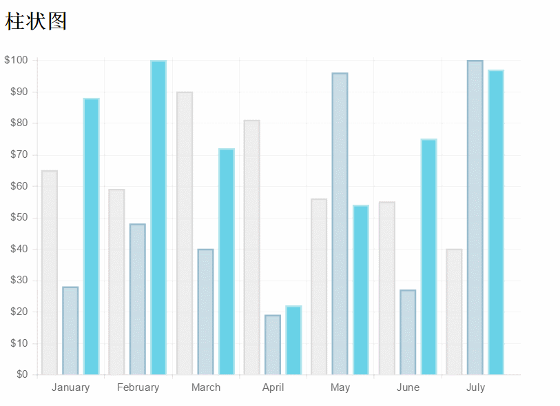
Bar chart:
new Chart(ctx).Bar(data,options);//简记,options可缺省
Data structure:
var data = {
 labels : ["January","February","March","April","May","June","July"],
 datasets : [
 {
  fillColor : "rgba(220,220,220,0.5)",
  strokeColor : "rgba(220,220,220,1)",
  data : [65,59,90,81,56,55,40]
 },
 {
  fillColor : "rgba(151,187,205,0.5)",
  strokeColor : "rgba(151,187,205,1)",
  data : [28,48,40,19,96,27,100]
 }
 ]
}Icon parameters:
Bar.defaults = {
  //网格线是否在数据线的上面
  scaleOverlay : false,
  //是否用硬编码重写y轴网格线
  scaleOverride : false,
  //** Required if scaleOverride is true **
  //y轴刻度的个数
  scaleSteps : null,
  //y轴每个刻度的宽度
  scaleStepWidth : null,
  //Y轴起始值
  scaleStartValue: null,
  // Y/X轴的颜色
  scaleLineColor: "rgba(0,0,0,.1)",
   // X,Y轴的宽度
  scaleLineWidth: 1,
  // 刻度是否显示标签, 即Y轴上是否显示文字
  scaleShowLabels: false,
  // Y轴上的刻度,即文字
  scaleLabel: "<%=value%>",
  // 字体
  scaleFontFamily: "'Arial'",
   // 文字大小
  scaleFontSize: 12,
  // 文字样式
  scaleFontStyle: "normal",
  // 文字颜色
  scaleFontColor: "#666",
  // 是否显示网格
  scaleShowGridLines: true,
  // 网格颜色
  scaleGridLineColor: "rgba(0,0,0,.05)",
  // 网格宽度
  scaleGridLineWidth: 1,
  //Bar Chart图表特定参数:
  //是否绘制柱状条的边框
  barShowStroke : true,
  //柱状条边框的宽度
  barStrokeWidth : 2,
  //柱状条组之间的间距(过大或过小会出现重叠偏移错位的效果,请控制合理数值)
  barValueSpacing :5,
  //每组柱状条组中柱状条之间的间距
  barDatasetSpacing :5,
  // 是否显示提示
  showTooltips: true,
  // 是否执行动画
  animation: true,
  // 动画的时间
  animationSteps: 60,
  // 动画的特效
  animationEasing: "easeOutQuart",
  // 动画完成时的执行函数
  onAnimationComplete: null
}Some javascript examples
var barChart = new Chart(ctx).Bar(data, {
   scaleLabel: "$"+"<%=value%>",
   //是否绘制柱状条的边框
   barShowStroke: true,
   //柱状条边框的宽度
   barStrokeWidth: 2,
   //柱状条组之间的间距(过大或过小会出现重叠偏移错位的效果,请控制合理数值)
   barValueSpacing: 5,
   //每组柱状条组中柱状条之间的间距
   barDatasetSpacing: 5,
});Rendering:
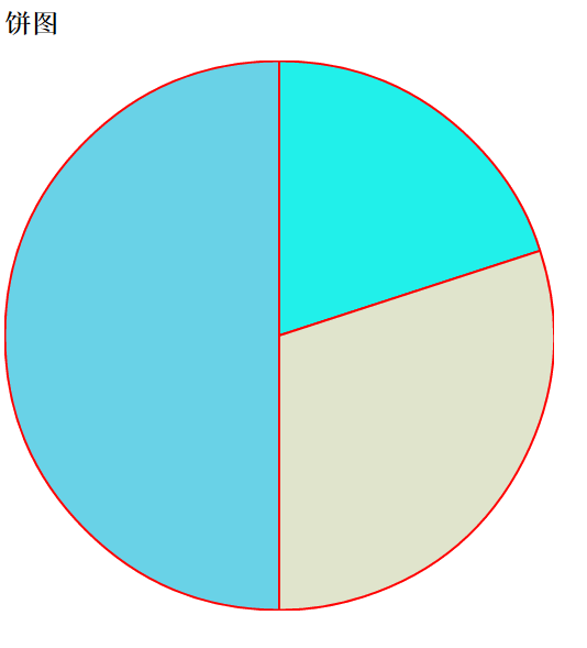
##Pie chart:##javascript :
new Chart(ctx).Pie(data,options);
Data structure:
var data=[
  {
  value:40,
  color:"#21F0EA",//背景色
  highlight:"#79E8E5",//高亮背景颜色
  label:'javascript'//文字标签
  },{
  value:60,
  color:"#E0E4CC",
  highlight:"#EAEDD8",
  label:'jquery'
  },{
  value:100,
  color:"#69D2E7",
  highlight:"#83E5F7",
  label:'html'
  }
];Icon parameters:
Pie.defaults = {
   //是否显示每段行程(即扇形区,不为true则无法看到后面设置的边框颜色)
   segmentShowStroke : true,
   //设置每段行程的边框颜色
   segmentStrokeColor : "red",
   //心啊是每段扇区边框的宽度
   segmentStrokeWidth :2,
   //Boolean - 是否执行动画
   animation : true,
   //Number - 动画时间
   animationSteps : 100,
   //String - 动画的效果
   animationEasing : "easeOutBounce",
   //Boolean -是否旋转动画
   animateRotate : true,
   //Boolean - 是否动画缩放饼图中心(效果不错)
   animateScale : true,
   //Function - 火动画完成时执行的函数
   onAnimationComplete : null
}Partial javascript examples:
var ctx=document.getElementById("pieChart").getContext("2d");
window.pieChart=new Chart(ctx).Pie(data,{
   //是否显示每段行程(即扇形区,不为true则无法看到后面设置的边框颜色)
   segmentShowStroke : true,
   //设置每段行程的边框颜色
   segmentStrokeColor : "red",
   //每段扇区边框的宽度
   segmentStrokeWidth :2,
   //Boolean - 是否执行动画
   animation : true,
   //Number - 动画时间
   animationSteps : 100,
   //String - 动画的效果
   animationEasing : "easeOutBounce",
   //Boolean -是否旋转动画
   animateRotate : true,
   //Boolean - 是否动画缩放饼图中心(效果不错)
   animateScale : true,
   //Function - 动画完成时执行的函数
   //onAnimationComplete : null
});Rendering:
Donut chart: javascript:
new Chart(ctx).Doughnut(data,options);
Data structure:
//数据结构(与饼图相似)
  var data = [{
  value: 30,
  color: "#F7464A",
  highlight: "#FA7C7C",
  label: "angularJS"
  }, {
  value: 50,
  color: "#E2EAE9",
  highlight: "#F2F5F5",
  label: "juqery"
  }, {
  value: 100,
  color: "#D4CCC5",
  hightlight: "#DBD6D1",
  label: "javascript"
  }, {
  value: 40,
  color: "#949FB1",
  highlight: "#AFBCCE",
  label: "nodeJS"
  }, {
  value: 120,
  color: "#4D5360",
  highlight: "#767C86",
  label: "html"
}];Icon parameters:
Doughnut.defaults={
   //是否显示每段行程(即环形区,不为true则无法看到后面设置的边框颜色)
   segmentShowStroke: true,
   //设置每段行程的边框颜色
   segmentStrokeColor: "#fff",
   //设置每段环形的边框宽度
   segmentStrokeWidth: 2,
   //图标中心剪切圆的比例(0为饼图,接近100则环形宽度越小)
   percentageInnerCutout: 50,
   //是否执行动画
   animation: true,
   //执行动画时间
   animationSteps: 100,
   //动画特效
   animationEasing: "easeOutBounce",
   //是否旋转动画
   animateRotate: true,
   //是否缩放图表中心
   animateScale: true,
   //动画完成时的回调函数
//   onAnimationComplete: null
}Rendering:
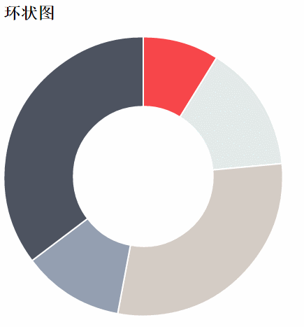 Chart.js has a total of six charts: in addition, there are two remaining Types: radar chart or spider web chart, polar region map, readers please refer to: Chart.js Chinese documentation
Then, here comes the question! ? What about the legend of the chart? This product is also very commonly used in applications! After many searches, I found the following method to implement the legend part. Let’s pay homage to all the great gods! In addition, each set of data can be automatically displayed after the animation is completed, instead of manually viewing each set of data!
Go directly to the code of each part:
html part:
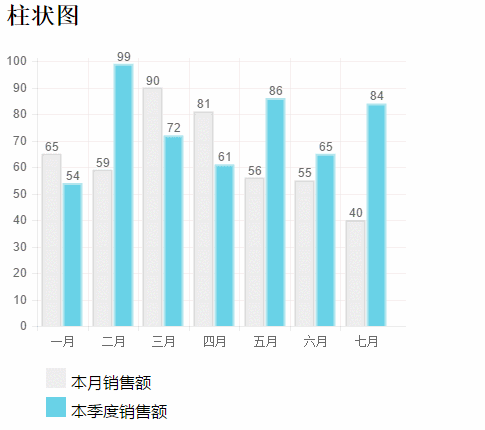
<h2>柱状图</h2>
<canvas id="barChart" width="400" height="300"></canvas>
<!--这里添加了用来放置图例的p标签-->
<p id="legend"></p>
css part: (If you don’t set the basic style, you may not see the expected effect)
 <style>
  ul,li{
  list-style-type:none;;
  }
  ul>li{
  margin:5px auto;
  font-family: "微软雅黑";
  }
  span{
  display: inline-block;
  width:20px;height:20px;line-height: 20px;
  vertical-align:middle;
  margin-right:5px;
  }
</style>javascript part:
window.onload = function() {
   var ctx = document.getElementById("barChart").getContext("2d");
   var barChart = new Chart(ctx).Bar(data, {
   showTooltips: false, // 是否显示提示,这里需要设置为false
   //模板
   legendTemplate:
   '<ul class=\"<%=name.toLowerCase()%>-legend\">'+
   '<% for (var i=0; i<datasets.length; i++){%>'+
   '<li><span style=\"background-color:<%=datasets[i].fillColor%>\"></span>'+
   '<%if(datasets[i].label){%><%=datasets[i].label%><%}%></li>'+
   '<%}%>'+
   '</ul>',
   onAnimationComplete: function() {//动画完成后显示对应的数据
    var ctx = this.chart.ctx;
    ctx.font = this.scale.font;
    ctx.fillStyle = this.scale.textColor;
    ctx.textAlign = 'center';
    ctx.textBaseline = 'bottom';
    this.datasets.forEach(function(dataset) {
    dataset.bars.forEach(function(bar) {
     ctx.fillText(bar.value, bar.x, bar.y);
    });
    });
   }
   });
   var legend = document.getElementById('legend');
   // 图例
   legend.innerHTML = barChart.generateLegend();
  }
 //数据结构:
  var data = {
  labels: ["一月", "二月", "三月", "四月", "五月", "六月", "七月"],
  datasets: [{
   fillColor: "rgba(220,220,220,0.5)",
   strokeColor: "rgba(220,220,220,1)",
   data: [65, 59, 90, 81, 56, 55, 40],
   label: "本月销售额"//图例标签
  },{
   fillColor: "#69D2E7",
   strokeColor: "#B2E5ED",
   data: [54, 99, 72, 61, 86, 65, 84],
   label: "本季度销售额"
  }]
};Rendering:
 I believe you have mastered the method after reading the case in this article. For more exciting information, please pay attention to php Chinese website Other related articles!
Recommended reading:
centos steps to build a ghost bloghttps use case analysis in Node.js
The above is the detailed content of Detailed explanation of the steps to use Chart.js lightweight HTML5 chart drawing tool library. For more information, please follow other related articles on the PHP Chinese website!

Hot AI Tools

Undresser.AI Undress
AI-powered app for creating realistic nude photos

AI Clothes Remover
Online AI tool for removing clothes from photos.

Undress AI Tool
Undress images for free

Clothoff.io
AI clothes remover

Video Face Swap
Swap faces in any video effortlessly with our completely free AI face swap tool!

Hot Article
Hot Tools

Notepad++7.3.1
Easy-to-use and free code editor

SublimeText3 Chinese version
Chinese version, very easy to use

Zend Studio 13.0.1
Powerful PHP integrated development environment

Dreamweaver CS6
Visual web development tools

SublimeText3 Mac version
God-level code editing software (SublimeText3)
Hot Topics


 Table Border in HTML
Sep 04, 2024 pm 04:49 PM
Table Border in HTML
Sep 04, 2024 pm 04:49 PM
Guide to Table Border in HTML. Here we discuss multiple ways for defining table-border with examples of the Table Border in HTML.
 Nested Table in HTML
Sep 04, 2024 pm 04:49 PM
Nested Table in HTML
Sep 04, 2024 pm 04:49 PM
This is a guide to Nested Table in HTML. Here we discuss how to create a table within the table along with the respective examples.
 HTML margin-left
Sep 04, 2024 pm 04:48 PM
HTML margin-left
Sep 04, 2024 pm 04:48 PM
Guide to HTML margin-left. Here we discuss a brief overview on HTML margin-left and its Examples along with its Code Implementation.
 HTML Table Layout
Sep 04, 2024 pm 04:54 PM
HTML Table Layout
Sep 04, 2024 pm 04:54 PM
Guide to HTML Table Layout. Here we discuss the Values of HTML Table Layout along with the examples and outputs n detail.
 HTML Input Placeholder
Sep 04, 2024 pm 04:54 PM
HTML Input Placeholder
Sep 04, 2024 pm 04:54 PM
Guide to HTML Input Placeholder. Here we discuss the Examples of HTML Input Placeholder along with the codes and outputs.
 HTML Ordered List
Sep 04, 2024 pm 04:43 PM
HTML Ordered List
Sep 04, 2024 pm 04:43 PM
Guide to the HTML Ordered List. Here we also discuss introduction of HTML Ordered list and types along with their example respectively
 Moving Text in HTML
Sep 04, 2024 pm 04:45 PM
Moving Text in HTML
Sep 04, 2024 pm 04:45 PM
Guide to Moving Text in HTML. Here we discuss an introduction, how marquee tag work with syntax and examples to implement.
 HTML onclick Button
Sep 04, 2024 pm 04:49 PM
HTML onclick Button
Sep 04, 2024 pm 04:49 PM
Guide to HTML onclick Button. Here we discuss their introduction, working, examples and onclick Event in various events respectively.
