

Technical explanation of bootstrap modal box
I first heard about modal when Brother Bao interviewed me over the phone last month and asked me if I knew about front-end modal. I was confused about my new term, so I asked Brother Bao to remind me, and he told me that it was a pop-up box on the interface. what? Wouldn’t it be better to use alter? ?
Last week I was mainly looking at the front-end code. It was really ugly and I didn’t write many comments... This is bad... Can you write more comments? Please Already...
Today I basically understand the modal.
What is a modal box
A modal box (Modal) is a child form covering the parent form. Typically, the purpose is to display content from a separate source that can have some interaction without leaving the parent form. Subforms provide information, interaction, and more.
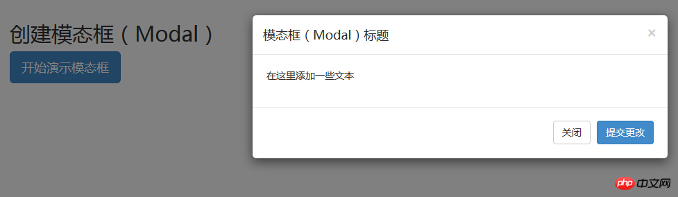
For example, as shown below: As soon as you click "Start Demonstration Modal Box", a box will pop up. We call this box a modal box
After knowing what modal box is, how to write an html? Without further ado, let me first take a look at my HTML code:
<!DOCTYPE html><html><head><meta charset="utf-8"><title>Bootstrap 实例 - 模态框(Modal)插件</title><link rel="stylesheet" href="../bootstrap-3.3.7-dist/css/bootstrap.min.css?1.1.11"></head><body><h2>创建模态框(Modal)</h2><!-- 按钮触发模态框 --><button class="btn btn-primary btn-lg" data-toggle="modal" data-target="#myModal">开始演示模态框</button><!-- 模态框(Modal) --><div class="modal fade" id="myModal" tabindex="-1" role="dialog" aria-labelledby="myModalLabel" aria-hidden="true"><div class="modal-dialog"><div class="modal-content"><div class="modal-header"><button type="button" class="close" data-dismiss="modal" aria-hidden="true">×</button><h4 class="modal-title" id="myModalLabel">模态框(Modal)标题</h4></div><div class="modal-body">在这里添加一些文本</div><div class="modal-footer"><button type="button" class="btn btn-default" data-dismiss="modal">关闭</button><button type="button" class="btn btn-primary">提交更改</button></div></div><!-- /.modal-content --></div><!-- /.modal --></div><script src="../bootstrap-3.3.7-dist/js/jquery-3.1.1.min.js?1.1.11"></script><script src="../bootstrap-3.3.7-dist/js/bootstrap.min.js?1.1.11"></script><!--<script>
// 只需要点击 ESC 键,模态窗口即会退出。
$(function() {
$('#myModal').modal({
keyboard: false
})
});
</script>--><script>$(function() {
$('#myModal').modal('hide')
});</script><script>$(function() {
$('#myModal').on('hide.bs.modal',function() {
alert('嘿,我听说您喜欢模态框...');
})
});</script></body></html>So you copy the above code and open it in the browser, and you find that it is ugly and the pop-up box cannot be implemented. function? Why is this? It's most likely because you didn't import bootstrap's css, js
First I downloaded bootstrap from the bootstrap official website; then quoted bootstrap's css and js
If you import it correctly, you will definitely be able to see this interface in the browser.

The effect is already there, let’s look at the code:
Code explanation:
To use a modal window, you need to have some kind of trigger. You can use buttons or links. Here we are using buttons.
If you look at the above code carefully, you will find that in the
You need to pay attention to two points in the modal box:
The first is .modal, use To identify the content of
as a modal box.The second is .fade class. When the modal is toggled, it causes the content to fade in and out.
aria-labelledby="myModalLabel", this attribute refers to the title of the modal box.
Attribute aria-hidden="true" Used to keep the modal window invisible until the trigger is fired (such as clicking on the relevant button) .
, modal-header is a class that defines the style for the head of the modal window.class="close", close is a CSS class used to style the close button of a modal window.
data-dismiss="modal", is a custom HTML5 data attribute. Here it is used to close the modal window.
class="modal-body", is a CSS class of Bootstrap CSS, used to set styles for the body of modal windows.
class="modal-footer", is a CSS class of Bootstrap CSS, used to set styles for the bottom of modal windows.
data-toggle="modal", HTML5 custom data attribute data-toggle is used to open a modal window.
Methods
Here are some useful methods that can be used with modal().
Method Description Instance Options: .modal(options) Activate the content as a modal box. Accepts an optional options object. $('#identifier').modal({keyboard: false})Copy after loginToggle: .modal('toggle') Manually switch the modal box. $('#identifier').modal('toggle')
Copy after loginShow: .modal('show') Manually open the modal box. $('#identifier').modal('show')
Copy after loginHide: .modal('hide') Manually hide the modal box. $('#identifier').modal('hide')
Copy after login事件
下表列出了模态框中要用到事件。这些事件可在函数中当钩子使用。
事件 描述 实例 show.bs.modal 在调用 show 方法后触发。 $('#identifier').on('show.bs.modal', function () { // 执行一些动作...})Copy after loginshown.bs.modal 当模态框对用户可见时触发(将等待 CSS 过渡效果完成)。 $('#identifier').on('shown.bs.modal', function () { // 执行一些动作...})Copy after loginhide.bs.modal 当调用 hide 实例方法时触发。 $('#identifier').on('hide.bs.modal', function () { // 执行一些动作...})Copy after loginhidden.bs.modal 当模态框完全对用户隐藏时触发。 $('#identifier').on('hidden.bs.modal', function () { // 执行一些动作...})Copy after login参考资料:
Bootstrap 模态框(Modal)插件
模态框 modal.js
我把modal的练习放到Github上了:模态框
The above is the detailed content of Technical explanation of bootstrap modal box. For more information, please follow other related articles on the PHP Chinese website!
Statement of this WebsiteThe content of this article is voluntarily contributed by netizens, and the copyright belongs to the original author. This site does not assume corresponding legal responsibility. If you find any content suspected of plagiarism or infringement, please contact admin@php.cn

Hot AI Tools

Undresser.AI Undress
AI-powered app for creating realistic nude photos

AI Clothes Remover
Online AI tool for removing clothes from photos.

Undress AI Tool
Undress images for free

Clothoff.io
AI clothes remover

Video Face Swap
Swap faces in any video effortlessly with our completely free AI face swap tool!

Hot Article
Hot Tools

Notepad++7.3.1
Easy-to-use and free code editor

SublimeText3 Chinese version
Chinese version, very easy to use

Zend Studio 13.0.1
Powerful PHP integrated development environment

Dreamweaver CS6
Visual web development tools

SublimeText3 Mac version
God-level code editing software (SublimeText3)
Hot Topics


 How to use bootstrap in vue
Apr 07, 2025 pm 11:33 PM
How to use bootstrap in vue
Apr 07, 2025 pm 11:33 PM
Using Bootstrap in Vue.js is divided into five steps: Install Bootstrap. Import Bootstrap in main.js. Use the Bootstrap component directly in the template. Optional: Custom style. Optional: Use plug-ins.
 How to get the bootstrap search bar
Apr 07, 2025 pm 03:33 PM
How to get the bootstrap search bar
Apr 07, 2025 pm 03:33 PM
How to use Bootstrap to get the value of the search bar: Determines the ID or name of the search bar. Use JavaScript to get DOM elements. Gets the value of the element. Perform the required actions.
 How to do vertical centering of bootstrap
Apr 07, 2025 pm 03:21 PM
How to do vertical centering of bootstrap
Apr 07, 2025 pm 03:21 PM
Use Bootstrap to implement vertical centering: flexbox method: Use the d-flex, justify-content-center, and align-items-center classes to place elements in the flexbox container. align-items-center class method: For browsers that do not support flexbox, use the align-items-center class, provided that the parent element has a defined height.
 How to write split lines on bootstrap
Apr 07, 2025 pm 03:12 PM
How to write split lines on bootstrap
Apr 07, 2025 pm 03:12 PM
There are two ways to create a Bootstrap split line: using the tag, which creates a horizontal split line. Use the CSS border property to create custom style split lines.
 How to set up the framework for bootstrap
Apr 07, 2025 pm 03:27 PM
How to set up the framework for bootstrap
Apr 07, 2025 pm 03:27 PM
To set up the Bootstrap framework, you need to follow these steps: 1. Reference the Bootstrap file via CDN; 2. Download and host the file on your own server; 3. Include the Bootstrap file in HTML; 4. Compile Sass/Less as needed; 5. Import a custom file (optional). Once setup is complete, you can use Bootstrap's grid systems, components, and styles to create responsive websites and applications.
 How to insert pictures on bootstrap
Apr 07, 2025 pm 03:30 PM
How to insert pictures on bootstrap
Apr 07, 2025 pm 03:30 PM
There are several ways to insert images in Bootstrap: insert images directly, using the HTML img tag. With the Bootstrap image component, you can provide responsive images and more styles. Set the image size, use the img-fluid class to make the image adaptable. Set the border, using the img-bordered class. Set the rounded corners and use the img-rounded class. Set the shadow, use the shadow class. Resize and position the image, using CSS style. Using the background image, use the background-image CSS property.
 How to use bootstrap button
Apr 07, 2025 pm 03:09 PM
How to use bootstrap button
Apr 07, 2025 pm 03:09 PM
How to use the Bootstrap button? Introduce Bootstrap CSS to create button elements and add Bootstrap button class to add button text
 How to resize bootstrap
Apr 07, 2025 pm 03:18 PM
How to resize bootstrap
Apr 07, 2025 pm 03:18 PM
To adjust the size of elements in Bootstrap, you can use the dimension class, which includes: adjusting width: .col-, .w-, .mw-adjust height: .h-, .min-h-, .max-h-
