
 Web Front-end
H5 Tutorial
HTML5 uses four methods to implement mobile page adaptation to mobile phone screens. Summary of methods
Web Front-end
H5 Tutorial
HTML5 uses four methods to implement mobile page adaptation to mobile phone screens. Summary of methods
HTML5 uses four methods to implement mobile page adaptation to mobile phone screens. Summary of methods

This article mainly introduces a summary of the four methods of adapting HTML5 mobile pages to mobile phone screens. It is of great practical value. Friends in need can refer to the following
1. Use meta tags: viewport
is a commonly used method for H5 mobile page adaptation. Theoretically, using this tag can adapt to all screen sizes, but the interpretation and support of this tag by each device The varying degrees result in incompatibility with all browsers or systems.
viewport is the visible area of the user web page. Translated into Chinese, it can be called "view area".
Mobile browsers place the page in a virtual "window" (viewport). Usually this virtual "window" (viewport) is wider than the screen, so that each web page does not need to be squeezed into a small size. In a window (which would break the layout of webpages that are not optimized for mobile browsers), users can pan and zoom to see different parts of the webpage.
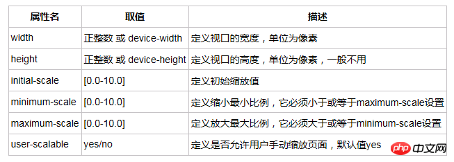
viewport tag and its attributes:
Copy code
The code is as follows:
1 2 |
|
Detailed introduction of each attribute:
2. Use css3 unit rem
rem is a new relative unit (root em, root em) in CSS3. When using rem to set the font size for an element, it is a relative size, but it is only relative to the HTML root element. Through it, you can adjust all font sizes proportionally by modifying only the root element, and you can avoid the chain reaction of compounding font sizes layer by layer.
Currently, all browsers except IE8 and earlier versions support rem. For browsers that do not support it, write an additional absolute unit declaration. These browsers ignore font sizes set with rem. Here is an example:
1 |
|
The default font-size of HTML is 16px, that is, 1rem=16px. If the width of a p is 32px, you can set it to 2rem.
Normally, in order to facilitate the calculation of values, 62.5%, which is the default 10px, is used as the base. Of course, this base can be any value, depending on the specific situation. The setting method is as follows:
1 |
|
Specific rules definition under different screens, that is, the way to define the base: it can be defined through CSS, and different base values can be defined in different width ranges. Of course, it can also be defined once through js as follows:
1 2 3 4 5 6 7 8 9 10 11 12 13 14 15 |
|
3. Use media query
Media query is also a css3 method. The problem we need to solve is to adapt to the mobile phone screen. This media query It was born to solve this problem.
The function of media query is to set different css styles for different media. The "media" here includes page size, device screen size, etc.
For example: If the browser window is smaller than 500px, the background will change to light blue:
1 2 3 4 5 |
|
4. Use percentage
Percent refers to the parent element, all percentages are like this. If the width of the child element is 50%, then the width of the parent element is 100%;
So the default width of the body is the screen width (in PC, it refers to the browser width). The descendant elements can be positioned by percentage (or specify the size). , this is only suitable for pages with simple layouts, and it is difficult to implement complex pages.
The above is the detailed content of HTML5 uses four methods to implement mobile page adaptation to mobile phone screens. Summary of methods. For more information, please follow other related articles on the PHP Chinese website!

Hot AI Tools

Undresser.AI Undress
AI-powered app for creating realistic nude photos

AI Clothes Remover
Online AI tool for removing clothes from photos.

Undress AI Tool
Undress images for free

Clothoff.io
AI clothes remover

Video Face Swap
Swap faces in any video effortlessly with our completely free AI face swap tool!
Hot Article
Hot Tools

Notepad++7.3.1
Easy-to-use and free code editor

SublimeText3 Chinese version
Chinese version, very easy to use

Zend Studio 13.0.1
Powerful PHP integrated development environment

Dreamweaver CS6
Visual web development tools

SublimeText3 Mac version
God-level code editing software (SublimeText3)
Hot Topics


 Table Border in HTML
Sep 04, 2024 pm 04:49 PM
Table Border in HTML
Sep 04, 2024 pm 04:49 PM
Guide to Table Border in HTML. Here we discuss multiple ways for defining table-border with examples of the Table Border in HTML.
 Nested Table in HTML
Sep 04, 2024 pm 04:49 PM
Nested Table in HTML
Sep 04, 2024 pm 04:49 PM
This is a guide to Nested Table in HTML. Here we discuss how to create a table within the table along with the respective examples.
 HTML margin-left
Sep 04, 2024 pm 04:48 PM
HTML margin-left
Sep 04, 2024 pm 04:48 PM
Guide to HTML margin-left. Here we discuss a brief overview on HTML margin-left and its Examples along with its Code Implementation.
 HTML Table Layout
Sep 04, 2024 pm 04:54 PM
HTML Table Layout
Sep 04, 2024 pm 04:54 PM
Guide to HTML Table Layout. Here we discuss the Values of HTML Table Layout along with the examples and outputs n detail.
 HTML Input Placeholder
Sep 04, 2024 pm 04:54 PM
HTML Input Placeholder
Sep 04, 2024 pm 04:54 PM
Guide to HTML Input Placeholder. Here we discuss the Examples of HTML Input Placeholder along with the codes and outputs.
 HTML Ordered List
Sep 04, 2024 pm 04:43 PM
HTML Ordered List
Sep 04, 2024 pm 04:43 PM
Guide to the HTML Ordered List. Here we also discuss introduction of HTML Ordered list and types along with their example respectively
 HTML onclick Button
Sep 04, 2024 pm 04:49 PM
HTML onclick Button
Sep 04, 2024 pm 04:49 PM
Guide to HTML onclick Button. Here we discuss their introduction, working, examples and onclick Event in various events respectively.
 Moving Text in HTML
Sep 04, 2024 pm 04:45 PM
Moving Text in HTML
Sep 04, 2024 pm 04:45 PM
Guide to Moving Text in HTML. Here we discuss an introduction, how marquee tag work with syntax and examples to implement.
