
 Web Front-end
H5 Tutorial
HTML5 practice-detailed explanation of using css to create time ICON (picture)
Web Front-end
H5 Tutorial
HTML5 practice-detailed explanation of using css to create time ICON (picture)
HTML5 practice-detailed explanation of using css to create time ICON (picture)

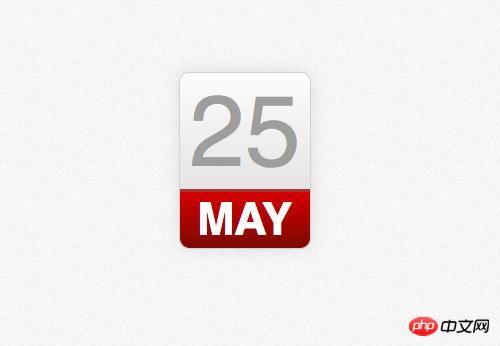
Recently I was redesigning my blog site and decided to use a calendar-style icon to display the time. The previous solution was generally to use background images. Thanks to CSS3, we can now achieve this function using CSS3. I will be using some linear-gradients, border radius and box shadow properties to replace the previous photoshop design.
photoshop concept map

Many designers use the method of designing directly on the browser, but I still prefer to do it first Concept drawing in photoshop. Although many effects can now be achieved directly with CSS, the way to design effects using Photoshop is much simpler than constantly trying to modify CSS to finally achieve the effect you want.
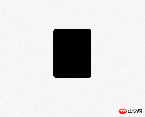
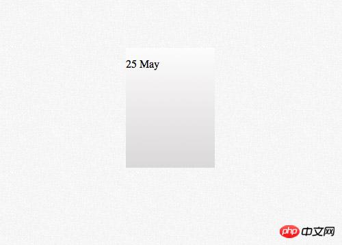
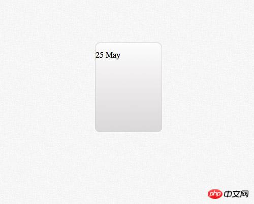
First create a rounded rectangle, set the rounded corner radius to 10px, and then we will use the border-radius property of css to implement it.

Add a vertical gradient to the rectangle. The gradient color is from #dad8d8 to #fcfcfc.

Set a 1 pixel stroke and the color is #e3e3e3
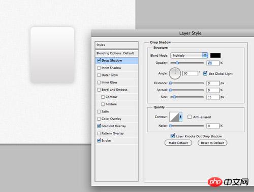
Finally add a downward shadow effect with transparency is 20%, 0 pixels distance and 15 pixels size. These effects will be implemented in css using the box-shadow property.
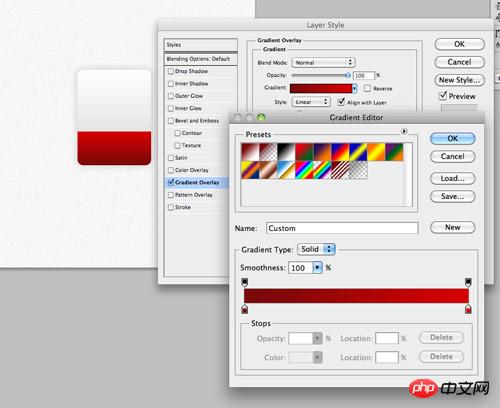
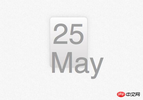
Copy the rectangle just now and remove the upper part. Modify the gradient from #790909 to #d40000 and fill the newly created rectangle where the month information will be placed.
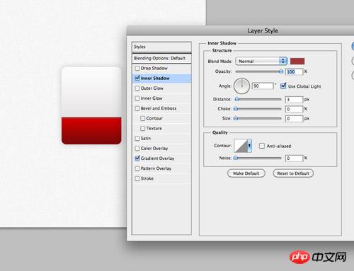
Set an inner shadow to represent the top border, color #a13838, 100% transparency, 3px distance and 0px size.

Use the font tool of Photoshop to set the font effect of the time content in the upper half of the calendar icon. The font is Helvetica and the color is #9e9e9e.
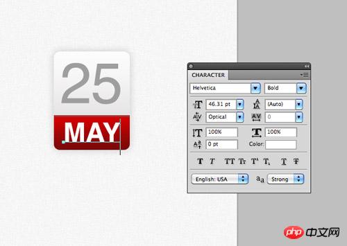
Enter the month information in the red part below, set the font to wide and the color to white.

The photoshop model is completed. In the past, we would extract the image as the background and write html numbers on it, but now all of this can be achieved with css.
HTML structure
<p class="date">
<p>25 <span>May</span></p></p>This time the html of the ICON demo is very simple. We will use p with class as 'date' as the container, and then use a p tag to represent the date number. Days and months are represented by characters of different sizes in our design, so we use the tag to treat different elements differently.
css style
.date {
    width: 130px; height: 160px;
    background: #fcfcfc;
    background: linear-gradient(top, #fcfcfc 0%,#dad8d8 100%);
    background: -moz-linear-gradient(top, #fcfcfc 0%, #dad8d8 100%);
    background: -webkit-linear-gradient(top, #fcfcfc 0%,#dad8d8 100%);
}
.date {
    width: 130px; height: 160px;
    background: #fcfcfc;
    background: linear-gradient(top, #fcfcfc 0%,#dad8d8 100%);
    background: -moz-linear-gradient(top, #fcfcfc 0%, #dad8d8 100%);
    background: -webkit-linear-gradient(top, #fcfcfc 0%,#dad8d8 100%);
    border: 1px solid #d2d2d2;
    border-radius: 10px;
    -moz-border-radius: 10px;
    -webkit-border-radius: 10px;
    box-shadow: 0px 0px 15px rgba(0,0,0,0.1);
    -moz-box-shadow: 0px 0px 15px rgba(0,0,0,0.1);
    -webkit-box-shadow: 0px 0px 15px rgba(0,0,0,0.1);
}
.date p {
    font-family: Helvetica, sans-serif;
    font-size: 100px; text-align: center; color: #9e9e9e;
}
.date p span {
    background: #d10000;
    background: linear-gradient(top, #d10000 0%, #7a0909 100%);
    background: -moz-linear-gradient(top, #d10000 0%, #7a0909 100%);
    background: -webkit-linear-gradient(top, #d10000 0%, #7a0909 100%);
} 
红色部分的实现是通过为span的背景设置linear-gradient属性实现的,红色的数值也是来自于photoshop。
.date p span {
    background: #d10000;
    background: linear-gradient(top, #d10000 0%, #7a0909 100%);
    background: -moz-linear-gradient(top, #d10000 0%, #7a0909 100%);
    background: -webkit-linear-gradient(top, #d10000 0%, #7a0909 100%);
    font-size: 45px; font-weight: bold; color: #fff; text-transform: uppercase;
    display: block;
} 
修改文字样式,使它和设计匹配,大小设置为45px,设置为粗体字,颜色设置为白色,使用text-transform实现大写转换。将span标签设置为块元素,这样他就会匹配容器的大小了,设置红色背景。
.date p span {
    background: #d10000;
    background: linear-gradient(top, #d10000 0%, #7a0909 100%);
    background: -moz-linear-gradient(top, #d10000 0%, #7a0909 100%);
    background: -webkit-linear-gradient(top, #d10000 0%, #7a0909 100%);
    font-size: 45px; font-weight: bold; color: #fff; text-transform: uppercase;
    display: block;
    border-top: 3px solid #a13838;
    border-radius: 0 0 10px 10px;
    -moz-border-radius: 0 0 10px 10px;
    -webkit-border-radius: 0 0 10px 10px;
    padding: 6px 0 6px 0;
}
剩下的就是添加头部边框,用border-top样式实现,还有就是用border-radius属性实现下部两个圆角。一点点的padding属性可以让月份文字上下和其他元素有些间隔。
浏览器兼容性
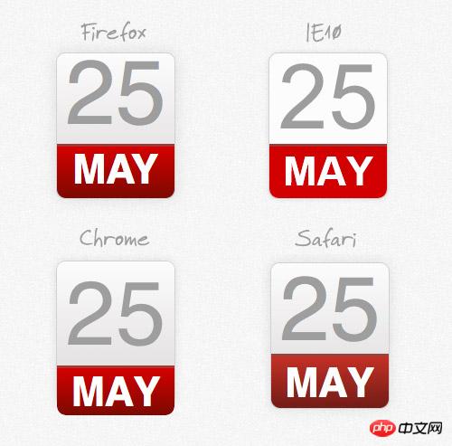
尽管css改进的属性可以帮助我们实现photoshop中渐变和阴影的效果,但是我们仍然要面对以前web设计师要面对的问题,浏览器兼容性。
The above is the detailed content of HTML5 practice-detailed explanation of using css to create time ICON (picture). For more information, please follow other related articles on the PHP Chinese website!

Hot AI Tools

Undresser.AI Undress
AI-powered app for creating realistic nude photos

AI Clothes Remover
Online AI tool for removing clothes from photos.

Undress AI Tool
Undress images for free

Clothoff.io
AI clothes remover

Video Face Swap
Swap faces in any video effortlessly with our completely free AI face swap tool!

Hot Article
Hot Tools

Notepad++7.3.1
Easy-to-use and free code editor

SublimeText3 Chinese version
Chinese version, very easy to use

Zend Studio 13.0.1
Powerful PHP integrated development environment

Dreamweaver CS6
Visual web development tools

SublimeText3 Mac version
God-level code editing software (SublimeText3)
Hot Topics


 How to use bootstrap in vue
Apr 07, 2025 pm 11:33 PM
How to use bootstrap in vue
Apr 07, 2025 pm 11:33 PM
Using Bootstrap in Vue.js is divided into five steps: Install Bootstrap. Import Bootstrap in main.js. Use the Bootstrap component directly in the template. Optional: Custom style. Optional: Use plug-ins.
 The Roles of HTML, CSS, and JavaScript: Core Responsibilities
Apr 08, 2025 pm 07:05 PM
The Roles of HTML, CSS, and JavaScript: Core Responsibilities
Apr 08, 2025 pm 07:05 PM
HTML defines the web structure, CSS is responsible for style and layout, and JavaScript gives dynamic interaction. The three perform their duties in web development and jointly build a colorful website.
 Understanding HTML, CSS, and JavaScript: A Beginner's Guide
Apr 12, 2025 am 12:02 AM
Understanding HTML, CSS, and JavaScript: A Beginner's Guide
Apr 12, 2025 am 12:02 AM
WebdevelopmentreliesonHTML,CSS,andJavaScript:1)HTMLstructurescontent,2)CSSstylesit,and3)JavaScriptaddsinteractivity,formingthebasisofmodernwebexperiences.
 How to write split lines on bootstrap
Apr 07, 2025 pm 03:12 PM
How to write split lines on bootstrap
Apr 07, 2025 pm 03:12 PM
There are two ways to create a Bootstrap split line: using the tag, which creates a horizontal split line. Use the CSS border property to create custom style split lines.
 How to set up the framework for bootstrap
Apr 07, 2025 pm 03:27 PM
How to set up the framework for bootstrap
Apr 07, 2025 pm 03:27 PM
To set up the Bootstrap framework, you need to follow these steps: 1. Reference the Bootstrap file via CDN; 2. Download and host the file on your own server; 3. Include the Bootstrap file in HTML; 4. Compile Sass/Less as needed; 5. Import a custom file (optional). Once setup is complete, you can use Bootstrap's grid systems, components, and styles to create responsive websites and applications.
 How to insert pictures on bootstrap
Apr 07, 2025 pm 03:30 PM
How to insert pictures on bootstrap
Apr 07, 2025 pm 03:30 PM
There are several ways to insert images in Bootstrap: insert images directly, using the HTML img tag. With the Bootstrap image component, you can provide responsive images and more styles. Set the image size, use the img-fluid class to make the image adaptable. Set the border, using the img-bordered class. Set the rounded corners and use the img-rounded class. Set the shadow, use the shadow class. Resize and position the image, using CSS style. Using the background image, use the background-image CSS property.
 How to use bootstrap button
Apr 07, 2025 pm 03:09 PM
How to use bootstrap button
Apr 07, 2025 pm 03:09 PM
How to use the Bootstrap button? Introduce Bootstrap CSS to create button elements and add Bootstrap button class to add button text
 What Does H5 Refer To? Exploring the Context
Apr 12, 2025 am 12:03 AM
What Does H5 Refer To? Exploring the Context
Apr 12, 2025 am 12:03 AM
H5referstoHTML5,apivotaltechnologyinwebdevelopment.1)HTML5introducesnewelementsandAPIsforrich,dynamicwebapplications.2)Itsupportsmultimediawithoutplugins,enhancinguserexperienceacrossdevices.3)SemanticelementsimprovecontentstructureandSEO.4)H5'srespo
