
 Web Front-end
HTML Tutorial
Discover why modern design values responsive layout and typography
Web Front-end
HTML Tutorial
Discover why modern design values responsive layout and typography
Discover why modern design values responsive layout and typography


Responsive layout and typography: why are they so important in modern design?
With the popularity and rapid development of mobile devices, more and more people choose to use mobile phones and tablets to browse the web. Therefore, responsive layout and typography have become crucial factors in modern design. This technology allows web pages to adapt to different screen sizes and device types, providing a better user experience.
The so-called responsive layout means that the web page can automatically adjust the layout according to different screen sizes and device types. This means users will get a consistent user interface and functionality whether they open a web page on a phone, tablet or laptop. Compared with traditional fixed layout, responsive layout is more flexible and can adapt to various screen sizes and resolutions, providing better readability and navigation experience.
So, why is responsive layout so important to modern design?
First of all, responsive layout provides a unified design style and user experience. Whether users open a web page on a mobile phone or a computer, they can get the same interface design and layout, which helps increase user trust and loyalty to the brand. The traditional fixed layout will lead to problems such as layout confusion and content overflow on different devices, causing trouble and inconvenience to users and reducing user satisfaction.
Secondly, responsive layout improves the accessibility of web pages. In modern society, more and more people use mobile devices to access the Internet. If web pages are only adapted to desktop computers and ignore other devices, many users will be unable to access and use web pages normally. Responsive layout ensures that web pages display properly on different devices, allowing more people to access and use the content and functions on the web page.
In addition, responsive layout is also very important for search engine optimization. As web designers, we hope that our web pages can have better search rankings to attract more traffic and users. According to relevant reports from Google, responsive layout and typography are one of the factors respected and recognized by search engine algorithms. This is because responsive layout can provide a better user experience and more convenient access, thereby improving user retention and the overall quality of the web page, thereby improving search engine rankings.
In addition to responsive layout, typography is also a factor that cannot be ignored in modern design. Typography refers to the way text and images are laid out and presented on a web page. In responsive design, typography determines how text and images appear on different screen sizes. Reasonable layout can improve the readability and visibility of web pages, making it easier for users to read and understand the content on the web pages. When choosing fonts, font sizes, line spacing, and paragraph spacing, designers need to comprehensively consider the display effects on different devices to ensure the readability and visual appeal of the web page.
In general, responsive layout and typography play an extremely important role in modern design. They can provide a unified design style, optimize user experience, improve accessibility and search engine rankings. In the future, with the continuous updating and popularization of mobile devices, responsive layout and typography will become increasingly important and become a technology that designers must master and apply.
The above is the detailed content of Discover why modern design values responsive layout and typography. For more information, please follow other related articles on the PHP Chinese website!

Hot AI Tools

Undresser.AI Undress
AI-powered app for creating realistic nude photos

AI Clothes Remover
Online AI tool for removing clothes from photos.

Undress AI Tool
Undress images for free

Clothoff.io
AI clothes remover

Video Face Swap
Swap faces in any video effortlessly with our completely free AI face swap tool!

Hot Article
Hot Tools

Notepad++7.3.1
Easy-to-use and free code editor

SublimeText3 Chinese version
Chinese version, very easy to use

Zend Studio 13.0.1
Powerful PHP integrated development environment

Dreamweaver CS6
Visual web development tools

SublimeText3 Mac version
God-level code editing software (SublimeText3)
Hot Topics
 1658
1658
 14
1415
52
1309
25
1257
29
1231
24
14
1415
52
1309
25
1257
29
1231
24

 What are the operating skills for excel typesetting?
Mar 20, 2024 pm 05:01 PM
What are the operating skills for excel typesetting?
Mar 20, 2024 pm 05:01 PM
In order to achieve the visual effect of the entire document, both word and excel files need to be typed. However, many novice friends do not know how to perform excel typesetting. Below, we will share some typesetting operation skills, hoping to give you some Inspiration on operational skills! 1. First, we create and open an excel form and enter some simple content to facilitate demonstration operations. 2. We find the print preview function menu in the menu bar above the file. 3. Click the print preview function, and we find that the table is asymmetrical when it is not typeset. We need to find the page setup function in the menu bar above the document. 4. Click Page Settings and find the margin function in the function menu that opens. 5. Click
 How to create a responsive blog list layout using HTML and CSS
Oct 21, 2023 am 10:00 AM
How to create a responsive blog list layout using HTML and CSS
Oct 21, 2023 am 10:00 AM
How to Create a Responsive Blog List Layout Using HTML and CSS In today’s digital age, blogs have become an important platform for people to share their opinions and experiences. And in order to attract more readers, a beautiful and responsive blog list layout is crucial. In this article, we will learn how to create a simple yet functional responsive blog list layout using HTML and CSS. First, we need to prepare some basic HTML code. The following is the HTML structure of a simple blog list layout: <
 Analysis and solutions to the causes of misaligned typography in WordPress
Mar 05, 2024 am 11:45 AM
Analysis and solutions to the causes of misaligned typography in WordPress
Mar 05, 2024 am 11:45 AM
Analysis of causes and solutions to misaligned typography in WordPress When building a website using WordPress, you may encounter misaligned typography, which will affect the overall beauty and user experience of the website. There are many reasons for typography misalignment, which may be caused by theme compatibility issues, plug-in conflicts, CSS style conflicts, etc. This article will analyze common causes of misaligned typography in WordPress and provide some solutions, including specific code examples. 1. Reason Analysis Theme Compatibility Issues: Some WordPress
 Discuz Editor: an efficient post layout tool
Mar 10, 2024 am 09:42 AM
Discuz Editor: an efficient post layout tool
Mar 10, 2024 am 09:42 AM
Discuz Editor: An efficient post layout tool. With the development of the Internet, online forums have become an important platform for people to communicate and share information. In the forum, users can not only express their opinions and ideas, but also discuss and interact with others. When publishing a post, a clear and beautiful format can often attract more readers and convey more accurate information. In order to facilitate users to quickly type and edit posts, the Discuz editor came into being and became an efficient post typesetting tool. Discu
 Unit Selection Guide for Responsive Layout Design
Jan 27, 2024 am 08:26 AM
Unit Selection Guide for Responsive Layout Design
Jan 27, 2024 am 08:26 AM
With the popularity of mobile devices and the development of technology, responsive layout has become one of the essential skills for designers. Responsive layout is designed to provide the best user experience for screens of different sizes, allowing web pages to automatically adjust their layout on different devices to ensure the readability and usability of content. Choosing the right units is one of the key steps in responsive layout design. This article will introduce some commonly used units and provide suggestions for selecting units. Pixel (px): Pixel is the smallest unit on the screen. It is an absolute unit and does not automatically change as the screen size changes.
 How to create a responsive blog layout using HTML and CSS
Oct 21, 2023 am 10:54 AM
How to create a responsive blog layout using HTML and CSS
Oct 21, 2023 am 10:54 AM
How to Create a Responsive Blog Layout Using HTML and CSS In today’s Internet age, blogs have become an important platform for people to share knowledge, experiences, and stories. Designing an attractive and responsive blog will allow your content to display better on different sizes and devices, improving user experience. This article will introduce how to use HTML and CSS to create a responsive blog layout, while providing specific code examples. 1. HTML structure First, we need to build the basic HTML structure of the blog. The following is a
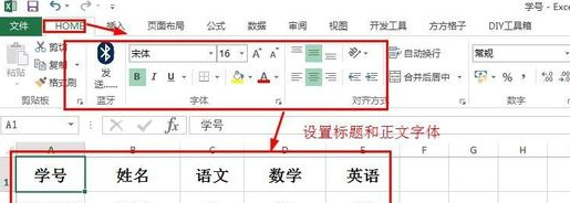 Basic operations of excel table layout
Mar 20, 2024 pm 03:50 PM
Basic operations of excel table layout
Mar 20, 2024 pm 03:50 PM
When everyone uses Excel for data processing, it is indispensable to format and beautify the data, so that it will be more beautiful when shown to others or printed out. Today I will introduce to you the basic operations of excel table formatting. I hope it will be helpful to those who have just started learning. Help for those new to Excel. 1. First select the text - click Start - typesetting the table text: Generally, the title font size is set to 14~16, black Song font, bold, and centered; the main text is generally set to 12 size, Song font, centered. Tips: If the content is small, you can set a larger font. 2. Set the appropriate row height and column width: Select the entire table - drag to uniformly adjust the row height and column width. You can also click Start - Format - Set the row height and column width - For the title row or
 Explore the best responsive layout frameworks: the competition is fierce!
Feb 19, 2024 pm 05:19 PM
Explore the best responsive layout frameworks: the competition is fierce!
Feb 19, 2024 pm 05:19 PM
Responsive layout framework competition: who is the best choice? With the popularity and diversification of mobile devices, responsive layout of web pages has become more and more important. In order to cater to the different devices and screen sizes of users, it is essential to adopt a responsive layout framework when designing and developing web pages. However, with so many framework options out there, we can’t help but ask: which one is the best choice? The following will be a comparative evaluation of three popular responsive layout frameworks, namely Bootstrap, Foundation and Tailwind.
