
 Web Front-end
H5 Tutorial
HTML5 SVG 2D Introduction 5 - Color Representation and Definition Methods_html5 Tutorial Skills
Web Front-end
H5 Tutorial
HTML5 SVG 2D Introduction 5 - Color Representation and Definition Methods_html5 Tutorial Skills
HTML5 SVG 2D Introduction 5 - Color Representation and Definition Methods_html5 Tutorial Skills

SVG and canvas are the same, both use standard HTML/CSS color representation methods, and these colors can be used for fill and stroke attributes.
There are basically the following ways to define colors :
1. Color name: directly use the color name red, blue, black...
2. rgba/rgb value: This is also It's easy to understand, for example #ff0000,rgba(255,100,100,0.5).
3. Hexadecimal value: Color defined in hexadecimal, such as #ffffff.
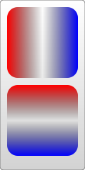
4. Gradient value: This is the same as canvas, supporting two gradient colors: linear gradient and circular gradient. As shown below:

5. Pattern fill: Use a custom pattern as the fill color.
The first ones are very simple, focus on the last two fill colors.
Linear Gradient
Use the linearGradient element to define a linear gradient, and each gradient color component is defined using the stop element. Look at the example below:
In this example, we need to pay attention to :
1. Gradient The color element must be placed in the defs element;
2. The id value needs to be set for the gradient color element, otherwise, other elements cannot use this gradient color.
3. The members of the gradient color are defined using stop, and its attributes can also be defined using CSS; it supports attributes such as class and id that are supported by standard HTML. Other commonly used attributes are as follows:
offset attribute: This defines the scope of the member color. The value of this attribute is from 0% to 100% (or 0 to 1) ; Usually the first color is set to 0%, and the last color is set to 100%.
stop-color attribute: This is very simple, it defines the color of the member color.
stop-opacity attribute: defines the transparency of the member color.
x1,y1,x2,y2Attribute: These two points define the direction of the gradient. If not written by default, it is a horizontal gradient. In the above example, a vertical gradient is also created.
4. To use gradient color, as shown in the example, just assign the value to fill or stroke directly in the form of url(#id).
5. Reuse of gradient members: You can also use xlink:href to reference defined gradient members, so the above example can also be rewritten as follows:
Circular Gradient
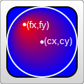
Use the radialGradient element to define the circular gradient, or use stop to define the member color. Look at the example:
From above As shown in the example, except for the element name and some special members, everything else is the same as a linear gradient, including the definition of stop, which must be placed in defs, an id must be set for it, and url(#id) must be used to assign values, etc. These special members are as follows:
offset attribute: This value is the same as the linear gradient, but the meaning is different. In a circular gradient, 0% represents the center of the circle, which is easy to understand.
cx,cy,rAttributes: In fact, it is also easy to understand. Ring gradient. Of course, the center and radius of the ring must be defined. You can understand it by experiencing the size and position of the circle in the above example.
fx,fyAttributes: Define the position of the color center (focus), which is the coordinates of the thickest gradient. In the above example, the reddest point is the center of the circle, which is the default effect ; If you want to change it, you can set the fx, fy coordinate values.
But here you need to pay attention to the values of cx, cy, r, fx, fy above. You will find that they are all decimals, so what are the units?
This requires understanding another related attribute first: gradientUnits, which defines the coordinate units used to define gradient colors. This property has 2 available values: userSpaceOnUse and objectBoundingBox.
objectBoundingBox is the default value. The coordinates it uses are relative to the object bounding box (square bounding box, the situation that is not a square bounding box is more complicated, skip it), and the value range is 0 to 1. For example, the coordinate values of cx and cy in the above example are (0.25, 0.25). This means that the center of the circle is 1/4 of the upper left corner of the bounding box, and the radius of 0.25 means that the radius is 1/4 of the length of the object's square bounding box, as you can see in the picture.
userSpaceOnUse indicates that absolute coordinates are used. When using this setting, you must ensure that the gradient color and the filled object remain in the same position.
Look at the example below again. Note that the default value of the gradientUnits attribute is objectBoundingBox:
You will know the meaning of "focus" by looking at the renderings.
In addition, there are gradient elements and some transformation attributes, such as gradientTransform. This is not the focus here. Transformations will be summarized later.
Another attribute that may be used is the spreadMethod attribute, which defines the behavior that the gradient should take when it reaches its end point. This attribute has 3 optional values: pad (default value), reflect, repeat. Needless to say, pad is a natural transition. After the gradient color ends, the last member color is used to directly render the remaining part of the object. refect will continue the gradient color, but the gradient color will continue to be rendered in the reverse direction, starting from the last color to the first color; wait until it reaches the end of the gradient color again, and then reverse the order, so as to guide the object to be filled. . Repeat will also continue to render the gradient colors, but not in reverse order. It will still be rendered from the first color to the last color over and over again. The rendering is as follows:

Look at a piece of code that is repeatedly rendered:
Texture filling
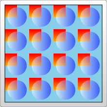
Texture filling is also a popular filling method. In SVG, you can use pattern to create a texture, and then use this pattern to fill other objects . Look directly at the example:
> ;
The example looks very simple, create a pattern from the gradient color, and then use the pattern
Fill the rectangle. Things to note here:
1. Different browsers have different effects when filling this pattern.
For example, the example works the same in FireFix and Chrome. But if you put the gradient color
Ifand pattern are defined in the same defs combination, FireFox can still render normally,
But Chrome cannot recognize the gradient color and will only fill it with the default black.
2. Pattern also needs to define id.
3. Pattern must also be defined in defs.
4. The use of pattern also assigns url(#id) directly to fill or stroke.
The above are very simple. Let’s focus on the coordinate representation in the example. The coordinates in the pattern are more complicated.
pattern contains two related attributes: patternUnits and patternContentUnits attributes; these two attributes still have only two values: objectBoundingBox and userSpaceOnUse. The meanings of these two values are explained above. What is easy to confuse here is that the default values of these two properties are different, but when you understand the reason for doing this, you will find that it really makes sense.
1. patternUnitsAttribute
This attribute is the same as Gradient’s gradientUnits attribute. By default, objectBoundingBox is used. The attributes affected by this attribute are x, y, width, and height. These four attributes define the starting point, width and height of the pattern respectively. They all use relative values. In the example, you want to fill 4 times in both the horizontal and vertical directions, so the width and height are both set to 0.25.
2. patternContentUnitsAttribute
The default value of this attribute is just the opposite, using userSpaceOnUse. This attribute describes the coordinate system of the shapes drawn in the pattern (such as the rect and circle above). That is to say, by default, the shape you draw in the pattern uses a different coordinate system than the size/position of the pattern itself. Consider the situation in the example above, where we want to fill a 200*200 rectangle and repeat it 4 times in each direction. This means that each pattern is 50*50, so the two rectangles and a circle in the pattern are drawn in this 50*50 rectangle. In this way we can understand the coordinates of the rectangle and circle in the pattern above. In addition, in order to be centered, the pattern in this example needs to be offset by 10px before rendering, and this value is restricted by the patternUnits attribute, so by default, the x and y values are: 10/200=0.05.
So why does pattern set the default values of the two attributes in this way?
This is determined by the user's usage (discussed with the above example):
The first pattern style : I think this is most cases, so it is processed as the default value: pattern It will be stretched as the outer shape is scaled. No matter how big the outer square is, the pattern will always be filled 4 times in both directions. But the graphics contained in the pattern will not stretch as the filled square outside scales. Although it is far-fetched, let’s understand it this way.
The second pattern style : The shape in the pattern also stretches as the surrounding shape scales. We can also explicitly set the value of the patternContentUnits attribute to objectBoundingBox to achieve this effect. For example, modify the pattern part as follows:
< ;pattern id="Pattern" width=".25" height=".25" patternContentUnits="objectBoundingBox">
After modification, when the size of the filled rectangle is changed, the shape in the pattern will also be stretched. Moreover, after the modification, it was changed to the coordinates relative to the peripheral object, so the x and y coordinates of the pattern are no longer needed. The pattern will always be adjusted to fit the filled shape.
The third pattern style: The shape and size of the pattern are fixed. No matter how the peripheral objects are scaled, you can change the coordinate system to userSpaceOnUse to achieve this effect. The code is as follows:
Typical patterns among these 3 are as shown below:

Practical reference:
Official documentation: http://www.w3.org/TR/SVG11/
Script index: http://msdn.microsoft.com/zh-cn/library /ff971910(v=vs.85).aspx
Development Center: https://developer.mozilla.org/en/SVG
Popular Reference: http: //www.chinasvg.com/

Hot AI Tools

Undresser.AI Undress
AI-powered app for creating realistic nude photos

AI Clothes Remover
Online AI tool for removing clothes from photos.

Undress AI Tool
Undress images for free

Clothoff.io
AI clothes remover

Video Face Swap
Swap faces in any video effortlessly with our completely free AI face swap tool!

Hot Article
Hot Tools

Notepad++7.3.1
Easy-to-use and free code editor

SublimeText3 Chinese version
Chinese version, very easy to use

Zend Studio 13.0.1
Powerful PHP integrated development environment

Dreamweaver CS6
Visual web development tools

SublimeText3 Mac version
God-level code editing software (SublimeText3)
Hot Topics
 1655
1655
 14
1413
52
1306
25
1252
29
1226
24
14
1413
52
1306
25
1252
29
1226
24

 How to change title bar color on Windows 11?
Sep 14, 2023 pm 03:33 PM
How to change title bar color on Windows 11?
Sep 14, 2023 pm 03:33 PM
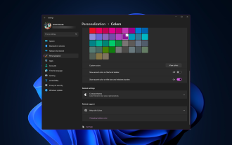
By default, the title bar color on Windows 11 depends on the dark/light theme you choose. However, you can change it to any color you want. In this guide, we'll discuss step-by-step instructions for three ways to change it and personalize your desktop experience to make it visually appealing. Is it possible to change the title bar color of active and inactive windows? Yes, you can change the title bar color of active windows using the Settings app, or you can change the title bar color of inactive windows using Registry Editor. To learn these steps, go to the next section. How to change title bar color in Windows 11? 1. Using the Settings app press + to open the settings window. WindowsI go to "Personalization" and then
![How to Invert Colors on Windows 11 [Using Shortcuts]](https://img.php.cn/upload/article/000/887/227/168145458732944.png?x-oss-process=image/resize,m_fill,h_207,w_330) How to Invert Colors on Windows 11 [Using Shortcuts]
Apr 14, 2023 pm 02:43 PM
How to Invert Colors on Windows 11 [Using Shortcuts]
Apr 14, 2023 pm 02:43 PM
When using a Windows computer, you may need to invert the computer's colors. This may be due to personal preference or a display driver error. If you want to invert the colors on your Windows 11 PC, this article provides you with all the necessary steps to invert the colors on your Windows PC. What does it mean to invert colors on an image in this article? Simply put, inverting the colors of an image means flipping the current color of the image to the opposite hue on the color wheel. You can also say this means changing the color of the image to a negative. For example, a blue image will be inverted to orange, black to white, green to magenta, etc. How to invert colors on Windows 11? 1. Use the Microsoft Paint button + and enter
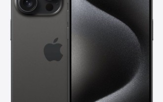 Natural Titanium: Revealing the True Color of iPhone 15 Pro
Sep 18, 2023 pm 02:13 PM
Natural Titanium: Revealing the True Color of iPhone 15 Pro
Sep 18, 2023 pm 02:13 PM
With its annual Wanderlust event over, Apple has finally put to rest months of rumors and speculation about its iPhone 15 lineup. As expected, its 2023 flagship "Pro" model sets itself apart in terms of raw power and new "Titanium" design and aesthetics. Here's a look at the different colors of the new iPhone 15 Pro models, and to determine the true colors and shades of the "natural titanium" variant. Apple iPhone 15 Pro Color Apple has chosen grade 5 titanium alloy as the material design for the latest iPhone 15 Pro model. The titanium alloy used on the iPhone 15 Pro is known for its strength-to-weight ratio, which not only makes it more durable and lightweight, but also gives the device an elegant "brush" texture that
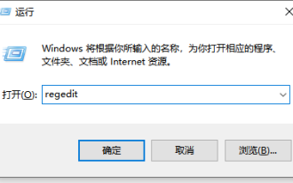 Detailed tutorial on how to set the eye protection color application on win10 computer
Jul 08, 2023 am 10:46 AM
Detailed tutorial on how to set the eye protection color application on win10 computer
Jul 08, 2023 am 10:46 AM
For office workers, working on the computer lasts all day, and the background color of most software is pure white. If you look at it for a long time, your eyes will feel dry and uncomfortable. In fact, we can customize the window eye protection color. The method introduced online is more troublesome to operate. In this article, the editor will share with you a method to adjust the window eye protection color in Win10. Let’s take a look at how to set the computer eye protection mode. 1. First, press the key combination [win] + [R] on the keyboard to open the run window, enter [regedit] and click OK to open. 2. Then expand the registry folder in sequence: [\HKEY_CURRENT_USER\ControlPanel\Colors] 3. Then in the Colors folder
 Let's talk about how to use SVG to achieve image mosaic effect
Sep 01, 2022 am 11:05 AM
Let's talk about how to use SVG to achieve image mosaic effect
Sep 01, 2022 am 11:05 AM
How to use SVG to achieve image mosaic effect without using Javascript? The following article will give you a detailed understanding, I hope it will be helpful to you!
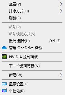 How to change the color of the Windows 10 taskbar
Jan 01, 2024 pm 09:05 PM
How to change the color of the Windows 10 taskbar
Jan 01, 2024 pm 09:05 PM
It is very simple to modify the taskbar color in Windows 10, but many users find that they cannot set it. In fact, it is very simple. Just choose your favorite color in the personalization of the computer. If you cannot change the color, pay attention to the detailed settings. How to change the color of the win10 taskbar Step 1: Right-click on the desktop - click Personalize Step 2: Customize the color area Step 3: Choose your favorite color PS: If you cannot change the color, you can click Color -> Select Color -> Customize->Default windows mode, select dark color.
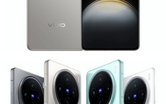 Vivo's new X100 series memory, color exposure: all series start at 12+256GB
May 06, 2024 pm 03:58 PM
Vivo's new X100 series memory, color exposure: all series start at 12+256GB
May 06, 2024 pm 03:58 PM
According to news on May 6, vivo officially announced today that the new vivoX100 series will be officially released at 19:00 on May 13. It is understood that this conference is expected to release three models, vivoX100s, vivoX100sPro, and vivoX100Ultra, as well as vivo's self-developed imaging brand BlueImage blueprint imaging technology. Digital blogger "Digital Chat Station" also released the official renderings, memory specifications and color matching of these three models today. Among them, X100s adopts a straight screen design, while X100sPro and X100Ultra have curved screen designs. The blogger revealed that vivoX100s comes in four colors: black, titanium, cyan, and white. The memory specifications
 An in-depth analysis of how to use svg icons in vue3+vite
Apr 28, 2022 am 10:48 AM
An in-depth analysis of how to use svg icons in vue3+vite
Apr 28, 2022 am 10:48 AM
svg images are widely used in projects. The following article will introduce how to use svg icons in vue3 + vite. I hope it will be helpful to everyone!
