

Let's talk about why you shouldn't rely on CSS 100vh?

Why shouldn’t you rely on CSS 100vh? The following article will talk to you about the reasons, I hope it will be helpful to you!

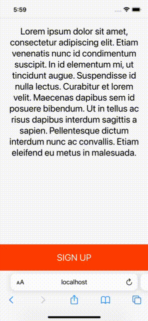
If there is a text and a button, we want the text to stick on top and the button to stick below! It seems easy to do using CSS Flex. [Recommended learning: css video tutorial]
// HTML
<div>
  <p>Lorem ipsum dolor sit amet...</p>
  <button>Sign Up</button>
</div>

// CSS
.layout {
  display: flex;
  flex-direction: column;
  justify-content: space-between;
  min-height: 100vh;
}Check the effect on a real machine:

Cool! Git add, git commit , git push, oh yeah!
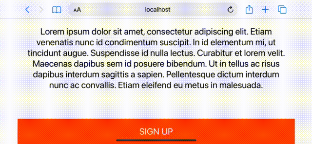
What’s wrong with this?
Of course, there is! To see this problem, you need to view your app on a real phone or emulator. The iPhone 13 (iOS 15.2) used in this article was tested. Here are the results:

What, where did the bottom button go?
By the way, it doesn't even work as expected on Android phones.

Why does the 100vh problem occur on mobile devices?
I conducted some investigation into this problem and found out the reason. The short answer is that the browser's toolbar height is not taken into account. If you want to dig deeper into why this happens, this Stack Overflow post is helpful.
How to fix 100vh issue on mobile device?
The first suggestion is to use vh as little as possible. For example, in the code above, you could use a sticky button to avoid using vh units.
// HTML
<div>
  <p>Lorem ipsum dolor sit amet...</p>
  <button>Sign Up</button>
</div>

// CSS
.layout {
  display: flex;
  flex-direction: column;
  justify-content: space-between;
  min-height: 100vh;
}
.layout button {
  position: sticky;
  bottom: 0;
}Effect:
It also works great in landscape mode:
To be honest , the result is good, but you can't always solve the 100vh problem with sticky elements.
Fixing the 100VH issue on mobile using only CSS
The purpose of using vh is to simply create a section that is equal to the height of the viewport. This is common when you are building a landing page, for example. In these cases, position sticky won't help, and here's the fill-available property. It's easy to use, just remember to use prefixes and fallback values.
.layout {
  min-height: 100vh;            /* fall-back */
  min-height: -moz-available;
  min-height: -webkit-fill-available;
  min-height: fill-available;
}Effect: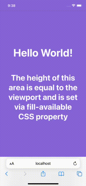
And, when you rotate the device, it also updates the height, awesome!
Fixing the 100vh problem with fill-available is indeed straightforward, but I encountered some issues while investigating this solution.
1. HTML type declaration problem
There is a declaration on the page, which will make <code>fill-available in the Chrome browser cannot work properly.

doesn't even work on Android browsers:

So in order to fix this issue one has to remove it from the page Remove the doctype declaration.
2. Vertical padding problem on Safari
is fill-available at min-height (or height) Adding vertical padding to elements (bottom and top) will cause problems on Safari where the height will not be correct.

To fix this, just wrap your content inside another div element and you’re done:
// HTML
<div>
  <div>
    ...
  </div>
</div>

// CSS
.screen {
  background-color: mediumpurple;
  min-height: 100vh;
  min-height: -moz-available;
  min-height: -webkit-fill-available;
  min-height: fill-available;
}
.content {
  color: #fff;
  display: flex;
  flex-direction: column;
  justify-content: center;
  height: 100%;
  padding: 30px;
}3. fill-available cannot be used with calc()
One thing to note is that it cannot be used under the fill-available attribute calc(). Therefore, the following CSS rules will not take effect:
min-height: calc(-webkit-fill-available / 2);
例如,如果需要在元素上有一半的可用高度,必须使用JavaScript。
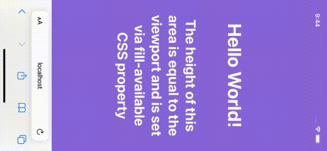
使用JavaScript修复移动设备上的100vh问题
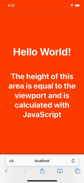
可以使用 window 的 innerHeight 属性,将元素 height (或minHeight)设置为window.innerHeight,如下所示:
nbsp;html>
<style>
...
</style>
<div>
<h1 id="Hello-World">Hello World!</h1>
<h2 id="The-height-of-this-area-is-equal-to">The height of this area is equal to...</h2>
</div>
...
<script>
(function () {
const el = document.getElementById('intro');
el.style.minHeight = window.innerHeight + 'px';
})();
</script>
效果:
接着,再介绍一种花销的方式。 一些开发者喜欢根据窗口的内部高度定义一个CSS变量,并使用该变量来设计他们所需的元素。代码如下:
// 以像素为单位计算1vh值
// 基于窗口的内部高度
var vh = window.innerHeight * 0.01;

//  将CSS变量设置为根元素
// 相当于1vh
document.documentElement.style.setProperty('--vh', vh + 'px');在 CSS 中:
min-height: calc(var(--vh) * 100);
最后一件事是当窗口被调整大小或设备方向改变时,重新计算这个值:
function calculateVh() {
  var vh = window.innerHeight * 0.01;
  document.documentElement.style.setProperty('--vh', vh + 'px');
}

// 初始计算
calculateVh();

// 调整大小时重新计算
window.addEventListener('resize', calculateVh);

// 在设备方向改变时重新计算
window.addEventListener('orientationchange', calculateVh);在我看来,你应该先用CSS的解决方案。
The above is the detailed content of Let's talk about why you shouldn't rely on CSS 100vh?. For more information, please follow other related articles on the PHP Chinese website!

Hot AI Tools

Undresser.AI Undress
AI-powered app for creating realistic nude photos

AI Clothes Remover
Online AI tool for removing clothes from photos.

Undress AI Tool
Undress images for free

Clothoff.io
AI clothes remover

Video Face Swap
Swap faces in any video effortlessly with our completely free AI face swap tool!

Hot Article
Hot Tools

Notepad++7.3.1
Easy-to-use and free code editor

SublimeText3 Chinese version
Chinese version, very easy to use

Zend Studio 13.0.1
Powerful PHP integrated development environment

Dreamweaver CS6
Visual web development tools

SublimeText3 Mac version
God-level code editing software (SublimeText3)
Hot Topics


 How to use bootstrap in vue
Apr 07, 2025 pm 11:33 PM
How to use bootstrap in vue
Apr 07, 2025 pm 11:33 PM
Using Bootstrap in Vue.js is divided into five steps: Install Bootstrap. Import Bootstrap in main.js. Use the Bootstrap component directly in the template. Optional: Custom style. Optional: Use plug-ins.
 The Roles of HTML, CSS, and JavaScript: Core Responsibilities
Apr 08, 2025 pm 07:05 PM
The Roles of HTML, CSS, and JavaScript: Core Responsibilities
Apr 08, 2025 pm 07:05 PM
HTML defines the web structure, CSS is responsible for style and layout, and JavaScript gives dynamic interaction. The three perform their duties in web development and jointly build a colorful website.
 Understanding HTML, CSS, and JavaScript: A Beginner's Guide
Apr 12, 2025 am 12:02 AM
Understanding HTML, CSS, and JavaScript: A Beginner's Guide
Apr 12, 2025 am 12:02 AM
WebdevelopmentreliesonHTML,CSS,andJavaScript:1)HTMLstructurescontent,2)CSSstylesit,and3)JavaScriptaddsinteractivity,formingthebasisofmodernwebexperiences.
 How to set up the framework for bootstrap
Apr 07, 2025 pm 03:27 PM
How to set up the framework for bootstrap
Apr 07, 2025 pm 03:27 PM
To set up the Bootstrap framework, you need to follow these steps: 1. Reference the Bootstrap file via CDN; 2. Download and host the file on your own server; 3. Include the Bootstrap file in HTML; 4. Compile Sass/Less as needed; 5. Import a custom file (optional). Once setup is complete, you can use Bootstrap's grid systems, components, and styles to create responsive websites and applications.
 How to write split lines on bootstrap
Apr 07, 2025 pm 03:12 PM
How to write split lines on bootstrap
Apr 07, 2025 pm 03:12 PM
There are two ways to create a Bootstrap split line: using the tag, which creates a horizontal split line. Use the CSS border property to create custom style split lines.
 How to insert pictures on bootstrap
Apr 07, 2025 pm 03:30 PM
How to insert pictures on bootstrap
Apr 07, 2025 pm 03:30 PM
There are several ways to insert images in Bootstrap: insert images directly, using the HTML img tag. With the Bootstrap image component, you can provide responsive images and more styles. Set the image size, use the img-fluid class to make the image adaptable. Set the border, using the img-bordered class. Set the rounded corners and use the img-rounded class. Set the shadow, use the shadow class. Resize and position the image, using CSS style. Using the background image, use the background-image CSS property.
 How to use bootstrap button
Apr 07, 2025 pm 03:09 PM
How to use bootstrap button
Apr 07, 2025 pm 03:09 PM
How to use the Bootstrap button? Introduce Bootstrap CSS to create button elements and add Bootstrap button class to add button text
 How to resize bootstrap
Apr 07, 2025 pm 03:18 PM
How to resize bootstrap
Apr 07, 2025 pm 03:18 PM
To adjust the size of elements in Bootstrap, you can use the dimension class, which includes: adjusting width: .col-, .w-, .mw-adjust height: .h-, .min-h-, .max-h-
