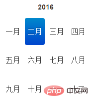
What is the usage of bootstrap-datepicker
In bootstrap, "bootstrap-datepicker" is used to set calendar and time styles. It is a time selection plug-in. The syntax is "element object.datepicker({attribute: attribute value,...})" ;The time display style can be set through different attributes.

The operating environment of this tutorial: Windows 10 system, bootstrap version 3.3.7, DELL G3 computer
What is the usage of bootstrap-datepicker
bootstrap-datepicker is a time selection plug-in, but the default displayed text format is English, so the Chinese package must be introduced first
<script type="text/javascript" src="bootstrap-datetimepicker-master/js/bootstrap-datetimepicker.js"></script> <script type="text/javascript" src='bootstrap-datetimepicker-master/js/locales/bootstrap-datetimepicker.zh-CN.js'></script> <script>
A brief introduction to some basic properties of bootstrap-datepicker
$(function(){
         $('#datetimepicker').datetimepicker({
           language:"zh-CN",    //语言选择中文
           format:"yyyy-mm",    //格式化日期
           timepicker:true,     //关闭时间选项
           yearEnd:2050,        //设置最大年份
           todayButton:false    //关闭选择今天按钮
           autoclose: 1,        //选择完日期后,弹出框自动关闭
           startView:3,         //打开弹出框时,显示到什么格式,3代表月
           minView: 3,          //能选择到的最小日期格式
});Give two simple cases
Only display the year and month
$('#datetimepicker').datetimepicker({
         language:"zh-CN",
         format:'yyyy-mm',
         autoclose: 1,
         startView:3,
         minView: 3,
       });
Display the year, month and day
            language:  'zh-CN',
            minView:2,
            autoclose: 1,
            startView:3,
            format:'yyyy-mm-dd',
Note: There may be a problem with the style of the calendar selection
There are no button images on the left and right sides

This should be a bootstrap version problem , it will be displayed in version 2, but will not be displayed in version 3. At this time, adding the form-control class name to the input can solve the problem
Option example:
weekStart
Integer. Default value: 0
The day on which the week starts. 0 (Sunday) to 6 (Saturday)
startDate
Date. Default value: Start time
endDate
Date. Default value: end time
autoclose
Boolean. Default value: false
Whether to close immediately after selecting a date This datetime picker.
startView
Number, String. Default value: 2, 'month'
The view that is first displayed after the date and time picker is opened. Acceptable values:
0 or 'hour' for hour view
1 or 'day' for day view
2 or 'month' is the month view (default value)
3 or 'year' is the year view
4 or 'decade' is ten-year view
todayBtn
Boolean, "linked". Default value: false
If this value is true or "linked", a "Today" button will be displayed at the bottom of the date and time picker component to select the current date. If true, the "Today" button only switches the view to today's date. If "linked", today's date will be selected.
todayHighlight
Boolean. Default value: false
If true, highlight the current date.
Related recommendations: bootstrap tutorial
The above is the detailed content of What is the usage of bootstrap-datepicker. For more information, please follow other related articles on the PHP Chinese website!

Hot AI Tools

Undresser.AI Undress
AI-powered app for creating realistic nude photos

AI Clothes Remover
Online AI tool for removing clothes from photos.

Undress AI Tool
Undress images for free

Clothoff.io
AI clothes remover

Video Face Swap
Swap faces in any video effortlessly with our completely free AI face swap tool!

Hot Article

Hot Tools

Notepad++7.3.1
Easy-to-use and free code editor

SublimeText3 Chinese version
Chinese version, very easy to use

Zend Studio 13.0.1
Powerful PHP integrated development environment

Dreamweaver CS6
Visual web development tools

SublimeText3 Mac version
God-level code editing software (SublimeText3)

Hot Topics
 1659
1659
 14
14
 1415
1415
 52
52
 1309
1309
 25
25
 1257
1257
 29
29
 1231
1231
 24
24
 How to get the bootstrap search bar
Apr 07, 2025 pm 03:33 PM
How to use Bootstrap to get the value of the search bar: Determines the ID or name of the search bar. Use JavaScript to get DOM elements. Gets the value of the element. Perform the required actions.
 How to use bootstrap in vue
Apr 07, 2025 pm 11:33 PM
Using Bootstrap in Vue.js is divided into five steps: Install Bootstrap. Import Bootstrap in main.js. Use the Bootstrap component directly in the template. Optional: Custom style. Optional: Use plug-ins.
 How to do vertical centering of bootstrap
Apr 07, 2025 pm 03:21 PM
Use Bootstrap to implement vertical centering: flexbox method: Use the d-flex, justify-content-center, and align-items-center classes to place elements in the flexbox container. align-items-center class method: For browsers that do not support flexbox, use the align-items-center class, provided that the parent element has a defined height.
 How to insert pictures on bootstrap
Apr 07, 2025 pm 03:30 PM
There are several ways to insert images in Bootstrap: insert images directly, using the HTML img tag. With the Bootstrap image component, you can provide responsive images and more styles. Set the image size, use the img-fluid class to make the image adaptable. Set the border, using the img-bordered class. Set the rounded corners and use the img-rounded class. Set the shadow, use the shadow class. Resize and position the image, using CSS style. Using the background image, use the background-image CSS property.
 How to write split lines on bootstrap
Apr 07, 2025 pm 03:12 PM
There are two ways to create a Bootstrap split line: using the tag, which creates a horizontal split line. Use the CSS border property to create custom style split lines.
 How to set up the framework for bootstrap
Apr 07, 2025 pm 03:27 PM
To set up the Bootstrap framework, you need to follow these steps: 1. Reference the Bootstrap file via CDN; 2. Download and host the file on your own server; 3. Include the Bootstrap file in HTML; 4. Compile Sass/Less as needed; 5. Import a custom file (optional). Once setup is complete, you can use Bootstrap's grid systems, components, and styles to create responsive websites and applications.
 How to resize bootstrap
Apr 07, 2025 pm 03:18 PM
To adjust the size of elements in Bootstrap, you can use the dimension class, which includes: adjusting width: .col-, .w-, .mw-adjust height: .h-, .min-h-, .max-h-
 How to use bootstrap button
Apr 07, 2025 pm 03:09 PM
How to use the Bootstrap button? Introduce Bootstrap CSS to create button elements and add Bootstrap button class to add button text


