

what is bootstrap panel

In bootstrap, panel refers to the "panel" component, which is used to insert DOM components into a box; to create this component, just add "panel" and "panel-xxx" styles to the div element That's it, a text display block with a border will be generated, and the "panel-xxx" style is used to set the theme color.
The operating environment of this tutorial: Windows7 system, bootsrap3.3.7 version, DELL G3 computer
1, panel
Panel (Panels) is a new component of the Bootstrap framework. Its main function is to handle some functions that cannot be completed by other components. There are also different source codes in different versions:
☑ Less version: The corresponding source code file is panels.less
☑ Sass version : The corresponding source code file is _panels.scss
☑ The compiled Bootstrap: Corresponding to the bootstrap.css file Line 4995 ~ Line 5302
2. Panel – Basic Panel
The basic panel is very simple. It is a div container that uses the "panel" style to generate a A text display block with a border. Since "panel" does not control the theme color, a color-controlling theme "panel-default" is added on the basis of "panel", and inside Added a "dpanel-body" style div to place the main content of the panel:
<div>
    <div>我是一个基础面板,带有默认主题样式风格</div>
</div>
The running effect is as follows: 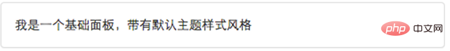
Principle analysis:
"panel"Mainly make certain settings for the border, spacing and rounded corners:
/bootstrap.cssFileLine 4995~ Line 5005/
.panel {
  margin-bottom: 20px;
  background-color: #fff;
  border: 1px solid transparent;
  border-radius: 4px;
  -webkit-box-shadow: 0 1px 1px rgba(0, 0, 0, .05);
          box-shadow: 0 1px 1px rgba(0, 0, 0, .05);
}
.panel-body {
  padding: 15px;
}3. Panel – panel with head and tail
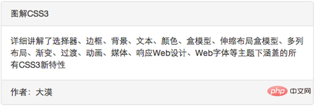
The basic panel looks too simple, BootstrapIn order to enrich the functions of the panel , specially add the "Panel Header" and "Page Footer" effects to the panel:
☑ panel-heading: Used to set the panel header style
☑ panel-footer: Used to set the panel tail style
<div class="panel panel-default">
    <div class="panel-heading">图解CSS3</div>
    <div class="panel-body">…</div>
    <div class="panel-footer">作者:大漠</div>
</div>The operation effect is as follows:
Principle analysis:
panel-heading and panel-footer only have spacing and rounded corners set:
/bootstrap.cssFile No. 5006 Line ~ Line 5030/
.panel-heading {
  padding: 10px 15px;
  border-bottom: 1px solid transparent;
  border-top-left-radius: 3px;
  border-top-right-radius: 3px;
}
.panel-heading > .dropdown .dropdown-toggle {
  color: inherit;
}
.panel-title {
  margin-top: 0;
  margin-bottom: 0;
  font-size: 16px;
  color: inherit;
}
.panel-title > a {
  color: inherit;
}
.panel-footer {
  padding: 10px 15px;
  background-color: #f5f5f5;
  border-top: 1px solid #ddd;
  border-bottom-right-radius: 3px;
  border-bottom-left-radius: 3px;
}4. Panel – Color Panel
In the Basic Panel section, we learned that the panel style does not modify the theme Style setting, and theme style is set through panel-default. In the Bootstrap framework, in addition to the default theme style, the panel component also includes the following theme styles, which constitute a colored panel:
☑ panel-primary :Key blue
☑ panel-success:Success green
☑ panel-info:Information blue
☑ panel-warning:Warning yellow
☑ panel-danger:Danger red
The method of use is very simple, just click on panel# Based on the class name of ##, add the class name you need:
<div class="panel panel-default">
    <div class="panel-heading">图解CSS3</div>
    <div class="panel-body">…</div>
    <div class="panel-footer">作者:大漠</div>
</div>
…
…
…
…
…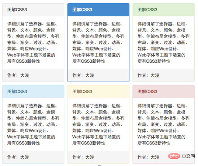 It is not difficult to find from the effect that these styles are just changes The background color, text and border color of the panel are changed: the specific source code can be viewed in
bootstrap.cssfileline 5195~line 5302.
<div class="panel panel-default">
    <div class="panel-heading">图解CSS3</div>
    <div class="panel-body">
        <p>详细讲解了选择器、边框、背景、文本、颜色、盒模型、伸缩布局盒模型、多列布局、渐变、过渡、动画、媒体、响应Web设计、Web字体等主题下涵盖的所有CSS3新特性
        </p>
        <ul class="list-group">
            <li class="list-group-item">我是列表项</li>
            <li class="list-group-item">我是列表项</li>
            <li class="list-group-item">我是列表项</li>
        </ul>
    </div>
    <div class="panel-footer">作者:大漠</div>
</div>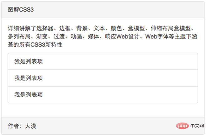 Optimized code:
<div class="panel panel-default">
    <div class="panel-heading">图解CSS3</div>
    <div class="panel-body">…</div>
    <ul class="list-group">
        <li class="list-group-item">我是列表项</li>
        <li class="list-group-item">我是列表项</li>
        <li class="list-group-item">我是列表项</li>
    </ul>
    <div class="panel-footer">作者:大漠</div>
</div>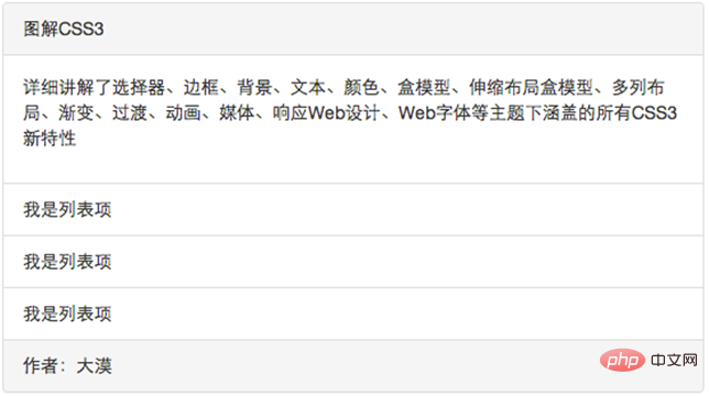 In the same way,
Bootstrap will be nested Certain style optimizations have been made to the list group in the panel. The specific source code can be viewed in bootstrap.css file line 5031 to line 5053.
bootstrap basic tutorial! !
The above is the detailed content of what is bootstrap panel. For more information, please follow other related articles on the PHP Chinese website!

Hot AI Tools

Undresser.AI Undress
AI-powered app for creating realistic nude photos

AI Clothes Remover
Online AI tool for removing clothes from photos.

Undress AI Tool
Undress images for free

Clothoff.io
AI clothes remover

Video Face Swap
Swap faces in any video effortlessly with our completely free AI face swap tool!

Hot Article
Hot Tools

Notepad++7.3.1
Easy-to-use and free code editor

SublimeText3 Chinese version
Chinese version, very easy to use

Zend Studio 13.0.1
Powerful PHP integrated development environment

Dreamweaver CS6
Visual web development tools

SublimeText3 Mac version
God-level code editing software (SublimeText3)
Hot Topics
 1655
1655
 14
1414
52
1307
25
1253
29
1227
24
14
1414
52
1307
25
1253
29
1227
24

 How to use bootstrap in vue
Apr 07, 2025 pm 11:33 PM
How to use bootstrap in vue
Apr 07, 2025 pm 11:33 PM
Using Bootstrap in Vue.js is divided into five steps: Install Bootstrap. Import Bootstrap in main.js. Use the Bootstrap component directly in the template. Optional: Custom style. Optional: Use plug-ins.
 How to get the bootstrap search bar
Apr 07, 2025 pm 03:33 PM
How to get the bootstrap search bar
Apr 07, 2025 pm 03:33 PM
How to use Bootstrap to get the value of the search bar: Determines the ID or name of the search bar. Use JavaScript to get DOM elements. Gets the value of the element. Perform the required actions.
 How to do vertical centering of bootstrap
Apr 07, 2025 pm 03:21 PM
How to do vertical centering of bootstrap
Apr 07, 2025 pm 03:21 PM
Use Bootstrap to implement vertical centering: flexbox method: Use the d-flex, justify-content-center, and align-items-center classes to place elements in the flexbox container. align-items-center class method: For browsers that do not support flexbox, use the align-items-center class, provided that the parent element has a defined height.
 How to write split lines on bootstrap
Apr 07, 2025 pm 03:12 PM
How to write split lines on bootstrap
Apr 07, 2025 pm 03:12 PM
There are two ways to create a Bootstrap split line: using the tag, which creates a horizontal split line. Use the CSS border property to create custom style split lines.
 How to insert pictures on bootstrap
Apr 07, 2025 pm 03:30 PM
How to insert pictures on bootstrap
Apr 07, 2025 pm 03:30 PM
There are several ways to insert images in Bootstrap: insert images directly, using the HTML img tag. With the Bootstrap image component, you can provide responsive images and more styles. Set the image size, use the img-fluid class to make the image adaptable. Set the border, using the img-bordered class. Set the rounded corners and use the img-rounded class. Set the shadow, use the shadow class. Resize and position the image, using CSS style. Using the background image, use the background-image CSS property.
 How to set up the framework for bootstrap
Apr 07, 2025 pm 03:27 PM
How to set up the framework for bootstrap
Apr 07, 2025 pm 03:27 PM
To set up the Bootstrap framework, you need to follow these steps: 1. Reference the Bootstrap file via CDN; 2. Download and host the file on your own server; 3. Include the Bootstrap file in HTML; 4. Compile Sass/Less as needed; 5. Import a custom file (optional). Once setup is complete, you can use Bootstrap's grid systems, components, and styles to create responsive websites and applications.
 How to use bootstrap button
Apr 07, 2025 pm 03:09 PM
How to use bootstrap button
Apr 07, 2025 pm 03:09 PM
How to use the Bootstrap button? Introduce Bootstrap CSS to create button elements and add Bootstrap button class to add button text
 How to resize bootstrap
Apr 07, 2025 pm 03:18 PM
How to resize bootstrap
Apr 07, 2025 pm 03:18 PM
To adjust the size of elements in Bootstrap, you can use the dimension class, which includes: adjusting width: .col-, .w-, .mw-adjust height: .h-, .min-h-, .max-h-
