

What does box-shadow mean in css3

In CSS3, "box-shadow" means "box shadow", which is a new attribute that adds border shadow to elements; this attribute can add one or more shadows to the box, the syntax "box -shadow: horizontal shadow vertical shadow blur distance size color inset;".
The operating environment of this tutorial: Windows 7 system, CSS3&&HTML5 version, Dell G3 computer.

In CSS3, "box-shadow" means "box shadow", which is a new attribute that adds border shadow to elements.

# The box-shadow property adds one or more shadows to the box.
Note: Use border-image-* attributes to construct beautiful scalable buttons!
Syntax:
box-shadow: h-shadow v-shadow blur spread color inset;
box-shadow Adds one or more shadows to the box. This property is a comma-separated list of shadows, each specified by 2-4 length values, an optional color value, and the optional inset keyword. The value for omitted length is 0.
h-shadow Required. The position of the horizontal shadow. Negative values are allowed.
v-shadow Required. The position of the vertical shadow. Negative values are allowed.
blur Optional. Fuzzy distance.
spread Optional. The size of the shadow.
color Optional. The color of the shadow. See CSS color values.
inset Optional. Change the outer shadow (outset) to an inner shadow.
The following are a few small tests I did for everyone:
<!DOCTYPE html>
<html>
<head>
<meta charset="utf-8">
<style>
div
{
	width:300px;
	height:100px;
	background-color:yellow;
	box-shadow: 10px 10px 5px #888888;
}
</style>
</head>
<body>

<div></div>

</body>
</html>Running results:
We also practiced Learn how to create "polaroid" photos and rotate pictures. For example:
<!DOCTYPE html>
<html>
<head>
<meta charset="utf-8">
<style>
body
{
	margin:30px;
	background-color:#E9E9E9;
}

div.polaroid
{
	width:294px;
	padding:10px 10px 20px 10px;
	border:1px solid #BFBFBF;
	background-color:white;
	/* Add box-shadow */
	box-shadow:2px 2px 3px #aaaaaa;
}

div.rotate_left
{
	float:left;
	-ms-transform:rotate(7deg); /* IE 9 */
	-webkit-transform:rotate(7deg); /* Safari and Chrome */
	transform:rotate(7deg);
}

div.rotate_right
{
	float:left;
	-ms-transform:rotate(-8deg); /* IE 9 */
	-webkit-transform:rotate(-8deg); /* Safari and Chrome */
	transform:rotate(-8deg);
}
</style>
</head>
<body>

<div class="polaroid rotate_left">
<img src="/static/imghw/default1.png"  data-src="pulpitrock.jpg"  class="lazy"   alt=""    style="max-width:90%"  style="max-width:90%">
<p class="caption">The pulpit rock in Lysefjorden, Norway.</p>
</div>

<div class="polaroid rotate_right">
<img src="/static/imghw/default1.png"  data-src="cinqueterre.jpg"  class="lazy"   alt=""    style="max-width:90%"  style="max-width:90%">
<p class="caption">Monterosso al Mare. One of the five villages in Cinque Terre.</p>
</div>


</body>
</html>The running result is as follows:

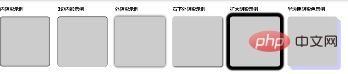
·There are many kinds of box-shadow shadows, such as: inner shadow, outer shadow, three-sided shadow, and two-sided shadow Shadow, single-sided shadow, western stroke...,
means:
 For example:
<div class="flex">
  <div class="flex-item">
    <h3 id="内阴影示例">内阴影示例</h3>
    <div class="box boxshadow1"></div>
  </div>
  <div class="flex-item">
    <h3 id="边内影示例">3边内影示例</h3>
    <div class="box boxshadow2"></div>
  </div>
  <div class="flex-item">
    <h3 id="外阴影示例">外阴影示例</h3>
    <div class="box boxshadow3"></div>
  </div>
  <div class="flex-item">
    <h3 id="右下外阴影示例">右下外阴影示例</h3>
    <div class="box boxshadow4"></div>
  </div>
  <div class="flex-item">
    <h3 id="扩大阴影示例">扩大阴影示例</h3>
    <div class="box boxshadow5"></div>
  </div>
  <div class="flex-item">
    <h3 id="半透明阴影色示例">半透明阴影色示例</h3>
    <div class="box boxshadow6"></div>
  </div>
</div>css:
.flex{display:flex;flex-wrap:wrap;}
.flex-item{margin-right:30px;}

.box {  background-color: #CCCCCC; border-radius:10px; width: 200px; height: 200px;  }
.boxshadow1{ box-shadow:inset 0px 0px 5px 1px #000; }
.boxshadow2{ box-shadow:inset 0 1px 2px 1px #000; }
.boxshadow3{box-shadow:0 0 10px #000;}
.boxshadow4{box-shadow:2px 2px 5px #000;}
.boxshadow5{box-shadow:0 0 5px 15px #000;}
.boxshadow6{box-shadow: 12px 12px 2px 1px rgba(0, 0, 255, .2);}Running results:
(Learning video sharing: css video tutorial, web front-end Getting Started Tutorial)
The above is the detailed content of What does box-shadow mean in css3. For more information, please follow other related articles on the PHP Chinese website!

Hot AI Tools

Undresser.AI Undress
AI-powered app for creating realistic nude photos

AI Clothes Remover
Online AI tool for removing clothes from photos.

Undress AI Tool
Undress images for free

Clothoff.io
AI clothes remover

Video Face Swap
Swap faces in any video effortlessly with our completely free AI face swap tool!

Hot Article
Hot Tools

Notepad++7.3.1
Easy-to-use and free code editor

SublimeText3 Chinese version
Chinese version, very easy to use

Zend Studio 13.0.1
Powerful PHP integrated development environment

Dreamweaver CS6
Visual web development tools

SublimeText3 Mac version
God-level code editing software (SublimeText3)
Hot Topics


 How to achieve wave effect with pure CSS3? (code example)
Jun 28, 2022 pm 01:39 PM
How to achieve wave effect with pure CSS3? (code example)
Jun 28, 2022 pm 01:39 PM
How to achieve wave effect with pure CSS3? This article will introduce to you how to use SVG and CSS animation to create wave effects. I hope it will be helpful to you!
 Use CSS skillfully to realize various strange-shaped buttons (with code)
Jul 19, 2022 am 11:28 AM
Use CSS skillfully to realize various strange-shaped buttons (with code)
Jul 19, 2022 am 11:28 AM
This article will show you how to use CSS to easily realize various weird-shaped buttons that appear frequently. I hope it will be helpful to you!
 How to hide elements in css without taking up space
Jun 01, 2022 pm 07:15 PM
How to hide elements in css without taking up space
Jun 01, 2022 pm 07:15 PM
Two methods: 1. Using the display attribute, just add the "display:none;" style to the element. 2. Use the position and top attributes to set the absolute positioning of the element to hide the element. Just add the "position:absolute;top:-9999px;" style to the element.
 How to implement lace borders in css3
Sep 16, 2022 pm 07:11 PM
How to implement lace borders in css3
Sep 16, 2022 pm 07:11 PM
In CSS, you can use the border-image attribute to achieve a lace border. The border-image attribute can use images to create borders, that is, add a background image to the border. You only need to specify the background image as a lace style; the syntax "border-image: url (image path) offsets the image border width inward. Whether outset is repeated;".
 How to enlarge the image by clicking the mouse in css3
Apr 25, 2022 pm 04:52 PM
How to enlarge the image by clicking the mouse in css3
Apr 25, 2022 pm 04:52 PM
Implementation method: 1. Use the ":active" selector to select the state of the mouse click on the picture; 2. Use the transform attribute and scale() function to achieve the picture magnification effect, the syntax "img:active {transform: scale(x-axis magnification, y Axis magnification);}".
 It turns out that text carousel and image carousel can also be realized using pure CSS!
Jun 10, 2022 pm 01:00 PM
It turns out that text carousel and image carousel can also be realized using pure CSS!
Jun 10, 2022 pm 01:00 PM
How to create text carousel and image carousel? The first thing everyone thinks of is whether to use js. In fact, text carousel and image carousel can also be realized using pure CSS. Let’s take a look at the implementation method. I hope it will be helpful to everyone!
 How to set animation rotation speed in css3
Apr 28, 2022 pm 04:32 PM
How to set animation rotation speed in css3
Apr 28, 2022 pm 04:32 PM
In CSS3, you can use the "animation-timing-function" attribute to set the animation rotation speed. This attribute is used to specify how the animation will complete a cycle and set the speed curve of the animation. The syntax is "element {animation-timing-function: speed attribute value;}".
 Does css3 animation effect have deformation?
Apr 28, 2022 pm 02:20 PM
Does css3 animation effect have deformation?
Apr 28, 2022 pm 02:20 PM
The animation effect in css3 has deformation; you can use "animation: animation attribute @keyframes ..{..{transform: transformation attribute}}" to achieve deformation animation effect. The animation attribute is used to set the animation style, and the transform attribute is used to set the deformation style. .
