

Is transform a new attribute in css3?

Transform is a new attribute of CSS3. It is used to set the shape change of elements and realize 2D or 3D conversion of elements. It can be used with the attribute value (transformation function) to rotate, skew, and scale the elements. scale, move translate and matrix deformation matrix.
The operating environment of this tutorial: Windows 7 system, CSS3&&HTML5 version, Dell G3 computer.
Transform literally means transformation, which means change. It is a new attribute of CSS3, which is used to set the shape change of elements and realize 2D or 3D transformation of elements.
Transform in CSS3 mainly includes the following types: rotation rotate, distortion skew, scaling scale and mobile translate and matrix transformation matrix.
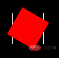
rotate Rotate
Rotate the element by the specified angle. The degree is positive and clockwise. If the set value is a positive number, it means clockwise. Rotation, if the set value is negative, it means counterclockwise rotation.
Example:
<!DOCTYPE html>
<html>
<head>
    <meta charset="UTF-8">
    <meta name="viewport" content="width=device-width, initial-scale=1.0">
    <title>Document</title>
</head>
<style>
    body{
        background-color: #000;
    }
   .box{
        width: 100px;
        height: 100px;
        border: 1px solid #fff;
        position: relative;
        top: 100px;
        left: 100px;

    }
    .box1{
        width: 100px;
        height: 100px;
        background-color: red;
        transform:rotate(30deg);
    }
</style>
<body>
    <div>
        <div></div>
    </div>


</body>
</html> Effect:
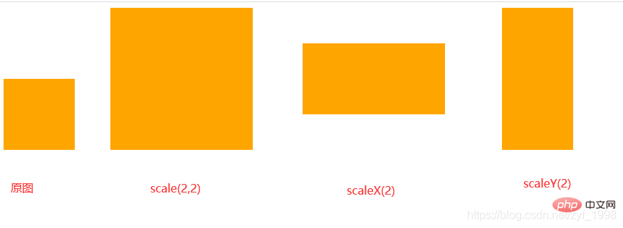
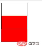
##scale scaling
scale has three situations:scale(x,y)
Make the element scale horizontally and vertically at the same timescaleX(x)
The element only scales horizontally (X-axis scaling)scaleY(y)
The element scales only vertically (Y-axis scaling)
.box{
	transfrom:scale(2,2)
}
.box{
	transfrom:scaleX(2)
}
.box{
	transfrom:scaleY(2)
} ##translate Mobile
Mobile translate is divided into three types Situation:
- translate(x,y)
Move horizontally and vertically at the same time (that is, the X-axis and Y-axis move at the same time);
- translateX(x)
Only moves in the horizontal direction (X-axis movement);
- translateY(Y)
Only Vertical movement (Y-axis movement)
##translate(x,y)
.box{
	transfrom:translate(100px,20px);
}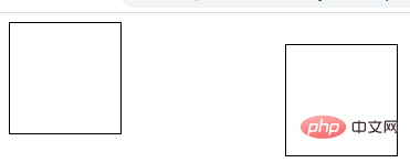 transform:translateX()
.box{
        transform:translateX(100px);
}transform:translateY()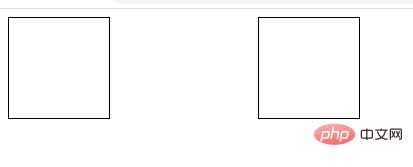
.box{
		transform:translateY(100px);
} skew distortion
skew is also divided into three situations
- make the element in Distort horizontally and vertically at the same time (the X-axis and Y-axis are distorted according to a certain angle value at the same time);
skewX(x) only makes the element horizontal Directional distortion (X-axis distortion);
skewY(y) Only causes the element to distort in the vertical direction (Y-axis distortion)
web front-end introductory tutorial<div class="code" style="position:relative; padding:0px; margin:0px;"><pre class='brush:php;toolbar:false;'>.box{ transform:skew(20deg,20deg); } .box{ transform:skewX(20deg); } .box{ transform:skewY(20deg); }</pre><div class="contentsignin">Copy after login</div></div><p><img src="/static/imghw/default1.png" data-src="https://img.php.cn/upload/article/000/000/024/bda93f90d65524aca18da029630c91c3-5.png" class="lazy" alt="Is transform a new attribute in css3?"><br><img src="/static/imghw/default1.png" data-src="https://img.php.cn/upload/article/000/000/024/029181c8c16c53d0d77d1427b19d506e-6.png" class="lazy" alt="Is transform a new attribute in css3?">transform-origin Change the element base point<br><img src="/static/imghw/default1.png" data-src="https://img.php.cn/upload/article/000/000/024/029181c8c16c53d0d77d1427b19d506e-7.png" class="lazy" alt="Is transform a new attribute in css3?"> <br>transform-origin(X ,Y)<strong>: Used to set the base point (reference point) of the element's movement. The default point is the center point of the element. The values of X and Y can be percentage values, em, and px, and X can also be character parameter values left, center, and right; Y, like X, can also set character values top, center, and bottom in addition to percentage values. </strong><br> (Learning video sharing: <code>css video tutorial,The above is the detailed content of Is transform a new attribute in css3?. For more information, please follow other related articles on the PHP Chinese website!

Hot AI Tools

Undresser.AI Undress
AI-powered app for creating realistic nude photos

AI Clothes Remover
Online AI tool for removing clothes from photos.

Undress AI Tool
Undress images for free

Clothoff.io
AI clothes remover

Video Face Swap
Swap faces in any video effortlessly with our completely free AI face swap tool!

Hot Article
Hot Tools

Notepad++7.3.1
Easy-to-use and free code editor

SublimeText3 Chinese version
Chinese version, very easy to use

Zend Studio 13.0.1
Powerful PHP integrated development environment

Dreamweaver CS6
Visual web development tools

SublimeText3 Mac version
God-level code editing software (SublimeText3)
Hot Topics


 How to achieve wave effect with pure CSS3? (code example)
Jun 28, 2022 pm 01:39 PM
How to achieve wave effect with pure CSS3? (code example)
Jun 28, 2022 pm 01:39 PM
How to achieve wave effect with pure CSS3? This article will introduce to you how to use SVG and CSS animation to create wave effects. I hope it will be helpful to you!
 How to use CSS to achieve the rotating background animation effect of elements
Nov 21, 2023 am 09:05 AM
How to use CSS to achieve the rotating background animation effect of elements
Nov 21, 2023 am 09:05 AM
How to use CSS to implement rotating background image animation effects of elements. Background image animation effects can increase the visual appeal and user experience of web pages. This article will introduce how to use CSS to achieve the rotating background animation effect of elements, and provide specific code examples. First, we need to prepare a background image, which can be any picture you like, such as a picture of the sun or an electric fan. Save the image and name it "bg.png". Next, create an HTML file and add a div element in the file, setting it to
 Use CSS skillfully to realize various strange-shaped buttons (with code)
Jul 19, 2022 am 11:28 AM
Use CSS skillfully to realize various strange-shaped buttons (with code)
Jul 19, 2022 am 11:28 AM
This article will show you how to use CSS to easily realize various weird-shaped buttons that appear frequently. I hope it will be helpful to you!
 How to hide elements in css without taking up space
Jun 01, 2022 pm 07:15 PM
How to hide elements in css without taking up space
Jun 01, 2022 pm 07:15 PM
Two methods: 1. Using the display attribute, just add the "display:none;" style to the element. 2. Use the position and top attributes to set the absolute positioning of the element to hide the element. Just add the "position:absolute;top:-9999px;" style to the element.
 How to implement lace borders in css3
Sep 16, 2022 pm 07:11 PM
How to implement lace borders in css3
Sep 16, 2022 pm 07:11 PM
In CSS, you can use the border-image attribute to achieve a lace border. The border-image attribute can use images to create borders, that is, add a background image to the border. You only need to specify the background image as a lace style; the syntax "border-image: url (image path) offsets the image border width inward. Whether outset is repeated;".
 How to enlarge the image by clicking the mouse in css3
Apr 25, 2022 pm 04:52 PM
How to enlarge the image by clicking the mouse in css3
Apr 25, 2022 pm 04:52 PM
Implementation method: 1. Use the ":active" selector to select the state of the mouse click on the picture; 2. Use the transform attribute and scale() function to achieve the picture magnification effect, the syntax "img:active {transform: scale(x-axis magnification, y Axis magnification);}".
 It turns out that text carousel and image carousel can also be realized using pure CSS!
Jun 10, 2022 pm 01:00 PM
It turns out that text carousel and image carousel can also be realized using pure CSS!
Jun 10, 2022 pm 01:00 PM
How to create text carousel and image carousel? The first thing everyone thinks of is whether to use js. In fact, text carousel and image carousel can also be realized using pure CSS. Let’s take a look at the implementation method. I hope it will be helpful to everyone!
 How to set animation rotation speed in css3
Apr 28, 2022 pm 04:32 PM
How to set animation rotation speed in css3
Apr 28, 2022 pm 04:32 PM
In CSS3, you can use the "animation-timing-function" attribute to set the animation rotation speed. This attribute is used to specify how the animation will complete a cycle and set the speed curve of the animation. The syntax is "element {animation-timing-function: speed attribute value;}".
