

Let's talk about CSS floating layout and document flow

This article brings you relevant knowledge about floating layout and document flow in CSS, including normal document flow and out of document flow. I hope it will be helpful to everyone.
Introduction to document flow
What is "document flow"? Simply put, it refers to the order in which elements appear on the page. It can be divided into "normal document flow" and "detached document flow".
1. Normal document flow
Normal document flow, also known as "normal document flow" or "normal flow", is what the W3C standard calls "normal flow". The simple definition of normal document flow is: "Normal document flow divides a page into rows and rows from top to bottom, in which block elements occupy one row, and elements in adjacent rows are arranged from left to right in each row until the row is Full." That is, normal document flow refers to the layout of page elements by default.
For example, p, p, and hr are all block elements, so they occupy one line. Span, i, and img are all inline elements, so if two inline elements are adjacent, they will be on the same line and arranged from left to right.
2. Detaching from the document flow
Departing from the document flow refers to breaking away from the normal document flow. If you want to change the normal document flow, you can use two methods: floating and positioning.
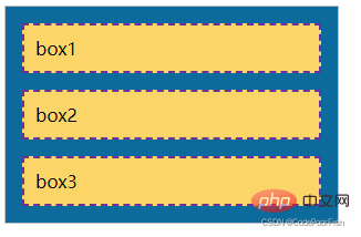
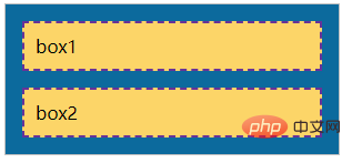
Normal document flow effect:
nbsp;html>
    <meta>
    <meta>
    <meta>
    <title>正常文档流</title>
    <style>
        /* 定义父元素样式 */
        .father{
            width: 300px;
            background-color: #0c6a9d;
            border: 1px solid silver;
        }

        /* 定义子元素样式 */
        .father p{
            padding: 10px;
            margin: 15px;
            border: 2px dashed rebeccapurple;
            background-color: #fcd568;
        }
    </style>
    <p>
        </p><p>box1</p>
        <p>box2</p>
        <p>box3</p>
The effect after setting the float:
When we are the second . When three p elements are set to left float: Under normal document flow, p is a block element and will occupy one line. However, due to the floating settings, the second and three p elements are in parallel and run outside the parent element, which is different from the normal document flow. That is, setting it to float takes the element out of the normal document flow. 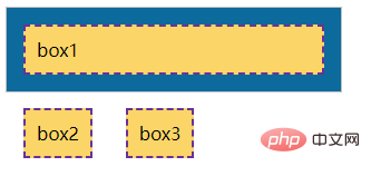
The effect after setting the positioning:
When we set absolute positioning for the third p element: Due to the positioning, the third p element runs to above the parent element. In other words, setting the positioning takes the element out of the document flow. 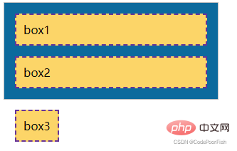
Floating
In the traditional printing layout, the text can be wrapped around the picture according to actual needs. We generally call this method "text wrapping". In front-end development, using floating page elements is actually like a picture surrounded by text in a typographic layout. This metaphor is easy to understand. Floating is the best tool for CSS layout. We can flexibly position page elements through floating to achieve the purpose of laying out web pages. For example, we can set the float attribute to make an element float to the left or right, so that surrounding elements or text can wrap around the element.
The float attribute has only two values: 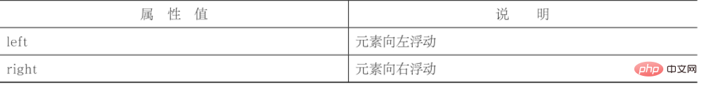
We use the above example again:
nbsp;html>
    <meta>
    <meta>
    <meta>
    <title>正常文档流</title>
    <style>
        /* 定义父元素样式 */
        .father{
            width: 300px;
            background-color: #0c6a9d;
            border: 1px solid silver;
        }

        /* 定义子元素样式 */
        .father p{
            padding: 10px;
            margin: 15px;
            border: 2px dashed rebeccapurple;
            background-color: #fcd568;
        }
    </style>
    <p>
        </p><p>box1</p>
        <p>box2</p>
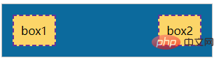
Next we respectively Add left float to box1 and right float to box2:
.son1{float: left;}
.son2{float: right;}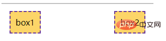
It can be seen from the above example that floating will affect surrounding elements and cause many unexpected problems. In CSS, we can use the clear attribute to clear the effects of floating.
The value of the clear attribute is as follows: 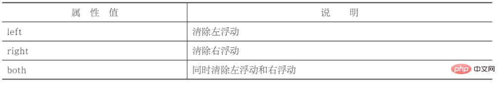
In actual development, we almost never use "clear:left;" or "clear:right;" to individually clear the left floating or For right floats, "clear:both;" is often used directly to clear all floats. Based on the above example, we clear the float:
nbsp;html>
    <meta>
    <meta>
    <meta>
    <title>清除浮动</title>
    <style>
        /* 定义父元素样式 */
        .father{
            width: 300px;
            background-color: #0c6a9d;
            border: 1px solid silver;
        }

        /* 定义子元素样式 */
        .father p{
            padding: 10px;
            margin: 15px;
            border: 2px dashed rebeccapurple;
            background-color: #fcd568;
        }
        .son1{float: left;}
        .son2{float: right;}
        .son3{clear: both; display: block;}
    </style>
    <p>
        </p><p>box1</p>
        <p>box2</p>
        <span></span>
We usually add an empty element after the floating element, and then define clear:both; for this empty element. Clear float. In actual development, if you find something wrong after using floats, first check whether the floats have been cleared. In fact, clearing floats is not only clear:both;, but also overflow:hidden, and the more commonly used pseudo-elements.
(Learning video sharing: css video tutorial)
The above is the detailed content of Let's talk about CSS floating layout and document flow. For more information, please follow other related articles on the PHP Chinese website!

Hot AI Tools

Undresser.AI Undress
AI-powered app for creating realistic nude photos

AI Clothes Remover
Online AI tool for removing clothes from photos.

Undress AI Tool
Undress images for free

Clothoff.io
AI clothes remover

Video Face Swap
Swap faces in any video effortlessly with our completely free AI face swap tool!

Hot Article
Hot Tools

Notepad++7.3.1
Easy-to-use and free code editor

SublimeText3 Chinese version
Chinese version, very easy to use

Zend Studio 13.0.1
Powerful PHP integrated development environment

Dreamweaver CS6
Visual web development tools

SublimeText3 Mac version
God-level code editing software (SublimeText3)
Hot Topics


 How to use bootstrap in vue
Apr 07, 2025 pm 11:33 PM
How to use bootstrap in vue
Apr 07, 2025 pm 11:33 PM
Using Bootstrap in Vue.js is divided into five steps: Install Bootstrap. Import Bootstrap in main.js. Use the Bootstrap component directly in the template. Optional: Custom style. Optional: Use plug-ins.
 The Roles of HTML, CSS, and JavaScript: Core Responsibilities
Apr 08, 2025 pm 07:05 PM
The Roles of HTML, CSS, and JavaScript: Core Responsibilities
Apr 08, 2025 pm 07:05 PM
HTML defines the web structure, CSS is responsible for style and layout, and JavaScript gives dynamic interaction. The three perform their duties in web development and jointly build a colorful website.
 Understanding HTML, CSS, and JavaScript: A Beginner's Guide
Apr 12, 2025 am 12:02 AM
Understanding HTML, CSS, and JavaScript: A Beginner's Guide
Apr 12, 2025 am 12:02 AM
WebdevelopmentreliesonHTML,CSS,andJavaScript:1)HTMLstructurescontent,2)CSSstylesit,and3)JavaScriptaddsinteractivity,formingthebasisofmodernwebexperiences.
 How to write split lines on bootstrap
Apr 07, 2025 pm 03:12 PM
How to write split lines on bootstrap
Apr 07, 2025 pm 03:12 PM
There are two ways to create a Bootstrap split line: using the tag, which creates a horizontal split line. Use the CSS border property to create custom style split lines.
 How to set up the framework for bootstrap
Apr 07, 2025 pm 03:27 PM
How to set up the framework for bootstrap
Apr 07, 2025 pm 03:27 PM
To set up the Bootstrap framework, you need to follow these steps: 1. Reference the Bootstrap file via CDN; 2. Download and host the file on your own server; 3. Include the Bootstrap file in HTML; 4. Compile Sass/Less as needed; 5. Import a custom file (optional). Once setup is complete, you can use Bootstrap's grid systems, components, and styles to create responsive websites and applications.
 How to insert pictures on bootstrap
Apr 07, 2025 pm 03:30 PM
How to insert pictures on bootstrap
Apr 07, 2025 pm 03:30 PM
There are several ways to insert images in Bootstrap: insert images directly, using the HTML img tag. With the Bootstrap image component, you can provide responsive images and more styles. Set the image size, use the img-fluid class to make the image adaptable. Set the border, using the img-bordered class. Set the rounded corners and use the img-rounded class. Set the shadow, use the shadow class. Resize and position the image, using CSS style. Using the background image, use the background-image CSS property.
 How to use bootstrap button
Apr 07, 2025 pm 03:09 PM
How to use bootstrap button
Apr 07, 2025 pm 03:09 PM
How to use the Bootstrap button? Introduce Bootstrap CSS to create button elements and add Bootstrap button class to add button text
 How to resize bootstrap
Apr 07, 2025 pm 03:18 PM
How to resize bootstrap
Apr 07, 2025 pm 03:18 PM
To adjust the size of elements in Bootstrap, you can use the dimension class, which includes: adjusting width: .col-, .w-, .mw-adjust height: .h-, .min-h-, .max-h-
