
 Web Front-end
Front-end Q&A
Let's talk about the postcss plug-in's automatic conversion of px to rem
Web Front-end
Front-end Q&A
Let's talk about the postcss plug-in's automatic conversion of px to rem
Let's talk about the postcss plug-in's automatic conversion of px to rem

This article will share with you the relevant knowledge of postcss. Postcss is a tool for converting css through js plug-ins. These plug-ins can support variables and mixing, and can generate compatible styles by appending browser prefixes. I hope everyone has to help.
postcss is a transpiler for css. It is for css just like babel is for js, and can analyze and convert css code. At the same time, it also provides a plug-in mechanism for customized conversion.
In this section, we will introduce the postcss plug-in through a function that automatically converts px to rem.
The principle of postcss
Postcss is a translator from css to css. Like babel, it is divided into three stages: parse, transform, and generate. Various conversion plug-ins work in the transform stage and perform analysis and conversion based on AST.
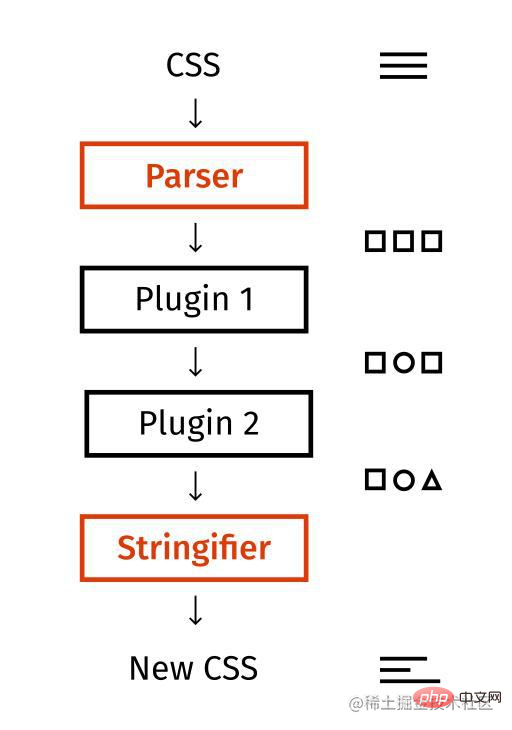
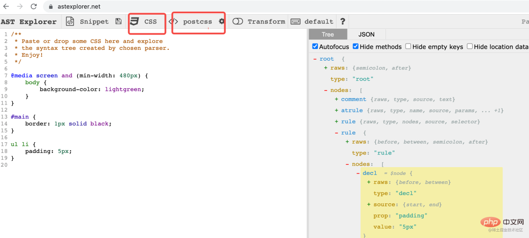
The AST of css is much simpler than that of js. There are mainly the following types:
atrule: Rules starting with @ , for example:
@media screen and (min-width: 480px) {
    body {
        background-color: lightgreen;
    }
}rule: The rule at the beginning of the selector, for example:
ul li {
 padding: 5px;
}decl: The specific style, for example:
padding: 5px;
Is it much simpler than the dozens of ASTs of js parser?
These can be viewed visually through astexplorer.net
How to write the postcss plug-in
The postcss plug-in works in the transform stage and processes ast node, the form of the plug-in is as follows:
const plugin = (options = {}) => {
  return {
    postcssPlugin: '插件名字',

    Rule (node) {},
    Declaration (node) {},
    AtRule (node) {}
  }
}The outer function accepts options, returns a plug-in object, declares the listener for which node to process, and then writes the processing logic in the corresponding listener.
You can also write like this:
module.exports = (opts = {}) => {
  return {
    postcssPlugin: '插件名字',
    prepare (result) {
      // 这里可以放一些公共的逻辑
      return {
        Declaration (node) {},
        Rule (node) {},
        AtRule (node) {}
      }
    }
  }
}Return various listeners in prepare. Compared with the first method, the advantage is that some common logic can be stored.
Then you can run the plug-in like this:
const postcss = require('postcss');

postcss([plugin({
    // options
})]).process('a { font-size: 20px; }').then(result => {
    console.log(result.css);
})Let’s write a simple plug-in that automatically converts px to rem to practice.
Practical case
Requirement description
px is a fixed length unit, and the size of the device viewport is various. We want to use a set of styles to To adapt to the display of various devices, relative units are required, and rem is commonly used.
The essence of rem is proportional scaling, relative to the font-size of the html element.
For example, if the font-size of html is set to 100px, then 1rem is equal to 100px. If the subsequent style is 200px, it will be written as 2rem.
In this way, we only need to modify the font-size of html to adapt to the display of various screen widths, and the specific units will be scaled proportionally.
We need to convert all px to rem according to the font-size value of html. This is usually done manually, but it is more cumbersome. After knowing the calculation method, you can completely use the postcss plug-in Come to do it yourself.
Next we will implement this postcss plug-in
Code implementation
Let’s take a look at the basic structure of the plug-in. We only need to declare the listener for Declaration processing:
const plugin = (options) => {
    return {
        postcssPlugin: 'postcss-simple-px2rem',
        Declaration (decl) {

        }
    }
}The next thing to do is to convert the px in the decl style value to rem. A simple regular replacement will do:
const plugin = (options) => {
    const pxReg = /(\d+)px/ig;
    return {
        postcssPlugin: 'postcss-simple-px2rem',
        Declaration (decl) {
            decl.value = decl.value.replace(pxReg, (matchStr, num) => {
                return num/options.base + 'rem';
            });
        }
    }
}Replacement is done through the replace method of the string. The first parameter is matched. String, the following parameters are groups, and the first group is the value of px.
Calculating the rem corresponding to px requires the px value corresponding to 1rem, which can be passed in through options.
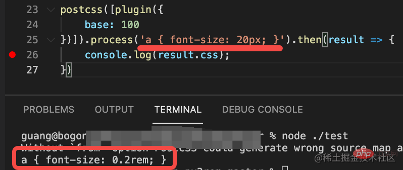
Then we test it:
postcss([plugin({
    base: 100
})]).process('a { font-size: 20px; }').then(result => {
    console.log(result.css);
})You can see that the conversion has been done correctly:
Of course, our plug-in is just The case is not perfect yet, and more complex rules are needed to make it perfect.
Summary
postcss is the transpiler of css, just like babel is the transpiler of js, and the AST of postcss has only a few nodes, which is relatively simple and can also be viewed visually through astexplorer.net .
postcss also provides plug-in functions, which can do some customized analysis and conversion.
We have implemented a simple plug-in that automatically converts px to rem:
rem is a solution to achieve a set of styles to adapt to the display of different device widths through proportional scaling. It requires px The conversion to rem can be done automatically using the postcss plug-in.
In fact, the analysis and conversion functions of the postcss plug-in have many applications. For example, to switch the theme color from white to black, you can use postcss to automatically analyze the color value and then perform conversion.
postcss The ability to analyze and convert CSS is still very powerful and useful. There are many application scenarios in business waiting for you to explore.
(Learning video sharing: css video tutorial)
The above is the detailed content of Let's talk about the postcss plug-in's automatic conversion of px to rem. For more information, please follow other related articles on the PHP Chinese website!

Hot AI Tools

Undresser.AI Undress
AI-powered app for creating realistic nude photos

AI Clothes Remover
Online AI tool for removing clothes from photos.

Undress AI Tool
Undress images for free

Clothoff.io
AI clothes remover

Video Face Swap
Swap faces in any video effortlessly with our completely free AI face swap tool!

Hot Article
Hot Tools

Notepad++7.3.1
Easy-to-use and free code editor

SublimeText3 Chinese version
Chinese version, very easy to use

Zend Studio 13.0.1
Powerful PHP integrated development environment

Dreamweaver CS6
Visual web development tools

SublimeText3 Mac version
God-level code editing software (SublimeText3)
Hot Topics
 1666
1666
 14
1425
52
1328
25
1273
29
1253
24
14
1425
52
1328
25
1273
29
1253
24

 How to use bootstrap in vue
Apr 07, 2025 pm 11:33 PM
How to use bootstrap in vue
Apr 07, 2025 pm 11:33 PM
Using Bootstrap in Vue.js is divided into five steps: Install Bootstrap. Import Bootstrap in main.js. Use the Bootstrap component directly in the template. Optional: Custom style. Optional: Use plug-ins.
 Understanding HTML, CSS, and JavaScript: A Beginner's Guide
Apr 12, 2025 am 12:02 AM
Understanding HTML, CSS, and JavaScript: A Beginner's Guide
Apr 12, 2025 am 12:02 AM
WebdevelopmentreliesonHTML,CSS,andJavaScript:1)HTMLstructurescontent,2)CSSstylesit,and3)JavaScriptaddsinteractivity,formingthebasisofmodernwebexperiences.
 The Roles of HTML, CSS, and JavaScript: Core Responsibilities
Apr 08, 2025 pm 07:05 PM
The Roles of HTML, CSS, and JavaScript: Core Responsibilities
Apr 08, 2025 pm 07:05 PM
HTML defines the web structure, CSS is responsible for style and layout, and JavaScript gives dynamic interaction. The three perform their duties in web development and jointly build a colorful website.
 How to write split lines on bootstrap
Apr 07, 2025 pm 03:12 PM
How to write split lines on bootstrap
Apr 07, 2025 pm 03:12 PM
There are two ways to create a Bootstrap split line: using the tag, which creates a horizontal split line. Use the CSS border property to create custom style split lines.
 How to insert pictures on bootstrap
Apr 07, 2025 pm 03:30 PM
How to insert pictures on bootstrap
Apr 07, 2025 pm 03:30 PM
There are several ways to insert images in Bootstrap: insert images directly, using the HTML img tag. With the Bootstrap image component, you can provide responsive images and more styles. Set the image size, use the img-fluid class to make the image adaptable. Set the border, using the img-bordered class. Set the rounded corners and use the img-rounded class. Set the shadow, use the shadow class. Resize and position the image, using CSS style. Using the background image, use the background-image CSS property.
 How to set up the framework for bootstrap
Apr 07, 2025 pm 03:27 PM
How to set up the framework for bootstrap
Apr 07, 2025 pm 03:27 PM
To set up the Bootstrap framework, you need to follow these steps: 1. Reference the Bootstrap file via CDN; 2. Download and host the file on your own server; 3. Include the Bootstrap file in HTML; 4. Compile Sass/Less as needed; 5. Import a custom file (optional). Once setup is complete, you can use Bootstrap's grid systems, components, and styles to create responsive websites and applications.
 How to resize bootstrap
Apr 07, 2025 pm 03:18 PM
How to resize bootstrap
Apr 07, 2025 pm 03:18 PM
To adjust the size of elements in Bootstrap, you can use the dimension class, which includes: adjusting width: .col-, .w-, .mw-adjust height: .h-, .min-h-, .max-h-
 How to use bootstrap button
Apr 07, 2025 pm 03:09 PM
How to use bootstrap button
Apr 07, 2025 pm 03:09 PM
How to use the Bootstrap button? Introduce Bootstrap CSS to create button elements and add Bootstrap button class to add button text
