
 Web Front-end
CSS Tutorial
In-depth analysis and understanding of the details of positioning and layout in CSS
Web Front-end
CSS Tutorial
In-depth analysis and understanding of the details of positioning and layout in CSS
In-depth analysis and understanding of the details of positioning and layout in CSS

This article brings you relevant knowledge about CSS positioning and layout. Let’s take a look at what relative positioning, absolute positioning and fixed positioning are, the different element properties and uses, and other knowledge. I hope it will be helpful to everyone.
1. Relative positioning
1.1) What is relative positioning
Relative positioning: The box can be adjusted according to its original position (Achieved through position descriptors).
Position descriptors:
left: move to the right; right moves to the left; top moves down; bottom moves up
(When the value inside is a negative number, Move in the opposite direction)
For example:
Original:
<!DOCTYPE html><html lang="en"><head>
    <meta charset="UTF-8">
    <meta http-equiv="X-UA-Compatible" content="IE=edge">
    <meta name="viewport" content="width=device-width, initial-scale=1.0">
    <title>相对定位</title>
    <style>
        * {
            margin: 0;
            padding: 0;
        }

        p {
            width: 500px;
            height: 500px;
            border: 1px solid #000;
            margin: 50px auto;
        }

        p {
            width: 100px;
            height: 100px;
            background-color: lightblue;
            position: relative;
            top: 50px;
            left: 50px;
        }
    </style></head><body>
    <p>
    	<p></p>
</p></body></html>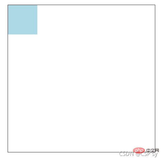 <br/>Set p to relative positioning:
p {
    width: 100px;
    height: 100px;
    background-color: lightblue;
    position: relative;
    top: 50px;
    left: 50px;}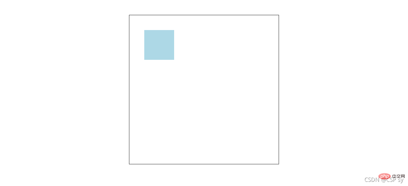
1.2) The nature and use of relative positioning
Properties
- Relatively positioned elements are still essentially In the original position, it will just be rendered in a new place and will not affect other elements of the page.
Purpose
- Used to fine-tune the position of elements
- Relatively positioned boxes can be used as reference boxes for absolute positioning
For example:
<!DOCTYPE html><html lang="en"><head>
    <meta charset="UTF-8">
    <meta http-equiv="X-UA-Compatible" content="IE=edge">
    <meta name="viewport" content="width=device-width, initial-scale=1.0">
    <title>相对定位</title>
    <style>
        * {
            margin: 0;
            padding: 0;
        }

        nav {
            width: 780px;
            height: 50px;
            margin: 40px auto;
        }

        nav ul {
            list-style: none;
        }

        nav ul li {
            float: left;
            width: 156px;
            height: 50px;
            line-height: 50px;
            text-align: center;
        }

        nav ul li a {
            display: block;
            width: 156px;
            height: 50px;
            background-color: lightcyan;
            color: #000;
            text-decoration: none;
        }

        nav ul li a:hover {
            border-top: 3px solid red;
        }
    </style></head><body>
    <nav>
        <ul>
            <li>
                <a href="#">导航一</a>
            </li>
            <li>
                <a href="#">导航二</a>
            </li>
            <li>
                <a href="#">导航三</a>
            </li>
            <li>
                <a href="#">导航四</a>
            </li>
            <li>
                <a href="#">导航五</a>
            </li>
        </ul>
</nav></body></html>The effect at this time is like this: <br/> <br/> You will find that when the mouse is hovering over it, the navigation area will sink. <br/> After we set relative positioning for it and fine-tuned it:
nav ul li a:hover {
    border-top: 3px solid red;
    position: relative;
top: -3px;}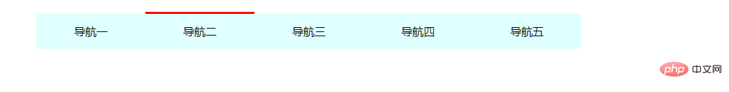 <br/> This will solve the problem just now
2. Absolute positioning
2.1) What is absolute positioning
Absolute positioning: The box describes its position with coordinates and has its own absolute position.
Absolutely positioned reference box: <br/> An absolutely positioned box will use the nearest box with positioning attributes among its ancestor elements as the reference point.
This box is usually positioned relatively, so it is also called "the son must be the father".
Position descriptors: <br/> left: the distance to the left; right: the distance to the right; top: the distance to the top; bottom: the distance to the bottom
For example:
<!DOCTYPE html><html lang="en"><head>
    <meta charset="UTF-8">
    <meta http-equiv="X-UA-Compatible" content="IE=edge">
    <meta name="viewport" content="width=device-width, initial-scale=1.0">
    <title>绝对定位</title>
    <style>
        * {
            margin: 0;
            padding: 0;
        }

        .box {
            position: absolute;
            width: 500px;
            height: 300px;
            left: 200px;
            top: 100px;
            background-color: antiquewhite;
        }
    </style></head><body>
    <p class="box">
</p></body></html>2.2) The nature and use of absolute positioning
The absolutely positioned box is vertically centered:
.box {
	position: absolute;
	top: 50%;
margin-top: -自己高度一半;}The absolutely positioned box is horizontally centered:
.box {
	position: absolute;
	left: 50%;
margin-left: -自己宽度一半;}- Stacking order z-index attribute
Set absolute positioning The stacking order of elements. <br/> is a positive integer without units. A larger value can suppress a smaller value (that is, the larger value is displayed on the upper layer)
For example:
<!DOCTYPE html><html lang="en"><head>
    <meta charset="UTF-8">
    <meta http-equiv="X-UA-Compatible" content="IE=edge">
    <meta name="viewport" content="width=device-width, initial-scale=1.0">
    <title>绝对定位</title>
    <style>
        * {
            margin: 0;
            padding: 0;
        }

        .box1 {
            width: 300px;
            height: 300px;
            position: absolute;
            left: 100px;
            top: 100px;
            background-color: antiquewhite;
        }

        .box2 {
            width: 300px;
            height: 300px;
            position: absolute;
            left: 200px;
            top: 200px;
            background-color: lightblue;
        }
    </style></head><body>
    <p class="box1"></p>
<p class="box2"></p></body></html>The effect at this time is as follows: <br/>
<br/>
At this time we want box1 to be displayed on the upper layer, so we set a z-index attribute. <br/>
.box1 {
    width: 300px;
    height: 300px;
    position: absolute;
    left: 100px;
    top: 100px;
    background-color: antiquewhite;
    z-index: 100;}.box2 {
    width: 300px;
    height: 300px;
    position: absolute;
    left: 200px;
    top: 200px;
    background-color: lightblue;
z-index: 1;}Look at the effect: <br/>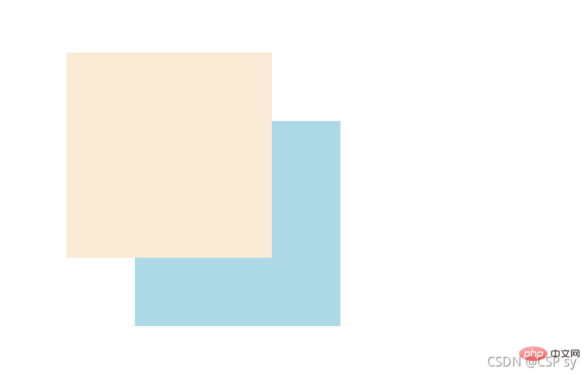
- Usage
Absolute positioning is used to "cover" and "cover" The effect of "hood"<br/> can be used in conjunction with CSS sprites<br/> can be combined with JS to achieve some animations
3. Fixed positioning
3.1) What is fixed positioning
Fixed Positioning: No matter how the page scrolls, it will always take the page as the reference point and be fixed there.
Position descriptors: <br/> left: the distance to the left; right: the distance to the right; top: the distance to the top; bottom: the distance to the bottom
.box {
	position: fixed;
	top: 100px;
left: 100px;}3.2) The nature and use of fixed positioning
can be used to achieve that some elements will always appear in front of the current window. For example, the return to top button when browsing a page will always appear in a certain part of the current page. Position
For example:
<!DOCTYPE html><html lang="en"><head>
    <meta charset="UTF-8">
    <meta http-equiv="X-UA-Compatible" content="IE=edge">
    <meta name="viewport" content="width=device-width, initial-scale=1.0">
    <title>固定定位</title>
    <style>
        * {
            margin: 0;
            padding: 0;
        }

        .box {
            position: fixed;
            bottom: 20px;
            right: 20px;
            width: 40px;
            height: 40px;

            text-align: center;
            line-height: 40px;
            border-radius: 50%;
            background-color: rgba(78, 209, 226, 0.5);

            cursor: pointer;
            font-size: 24px;
        }
    </style></head><body>
    <a class="box">^</a>
    <p>
        <img src="/static/imghw/default1.png"  data-src="https://dummyimage.com/600x400/00bcd4/fff"  class="lazy"   alt="">
    </p>
    <p>
        <img src="/static/imghw/default1.png"  data-src="https://dummyimage.com/600x400/00bcd4/fff"  class="lazy"   alt="">
    </p>
    <p>
        <img src="/static/imghw/default1.png"  data-src="https://dummyimage.com/600x400/00bcd4/fff"  class="lazy"   alt="">
</p></body></html>The effect is as follows:
When the page goes to the bottom, the position of the return to top button in the lower right corner remains unchanged. 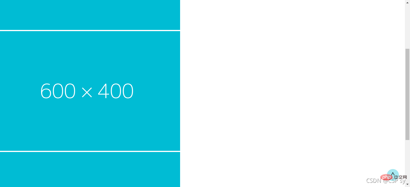
If you are interested, you can continue to visit: css video tutorial.
The above is the detailed content of In-depth analysis and understanding of the details of positioning and layout in CSS. For more information, please follow other related articles on the PHP Chinese website!

Hot AI Tools

Undresser.AI Undress
AI-powered app for creating realistic nude photos

AI Clothes Remover
Online AI tool for removing clothes from photos.

Undress AI Tool
Undress images for free

Clothoff.io
AI clothes remover

Video Face Swap
Swap faces in any video effortlessly with our completely free AI face swap tool!

Hot Article
Hot Tools

Notepad++7.3.1
Easy-to-use and free code editor

SublimeText3 Chinese version
Chinese version, very easy to use

Zend Studio 13.0.1
Powerful PHP integrated development environment

Dreamweaver CS6
Visual web development tools

SublimeText3 Mac version
God-level code editing software (SublimeText3)
Hot Topics


 How to use bootstrap in vue
Apr 07, 2025 pm 11:33 PM
How to use bootstrap in vue
Apr 07, 2025 pm 11:33 PM
Using Bootstrap in Vue.js is divided into five steps: Install Bootstrap. Import Bootstrap in main.js. Use the Bootstrap component directly in the template. Optional: Custom style. Optional: Use plug-ins.
 The Roles of HTML, CSS, and JavaScript: Core Responsibilities
Apr 08, 2025 pm 07:05 PM
The Roles of HTML, CSS, and JavaScript: Core Responsibilities
Apr 08, 2025 pm 07:05 PM
HTML defines the web structure, CSS is responsible for style and layout, and JavaScript gives dynamic interaction. The three perform their duties in web development and jointly build a colorful website.
 Understanding HTML, CSS, and JavaScript: A Beginner's Guide
Apr 12, 2025 am 12:02 AM
Understanding HTML, CSS, and JavaScript: A Beginner's Guide
Apr 12, 2025 am 12:02 AM
WebdevelopmentreliesonHTML,CSS,andJavaScript:1)HTMLstructurescontent,2)CSSstylesit,and3)JavaScriptaddsinteractivity,formingthebasisofmodernwebexperiences.
 How to set up the framework for bootstrap
Apr 07, 2025 pm 03:27 PM
How to set up the framework for bootstrap
Apr 07, 2025 pm 03:27 PM
To set up the Bootstrap framework, you need to follow these steps: 1. Reference the Bootstrap file via CDN; 2. Download and host the file on your own server; 3. Include the Bootstrap file in HTML; 4. Compile Sass/Less as needed; 5. Import a custom file (optional). Once setup is complete, you can use Bootstrap's grid systems, components, and styles to create responsive websites and applications.
 How to write split lines on bootstrap
Apr 07, 2025 pm 03:12 PM
How to write split lines on bootstrap
Apr 07, 2025 pm 03:12 PM
There are two ways to create a Bootstrap split line: using the tag, which creates a horizontal split line. Use the CSS border property to create custom style split lines.
 How to insert pictures on bootstrap
Apr 07, 2025 pm 03:30 PM
How to insert pictures on bootstrap
Apr 07, 2025 pm 03:30 PM
There are several ways to insert images in Bootstrap: insert images directly, using the HTML img tag. With the Bootstrap image component, you can provide responsive images and more styles. Set the image size, use the img-fluid class to make the image adaptable. Set the border, using the img-bordered class. Set the rounded corners and use the img-rounded class. Set the shadow, use the shadow class. Resize and position the image, using CSS style. Using the background image, use the background-image CSS property.
 How to use bootstrap button
Apr 07, 2025 pm 03:09 PM
How to use bootstrap button
Apr 07, 2025 pm 03:09 PM
How to use the Bootstrap button? Introduce Bootstrap CSS to create button elements and add Bootstrap button class to add button text
 How to resize bootstrap
Apr 07, 2025 pm 03:18 PM
How to resize bootstrap
Apr 07, 2025 pm 03:18 PM
To adjust the size of elements in Bootstrap, you can use the dimension class, which includes: adjusting width: .col-, .w-, .mw-adjust height: .h-, .min-h-, .max-h-
