

Does CSS3 support filters?

CSS3 supports a variety of filters. In CSS3, the filter attribute can be used to add filter effects to elements. This attribute has a variety of built-in filter functions: blur() sets the blur filter, brightness() sets the brightness filter, contrast() sets the contrast filter, grayscale() Set grayscale filters, etc.

The operating environment of this tutorial: Windows 7 system, CSS3&&HTML5 version, Dell G3 computer.
css3 supports many kinds of filters. Through the css3 filter filter attribute, we can create a filter effect similar to photoshop. For example, create blur effects, shadow effects, color filter effects, etc. for pictures.
| Filter | Description |
|---|---|
| blur(px) | Set Gaussian blur to the image. The "radius" value sets the standard deviation of the Gaussian function, or how many pixels are blended together on the screen, so the larger the value, the blurr it is; If no value is set, the default is 0; this parameter can Set css length value, but does not accept percentage value. |
| brightness(%) | Applies a linear multiplication to the image, making it appear brighter or darker. If the value is 0%, the image will be completely black. If the value is 100%, there will be no change in the image. Other values correspond to linear multiplier effects. Values above 100% are okay and the image will be brighter than before. If no value is set, the default is 1. |
| contrast(%) | Adjust the contrast of the image. If the value is 0%, the image will be completely black. The value is 100% and the image is unchanged. Values can exceed 100%, meaning a lower comparison will be used. If no value is set, the default is 1. |
| drop-shadow(h-shadow v-shadow blur spread color) |
Sets a shadow effect to the image. Shadows are composited underneath the image and can be blurred, offset versions of the matte that can be painted in a specific color. The function accepts values of type | grayscale(
| Convert the image to grayscale. The value defines the scale of the conversion. If the value is 100%, the image will be completely converted to grayscale, and if the value is 0%, the image will remain unchanged. Values between 0% and 100% are linear multipliers of the effect. If not set, the value defaults to 0; | |
| hue-rotate(deg) | Apply hue rotation to the image. The "angle" value sets the angle of the color circle by which the image will be adjusted. If the value is 0deg, there will be no change in the image. If the value is not set, the default value is 0deg. Although this value does not have a maximum value, a value exceeding 360deg is equivalent to going around again. |
| invert(%) | Invert the input image. The value defines the scale of the conversion. 100% of the value is a complete reversal. A value of 0% means there is no change in the image. Values between 0% and 100% are linear multipliers of the effect. If the value is not set, the value defaults to 0. |
| opacity(%) | Convert the transparency of the image. The value defines the scale of the conversion. A value of 0% means complete transparency, a value of 100% means no change to the image. Values between 0% and 100% are linear multipliers of the effect, equivalent to multiplying the number of image samples. If the value is not set, the value defaults to 1. This function is very similar to the existing opacity attribute, except that through filter, some browsers provide hardware acceleration to improve performance. |
| saturate(%) | Convert image saturation. The value defines the scale of the conversion. A value of 0% means the image is completely desaturated, and a value of 100% means the image has no change. Other values are linear multipliers of the effect. Values above 100% are allowed, with higher saturation. If the value is not set, the value defaults to 1. |
| sepia(%) | Convert the image to sepia. The value defines the scale of the conversion. A value of 100% is completely sepia, and a value of 0% leaves the image unchanged. Values between 0% and 100% are linear multipliers of the effect. If not set, the value defaults to 0; |
| url() |
URL function accepts an XML file, which sets an SVG filter. Mirror, and can contain an anchor point to specify a specific filter element. For example: filter: url(svg-url#element-id) Copy after login |
Usage example
/* 使用SVG filter */
filter: url("filters.svg#filter-id");
/* 使用filter函数 */
filter: blur(5px);
filter: brightness(0.4);
filter: contrast(200%);
filter: drop-shadow(16px 16px 20px blue);
filter: grayscale(50%);
filter: hue-rotate(90deg);
filter: invert(75%);
filter: opacity(25%);
filter: saturate(30%);
filter: sepia(60%);
/* 多个filter */
filter: contrast(175%) brightness(3%);
/* 不使用filter */
filter: none;
/* 全局变量 */
filter: inherit;
filter: initial;
filter: unset;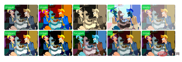
(Learning video sharing: css video tutorial)
The above is the detailed content of Does CSS3 support filters?. For more information, please follow other related articles on the PHP Chinese website!

Hot AI Tools

Undresser.AI Undress
AI-powered app for creating realistic nude photos

AI Clothes Remover
Online AI tool for removing clothes from photos.

Undress AI Tool
Undress images for free

Clothoff.io
AI clothes remover

Video Face Swap
Swap faces in any video effortlessly with our completely free AI face swap tool!

Hot Article
Hot Tools

Notepad++7.3.1
Easy-to-use and free code editor

SublimeText3 Chinese version
Chinese version, very easy to use

Zend Studio 13.0.1
Powerful PHP integrated development environment

Dreamweaver CS6
Visual web development tools

SublimeText3 Mac version
God-level code editing software (SublimeText3)
Hot Topics
 1659
1659
 14
1416
52
1310
25
1258
29
1232
24
14
1416
52
1310
25
1258
29
1232
24

 How to achieve wave effect with pure CSS3? (code example)
Jun 28, 2022 pm 01:39 PM
How to achieve wave effect with pure CSS3? (code example)
Jun 28, 2022 pm 01:39 PM
How to achieve wave effect with pure CSS3? This article will introduce to you how to use SVG and CSS animation to create wave effects. I hope it will be helpful to you!
 C++ Image Processing Practice Guide: Implementing Image Special Effects and Filters
Nov 27, 2023 am 11:40 AM
C++ Image Processing Practice Guide: Implementing Image Special Effects and Filters
Nov 27, 2023 am 11:40 AM
In the fields of computer science and image processing, C++ has always been one of the most commonly used programming languages. Image processing is one of the important subfields of computer vision, including image analysis, processing and recognition. This article will introduce some basic concepts and techniques in C++ image processing, and provide some sample codes for implementing image special effects and filters to help readers better understand and practice C++ image processing. 1. Basics of C++ image processing 1.1 Commonly used image file formats In image processing, we usually need to use various image file formats, including
 Use CSS skillfully to realize various strange-shaped buttons (with code)
Jul 19, 2022 am 11:28 AM
Use CSS skillfully to realize various strange-shaped buttons (with code)
Jul 19, 2022 am 11:28 AM
This article will show you how to use CSS to easily realize various weird-shaped buttons that appear frequently. I hope it will be helpful to you!
 How to hide elements in css without taking up space
Jun 01, 2022 pm 07:15 PM
How to hide elements in css without taking up space
Jun 01, 2022 pm 07:15 PM
Two methods: 1. Using the display attribute, just add the "display:none;" style to the element. 2. Use the position and top attributes to set the absolute positioning of the element to hide the element. Just add the "position:absolute;top:-9999px;" style to the element.
 How to implement lace borders in css3
Sep 16, 2022 pm 07:11 PM
How to implement lace borders in css3
Sep 16, 2022 pm 07:11 PM
In CSS, you can use the border-image attribute to achieve a lace border. The border-image attribute can use images to create borders, that is, add a background image to the border. You only need to specify the background image as a lace style; the syntax "border-image: url (image path) offsets the image border width inward. Whether outset is repeated;".
 How to enlarge the image by clicking the mouse in css3
Apr 25, 2022 pm 04:52 PM
How to enlarge the image by clicking the mouse in css3
Apr 25, 2022 pm 04:52 PM
Implementation method: 1. Use the ":active" selector to select the state of the mouse click on the picture; 2. Use the transform attribute and scale() function to achieve the picture magnification effect, the syntax "img:active {transform: scale(x-axis magnification, y Axis magnification);}".
 It turns out that text carousel and image carousel can also be realized using pure CSS!
Jun 10, 2022 pm 01:00 PM
It turns out that text carousel and image carousel can also be realized using pure CSS!
Jun 10, 2022 pm 01:00 PM
How to create text carousel and image carousel? The first thing everyone thinks of is whether to use js. In fact, text carousel and image carousel can also be realized using pure CSS. Let’s take a look at the implementation method. I hope it will be helpful to everyone!
 How to set animation rotation speed in css3
Apr 28, 2022 pm 04:32 PM
How to set animation rotation speed in css3
Apr 28, 2022 pm 04:32 PM
In CSS3, you can use the "animation-timing-function" attribute to set the animation rotation speed. This attribute is used to specify how the animation will complete a cycle and set the speed curve of the animation. The syntax is "element {animation-timing-function: speed attribute value;}".
