

What are the attributes used to achieve rotation effects in css3

The attribute that achieves rotation effect in css3 is "transform". The transform attribute is used to apply a 2D or 3D transformation to an element. Rotation can be achieved when this attribute is used with the rotate(), rotate3d(), rotateX(), rotateY() or rotateZ() functions.
The operating environment of this tutorial: Windows 7 system, CSS3&&HTML5 version, Dell G3 computer.
The attribute that implements the rotation effect in css3 is "transform".
The transform attribute is used to apply 2D or 3D transformation to the element. When this attribute is used with the following function, the element rotation can be achieved:
rotate(angle ) Define 2D rotation and specify the angle in the parameters.
rotate3d(x,y,z,angle) Define 3D rotation.
rotateX(angle) Defines a 3D rotation along the X-axis.
rotateY(angle) Defines 3D rotation along the Y axis.
rotateZ(angle) Defines 3D rotation along the Z axis.
Example 1:
<!DOCTYPE html>
<html>
<head>
<meta charset="utf-8">
<style>
div
{
	width:200px;
	height:100px;
	background-color:yellow;
	/* Rotate div */
	transform:rotate(7deg);
	-ms-transform:rotate(7deg); /* IE 9 */
	-webkit-transform:rotate(7deg); /* Safari and Chrome */
}
</style>
</head>
<body>

<div>Hello</div>

</body>
</html>
Example 2:
<!DOCTYPE html>
<html>
<head>
<meta charset="utf-8">
<style>
*,
*:after,
*:before {
box-sizing: border-box;
}
body {
background: #F5F3F4;
margin: 0;
padding: 10px;
font-family: 'Open Sans', sans-serif;
text-align: center;
}
h1 {
color: #4c4c4c;
font-weight: 600;
border-bottom: 1px solid #ccc;
}
h2,
h4 {
font-weight: 400;
color: #4d4d4d;
}
.card {
display: inline-block;
margin: 10px;
background: #fff;
padding: 15px;
min-width: 200px;
box-shadow: 0 3px 5px #ddd;
color: #555;
}
.card .box {
width: 100px;
height: 100px;
margin: auto;
background: #ddd;
cursor: pointer;
box-shadow: 0 0 5px #ccc inset;
}
.card .box .fill {
width: 100px;
height: 100px;
position: relative;
background: #03A9F4;
opacity: .5;
box-shadow: 0 0 5px #ccc;
-webkit-transition: 0.3s;
transition: 0.3s;
}
.card p {
margin: 25px 0 0;
}
.rotate:hover .fill {
-webkit-transform: rotate(45deg);
transform: rotate(45deg);
}
.rotateX:hover .fill {
-webkit-transform: rotateX(45deg);
transform: rotateX(45deg);
}
.rotateY:hover .fill {
-webkit-transform: rotateY(45deg);
transform: rotateY(45deg);
}
.rotateZ:hover .fill {
-webkit-transform: rotate(45deg);
transform: rotate(45deg);
}
.scale:hover .fill {
-webkit-transform: scale(2, 2);
transform: scale(2, 2);
}
.scaleX:hover .fill {
-webkit-transform: scaleX(2);
transform: scaleX(2);
}
.scaleY:hover .fill {
-webkit-transform: scaleY(2);
transform: scaleY(2);
}
</style>
</head>
<body>
<h1 id="CSS-nbsp-元素旋转">CSS3 元素旋转</h1>
<!-- Rotate-->
<div class="card">
<div class="box rotate">
<div class="fill"></div>
</div>
<p>rotate(45deg) </p>
</div>
<div class="card">
<div class="box rotateX">
<div class="fill"></div>
</div>
<p>rotateX(45deg)</p>
</div>
<div class="card">
<div class="box rotateY">
<div class="fill"></div>
</div>
<p>rotateY(45deg)</p>
</div>
<div class="card">
<div class="box rotateZ">
<div class="fill"></div>
</div>
<p>rotateZ(45deg) </p>
</div>
</body>
</html>
(Learning video sharing: css video tutorial)
The above is the detailed content of What are the attributes used to achieve rotation effects in css3. For more information, please follow other related articles on the PHP Chinese website!

Hot AI Tools

Undresser.AI Undress
AI-powered app for creating realistic nude photos

AI Clothes Remover
Online AI tool for removing clothes from photos.

Undress AI Tool
Undress images for free

Clothoff.io
AI clothes remover

Video Face Swap
Swap faces in any video effortlessly with our completely free AI face swap tool!

Hot Article
Hot Tools

Notepad++7.3.1
Easy-to-use and free code editor

SublimeText3 Chinese version
Chinese version, very easy to use

Zend Studio 13.0.1
Powerful PHP integrated development environment

Dreamweaver CS6
Visual web development tools

SublimeText3 Mac version
God-level code editing software (SublimeText3)
Hot Topics
 1664
1664
 14
1423
52
1317
25
1268
29
1246
24
14
1423
52
1317
25
1268
29
1246
24

 How to achieve wave effect with pure CSS3? (code example)
Jun 28, 2022 pm 01:39 PM
How to achieve wave effect with pure CSS3? (code example)
Jun 28, 2022 pm 01:39 PM
How to achieve wave effect with pure CSS3? This article will introduce to you how to use SVG and CSS animation to create wave effects. I hope it will be helpful to you!
 Use CSS skillfully to realize various strange-shaped buttons (with code)
Jul 19, 2022 am 11:28 AM
Use CSS skillfully to realize various strange-shaped buttons (with code)
Jul 19, 2022 am 11:28 AM
This article will show you how to use CSS to easily realize various weird-shaped buttons that appear frequently. I hope it will be helpful to you!
 How to use CSS to achieve the rotating background animation effect of elements
Nov 21, 2023 am 09:05 AM
How to use CSS to achieve the rotating background animation effect of elements
Nov 21, 2023 am 09:05 AM
How to use CSS to implement rotating background image animation effects of elements. Background image animation effects can increase the visual appeal and user experience of web pages. This article will introduce how to use CSS to achieve the rotating background animation effect of elements, and provide specific code examples. First, we need to prepare a background image, which can be any picture you like, such as a picture of the sun or an electric fan. Save the image and name it "bg.png". Next, create an HTML file and add a div element in the file, setting it to
 How to hide elements in css without taking up space
Jun 01, 2022 pm 07:15 PM
How to hide elements in css without taking up space
Jun 01, 2022 pm 07:15 PM
Two methods: 1. Using the display attribute, just add the "display:none;" style to the element. 2. Use the position and top attributes to set the absolute positioning of the element to hide the element. Just add the "position:absolute;top:-9999px;" style to the element.
 How to implement lace borders in css3
Sep 16, 2022 pm 07:11 PM
How to implement lace borders in css3
Sep 16, 2022 pm 07:11 PM
In CSS, you can use the border-image attribute to achieve a lace border. The border-image attribute can use images to create borders, that is, add a background image to the border. You only need to specify the background image as a lace style; the syntax "border-image: url (image path) offsets the image border width inward. Whether outset is repeated;".
 It turns out that text carousel and image carousel can also be realized using pure CSS!
Jun 10, 2022 pm 01:00 PM
It turns out that text carousel and image carousel can also be realized using pure CSS!
Jun 10, 2022 pm 01:00 PM
How to create text carousel and image carousel? The first thing everyone thinks of is whether to use js. In fact, text carousel and image carousel can also be realized using pure CSS. Let’s take a look at the implementation method. I hope it will be helpful to everyone!
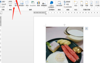 How to rotate Word pictures
Mar 19, 2024 pm 06:16 PM
How to rotate Word pictures
Mar 19, 2024 pm 06:16 PM
When we use Word office software for document processing, we often need to insert some pictures and other materials into the document. However, in order to achieve beautiful layout, we also need to perform some special layout on the pictures, among which rotation processing is the most basic. Typesetting processing, however, for some newcomers to the workplace who have just come into contact with Word office software, they may not be able to process pictures in Word documents. Below, we will share how to rotate pictures in Word. We hope it will be helpful and inspiring to you. 1. First, we open a Word document, and then click the Insert-Picture button on the menu bar to insert a random picture on the computer to facilitate our operation and demonstration. 2. If we want to rotate the image, then we need to
 How to compress and format images in Vue?
Aug 25, 2023 pm 11:06 PM
How to compress and format images in Vue?
Aug 25, 2023 pm 11:06 PM
How to compress and format images in Vue? In front-end development, we often encounter the need to compress and format images. Especially in mobile development, in order to improve page loading speed and save user traffic, it is critical to compress and format images. In the Vue framework, we can use some tool libraries to compress and format images. Compression using the compressor.js library compressor.js is a JavaS for compressing images
