

How to set relative positioning and absolute positioning in css

In CSS, you can use the position attribute to set relative positioning and absolute positioning. Add the "position:relative;" style to the element to set the relative positioning, and add the "position:absolute;" style to the element. Set absolute positioning.
The operating environment of this tutorial: Windows 7 system, CSS3&&HTML5 version, Dell G3 computer.
In CSS, you can use the position attribute to set relative positioning (relative) and absolute positioning (absolute).
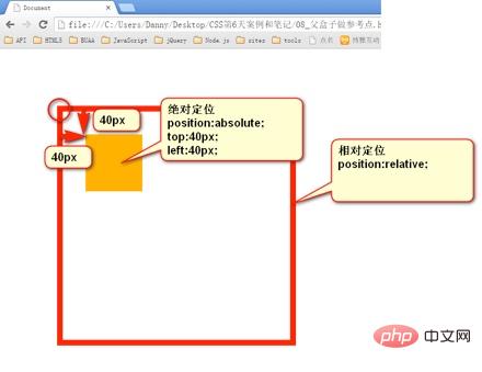
Relative positioning position: relative
-
Relative positioning is to fine-tune the position of an element. Let the element relative to
its original position and fine-tune its position.
In other words, if a box wants to adjust its position, then relative positioning must be used
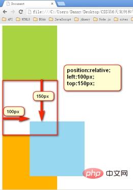
position:relative;   → 必须先声明,自己要相对定位了,
left:100px;       → 然后进行调整。
top:150px;       → 然后进行调整。
1. Characteristics of relative positioning - not off the mark, leaving a hole in my hometown, separated from the shadows
Relative positioning is not off the mark, the real location is in my hometown, but Once the shadow is out, it can float everywhere.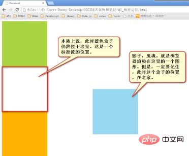
2. The purpose of relative positioning
- There are pitfalls in relative positioning, so It is generally not used to create a "capping" effect. On the page, the effect is minimal. It has only two functions:
- Fine-tuning elements
- as a reference for absolute positioning,
子无 father相(More details in absolute positioning)
3. The positioning value of relative positioning
- can be left, right to describe the movement of the right and left sides of the box
- You can use top and bottom to describe the movement of the bottom and top of the box.
position: relative;
right: 100px;   → 往左边移动
top: 100px;

position: relative;
right: 100px;
bottom: 100px;    → 移动方向是向上。
Absolute positioning
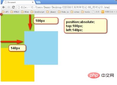
- Absolute positioning is out of standard
- The absolutely positioned box is also out of the standard document flow. Therefore, all the properties of the standard document flow are no longer observed after absolute positioning.
- After absolute positioning, the label will not distinguish between so-called inline elements and block-level elements. You can set the width and height without
display:block;
span{
position: absolute;
top: 100px;
left: 100px;
width: 100px;
height: 100px;
background-color: pink;
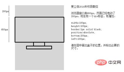
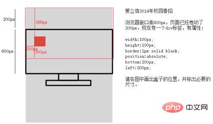
}1. Reference point
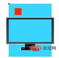
The reference point for absolute positioning. If top is used to describe it, then the positioning reference point is the lower left corner of the page. , instead of the upper left corner of the browser:
If described with bottom, it is the size of the first screen window of the browser, corresponding to the lower left corner of the page :
Interview question:
Answer: When using bottom positioning, refer to The bottom left corner of the page corresponding to the size of the first screen of the browser.

2. Use the box as a reference point - the son must be the father
An absolutely positioned element, if there is an element that is also positioned in the parent element, then the parent element will be used as the reference point.
- ##The son is absolutely bound to his father, the son is absolutely father-like, and the son is absolutely father-solid, all of which can be used to position the son. However, in engineering, there is no box in the standard document flow. , so the page is not stable and has no practical use.
In engineering, "son must have the same father-like appearance" is meaningful. The father does not go off the mark, and the son moves within the scope of the father when he goes off the mark.
<div class=”box1”>  → 绝对定位
	<div class=”box2”>  → 相对定位
		<div class=”box3”>  → 没有定位
			<p></p>  → 绝对定位,以box2为参考定位。
		</div>
	</div>
</div>
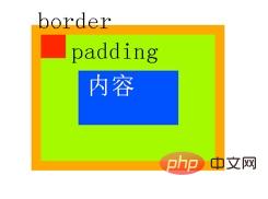
- The son of absolute positioning ignores the padding of the reference box. In the picture below, the green part is the padding of the div, and the blue part is the content area of the div. Then at this time, div is positioned relatively and p is positioned absolutely.
After absolute positioning, all standard flows All the rules no longer apply. So margin: 0 auto; is invalid.
width: 600px;
height: 60px;
position: absolute;
left: 50%;
top: 0;
margin-left: -300px;   → 宽度的一半
is very simple, just write it down as a formula. That’s  left: 50%;margin-left: half of the negative width
(Learning video sharing: css video tutorial
The above is the detailed content of How to set relative positioning and absolute positioning in css. For more information, please follow other related articles on the PHP Chinese website!

Hot AI Tools

Undresser.AI Undress
AI-powered app for creating realistic nude photos

AI Clothes Remover
Online AI tool for removing clothes from photos.

Undress AI Tool
Undress images for free

Clothoff.io
AI clothes remover

Video Face Swap
Swap faces in any video effortlessly with our completely free AI face swap tool!

Hot Article
Hot Tools

Notepad++7.3.1
Easy-to-use and free code editor

SublimeText3 Chinese version
Chinese version, very easy to use

Zend Studio 13.0.1
Powerful PHP integrated development environment

Dreamweaver CS6
Visual web development tools

SublimeText3 Mac version
God-level code editing software (SublimeText3)
Hot Topics
 1664
1664
 14
1423
52
1318
25
1268
29
1248
24
14
1423
52
1318
25
1268
29
1248
24

 How to use bootstrap in vue
Apr 07, 2025 pm 11:33 PM
How to use bootstrap in vue
Apr 07, 2025 pm 11:33 PM
Using Bootstrap in Vue.js is divided into five steps: Install Bootstrap. Import Bootstrap in main.js. Use the Bootstrap component directly in the template. Optional: Custom style. Optional: Use plug-ins.
 Understanding HTML, CSS, and JavaScript: A Beginner's Guide
Apr 12, 2025 am 12:02 AM
Understanding HTML, CSS, and JavaScript: A Beginner's Guide
Apr 12, 2025 am 12:02 AM
WebdevelopmentreliesonHTML,CSS,andJavaScript:1)HTMLstructurescontent,2)CSSstylesit,and3)JavaScriptaddsinteractivity,formingthebasisofmodernwebexperiences.
 The Roles of HTML, CSS, and JavaScript: Core Responsibilities
Apr 08, 2025 pm 07:05 PM
The Roles of HTML, CSS, and JavaScript: Core Responsibilities
Apr 08, 2025 pm 07:05 PM
HTML defines the web structure, CSS is responsible for style and layout, and JavaScript gives dynamic interaction. The three perform their duties in web development and jointly build a colorful website.
 How to insert pictures on bootstrap
Apr 07, 2025 pm 03:30 PM
How to insert pictures on bootstrap
Apr 07, 2025 pm 03:30 PM
There are several ways to insert images in Bootstrap: insert images directly, using the HTML img tag. With the Bootstrap image component, you can provide responsive images and more styles. Set the image size, use the img-fluid class to make the image adaptable. Set the border, using the img-bordered class. Set the rounded corners and use the img-rounded class. Set the shadow, use the shadow class. Resize and position the image, using CSS style. Using the background image, use the background-image CSS property.
 How to write split lines on bootstrap
Apr 07, 2025 pm 03:12 PM
How to write split lines on bootstrap
Apr 07, 2025 pm 03:12 PM
There are two ways to create a Bootstrap split line: using the tag, which creates a horizontal split line. Use the CSS border property to create custom style split lines.
 How to set up the framework for bootstrap
Apr 07, 2025 pm 03:27 PM
How to set up the framework for bootstrap
Apr 07, 2025 pm 03:27 PM
To set up the Bootstrap framework, you need to follow these steps: 1. Reference the Bootstrap file via CDN; 2. Download and host the file on your own server; 3. Include the Bootstrap file in HTML; 4. Compile Sass/Less as needed; 5. Import a custom file (optional). Once setup is complete, you can use Bootstrap's grid systems, components, and styles to create responsive websites and applications.
 How to resize bootstrap
Apr 07, 2025 pm 03:18 PM
How to resize bootstrap
Apr 07, 2025 pm 03:18 PM
To adjust the size of elements in Bootstrap, you can use the dimension class, which includes: adjusting width: .col-, .w-, .mw-adjust height: .h-, .min-h-, .max-h-
 How to use bootstrap button
Apr 07, 2025 pm 03:09 PM
How to use bootstrap button
Apr 07, 2025 pm 03:09 PM
How to use the Bootstrap button? Introduce Bootstrap CSS to create button elements and add Bootstrap button class to add button text
