What are the built-in plugins of bootstrap?
bootstrap built-in plug-ins include: 1. Transition effect plug-in; 2. Modal box plug-in; 3. Drop-down menu plug-in; 4. Scroll monitoring plug-in; 5. Tab plug-in; 6. Prompt tool plug-in; 7. Pop-up box plug-in; 8. Alert box plug-in; 9. Button plug-in; 10. Folding plug-in; 11. Carousel plug-in; 12. Additional navigation plug-in.

The operating environment of this tutorial: Windows 7 system, bootsrap version 3.3.7, DELL G3 computer
bootstrap built-in plug-ins include:
Bootstrap transition effect
Bootstrap modal box
-
Bootstrap drop-down menu
Bootstrap scroll monitoring
Bootstrap tab page
- ##Bootstrap prompt tool
- Bootstrap pop-up box
- Bootstrap warning box
- Bootstrap button
- Bootstrap collapse
- Bootstrap Carousel
- Bootstrap Additional Navigation
Bootstrap Transition Plug-in
The Transition plug-in provides simple transition effects.If you want to reference the functionality of this plugin separately, you need to reference transition.js in addition to other JS files. Alternatively, you can reference bootstrap.js or a minified version of bootstrap.min.js.Transition.js is the base helper class for the transitionEnd event and CSS transition effect simulator. It is used by other plugins to check for CSS transition support and to obtain transition effects.
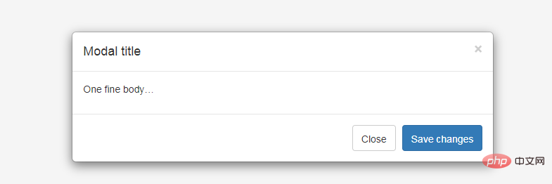
Bootstrap modal box (Modal) plug-in
Modal box (Modal) is a child form covering the parent form. Typically, the purpose is to display content from a separate source that can have some interaction without leaving the parent form. Subforms provide information, interaction, and more.
#If you want to reference the functionality of the plugin separately, then you need to reference modal.js. Alternatively, you can reference bootstrap.js or a minified version of bootstrap.min.js.
Usage:
You can switch the hidden content of the modal plug-in:- Pass data attribute: Set the attribute data-toggle="modal" on a controller element (such as a button or link), and set data-target="#identifier" or href="#identifier" to specify the specific modal to be switched. box (with id="identifier").
- Via JavaScript: Using this technique, you can call a modal with id="identifier" with a simple line of JavaScript:
$('#identifier').modal(options)
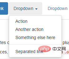
Bootstrap drop-down menu (Dropdown) plug-in
Bootstrap Scrollspy plug-in
Scrollspy plug-in, which is automatically updated The navigation plug-in will automatically update the corresponding navigation target according to the position of the scroll bar. The basic implementation is to add an .active class to the navigation bar based on the position of the scroll bar as you scroll.Usage
You can add scroll listening behavior to the top navigation: Through the data attribute: to the element you want to listen to (usually body ) add data-spy="scroll". Then add an attribute data-target with the ID or class of the parent element of the Bootstrap .nav component. For this to work, you must ensure that an element exists in the body of the page that matches the ID of the link you want to listen for.<body data-spy="scroll" data-target=".navbar-example">
...
<div class="navbar-example">
<ul class="nav nav-tabs">
...
</ul>
</div>
...
</body>$('body').scrollspy({ target: '.navbar-example' })Bootstrap tab (Tab )Plugin
By combining some data attributes, you can easily create a tabbed interface. With this plugin you can place content in tabs, capsule tabs or even drop-down menu tabs.
Bootstrap Tooltip plug-in
Tooltip is very useful when you want to describe a link. The Tooltip plugin was inspired by jQuery.tipsy written by Jason Frame. The Tooltip plug-in has made many improvements. For example, it does not need to rely on images, but instead uses CSS to achieve animation effects and uses the data attribute to store title information.

Bootstrap Popover plug-in
Popover and Tooltip ), provides an expanded view. To activate the popover, users simply hover over the element. The content of the popup box can be filled entirely using the Bootstrap Data API. This method relies on tooltips.

Bootstrap Alert plug-in
Alert messages are mostly used Display information such as warning or confirmation messages to end users. Using the Alert plugin, you can add dismissal functionality to all alert messages.

Bootstrap button (Button) plug-in
Button (Button) is introduced in the chapter Bootstrap button Pass. With the Button plug-in, you can add some interactions, such as controlling button states, or create button groups for other components (such as toolbars).
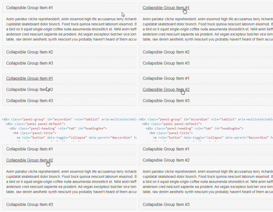
Bootstrap Collapse plugin
The Collapse plugin can easily make pages The area collapses. Whether you use it to create accordion navigation or content panels, it allows for a lot of content options.

Bootstrap Carousel plug-in
Bootstrap Carousel plug-in is a Flexible and responsive way to add sliders to your site. Beyond that, the content is flexible enough and can be images, iframes, videos, or any other type of content you want to place.
Bootstrap Additional Navigation (Affix) Plugin
The Additional Navigation (Affix) plugin allows specifying is fixed at a certain position on the page. A common example is social icons. They will start at a certain position, but when a mark is clicked on the page, the
Recommended study: "bootstrap usage tutorial"
The above is the detailed content of What are the built-in plugins of bootstrap?. For more information, please follow other related articles on the PHP Chinese website!

Hot AI Tools

Undresser.AI Undress
AI-powered app for creating realistic nude photos

AI Clothes Remover
Online AI tool for removing clothes from photos.

Undress AI Tool
Undress images for free

Clothoff.io
AI clothes remover

Video Face Swap
Swap faces in any video effortlessly with our completely free AI face swap tool!

Hot Article

Hot Tools

Notepad++7.3.1
Easy-to-use and free code editor

SublimeText3 Chinese version
Chinese version, very easy to use

Zend Studio 13.0.1
Powerful PHP integrated development environment

Dreamweaver CS6
Visual web development tools

SublimeText3 Mac version
God-level code editing software (SublimeText3)

Hot Topics
 How to use bootstrap in vue
Apr 07, 2025 pm 11:33 PM
Using Bootstrap in Vue.js is divided into five steps: Install Bootstrap. Import Bootstrap in main.js. Use the Bootstrap component directly in the template. Optional: Custom style. Optional: Use plug-ins.
 How to get the bootstrap search bar
Apr 07, 2025 pm 03:33 PM
How to use Bootstrap to get the value of the search bar: Determines the ID or name of the search bar. Use JavaScript to get DOM elements. Gets the value of the element. Perform the required actions.
 How to do vertical centering of bootstrap
Apr 07, 2025 pm 03:21 PM
Use Bootstrap to implement vertical centering: flexbox method: Use the d-flex, justify-content-center, and align-items-center classes to place elements in the flexbox container. align-items-center class method: For browsers that do not support flexbox, use the align-items-center class, provided that the parent element has a defined height.
 How to set up the framework for bootstrap
Apr 07, 2025 pm 03:27 PM
To set up the Bootstrap framework, you need to follow these steps: 1. Reference the Bootstrap file via CDN; 2. Download and host the file on your own server; 3. Include the Bootstrap file in HTML; 4. Compile Sass/Less as needed; 5. Import a custom file (optional). Once setup is complete, you can use Bootstrap's grid systems, components, and styles to create responsive websites and applications.
 How to write split lines on bootstrap
Apr 07, 2025 pm 03:12 PM
There are two ways to create a Bootstrap split line: using the tag, which creates a horizontal split line. Use the CSS border property to create custom style split lines.
 How to insert pictures on bootstrap
Apr 07, 2025 pm 03:30 PM
There are several ways to insert images in Bootstrap: insert images directly, using the HTML img tag. With the Bootstrap image component, you can provide responsive images and more styles. Set the image size, use the img-fluid class to make the image adaptable. Set the border, using the img-bordered class. Set the rounded corners and use the img-rounded class. Set the shadow, use the shadow class. Resize and position the image, using CSS style. Using the background image, use the background-image CSS property.
 How to use bootstrap button
Apr 07, 2025 pm 03:09 PM
How to use the Bootstrap button? Introduce Bootstrap CSS to create button elements and add Bootstrap button class to add button text
 How to resize bootstrap
Apr 07, 2025 pm 03:18 PM
To adjust the size of elements in Bootstrap, you can use the dimension class, which includes: adjusting width: .col-, .w-, .mw-adjust height: .h-, .min-h-, .max-h-


