

What are the functions of the four css hyperlink pseudo-classes?

The functions of the four css hyperlink pseudo-classes: 1. ":link", which defines the style of normal links; 2. ":visited", which defines the style of visited links; 3. ":hover" , defines the style when the mouse hovers over the link; 4. "active", defines the style when the mouse clicks on the link.

The operating environment of this tutorial: Windows 7 system, CSS3&&HTML5 version, Dell G3 computer.
Because we need to define the link style, the anchor tag in the hyperlink - a is essential. The method of writing the link between the anchor tag and the pseudo class is the basic method of defining the link style. , they are written as follows:
a:link, define the style of normal link;a :visited, defines the style of the visited link;a:hover, defines the style when the mouse is hovering over the link;a:active, defines the style when the mouse clicks on the link.
Among them: :link and :visited can only be applied to setting hyperlink a, while :hover and :active can be applied to all elements
:hover is used to indicate the status of the mouse moving in
:active is used to indicate the mouse click
<!DOCTYPE html>
<html>
<head>
    <meta charset="UTF-8">
    <title>超链接的伪类</title>
    <link rel="stylesheet" href="../css/a.css">
</head>
<body>
     <a href="https://www.12345.com/" target="__blank">没访问过的链接</a>
     <br>
     <a href="https://www.csdn.net/" target="__blank">访问过的链接</a>
</body>
</html>/* 没访问过的链接状态 */
a:link{
font-size: 20px;
color: hotpink;
}
/* 访问过的链接状态 */
a:visited{
color: green;
}
/* 鼠标移入链接时的状态 */
a:hover{
color: rgb(0, 217, 255);
}
/* 鼠标点击链接时的状态 */
a:active{
color: rgb(255, 0, 0);
}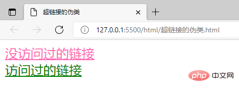
Note: As long as you have searched for it, it will be counted as visited, unless you clear the historical browsing cache data.
Pseudo elements
Pseudo elements are some special elements on the page that do not really exist. Pseudo elements represent some special positions. Pseudo elements use:: at the beginning
::first-letter represents the first letter
::first-line represents the first line
::selection represents Selected content
::before The beginning of the element
::after The last part of the element
Note:
1. Because of setting::before and: :after has no effect, so ::before and ::after must be used in conjunction with the content attribute. 2. The content added in content cannot be selected with the mouse.
3. The q tag in HTML represents a short quote, which has the effect of adding double quotes. The principle is that the ::before and ::after attributes are used, and double quotes are added to the content, so the double quotes of the q tag cannot be selected. .
<!DOCTYPE html>
<html lang="zh">
<head>
    <meta charset="UTF-8">
    <title>伪元素</title>
    <link rel="stylesheet" href="../css/pseudo_element.css">
</head>
<body>
    <h3>WHERE THERE IS A WILL, THERE IS A WAY</h3>
     <p>The secret of success (The key to success) is not so much money as a strong will. A great man is one who has a strong will and an indomitable spirit. In other words, if a man does not have a strong will to win (get) the final victory, he will never succeed in his life. He is no more than a failure.It is quite obvious that there is no difficult thing (nothing difficult) in the world. if you make up your mind to do it, you will certainly accomplish your end. That stands to reason.</p>
</body>
</html>/* 第一个字母设置像素为50px */
::first-letter{
font-size: 50px;
}
/* 第一行设置绿色 */
::first-line{
color: green;
}
/* 鼠标选中的字体背景设置为橙色 */
::selection{
background-color: sandybrown;
}
/* 元素p内容开始之前添加符号 ☛,结尾添加符号☚,注意该符号鼠标无法被选中*/
p::before{
content: "☛";
}
p::after{
content: "☚";
}
(Learning video sharing: css video tutorial)
The above is the detailed content of What are the functions of the four css hyperlink pseudo-classes?. For more information, please follow other related articles on the PHP Chinese website!

Hot AI Tools

Undresser.AI Undress
AI-powered app for creating realistic nude photos

AI Clothes Remover
Online AI tool for removing clothes from photos.

Undress AI Tool
Undress images for free

Clothoff.io
AI clothes remover

Video Face Swap
Swap faces in any video effortlessly with our completely free AI face swap tool!

Hot Article
Hot Tools

Notepad++7.3.1
Easy-to-use and free code editor

SublimeText3 Chinese version
Chinese version, very easy to use

Zend Studio 13.0.1
Powerful PHP integrated development environment

Dreamweaver CS6
Visual web development tools

SublimeText3 Mac version
God-level code editing software (SublimeText3)
Hot Topics
 1655
1655
 14
1414
52
1307
25
1254
29
1228
24
14
1414
52
1307
25
1254
29
1228
24

 How to use bootstrap in vue
Apr 07, 2025 pm 11:33 PM
How to use bootstrap in vue
Apr 07, 2025 pm 11:33 PM
Using Bootstrap in Vue.js is divided into five steps: Install Bootstrap. Import Bootstrap in main.js. Use the Bootstrap component directly in the template. Optional: Custom style. Optional: Use plug-ins.
 Understanding HTML, CSS, and JavaScript: A Beginner's Guide
Apr 12, 2025 am 12:02 AM
Understanding HTML, CSS, and JavaScript: A Beginner's Guide
Apr 12, 2025 am 12:02 AM
WebdevelopmentreliesonHTML,CSS,andJavaScript:1)HTMLstructurescontent,2)CSSstylesit,and3)JavaScriptaddsinteractivity,formingthebasisofmodernwebexperiences.
 The Roles of HTML, CSS, and JavaScript: Core Responsibilities
Apr 08, 2025 pm 07:05 PM
The Roles of HTML, CSS, and JavaScript: Core Responsibilities
Apr 08, 2025 pm 07:05 PM
HTML defines the web structure, CSS is responsible for style and layout, and JavaScript gives dynamic interaction. The three perform their duties in web development and jointly build a colorful website.
 How to write split lines on bootstrap
Apr 07, 2025 pm 03:12 PM
How to write split lines on bootstrap
Apr 07, 2025 pm 03:12 PM
There are two ways to create a Bootstrap split line: using the tag, which creates a horizontal split line. Use the CSS border property to create custom style split lines.
 How to insert pictures on bootstrap
Apr 07, 2025 pm 03:30 PM
How to insert pictures on bootstrap
Apr 07, 2025 pm 03:30 PM
There are several ways to insert images in Bootstrap: insert images directly, using the HTML img tag. With the Bootstrap image component, you can provide responsive images and more styles. Set the image size, use the img-fluid class to make the image adaptable. Set the border, using the img-bordered class. Set the rounded corners and use the img-rounded class. Set the shadow, use the shadow class. Resize and position the image, using CSS style. Using the background image, use the background-image CSS property.
 How to set up the framework for bootstrap
Apr 07, 2025 pm 03:27 PM
How to set up the framework for bootstrap
Apr 07, 2025 pm 03:27 PM
To set up the Bootstrap framework, you need to follow these steps: 1. Reference the Bootstrap file via CDN; 2. Download and host the file on your own server; 3. Include the Bootstrap file in HTML; 4. Compile Sass/Less as needed; 5. Import a custom file (optional). Once setup is complete, you can use Bootstrap's grid systems, components, and styles to create responsive websites and applications.
 How to use bootstrap button
Apr 07, 2025 pm 03:09 PM
How to use bootstrap button
Apr 07, 2025 pm 03:09 PM
How to use the Bootstrap button? Introduce Bootstrap CSS to create button elements and add Bootstrap button class to add button text
 How to resize bootstrap
Apr 07, 2025 pm 03:18 PM
How to resize bootstrap
Apr 07, 2025 pm 03:18 PM
To adjust the size of elements in Bootstrap, you can use the dimension class, which includes: adjusting width: .col-, .w-, .mw-adjust height: .h-, .min-h-, .max-h-
