

What is the difference between bootstrap v4 v3

Difference: 1. bootstrap v4 is written in Sass language, v3 is written in Less language; 2. v4 has 5 grid classes, v3 has 4 grid classes; 3. v3 uses px as the unit, v4 Use rem and em as units; 4. v3 uses float layout and v4 uses flexbox layout.

The operating environment of this tutorial: Windows7 system, Bootstrap3&&Bootstrap4 version, DELL G3 computer
Differences
| Bootstrap3 | Bootstrap4 |
| Sass language writing | |
| 5 types of grid classes | |
| Use rem and em is the unit (except for some margins and padding that use px) | |
| Offset columns are set by the offset-class | |
| Select the flexible box model (flexbox) |
- Extra small (col-xs-) Adapted to mobile phones (<768px)
- Small (col-sm-) Adapted to tablets (≥768px)
- Medium (col-md-) Suitable for computers (≥992px) ##Large (col-lg-) Suitable For widescreen computers (≥1200px)
- 5 grids for Bootstrap4:
- Extra small (col-)(<576px)
- small(col-sm-)(≥576px)
- ##中(col-md-)(≥768px)
- Large (col-lg-) (≥992px)
- Extra large (col-xl-) (≥1200px)
The new grid layer is adapted to the mobile terminal;
- Comprehensive introduction of ES6 new Features (rewrite all JavaScript plugins);
- css files reduced by at least 40%;
- All documents rewritten with Markdown editor ;
- Abandon support for IE8
- Note:
Bootstrap3 cannot be used in Bootstrap4 The hidden-xs, visible-xs classes in
If you want to hide at a certain size in Bootstrap 4, you should refer to the following table It’s worth mentioning What's more, using hidden-sm in B3 will only hide the sm size, and other sizes will be displayed normally. In B4, if you simply specify d-sm-none, the element will be hidden in the sm size, but the size above sm will be hidden. It will also be hidden, and the size under sm will be displayed normally. This involves the issue of upward compatibility, so when you set the sm element to be hidden, you must also set the md size display, as shown in the table above, and so on for others.Hide upward compatibility , showing downward compatibility 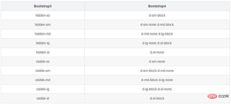
Bootstrap3 horizontal centering
// 文本:
class ="text-center"
// 图片居中:
class = "center-block"
Under flex: For example, p.row
bootstrap usage tutorial
》The above is the detailed content of What is the difference between bootstrap v4 v3. For more information, please follow other related articles on the PHP Chinese website!

Hot AI Tools

Undresser.AI Undress
AI-powered app for creating realistic nude photos

AI Clothes Remover
Online AI tool for removing clothes from photos.

Undress AI Tool
Undress images for free

Clothoff.io
AI clothes remover

Video Face Swap
Swap faces in any video effortlessly with our completely free AI face swap tool!

Hot Article
Hot Tools

Notepad++7.3.1
Easy-to-use and free code editor

SublimeText3 Chinese version
Chinese version, very easy to use

Zend Studio 13.0.1
Powerful PHP integrated development environment

Dreamweaver CS6
Visual web development tools

SublimeText3 Mac version
God-level code editing software (SublimeText3)
Hot Topics
 1664
1664
 14
1423
52
1317
25
1268
29
1243
24
14
1423
52
1317
25
1268
29
1243
24

 How to get the bootstrap search bar
Apr 07, 2025 pm 03:33 PM
How to get the bootstrap search bar
Apr 07, 2025 pm 03:33 PM
How to use Bootstrap to get the value of the search bar: Determines the ID or name of the search bar. Use JavaScript to get DOM elements. Gets the value of the element. Perform the required actions.
 How to use bootstrap in vue
Apr 07, 2025 pm 11:33 PM
How to use bootstrap in vue
Apr 07, 2025 pm 11:33 PM
Using Bootstrap in Vue.js is divided into five steps: Install Bootstrap. Import Bootstrap in main.js. Use the Bootstrap component directly in the template. Optional: Custom style. Optional: Use plug-ins.
 How to do vertical centering of bootstrap
Apr 07, 2025 pm 03:21 PM
How to do vertical centering of bootstrap
Apr 07, 2025 pm 03:21 PM
Use Bootstrap to implement vertical centering: flexbox method: Use the d-flex, justify-content-center, and align-items-center classes to place elements in the flexbox container. align-items-center class method: For browsers that do not support flexbox, use the align-items-center class, provided that the parent element has a defined height.
 How to insert pictures on bootstrap
Apr 07, 2025 pm 03:30 PM
How to insert pictures on bootstrap
Apr 07, 2025 pm 03:30 PM
There are several ways to insert images in Bootstrap: insert images directly, using the HTML img tag. With the Bootstrap image component, you can provide responsive images and more styles. Set the image size, use the img-fluid class to make the image adaptable. Set the border, using the img-bordered class. Set the rounded corners and use the img-rounded class. Set the shadow, use the shadow class. Resize and position the image, using CSS style. Using the background image, use the background-image CSS property.
 How to write split lines on bootstrap
Apr 07, 2025 pm 03:12 PM
How to write split lines on bootstrap
Apr 07, 2025 pm 03:12 PM
There are two ways to create a Bootstrap split line: using the tag, which creates a horizontal split line. Use the CSS border property to create custom style split lines.
 How to set up the framework for bootstrap
Apr 07, 2025 pm 03:27 PM
How to set up the framework for bootstrap
Apr 07, 2025 pm 03:27 PM
To set up the Bootstrap framework, you need to follow these steps: 1. Reference the Bootstrap file via CDN; 2. Download and host the file on your own server; 3. Include the Bootstrap file in HTML; 4. Compile Sass/Less as needed; 5. Import a custom file (optional). Once setup is complete, you can use Bootstrap's grid systems, components, and styles to create responsive websites and applications.
 How to resize bootstrap
Apr 07, 2025 pm 03:18 PM
How to resize bootstrap
Apr 07, 2025 pm 03:18 PM
To adjust the size of elements in Bootstrap, you can use the dimension class, which includes: adjusting width: .col-, .w-, .mw-adjust height: .h-, .min-h-, .max-h-
 How to use bootstrap button
Apr 07, 2025 pm 03:09 PM
How to use bootstrap button
Apr 07, 2025 pm 03:09 PM
How to use the Bootstrap button? Introduce Bootstrap CSS to create button elements and add Bootstrap button class to add button text
