

How to set the diagonal of an element in css

css设置一个元素对角线的方法:1、利用“::before”伪类配合rotateZ()、scale()来实现;2、利用linear-gradient()线性渐变来实现;3、利用伪元素+三角形来实现;4、利用clip-path属性来实现。
本教程操作环境:windows7系统、CSS3&&HTML5版、Dell G3电脑。
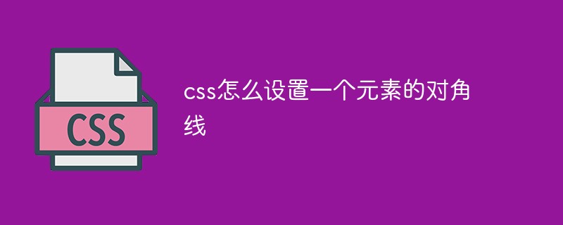
使用单个标签,如何实现下图所示的斜线效果。也就是如何使用 CSS 画斜线?
这种类似于表格的斜线效果,细细研究一下,还是有一些挺有趣的方法可以实现之。
我们假定我们的 HTML 结构如下:
<div></div>
假定高宽各为 100px,在单个标签局限内,看看能有多少种方法实现。
法一、CSS3 旋转缩放
这个应该属于看到需求第一眼就可以想到的方法了。
这里我们使用 伪元素 画出一条直线,然后绕 div 中心旋转 45deg ,再缩放一下就可以得到。
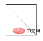
简单的一张流程图:
代码示例:
div {
	position: relative;
	margin: 50px auto;
	width: 100px;
	height: 100px;
	box-sizing: border-box;
	border: 1px solid #333;
	// background-color:#333;
	line-height: 120px;
	text-indent: 5px;
}

div::before {
	content: "";
	position: absolute;
	left: 0;
	top: 0;
	width: 100%;
	height: 50px;
	box-sizing: border-box;
	border-bottom: 1px solid deeppink;
	transform-origin: bottom center;
	// transform:rotateZ(45deg) scale(1.414);
	animation: slash 5s infinite ease;
}

@keyframes slash {
	0% {
		transform: rotateZ(0deg) scale(1);
	}

	30% {
		transform: rotateZ(45deg) scale(1);
	}

	60% {
		transform: rotateZ(45deg) scale(1.414);
	}

	100% {
		transform: rotateZ(45deg) scale(1.414);
	}
}
法二、线性渐变实现
这种方法使用了背景的线性渐变实现,渐变背景很重要的一点是,虽然名字唤作渐变,但是也是可以画出实色而非渐变色。
我们选定线性渐变的方向为 45deg,依次将渐变色值设为:transparent -> deeppink -> deeppink ->transparent。
transparent为透明色值。
就像这样简单的一句,即可实现斜线效果:
div{
  background:
    linear-gradient(45deg, transparent 49.5%, deeppink 49.5%, deeppink 50.5%, transparent 50.5%);
}完整css代码:
div{
  position:relative;
  margin:50px auto;
  width:100px;
  height:100px;
  box-sizing:border-box;
  border:1px solid #333;
  line-height:120px;
  text-indent:5px;
  background:
    linear-gradient(45deg, transparent 49.5%, deeppink 49.5%, deeppink 50.5%, transparent 50.5%);
}
法三、伪元素+三角形
接下来两种方法就有点为了斜线而斜线的感觉。
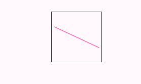
利用 CSS border ,是可以轻松实现一个类似这样的三角形的:

CSS 代码如下:
div{
  border:50px solid transparent;
  border-left:50px solid deeppink;
  border-bottom:50px solid deeppink;
}类似这样,配合 div 的白色底色,即可得到一条斜线:这里,我们使用 div 的两个 伪元素 画出两个大小不一的三角形,然后通过叠加在一起的方式,实现一条斜线。

完整css代码:
body{
  background:#eee;
}
div{
  position:relative;
  margin:50px auto;
  width:100px;
  height:100px;
  box-sizing:border-box;
  border:1px solid #333;
  background:#fff;
  line-height:120px;
  text-indent:5px;
}

div::before{
  content:"";
  position:absolute;
  left:0;
  bottom:0;
  width:0;
  height:0;
  border:49px solid transparent;
  border-left:49px solid deeppink;
  border-bottom:49px solid deeppink;
  animation:slash 6s infinite ease;
}

div::after{
  content:"";
  position:absolute;
  left:0;
  bottom:0;
  width:0;
  height:0;
  border:48px solid transparent;
  border-left:48px solid #fff;
  border-bottom:48px solid #fff;
  animation:slash2 6s infinite ease;
}

@keyframes slash{
  0%{
    transform:translate(-50px);
  }
  30%{
    transform:translate(0px);
  }
  100%{
    transform:translate(0px);
  }
}
@keyframes slash2{
  0%{
    transform:translate(-100px);
  }
  30%{
    transform:translate(-100px);
  }
  60%{
    transform:translate(0px);
  }
  100%{
    transform:translate(0px);
  }
}法四、clip-path
clip-path 是啥?可以算是 CSS3 的新增属性,或者准确来说是 SVG 的
使用 clip-path,我们可以定义任意想要的剪裁路径。
本文不深入探讨
clip-path,可以先移步 MDN 或者其他关于 clip-path 讲解的文章学习一下。
使用 clip-path 的多边形规则 polygon,也可以轻松制作一个三角形(本题中,我们依然借助伪元素来使用clip-path):

CSS 代码如下:
div {
    width: 100px;
    height: 100px;
    -webkit-clip-path: polygon(0 0, 0 100px, 100px 100px, 0 0);
    background: deeppink;
}可以看到 CSS 代码,主要 polygon(0 0, 0 100px, 100px 100px, 0 0) 中,其实是一系列路径坐标点,整个图形就是由这些点围起来的区域。
所以使用 clip-path 加上两个伪元素我们可以像 解法三 一样制作出斜线。
当然,我们也可以换一种方法,殊途同归,解法三也可以这样做,看看下面的效果图:

完整css代码
body{
  background:#eee;
}
div{
  position:relative;
  margin:50px auto;
  width:100px;
  height:100px;
  box-sizing:border-box;
  // border:1px solid deeppink;
  background-color:deeppink;
  line-height:120px;
  text-indent:5px;
}

div::before{
  content:"";
  position:absolute;
  left:0px;
  top:0;
  right:0;
  bottom:0;
  -webkit-clip-path: polygon(0 0, 0 100px, 100px 100px, 0 0);
  background:#fff;
  border:1px solid #333;
  transform:translateX(-120px);
  animation:move 5s infinite linear;
}

div::after{
  content:"";
  position:absolute;
  left:0;
  top:0;
  right:0;
  bottom:0;
  -webkit-clip-path: polygon(100px 99px, 100px 0, 1px 0, 100px 99px);
  background:#fff;
  border:1px solid #333;
  transform:translateX(120px);
  animation:move 5s infinite linear;
}

@keyframes move{
  40%{
    transform:translateX(0px);
  }
  100%{
    transform:translateX(0px);
  }
}(学习视频分享:css视频教程)
The above is the detailed content of How to set the diagonal of an element in css. For more information, please follow other related articles on the PHP Chinese website!

Hot AI Tools

Undresser.AI Undress
AI-powered app for creating realistic nude photos

AI Clothes Remover
Online AI tool for removing clothes from photos.

Undress AI Tool
Undress images for free

Clothoff.io
AI clothes remover

Video Face Swap
Swap faces in any video effortlessly with our completely free AI face swap tool!

Hot Article
Hot Tools

Notepad++7.3.1
Easy-to-use and free code editor

SublimeText3 Chinese version
Chinese version, very easy to use

Zend Studio 13.0.1
Powerful PHP integrated development environment

Dreamweaver CS6
Visual web development tools

SublimeText3 Mac version
God-level code editing software (SublimeText3)
Hot Topics


 How to use bootstrap in vue
Apr 07, 2025 pm 11:33 PM
How to use bootstrap in vue
Apr 07, 2025 pm 11:33 PM
Using Bootstrap in Vue.js is divided into five steps: Install Bootstrap. Import Bootstrap in main.js. Use the Bootstrap component directly in the template. Optional: Custom style. Optional: Use plug-ins.
 The Roles of HTML, CSS, and JavaScript: Core Responsibilities
Apr 08, 2025 pm 07:05 PM
The Roles of HTML, CSS, and JavaScript: Core Responsibilities
Apr 08, 2025 pm 07:05 PM
HTML defines the web structure, CSS is responsible for style and layout, and JavaScript gives dynamic interaction. The three perform their duties in web development and jointly build a colorful website.
 Understanding HTML, CSS, and JavaScript: A Beginner's Guide
Apr 12, 2025 am 12:02 AM
Understanding HTML, CSS, and JavaScript: A Beginner's Guide
Apr 12, 2025 am 12:02 AM
WebdevelopmentreliesonHTML,CSS,andJavaScript:1)HTMLstructurescontent,2)CSSstylesit,and3)JavaScriptaddsinteractivity,formingthebasisofmodernwebexperiences.
 How to set up the framework for bootstrap
Apr 07, 2025 pm 03:27 PM
How to set up the framework for bootstrap
Apr 07, 2025 pm 03:27 PM
To set up the Bootstrap framework, you need to follow these steps: 1. Reference the Bootstrap file via CDN; 2. Download and host the file on your own server; 3. Include the Bootstrap file in HTML; 4. Compile Sass/Less as needed; 5. Import a custom file (optional). Once setup is complete, you can use Bootstrap's grid systems, components, and styles to create responsive websites and applications.
 How to write split lines on bootstrap
Apr 07, 2025 pm 03:12 PM
How to write split lines on bootstrap
Apr 07, 2025 pm 03:12 PM
There are two ways to create a Bootstrap split line: using the tag, which creates a horizontal split line. Use the CSS border property to create custom style split lines.
 How to insert pictures on bootstrap
Apr 07, 2025 pm 03:30 PM
How to insert pictures on bootstrap
Apr 07, 2025 pm 03:30 PM
There are several ways to insert images in Bootstrap: insert images directly, using the HTML img tag. With the Bootstrap image component, you can provide responsive images and more styles. Set the image size, use the img-fluid class to make the image adaptable. Set the border, using the img-bordered class. Set the rounded corners and use the img-rounded class. Set the shadow, use the shadow class. Resize and position the image, using CSS style. Using the background image, use the background-image CSS property.
 How to use bootstrap button
Apr 07, 2025 pm 03:09 PM
How to use bootstrap button
Apr 07, 2025 pm 03:09 PM
How to use the Bootstrap button? Introduce Bootstrap CSS to create button elements and add Bootstrap button class to add button text
 How to resize bootstrap
Apr 07, 2025 pm 03:18 PM
How to resize bootstrap
Apr 07, 2025 pm 03:18 PM
To adjust the size of elements in Bootstrap, you can use the dimension class, which includes: adjusting width: .col-, .w-, .mw-adjust height: .h-, .min-h-, .max-h-
