What is :placeholder-shown in CSS? how to work? What is the use?
CSS :placeholder-shown pseudo-class is an object specifically used to determine whether an element displays a placeholder. It is mainly used to check whether the input content is empty. This article will take you through: placeholder-shown pseudo-class and introduce in detail how it works.
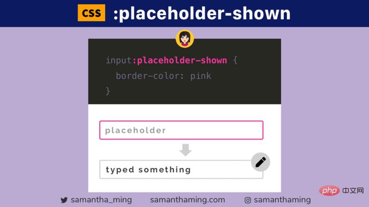
Use this pseudo-class to style an input that is currently displaying placeholder text, in other words, the user is not typing anything in the text box
It would be nice to apply some dynamic styling depending on whether your input is empty or not
input:placeholder-shown { border-color: pink; }
How does it work?
:placeholder-show
is a CSS pseudo-class that allows you to apply styles to <input>
or ## that have placeholder text #
- If the placeholder is shown, it is pink, indicating that the user did not enter anything If no placeholder is shown, it is black, indicating that the user has typed
:placeholder-showdMust have placeholder
This selector will have no effect if the element has no placeholder text. <input /><!-- 没有占位符 --> <!-- 这也被视为没有占位符文本 --> <input placeholder="" />
input:placeholder-shown { border-color: pink; }
##:placeholder-shown vs ::placeholder
Therefore, We can use
:placeholder-shown to style the input element. <div class="code" style="position:relative; padding:0px; margin:0px;"><pre class='brush:php;toolbar:false;'>input:placeholder-shown {
border: 1px solid pink;
background: yellow;
color: green;
}</pre><div class="contentsignin">Copy after login</div></div>
☝️Hmm... noticed something strange - we set the color to: green, but it didn't work. Well, that's because
only targets the input itself. But for actual placeholder text, you must use the pseudo-element ::placeholder
. <div class="code" style="position:relative; padding:0px; margin:0px;"><pre class='brush:php;toolbar:false;'>input::placeholder {
color: green;
}</pre><div class="contentsignin">Copy after login</div></div>
But! While I was working on this issue, I noticed that there are a few other properties that would affect the placeholder text if applied at the
level. <div class="code" style="position:relative; padding:0px; margin:0px;"><pre class='brush:php;toolbar:false;'>input:placeholder-shown {
font-style: italic;
text-transform: uppercase;
letter-spacing: 5px;
}</pre><div class="contentsignin">Copy after login</div></div>
Now, I don't really know why this happens, maybe it's because the properties are inherited by the placeholders.
:placeholder-shown vs :empty
although
:placeholder-shown is specifically Used to determine whether an element displays placeholders. In fact, we can use this to check if the input is empty (assuming, of course, that all inputs have a placeholder). So maybe your next question is, can't we use CSS empty? Ok let's check <div class="code" style="position:relative; padding:0px; margin:0px;"><pre class='brush:php;toolbar:false;'><input value="not empty">
<input><!-- empty --></pre><div class="contentsignin">Copy after login</div></div><div class="code" style="position:relative; padding:0px; margin:0px;"><pre class='brush:php;toolbar:false;'>input:empty {
border: 1px solid pink;
}
input {
border: 1px solid black;
}</pre><div class="contentsignin">Copy after login</div></div>
Expecting:
- If not Empty is black Hmm...from here on, you might think that
seems to be working, since what we see is a pink border. But this doesn't actually work The reason it's shown in pink is because pseudo-classes add specificity, similar to how class selectors (i.e.
) are better than type selectors ( i.e. input
) has higher specificity. High-specificity selectors will always override styles set by low-specificity. This is the verdict! Don't use
to check if the input element is empty
Okay, so the only way we can check if the input is empty is to use
:placeholder-shown. But what happens if our input elements don't have placeholders? Well, that's a smart way! Pass in an empty string " "
. <div class="code" style="position:relative; padding:0px; margin:0px;"><pre class='brush:php;toolbar:false;'><input placeholder=" "><!-- 传递空字符串 --></pre><div class="contentsignin">Copy after login</div></div><div class="code" style="position:relative; padding:0px; margin:0px;"><div class="code" style="position:relative; padding:0px; margin:0px;"><div class="code" style="position:relative; padding:0px; margin:0px;"><pre class='brush:php;toolbar:false;'>input:placeholder-shown {
border-color: pink;
}</pre><div class="contentsignin">Copy after login</div></div><div class="contentsignin">Copy after login</div></div><div class="contentsignin">Copy after login</div></div>
So, we can target input elements that display placeholder text, which is cool . In other words, if placeholder text is displayed, it must mean that the element is empty. Using this knowledge, we can combine this pseudo-class with other selectors and do some really neat things! let's see.
Reverse:placeholder-shown For :not
we can use
:not Pseudo class to do the opposite. Here, we can perform target operations when the input is not empty. <div class="code" style="position:relative; padding:0px; margin:0px;"><pre class='brush:php;toolbar:false;'><input placeholder="placeholder" value="not empty" /></pre><div class="contentsignin">Copy after login</div></div><div class="code" style="position:relative; padding:0px; margin:0px;"><pre class='brush:php;toolbar:false;'>input:not(:placeholder) {
border-color: green;
}</pre><div class="contentsignin">Copy after login</div></div><p><img src="/static/imghw/default1.png" data-src="https://img.php.cn/upload/image/738/627/999/1625538639610588.gif" class="lazy" title="1625538639610588.gif" alt="What is :placeholder-shown in CSS? how to work? What is the use?"/></p><p>结果:</p><ul><li>绿色,如果不为空,则表示用户已经输入了一些内容。</li><li>如果为空,则为黑色</li></ul><h3 id="strong-浮动标签-strong"><strong>浮动标签</strong></h3><p>使用占位符而不使用标签的问题之一就是无障碍,因为一旦你在打字的时候,占位符文字就没有了,这可能会导致用户的困惑。一个真正好的解决方案是浮动标签。最初,占位符文本显示时没有标签,而一旦用户开始输入,标签就会出现。这样一来,你仍然可以在不影响用户体验和可访问性的前提下,保持表单的简洁性。双赢</p><p>而这是可以用纯CSS实现的,我们只需要将 <code>placeholder-shown
与 :not
和 +
结合起来就可以了。这是一个超级简化版的浮动标签。
<input name="name" placeholder="Type name..." /> <label for="name">NAME</label>
label { display: none; position: absolute; top: 0; } input:not(:placeholder-shown) + label { display: block; }
浏览器支持
对 :placeholder-shown
的支持非常好!这包括Internet Explorer(是的,我和你一样惊讶)。但是,对于IE,你需要使用非标准名称 :-ms-input-placeholder
。
本文转载自:https://segmentfault.com/a/1190000039928413
作者:杜尼卜
更多编程相关知识,请访问:编程入门!!
The above is the detailed content of What is :placeholder-shown in CSS? how to work? What is the use?. For more information, please follow other related articles on the PHP Chinese website!

Hot AI Tools

Undresser.AI Undress
AI-powered app for creating realistic nude photos

AI Clothes Remover
Online AI tool for removing clothes from photos.

Undress AI Tool
Undress images for free

Clothoff.io
AI clothes remover

Video Face Swap
Swap faces in any video effortlessly with our completely free AI face swap tool!

Hot Article

Hot Tools

Notepad++7.3.1
Easy-to-use and free code editor

SublimeText3 Chinese version
Chinese version, very easy to use

Zend Studio 13.0.1
Powerful PHP integrated development environment

Dreamweaver CS6
Visual web development tools

SublimeText3 Mac version
God-level code editing software (SublimeText3)

Hot Topics


How to achieve wave effect with pure CSS3? This article will introduce to you how to use SVG and CSS animation to create wave effects. I hope it will be helpful to you!

This article will show you how to use CSS to easily realize various weird-shaped buttons that appear frequently. I hope it will be helpful to you!

Two methods: 1. Using the display attribute, just add the "display:none;" style to the element. 2. Use the position and top attributes to set the absolute positioning of the element to hide the element. Just add the "position:absolute;top:-9999px;" style to the element.

In CSS, you can use the border-image attribute to achieve a lace border. The border-image attribute can use images to create borders, that is, add a background image to the border. You only need to specify the background image as a lace style; the syntax "border-image: url (image path) offsets the image border width inward. Whether outset is repeated;".

Implementation method: 1. Use the ":active" selector to select the state of the mouse click on the picture; 2. Use the transform attribute and scale() function to achieve the picture magnification effect, the syntax "img:active {transform: scale(x-axis magnification, y Axis magnification);}".

How to create text carousel and image carousel? The first thing everyone thinks of is whether to use js. In fact, text carousel and image carousel can also be realized using pure CSS. Let’s take a look at the implementation method. I hope it will be helpful to everyone!

In CSS3, you can use the "animation-timing-function" attribute to set the animation rotation speed. This attribute is used to specify how the animation will complete a cycle and set the speed curve of the animation. The syntax is "element {animation-timing-function: speed attribute value;}".

The animation effect in css3 has deformation; you can use "animation: animation attribute @keyframes ..{..{transform: transformation attribute}}" to achieve deformation animation effect. The animation attribute is used to set the animation style, and the transform attribute is used to set the deformation style. .