A deep dive into the css box-decoration-break property
 <p>In the past two days, I came into contact with a very interesting CSS property --
 box-decoration-break. Let’s go find out together below.
<p>Because there is no Chinese document about this attribute on MDN, I have been thinking of a reasonable and appropriate Chinese translation. Literal translation:
- box -- box, can be understood as the element box model
- decoration -- decoration, understood as the element style
- break -- line break, reference
word-break, understood as the expression of line break
The English explanation on MDN is: The box-decoration-break CSS property specifies how an element's fragments should be rendered when broken across multiple lines, columns, or pages. The general idea is that the box-decoration-break attribute specifies how an element fragment should be rendered when a line break/break occurs.<p>There are only two optional values:
{
    box-decoration-break: slice;   // 默认取值
    box-decoration-break: clone;
}Line break example
<p>This attribute usually acts on inline elements. Suppose we have the following structure and add a border to it:<span>ABCDEFGHIJKLMN</span>
span {
    border: 2px solid #999;
}<p>
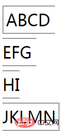 <p>Okay, continue The next step is break. We break the text in the above line and the style remains unchanged:
 <span>ABCD <br/>EFG <br/> HI<br/> JKLMN</span>
 <p>O, you can see that the text wraps At the same time, the borders also change accordingly. The first and last rows have 3-sided borders, and the middle two lines only have upper and lower borders. If you put the 4 lines together, you can form Figure 1. This is the normal display effect. <p>Next, we add the protagonist of this article
box-decoration-break: clone:span {
border: 2px solid #999;
+ box-decoration-break: clone;
}
box-decoration-break: clone usage summary
<p>Seeing this, we can already roughly understand this attribute What it does: <p> uses the inline element ofbox-decoration-break: clone. If there is a line break display, then each line will have all the complete elements of the original single line. style. <p> Let’s look at an example to deepen our understanding. There is the following structure, which uses box-decoration-break: clone with two effects before and after: <span >每一行 <br/>样式 <br/> 都 <br/> 保持<br/> 完整独立</span>

<p>CodePen Demo -- box-decoration-break<p>https://codepen.io/Chokcoco/pen/NJKoNq
box-decoration-break: clone The scope of influence of effective styles
<p>Of course, elements usingbox-decoration-break: clone will not take effect on every style , will only apply to the following styles: - background
- border
- border-image
- box-shadow
- clip -path
- margin
- padding
- Syntax
##box-decoration-break: clone actual application
Let’s see if there are any reliable practical application scenarios. <p>box-decoration-break: clone to achieve text selection effect
There will be such a scenario, we want to highlight a specific section of text in a multi-line text . At this time, we can nest <p> by <p> to perform some specific display on the text wrapped by . For example, we have this piece of copy: <p><p> The <span>box-decoration-break</span> CSS property specifies how an element's fragments should be rendered when broken across multiple lines, columns, or pages..Each box fragment is rendered independently with the <span>specified border, padding, and margin wrapping each fragment.</span> The border-radius, border-image, and box-shadow are applied to each <span>fragment independently.</span> </p>
tag, give it a specific style and add box-decoration-break: clone, in this way, no matter whether the emphasis copy is newline or not, the emphasis background of each place is the same: p {
font-size: 22px;
line-height: 36px;
}
span {
background-image: linear-gradient(135deg, deeppink, yellowgreen);
color: #fff;
padding: 2px 10px;
border-radius: 50% 3em 50% 3em;
box-decoration-break: clone;
}<p>
 What if <p>box-decoration-break: clone
 is not added? Then if there is a line break, the effect will be greatly reduced: <p>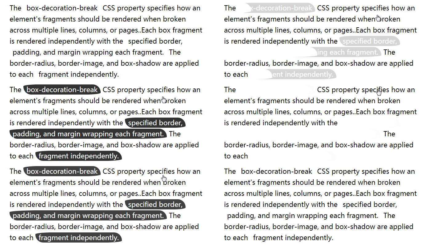
CodePen Demo -- text-decoration-break text selection effect<p>https:// codepen.io/Chokcoco/pen/rRaLqo<p>
box-decoration-break 每行文字带特定边框
<p>又会有这样的场景,我们希望每一行文案都带有特定的边框样式,像这样:<p>
 <p>怎么实现呢?也许可以每一行都是一个
 <p>,每一行 <p> 设定上述样式。但是如果文本内容不确定,容器的宽度也不确定呢?<p>这种场景,使用 box-decoration-break 也非常便捷。当然这里有个小技巧,正常而言, box-decoration-break: clone 只对 inline 元素生效,如果我们的文案像是这样包裹在 <p> 标签内:<p> The box-decoration-break CSS property specifies how an element's fragments should be rendered when broken across multiple lines, columns, or pages..Each box fragment is rendered independently with the specified border, padding, and margin wrapping each fragment. The border-radius, border-image, and box-shadow are applied to each fragment independently. </p>
box-decoration-break: clone 对 <p> 生效,可以通过设定 <p> 的 display: inline 来实现。如此一来,要实现上述效果,我们只需要:p {
display: inline;
box-decoration-break: clone;
background:linear-gradient(110deg, deeppink 0%, deeppink 98%, transparent 98%, transparent 100%);
}
<p>CodePen Demo -- box-decoration-break 每行文字带特定边框<p>https://codepen.io/Chokcoco/pen/gEbMGr?editors=1100
box-decoration-break 结合过渡动画
<p>结合上面的内容,我们还可以考虑将box-decoration-break 与过渡效果或者动画效果结合起来。<p>譬如,我们希望当我们 hover 文字内容的时候,一些重点需要展示的文字段落能够被强调展示,可能是这样:<p>
<p>CodePen Demo -- box-decoration-break 过渡动画<p>https://codepen.io/Chokcoco/pen/ZPGpmd<p>又或者是这样:<p>

<p>CodePen Demo -- box-decoration-break 结合过渡动画<p>https://codepen.io/Chokcoco/pen/ZPGpmd<p>你可以尝试点进 Demo ,然后去掉
box-decoration-break: clone ,会发现效果大打折扣。兼容性
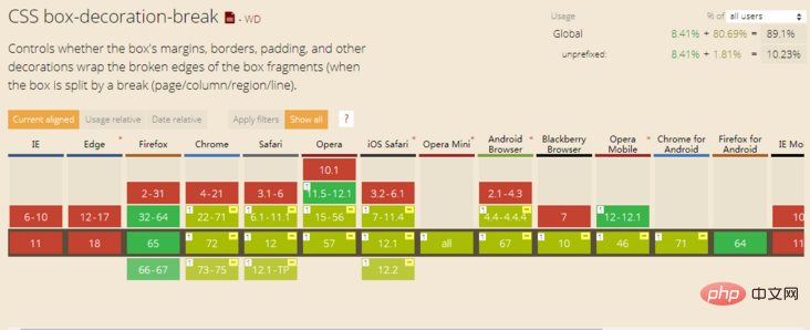
<p>额,按照惯例兼容性应该都不太行。并且 MDN 也给出了这样的提示:This is an experimental technology. Check the Browser compatibility table carefully before using this in production.<p>看看 Can I Use,其实还好,除了 IE 系列全军覆没,所以可以考虑应用在移动端。即便这个属性不兼容,降级展示对页面不会造成什么影响:
<p>
 <p>另外,本文中,给出的代码都是
 box-decoration-break: clone ,CodePen 自带了 autoprefixer 实际中可能需要写成:{
box-decoration-break: clone;
-webkit-box-decoration-break: clone;
}最后
<p>国内看到了大漠老师和张鑫旭大大都已经写过这个属性,大家可以对比着看看,加深理解: <p>好了,本文到此结束,希望对你有帮助 :) <p>更多编程相关知识,请访问:编程视频!!The above is the detailed content of A deep dive into the css box-decoration-break property. For more information, please follow other related articles on the PHP Chinese website!

Hot AI Tools

Undresser.AI Undress
AI-powered app for creating realistic nude photos

AI Clothes Remover
Online AI tool for removing clothes from photos.

Undress AI Tool
Undress images for free

Clothoff.io
AI clothes remover

Video Face Swap
Swap faces in any video effortlessly with our completely free AI face swap tool!

Hot Article

Hot Tools

Notepad++7.3.1
Easy-to-use and free code editor

SublimeText3 Chinese version
Chinese version, very easy to use

Zend Studio 13.0.1
Powerful PHP integrated development environment

Dreamweaver CS6
Visual web development tools

SublimeText3 Mac version
God-level code editing software (SublimeText3)

Hot Topics
 How to use bootstrap in vue
Apr 07, 2025 pm 11:33 PM
Using Bootstrap in Vue.js is divided into five steps: Install Bootstrap. Import Bootstrap in main.js. Use the Bootstrap component directly in the template. Optional: Custom style. Optional: Use plug-ins.
 The Roles of HTML, CSS, and JavaScript: Core Responsibilities
Apr 08, 2025 pm 07:05 PM
HTML defines the web structure, CSS is responsible for style and layout, and JavaScript gives dynamic interaction. The three perform their duties in web development and jointly build a colorful website.
 Understanding HTML, CSS, and JavaScript: A Beginner's Guide
Apr 12, 2025 am 12:02 AM
WebdevelopmentreliesonHTML,CSS,andJavaScript:1)HTMLstructurescontent,2)CSSstylesit,and3)JavaScriptaddsinteractivity,formingthebasisofmodernwebexperiences.
 How to set up the framework for bootstrap
Apr 07, 2025 pm 03:27 PM
To set up the Bootstrap framework, you need to follow these steps: 1. Reference the Bootstrap file via CDN; 2. Download and host the file on your own server; 3. Include the Bootstrap file in HTML; 4. Compile Sass/Less as needed; 5. Import a custom file (optional). Once setup is complete, you can use Bootstrap's grid systems, components, and styles to create responsive websites and applications.
 How to write split lines on bootstrap
Apr 07, 2025 pm 03:12 PM
There are two ways to create a Bootstrap split line: using the tag, which creates a horizontal split line. Use the CSS border property to create custom style split lines.
 How to insert pictures on bootstrap
Apr 07, 2025 pm 03:30 PM
There are several ways to insert images in Bootstrap: insert images directly, using the HTML img tag. With the Bootstrap image component, you can provide responsive images and more styles. Set the image size, use the img-fluid class to make the image adaptable. Set the border, using the img-bordered class. Set the rounded corners and use the img-rounded class. Set the shadow, use the shadow class. Resize and position the image, using CSS style. Using the background image, use the background-image CSS property.
 How to use bootstrap button
Apr 07, 2025 pm 03:09 PM
How to use the Bootstrap button? Introduce Bootstrap CSS to create button elements and add Bootstrap button class to add button text
 How to resize bootstrap
Apr 07, 2025 pm 03:18 PM
To adjust the size of elements in Bootstrap, you can use the dimension class, which includes: adjusting width: .col-, .w-, .mw-adjust height: .h-, .min-h-, .max-h-


