 Web Front-end
 CSS Tutorial
 Detailed explanation of how the new CSS contain feature controls page redrawing and reflowing
Detailed explanation of how the new CSS contain feature controls page redrawing and reflowing
This article will introduce you to the new CSS feature contain, and introduce how to control page redrawing and reflowing. It has certain reference value. Friends in need can refer to it. I hope it will be helpful to everyone.

Before introducing the new CSS property contain, readers first need to understand what page redrawing and reflowing are.
OK, let’s get to the main topic of this article.
contain Why? The
contain attribute allows us to specify a specific DOM element and its child elements so that they can be independent of the entire DOM tree structure. The purpose is to give the browser the ability to redraw and rearrange only some elements without having to target the entire page every time.
The contain property allows an author to indicate that an element and its contents are, as much as possible, independent of the rest of the document tree. This allows the browser to recalculate layout, style, paint, size, or any combination of them for a limited area of the DOM and not the entire page.
contain Syntax
Look at its syntax:
{
  /* No layout containment. */
  contain: none;
  /* Turn on size containment for an element. */
  contain: size;
  /* Turn on layout containment for an element. */
  contain: layout;
  /* Turn on style containment for an element. */
  contain: style;
  /* Turn on paint containment for an element. */
  contain: paint;

  /* Turn on containment for layout, paint, and size. */
  contain: strict;
  /* Turn on containment for layout, and paint. */
  contain: content;
}Except none, there are still 6 values, let’s take a look one by one.
contain: size
contain: size: The rendering of an element set to contain: size will not be affected by the content of its child elements.
The value turns on size containment for the element. This ensures that the containing box can be laid out without needing to examine its descendants.
I was confused when I started to see this definition, It’s hard to understand what it means just by looking at the definition. Still need to practice:
Suppose we have the following simple structure:
<div class="container">

</div>
.container {
    width: 300px;
    padding: 10px;
    border: 1px solid red;
}

p {
    border: 1px solid #333;
    margin: 5px;
    font-size: 14px;
}And, with the help of jQuery, each click on the container adds a <p>Coco</p> Structure:
$('.container').on('click', e => {
$('.container').append('<p>Coco</p>')
})Then you will get the following result:
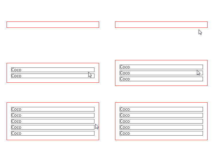
You can see that the height of the container .container will change with It increases with the increase of elements, which is a normal phenomenon.
At this moment, we add a contain: size to the container .container, and the above mentioned will appear: setcontain: The rendering of an element of size will not be affected by the contents of its child elements.
.container {
    width: 300px;
    padding: 10px;
    border: 1px solid red;
+   contain: size
}Let’s see what happens:
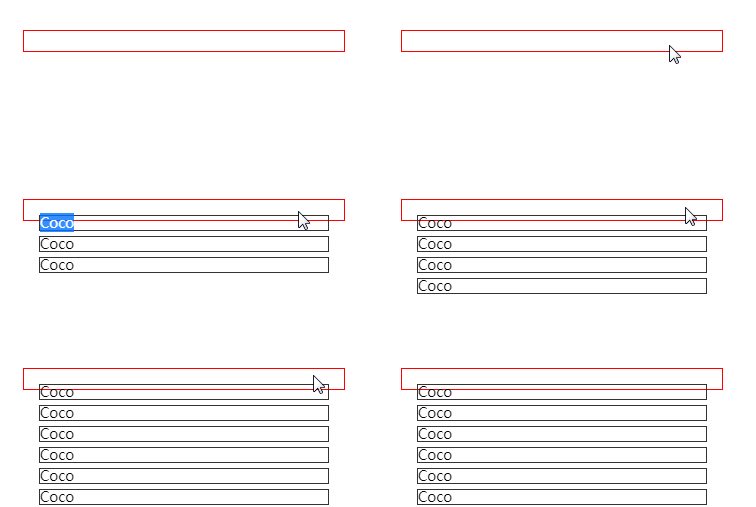
Normally, the height of the parent element will be increased due to the increase in child elements, but now , changes in child elements no longer affect the style layout of the parent element. This is the role of contain: size.
contain: style
Let’s talk about contain: style, contain: layout, contain: paint. Let’s look at contain: style first.
As of the writing of this article, contain: style has been temporarily removed.
CSS Containment Module Level 1: Drop the at-risk “style containment” feature from this specification, move it Level 2.
Well, the official saying is that it has been temporarily removed because of certain risks. It may be redefined in the second version of the specification, so let’s leave this attribute aside for now.
contain: paint
contain: paint: The element with contain: paint is set to have layout restrictions, which means to inform the User Agent that this element The child elements of will not be displayed outside the bounds of this element, so if the element is not on the screen or is otherwise set to be invisible, its descendants are also guaranteed to be invisible and not rendered.
This value turns on paint containment for the element. This ensures that the descendants of the containing box don't display outside its bounds, so if an element is off-screen or otherwise not visible, its descendants are also guaranteed to be not visible.
This is a little easier to understand. Let’s look at the first feature first:
The child elements of the element that has contain: paint set are not Will be displayed outside the bounds of this element
- The child elements of an element that is set to
contain: paintwill not be displayed outside the bounds of this element
This feature is somewhat similar to overflow: hidden, which means that the user agent is clearly informed that the content of the sub-element will not exceed the boundary of the element, so the excess part does not need to be rendered.
Simple example, assuming the element structure is as follows:
<div class="container">
    <p>Coco</p>
</div>.container {
contain: paint;
border: 1px solid red;
}
p{
left: -100px;
} Let’s take a look at what will happen when contain: paint is set and not set:
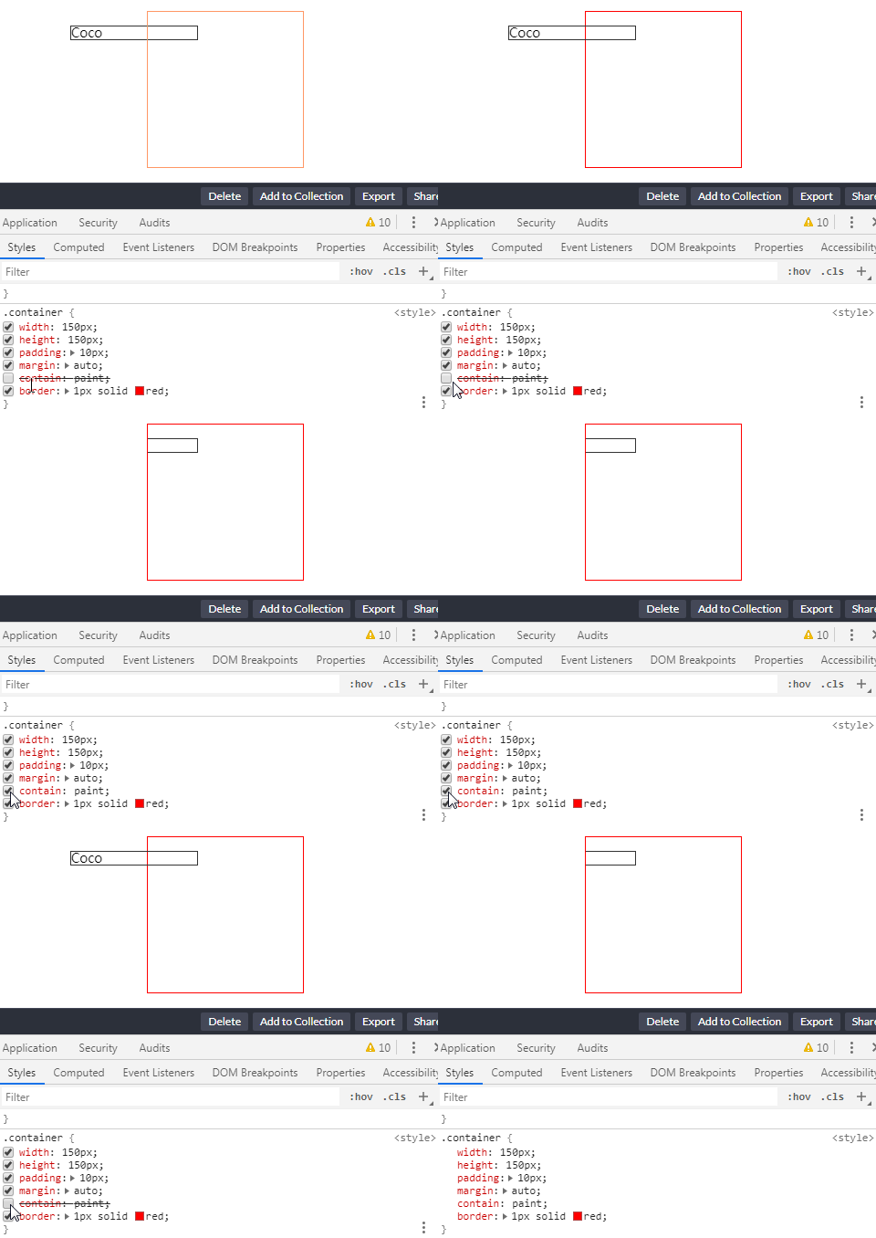
CodePen Demo -- contain: paint Demo
设定了 contain: paint 的元素在屏幕之外时不会渲染绘制
通过使用 contain: paint, 如果元素处于屏幕外,那么用户代理就会忽略渲染这些元素,从而能更快的渲染其它内容。
contain: layout
contain: layout:设定了 contain: layout 的元素即是设定了布局限制,也就是说告知 User Agent,此元素内部的样式变化不会引起元素外部的样式变化,反之亦然。
This value turns on layout containment for the element. This ensures that the containing box is totally opaque for layout purposes; nothing outside can affect its internal layout, and vice versa.
启用 contain: layout 可以潜在地将每一帧需要渲染的元素数量减少到少数,而不是重新渲染整个文档,从而为浏览器节省了大量不必要的工作,并显着提高了性能。
使用 contain:layout,开发人员可以指定对该元素任何后代的任何更改都不会影响任何外部元素的布局,反之亦然。
因此,浏览器仅计算内部元素的位置(如果对其进行了修改),而其余DOM保持不变。因此,这意味着帧渲染管道中的布局过程将加快。
存在的问题
描述很美好,但是在实际 Demo 测试的过程中(截止至2021/04/27,Chrome 90.0.4430.85),仅仅单独使用 contain:layout 并没有验证得到上述那么美好的结果。
设定了 contain: layout 的指定元素,改元素的任何后代的任何更改还是会影响任何外部元素的布局,点击红框会增加一条 <p>Coco<p> 元素插入到 container 中:
简单的代码如下:
<div class="container">
    <p>Coco</p>
    ...
</div>
<div class="g-test"></div>html,
body {
width: 100%;
height: 100%;
display: flex;
justify-content: center;
align-items: center;
flex-direction: column;
gap: 10px;
}
.container {
width: 150px;
padding: 10px;
contain: layout;
border: 1px solid red;
}
.g-test {
width: 150px;
height: 150px;
border: 1px solid green;
}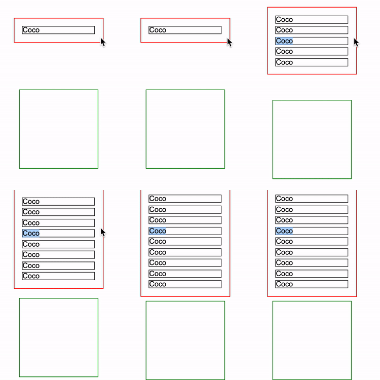
CodePen Demo -- contain: layout Demo
目前看来,contain: layout 的实际作用不那么明显,更多的关于它的用法,你可以再看看这篇文章:CSS-tricks - contain
contain: strict | contain: content
这两个属性稍微有点特殊,效果是上述介绍的几个属性的聚合效果:
-
contain: strict:同时开启 layout、style、paint 以及 size 的功能,它相当于contain: size layout paint -
contain: content:同时开启 layout、style 以及 paint 的功能,它相当于contain: layout paint
所以,这里也提一下,contain 属性是可以同时定义几个的。
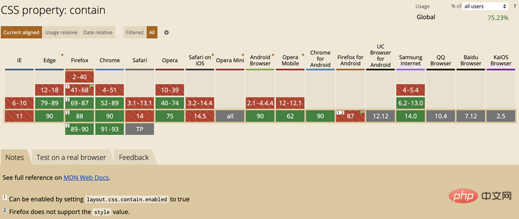
Can i Use -- CSS Contain
截止至 2021-04-27,Can i Use 上的 CSS Contain 兼容性,已经可以开始使用起来:
参考文献
最后
好了,本文到此结束,希望对你有帮助 :)
原文地址:https://segmentfault.com/a/1190000039950464
作者:chokcoco
更多编程相关知识,请访问:编程入门!!
The above is the detailed content of Detailed explanation of how the new CSS contain feature controls page redrawing and reflowing. For more information, please follow other related articles on the PHP Chinese website!

Hot AI Tools

Undresser.AI Undress
AI-powered app for creating realistic nude photos

AI Clothes Remover
Online AI tool for removing clothes from photos.

Undress AI Tool
Undress images for free

Clothoff.io
AI clothes remover

Video Face Swap
Swap faces in any video effortlessly with our completely free AI face swap tool!

Hot Article

Hot Tools

Notepad++7.3.1
Easy-to-use and free code editor

SublimeText3 Chinese version
Chinese version, very easy to use

Zend Studio 13.0.1
Powerful PHP integrated development environment

Dreamweaver CS6
Visual web development tools

SublimeText3 Mac version
God-level code editing software (SublimeText3)

Hot Topics
 1653
1653
 14
14
 1413
1413
 52
52
 1304
1304
 25
25
 1251
1251
 29
29
 1224
1224
 24
24
 How to use bootstrap in vue
Apr 07, 2025 pm 11:33 PM
Using Bootstrap in Vue.js is divided into five steps: Install Bootstrap. Import Bootstrap in main.js. Use the Bootstrap component directly in the template. Optional: Custom style. Optional: Use plug-ins.
 The Roles of HTML, CSS, and JavaScript: Core Responsibilities
Apr 08, 2025 pm 07:05 PM
HTML defines the web structure, CSS is responsible for style and layout, and JavaScript gives dynamic interaction. The three perform their duties in web development and jointly build a colorful website.
 Understanding HTML, CSS, and JavaScript: A Beginner's Guide
Apr 12, 2025 am 12:02 AM
WebdevelopmentreliesonHTML,CSS,andJavaScript:1)HTMLstructurescontent,2)CSSstylesit,and3)JavaScriptaddsinteractivity,formingthebasisofmodernwebexperiences.
 How to insert pictures on bootstrap
Apr 07, 2025 pm 03:30 PM
There are several ways to insert images in Bootstrap: insert images directly, using the HTML img tag. With the Bootstrap image component, you can provide responsive images and more styles. Set the image size, use the img-fluid class to make the image adaptable. Set the border, using the img-bordered class. Set the rounded corners and use the img-rounded class. Set the shadow, use the shadow class. Resize and position the image, using CSS style. Using the background image, use the background-image CSS property.
 How to write split lines on bootstrap
Apr 07, 2025 pm 03:12 PM
There are two ways to create a Bootstrap split line: using the tag, which creates a horizontal split line. Use the CSS border property to create custom style split lines.
 How to set up the framework for bootstrap
Apr 07, 2025 pm 03:27 PM
To set up the Bootstrap framework, you need to follow these steps: 1. Reference the Bootstrap file via CDN; 2. Download and host the file on your own server; 3. Include the Bootstrap file in HTML; 4. Compile Sass/Less as needed; 5. Import a custom file (optional). Once setup is complete, you can use Bootstrap's grid systems, components, and styles to create responsive websites and applications.
 How to use bootstrap button
Apr 07, 2025 pm 03:09 PM
How to use the Bootstrap button? Introduce Bootstrap CSS to create button elements and add Bootstrap button class to add button text
 How to resize bootstrap
Apr 07, 2025 pm 03:18 PM
To adjust the size of elements in Bootstrap, you can use the dimension class, which includes: adjusting width: .col-, .w-, .mw-adjust height: .h-, .min-h-, .max-h-


