

How to achieve text effects with pure CSS3? 8 text effects to share

This article will share with you 8 ways to implement CSS text effects. It has certain reference value. Friends in need can refer to it. I hope it will be helpful to everyone.
Today we will study several text effects, mainly using text-shadow and several unique features of the webkit kernel to achieve the effects.
Click here to study online and click here to download collections.
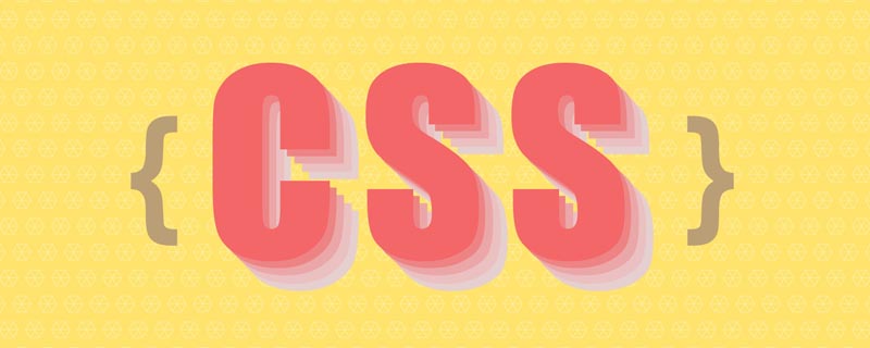
Effect 1 - Three-dimensional character effect

<div contenteditable="true" class="text effect01">前端开发whqet</div>
body{
  background-color: #666;
}
@import url(http://fonts.googleapis.com/css?family=Dosis:500,800);
.text {
    font-family:"微软雅黑", "Dosis", sans-serif;
    font-size: 80px;
    text-align: center;
    font-weight: bold;
    line-height:200px;
    text-transform:uppercase;
    position: relative;
}.effect01{
background-color: #333;
color:#fefefe;
text-shadow:
0px 1px 0px #c0c0c0,
0px 2px 0px #b0b0b0,
0px 3px 0px #a0a0a0,
0px 4px 0px #909090,
0px 5px 10px rgba(0, 0, 0, 0.6);
}Effect 2-long tail effect

<div contenteditable="true" class="text effect02">前端开发whqet</div>
.effect02{
  color:#333;
  background-color: #ddd;
  text-shadow:
    1px -1px 0 #767676,
    -1px 2px 1px #737272,
    -2px 4px 1px #767474,
    -3px 6px 1px #787777,
    -4px 8px 1px #7b7a7a,
    -5px 10px 1px #7f7d7d,
    -6px 12px 1px #828181,
    -7px 14px 1px #868585,
    -8px 16px 1px #8b8a89,
    -9px 18px 1px #8f8e8d,
    -10px 20px 1px #949392,
    -11px 22px 1px #999897,
    -12px 24px 1px #9e9c9c,
    -13px 26px 1px #a3a1a1,
    -14px 28px 1px #a8a6a6,
    -15px 30px 1px #adabab,
    -16px 32px 1px #b2b1b0,
    -17px 34px 1px #b7b6b5,
    -18px 36px 1px #bcbbba,
    -19px 38px 1px #c1bfbf,
    -20px 40px 1px #c6c4c4,
    -21px 42px 1px #cbc9c8,
    -22px 44px 1px #cfcdcd;
}Effect Three-Inner Shadow
 html file
<div contenteditable="true" class="text effect03">前端开发whqet</div>
.effect03{
  color: #202020;
  background-color: #2d2d2d;
  text-shadow:
    -1px -1px 1px #111111,
    2px 2px 1px #363636;
}Effect 4-Twill stroke effect

<div contenteditable="true" class="text effect04">前端开发whqet</div>
.effect04{
  background-color: #333;
  background-image:
      linear-gradient(
        45deg,
        transparent 45%,
        hsla(48,20%,90%,1) 45%,
        hsla(48,20%,90%,1) 55%,
        transparent 0
        );
    background-size: .05em .05em;
  -webkit-background-clip: text;
  -webkit-text-fill-color: transparent;
  -webkit-text-stroke: 2px #111;
}Effect Five-Text Stripe Animation
 html file
<div data-text="前端开发whqet" class="text effect05">前端开发whqet</div>
.effect05{
    color:#DC554F;
    background-color:#27ae60;
    z-index: 3;
}
.effect05:before{
    content:attr(data-text);
    width:100%;
    line-height:200px;
    opacity: .5;
    position: absolute;
    top:2px;
    left:5px;
    background-image:
      linear-gradient(
        45deg,
        transparent 45%,
        hsla(48,20%,90%,1) 45%,
        hsla(48,20%,90%,1) 55%,
        transparent 0
        );
    z-index:-1;
    background-size: .05em .05em;
    -webkit-background-clip: text;
    -webkit-text-fill-color: transparent;
    animation: shadowGo 20s linear infinite;
}
@keyframes shadowGo{
    0% {background-position: 0 0}
    0% {background-position: -100% 100%}};
}Effect Six-Stroke Text
 html file
<div contenteditable="true" class="text effect06">前端开发whqet</div>
.effect06 {
    -webkit-text-fill-color: transparent;
    -webkit-text-stroke: 2px #d6d6d6;
    background: url(http://www.pencilscoop.com/demos/CSS_Text_Effects/images/galaxy.jpg);
    background-size: cover;
}Effect Seven-Mask Text

<div contenteditable="true" class="text effect07">前端开发whqet</div>
.effect07 {
    background: url(http://www.pencilscoop.com/demos/CSS_Text_Effects/images/galaxy.jpg) #333;
    -webkit-background-clip: text;
    -webkit-text-fill-color: transparent;
    background-size: cover;
    animation: 10s infinite linear animate;
}
.effect07:before {
    content:"";
    width:100%;
    height:100%;
    position: absolute;
    left:0;
    top:0;
    background-color: #999;
    z-index: -1;
}
@keyframes animate {
    0% {
        background-position:0;
    }
    100% {
        background-position:-1000px 0;
    }
}Effect eight-3D glare effect
##html file
<div class="text effect08">
  <h1>前端开发whqet</h1>
  <h1>前端开发whqet</h1>
  <h1>前端开发whqet</h1>
  <h1>前端开发whqet</h1>
  <h1>前端开发whqet</h1>
  <h1>前端开发whqet</h1>
  <h1>前端开发whqet</h1>
  <h1>前端开发whqet</h1>
</div>
css file
.effect08 {
    color:#fff;
    transform-origin:center bottom;
    transform-style:preserve-3d;
    transition:all 1s;
    cursor: pointer;
}
.effect08:hover {
    transform:rotate3d(1, 0, 0, 40deg);
}
.effect08 h1 {
    position: absolute;
    left:0;
    right:0;
    margin:auto;
    text-shadow:0 0 10px rgba(0, 0, 100, .5);
}
/*
sass 循环给每一个h1设置不同的translateZ
*/
@for $n from 1 to 8 {
    .effect08 h1:nth-child(#{$n}) {
        transform:translateZ(4px*$n);
    }
}For more programming-related knowledge, please visit:
programming videoThe above is the detailed content of How to achieve text effects with pure CSS3? 8 text effects to share. For more information, please follow other related articles on the PHP Chinese website!

Hot AI Tools

Undresser.AI Undress
AI-powered app for creating realistic nude photos

AI Clothes Remover
Online AI tool for removing clothes from photos.

Undress AI Tool
Undress images for free

Clothoff.io
AI clothes remover

Video Face Swap
Swap faces in any video effortlessly with our completely free AI face swap tool!

Hot Article
Hot Tools

Notepad++7.3.1
Easy-to-use and free code editor

SublimeText3 Chinese version
Chinese version, very easy to use

Zend Studio 13.0.1
Powerful PHP integrated development environment

Dreamweaver CS6
Visual web development tools

SublimeText3 Mac version
God-level code editing software (SublimeText3)
Hot Topics
 1664
1664
 14
1423
52
1318
25
1268
29
1248
24
14
1423
52
1318
25
1268
29
1248
24

 How to use bootstrap in vue
Apr 07, 2025 pm 11:33 PM
How to use bootstrap in vue
Apr 07, 2025 pm 11:33 PM
Using Bootstrap in Vue.js is divided into five steps: Install Bootstrap. Import Bootstrap in main.js. Use the Bootstrap component directly in the template. Optional: Custom style. Optional: Use plug-ins.
 Understanding HTML, CSS, and JavaScript: A Beginner's Guide
Apr 12, 2025 am 12:02 AM
Understanding HTML, CSS, and JavaScript: A Beginner's Guide
Apr 12, 2025 am 12:02 AM
WebdevelopmentreliesonHTML,CSS,andJavaScript:1)HTMLstructurescontent,2)CSSstylesit,and3)JavaScriptaddsinteractivity,formingthebasisofmodernwebexperiences.
 The Roles of HTML, CSS, and JavaScript: Core Responsibilities
Apr 08, 2025 pm 07:05 PM
The Roles of HTML, CSS, and JavaScript: Core Responsibilities
Apr 08, 2025 pm 07:05 PM
HTML defines the web structure, CSS is responsible for style and layout, and JavaScript gives dynamic interaction. The three perform their duties in web development and jointly build a colorful website.
 How to insert pictures on bootstrap
Apr 07, 2025 pm 03:30 PM
How to insert pictures on bootstrap
Apr 07, 2025 pm 03:30 PM
There are several ways to insert images in Bootstrap: insert images directly, using the HTML img tag. With the Bootstrap image component, you can provide responsive images and more styles. Set the image size, use the img-fluid class to make the image adaptable. Set the border, using the img-bordered class. Set the rounded corners and use the img-rounded class. Set the shadow, use the shadow class. Resize and position the image, using CSS style. Using the background image, use the background-image CSS property.
 How to write split lines on bootstrap
Apr 07, 2025 pm 03:12 PM
How to write split lines on bootstrap
Apr 07, 2025 pm 03:12 PM
There are two ways to create a Bootstrap split line: using the tag, which creates a horizontal split line. Use the CSS border property to create custom style split lines.
 How to set up the framework for bootstrap
Apr 07, 2025 pm 03:27 PM
How to set up the framework for bootstrap
Apr 07, 2025 pm 03:27 PM
To set up the Bootstrap framework, you need to follow these steps: 1. Reference the Bootstrap file via CDN; 2. Download and host the file on your own server; 3. Include the Bootstrap file in HTML; 4. Compile Sass/Less as needed; 5. Import a custom file (optional). Once setup is complete, you can use Bootstrap's grid systems, components, and styles to create responsive websites and applications.
 How to resize bootstrap
Apr 07, 2025 pm 03:18 PM
How to resize bootstrap
Apr 07, 2025 pm 03:18 PM
To adjust the size of elements in Bootstrap, you can use the dimension class, which includes: adjusting width: .col-, .w-, .mw-adjust height: .h-, .min-h-, .max-h-
 How to use bootstrap button
Apr 07, 2025 pm 03:09 PM
How to use bootstrap button
Apr 07, 2025 pm 03:09 PM
How to use the Bootstrap button? Introduce Bootstrap CSS to create button elements and add Bootstrap button class to add button text
