

How to change the color of an image with css

In CSS, you can use the filter attribute to change the color of the picture. You only need to set the "filter: style value" style to the picture element. The filter attribute sets or retrieves the filter effect applied to the object, which defines the visual effect of the element (for example: blur and saturation).

The operating environment of this tutorial: Windows 7 system, CSS3&&HTML5 version, Dell G3 computer.
When it comes to processing pictures, we often think of image processing tools such as PhotoShop. As front-end developers, we often need to deal with some special effects, such as making icons display different colors according to different states. Or when hovering, process the contrast and shadows of the picture.
Do you think these are processed through PS software? No, no, it’s purely written in CSS, it’s very magical.
Powerful CSS:filter
CSS filter (filter) provides graphic special effects, such as blurring, sharpening or discoloration of elements. Filters are commonly used to adjust the rendering of images, backgrounds and borders. MDN
The CSS standard contains some functions that have implemented predefined effects.
filter: none
| blur()
| brightness()
| contrast()
| drop-shadow()
| grayscale()
| hue-rotate()
| invert()
| opacity()
| saturate()
| sepia()
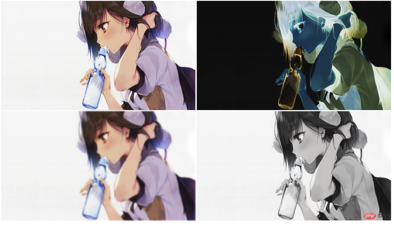
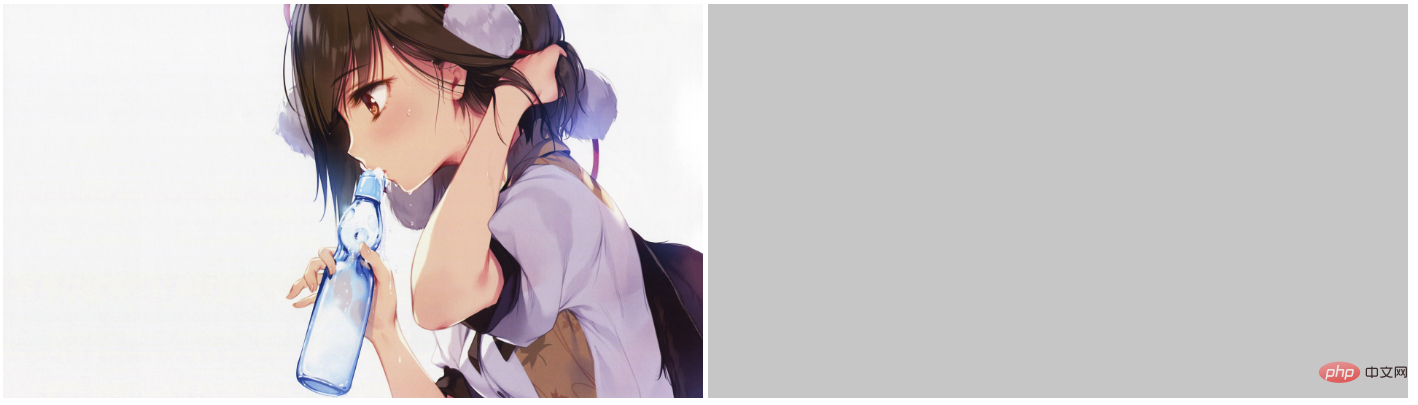
| url();<!--html--> <img src="https://note.youdao.com/yws/res/237/WEBRESOURCE7e77df2551fe1a1db1b9d91f4d518917" alt="原图">
filter: none
has no effect, the default filter is none
filter:blur( ) Gaussian blur
Give the image a Gaussian blur effect. The larger the length value, the blurr the image.
Let’s try it
img {
    filter:blur(2px);;
}
img {
    filter:brightness(70%);
} ##contrast(%) Contrast
Adjust the contrast of the image.
img {
    filter:contrast(50%);
} drop-shadow(h-shadow v-shadow blur spread color)
Set a shadow effect to the image. Shadows are composited underneath the image and can be blurred, offset versions of the matte that can be painted in a specific color. The function accepts values of type
Using this solution, we actually change Similar to the color of some icons, such as black icons turning into blue icons.
CSS arbitrary color coloring technology for small icons in PNG format
img {
    filter: drop-shadow(705px 0 0 #ccc);
}Here, we project the image to form a gray area of equal size.
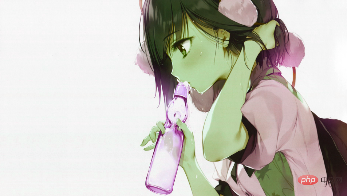
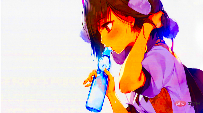
 hue-rotate(deg) Hue rotation
img {
    filter:hue-rotate(70deg);
}Look, the little sister has turned into an Avatar!
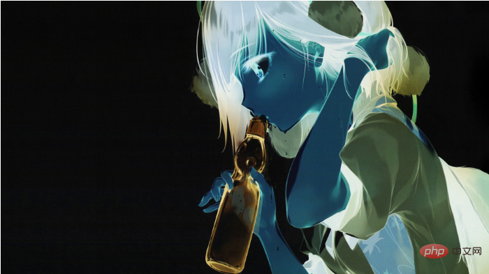
 invert(%) Inversion
The function of this function is to invert the input image, a bit like the effect of exposure
img {
    filter:invert(100%)
} grayscale(%) Convert the image to a grayscale image
This effect can make the picture look old, giving it a sense of the vicissitudes of the times. People who like ancient style will definitely like this effect. when.
 You can set it like this
img {
    filter:grayscale(80%);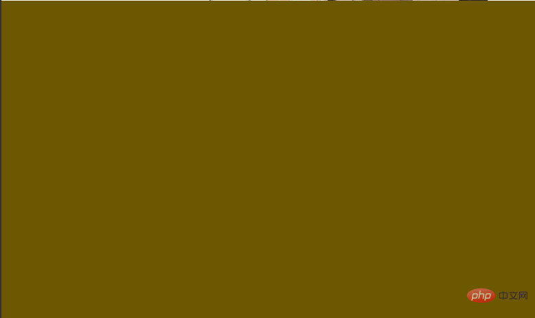
}sepia(%) Convert the image to dark brown
Let me give my little sister a warm hue. 
*{
    filter: grayscale(100%);
    -webkit-filter: grayscale(100%);
    -moz-filter: grayscale(100%);
    -ms-filter: grayscale(100%);
    -o-filter: grayscale(100%);
}Yes, because I I want to leave this content to the end. filter:url() is the ultimate way to change images with css filters. CSS:filter can import an svg filter as its own filter. 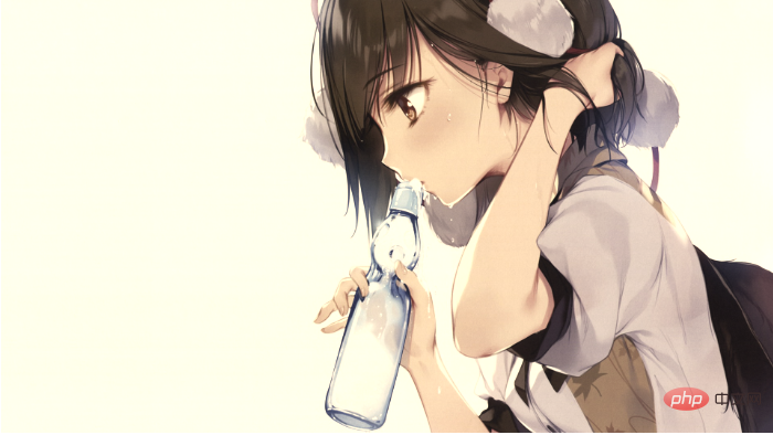
Why is filter:url() the ultimate solution to image discoloration? Please allow me to explain slowly.
我们先科普一下PS的工作原理,我们都知道网页是有三原色的R(红) G(绿) B(蓝),常见的RGBA还包括一个opicity值,而opcity值是根据alpha通道计算出来的。也就是说,我们见到的网页的每一个像素点都是由红蓝绿再加alpha四个通道组成,每一个通道我们称之为色板,PS中的8位板的意思就是2的八次方256,意思就是每一个通道的取值范围都是(0-255) SVG 研究之路 (11) - filter:feColorMatrix
如果我们可以改变每个通道的值是不是就能完美的得到我们想要的任意颜色了呢,原理上,我们可以像ps那样利用svg滤镜得到任何我们想要的图像,不仅仅是变色。我们甚至可以凭空生成一幅图像。
svg feColorMatrix大法好
<svg height="0" xmlns="http://www.w3.org/2000/svg">
    <defs>
        <filter id="change">
                <feColorMatrix type="matrix" values="
                0 0 0 0 0.55
                0 0 0 0 0.23
                0 0 0 0 0
                0 0 0 0 1" />
        </filter>
    </defs>
</svg>
<img src="https://note.youdao.com/yws/res/237/WEBRESOURCE7e77df2551fe1a1db1b9d91f4d518917" alt="">img {
filter:url(#change);
}通过单通道我们可以将图片变成单一的颜色
<svg height="0" xmlns="http://www.w3.org/2000/svg">
    <defs>
        <filter id="change">
               <feColorMatrix values="3 -1 -1 0 0
                       -1 3 -1 0 0
                       -1 -1 3 0 0
                       0 0 0 1 0" />
        </filter>
    </defs>
</svg>通过双通道我们可以的到一些非常炫酷的PS效果
当然,在这里,只是举个例子,通过配置矩阵中的值,我们可以配置每一个像素点的值按照我们定义的规则显示
我们在这里详细讲一下feColorMatrix 矩阵的计算方式
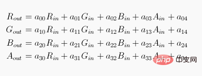
其中Rin Gi
n Bin a(alpha) 为原始图片中每个像素点的rgba值
通过矩阵计算,得到的Rout Gout Bout Aout就是最终显示出来的rgba值。
将图片转为单色 拿棕色rgba(140,59,0,1)作为例子
根据上面的公式,我们可以简化一些计算,同一行中,只设置一个通道的值,其他通道为0
不难得出矩阵
0 0 0 0 目标值R
0 0 0 0 目标值G
0 0 0 0 目标值B
0 0 0 0 1
根据规则,只需要计算,255/想要显示的颜色对应通道 = 目标值
我们想要的棕色rgba(140,59,0,1) 换算成色板 rgba 为 140 59 0 255
可以算出目标值
0 0 0 0 0.55
0 0 0 0 0.23
0 0 0 0 0
0 0 0 0 1
总结
- css3提供了filter这个属性,使得通过前端技术实现更多炫酷的特效成为了可能
- 依赖于svg的滤镜,我们可以实现复杂的滤镜效果
注意
- css:filter与ie上的filter并不是相同的概念
- css:filter在不同的浏览器上兼容性不一样,您在使用的时候需要注意浏览器的兼容性
推荐学习:css视频教程
The above is the detailed content of How to change the color of an image with css. For more information, please follow other related articles on the PHP Chinese website!

Hot AI Tools

Undresser.AI Undress
AI-powered app for creating realistic nude photos

AI Clothes Remover
Online AI tool for removing clothes from photos.

Undress AI Tool
Undress images for free

Clothoff.io
AI clothes remover

Video Face Swap
Swap faces in any video effortlessly with our completely free AI face swap tool!

Hot Article
Hot Tools

Notepad++7.3.1
Easy-to-use and free code editor

SublimeText3 Chinese version
Chinese version, very easy to use

Zend Studio 13.0.1
Powerful PHP integrated development environment

Dreamweaver CS6
Visual web development tools

SublimeText3 Mac version
God-level code editing software (SublimeText3)
Hot Topics


 How to use bootstrap in vue
Apr 07, 2025 pm 11:33 PM
How to use bootstrap in vue
Apr 07, 2025 pm 11:33 PM
Using Bootstrap in Vue.js is divided into five steps: Install Bootstrap. Import Bootstrap in main.js. Use the Bootstrap component directly in the template. Optional: Custom style. Optional: Use plug-ins.
 The Roles of HTML, CSS, and JavaScript: Core Responsibilities
Apr 08, 2025 pm 07:05 PM
The Roles of HTML, CSS, and JavaScript: Core Responsibilities
Apr 08, 2025 pm 07:05 PM
HTML defines the web structure, CSS is responsible for style and layout, and JavaScript gives dynamic interaction. The three perform their duties in web development and jointly build a colorful website.
 Understanding HTML, CSS, and JavaScript: A Beginner's Guide
Apr 12, 2025 am 12:02 AM
Understanding HTML, CSS, and JavaScript: A Beginner's Guide
Apr 12, 2025 am 12:02 AM
WebdevelopmentreliesonHTML,CSS,andJavaScript:1)HTMLstructurescontent,2)CSSstylesit,and3)JavaScriptaddsinteractivity,formingthebasisofmodernwebexperiences.
 How to set up the framework for bootstrap
Apr 07, 2025 pm 03:27 PM
How to set up the framework for bootstrap
Apr 07, 2025 pm 03:27 PM
To set up the Bootstrap framework, you need to follow these steps: 1. Reference the Bootstrap file via CDN; 2. Download and host the file on your own server; 3. Include the Bootstrap file in HTML; 4. Compile Sass/Less as needed; 5. Import a custom file (optional). Once setup is complete, you can use Bootstrap's grid systems, components, and styles to create responsive websites and applications.
 How to write split lines on bootstrap
Apr 07, 2025 pm 03:12 PM
How to write split lines on bootstrap
Apr 07, 2025 pm 03:12 PM
There are two ways to create a Bootstrap split line: using the tag, which creates a horizontal split line. Use the CSS border property to create custom style split lines.
 How to insert pictures on bootstrap
Apr 07, 2025 pm 03:30 PM
How to insert pictures on bootstrap
Apr 07, 2025 pm 03:30 PM
There are several ways to insert images in Bootstrap: insert images directly, using the HTML img tag. With the Bootstrap image component, you can provide responsive images and more styles. Set the image size, use the img-fluid class to make the image adaptable. Set the border, using the img-bordered class. Set the rounded corners and use the img-rounded class. Set the shadow, use the shadow class. Resize and position the image, using CSS style. Using the background image, use the background-image CSS property.
 How to use bootstrap button
Apr 07, 2025 pm 03:09 PM
How to use bootstrap button
Apr 07, 2025 pm 03:09 PM
How to use the Bootstrap button? Introduce Bootstrap CSS to create button elements and add Bootstrap button class to add button text
 How to resize bootstrap
Apr 07, 2025 pm 03:18 PM
How to resize bootstrap
Apr 07, 2025 pm 03:18 PM
To adjust the size of elements in Bootstrap, you can use the dimension class, which includes: adjusting width: .col-, .w-, .mw-adjust height: .h-, .min-h-, .max-h-
