
 Web Front-end
Bootstrap Tutorial
A brief discussion on the usage of Glyphicons icons in Bootstrap
Web Front-end
Bootstrap Tutorial
A brief discussion on the usage of Glyphicons icons in Bootstrap
A brief discussion on the usage of Glyphicons icons in Bootstrap

This article will introduce to you the usage of Glyphicons icons in Bootstrap. It has certain reference value. Friends in need can refer to it. I hope it will be helpful to everyone.

Available Icons
Bootstrap3 provides almost 300 font icons from Glyphicon Halflings, which can be used for buttons, links, navigation and forms, etc. element. The most common icons are shown in Figure 3-1:
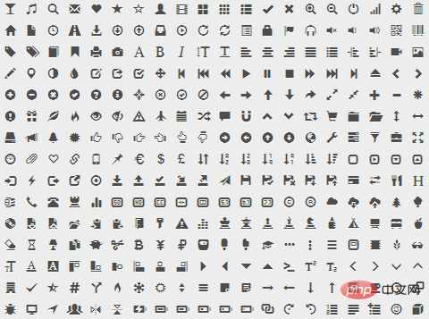
Figure 3-1 Icons provided by Glyphicons
Glyphicons Halflings are generally paid, but their authors Bootstrap is allowed to be used for free. To express our gratitude, I hope you will try your best to add a friendly link to Glyphicons when using it.
Related recommendations: "bootstrap tutorial"
How to use
The usage of font icons is very simple. Apply the icon class on any inline-level element. Can. However, since the icon class cannot be used directly with other components, it is usually necessary to create a separate inline-level element to place the icon.
For performance reasons, all icons require a base class .glyphicon and a .glyphicon-* class corresponding to each icon. In order to avoid potentially confusing output content captured by screen reading devices, it is recommended to set the aria-hidden="true" attribute for the icon. For example, the following is the code to add a search icon:
<span class="glyphicon glyphicon-search" aria-hidden="true"></span>
Bootstrap assumes that all icon font files are located in the ../fonts/ directory (relative to the directory of the precompiled CSS file) . If you modify the location of the icon font file, you need to choose any of the following methods to update the CSS file according to your own situation:
- Modify
@icon in the Less source file -font-pathand/or@icon-font-namevariables. - Use the relative URL address option provided by the Less compiler.
- Modify the
url()address in the precompiled CSS file.
Usage examples
You can use these icons to design wherever needed, such as button groups, buttons, navigation, form input boxes, warning boxes and other components. Beautiful interface. For example, in button groups and buttons:
<button type="button" class="btn btn-default" aria-label="Left Align">
  <span class="glyphicon glyphicon-align-left" aria-hidden="true"></span>
</button>
<button type="button" class="btn btn-default btn-lg">
  <span class="glyphicon glyphicon-star" aria-hidden="true"></span> Star
</button>
The effect is shown in Figure 3-2:
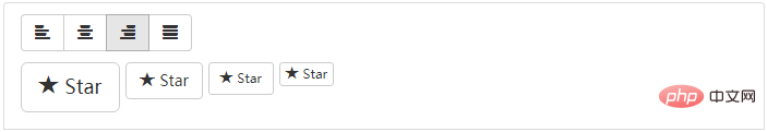 ##Figure 3-2 Using font icons in button groups
The icon contained in the
.sr-only text, you can let the assistive device know what this prompt means. . For example:
<div class="alert alert-danger" role="alert">
  <span class="glyphicon glyphicon-exclamation-sign" aria-hidden="true"></span>
  <span class="sr-only">Error:</span>
  Enter a valid email address
</div>
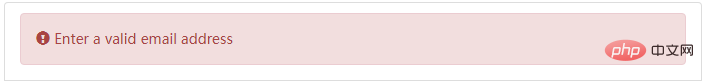 Figure 3-3 Using icons in the warning box
A very convenient thing about font icons is that you can customize the appearance of the icon through CSS. It is no exaggeration to say that as long as CSS supports it, no matter the color, size, shadow or any other effect, it can be easily displayed in the font icon. Suppose a font icon is used on a button:
<button type="button" class="btn btn-primary">
  <span class="glyphicon glyphicon-user"></span> User
</button>
##Figure 3-4 Font icon
If If you want the icon to be slightly larger, you can apply the .btn-lg class to the button, or set the font size via CSS to get an icon of any size. For example:
<button type="button" class="btn btn-primary"   style="max-width:90%">
  <span class="glyphicon glyphicon-user"></span> User
</button>
The effect is shown in Figure 3‑5:
Figure 3-5 Font icon size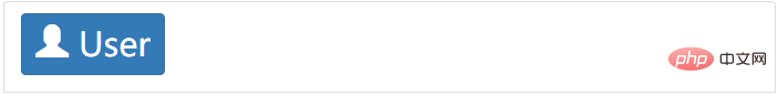
You can also use the same method Get the icon color you want by setting the button's text color. For example:
<button type="button" class="btn btn-primary"   style="max-width:90%">
  <span class="glyphicon glyphicon-user"></span> User
</button>
The effect is shown in Figure 3‑6:
Figure 3-6 Font icon color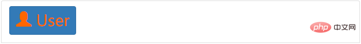
Even, you can also set the icon Add text shadow. For example:
<button type="button" class="btn btn-primary"   style="max-width:90%">
  <span class="glyphicon glyphicon-user"></span> User
</button>
The effect is shown in Figure 3-7:
Figure 3-7 Font icon shadow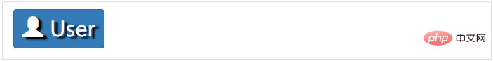
For more programming-related knowledge, please Visit:
The above is the detailed content of A brief discussion on the usage of Glyphicons icons in Bootstrap. For more information, please follow other related articles on the PHP Chinese website!

Hot AI Tools

Undresser.AI Undress
AI-powered app for creating realistic nude photos

AI Clothes Remover
Online AI tool for removing clothes from photos.

Undress AI Tool
Undress images for free

Clothoff.io
AI clothes remover

Video Face Swap
Swap faces in any video effortlessly with our completely free AI face swap tool!

Hot Article
Hot Tools

Notepad++7.3.1
Easy-to-use and free code editor

SublimeText3 Chinese version
Chinese version, very easy to use

Zend Studio 13.0.1
Powerful PHP integrated development environment

Dreamweaver CS6
Visual web development tools

SublimeText3 Mac version
God-level code editing software (SublimeText3)
Hot Topics


 How to use bootstrap in vue
Apr 07, 2025 pm 11:33 PM
How to use bootstrap in vue
Apr 07, 2025 pm 11:33 PM
Using Bootstrap in Vue.js is divided into five steps: Install Bootstrap. Import Bootstrap in main.js. Use the Bootstrap component directly in the template. Optional: Custom style. Optional: Use plug-ins.
 How to get the bootstrap search bar
Apr 07, 2025 pm 03:33 PM
How to get the bootstrap search bar
Apr 07, 2025 pm 03:33 PM
How to use Bootstrap to get the value of the search bar: Determines the ID or name of the search bar. Use JavaScript to get DOM elements. Gets the value of the element. Perform the required actions.
 How to do vertical centering of bootstrap
Apr 07, 2025 pm 03:21 PM
How to do vertical centering of bootstrap
Apr 07, 2025 pm 03:21 PM
Use Bootstrap to implement vertical centering: flexbox method: Use the d-flex, justify-content-center, and align-items-center classes to place elements in the flexbox container. align-items-center class method: For browsers that do not support flexbox, use the align-items-center class, provided that the parent element has a defined height.
 How to write split lines on bootstrap
Apr 07, 2025 pm 03:12 PM
How to write split lines on bootstrap
Apr 07, 2025 pm 03:12 PM
There are two ways to create a Bootstrap split line: using the tag, which creates a horizontal split line. Use the CSS border property to create custom style split lines.
 How to set up the framework for bootstrap
Apr 07, 2025 pm 03:27 PM
How to set up the framework for bootstrap
Apr 07, 2025 pm 03:27 PM
To set up the Bootstrap framework, you need to follow these steps: 1. Reference the Bootstrap file via CDN; 2. Download and host the file on your own server; 3. Include the Bootstrap file in HTML; 4. Compile Sass/Less as needed; 5. Import a custom file (optional). Once setup is complete, you can use Bootstrap's grid systems, components, and styles to create responsive websites and applications.
 How to insert pictures on bootstrap
Apr 07, 2025 pm 03:30 PM
How to insert pictures on bootstrap
Apr 07, 2025 pm 03:30 PM
There are several ways to insert images in Bootstrap: insert images directly, using the HTML img tag. With the Bootstrap image component, you can provide responsive images and more styles. Set the image size, use the img-fluid class to make the image adaptable. Set the border, using the img-bordered class. Set the rounded corners and use the img-rounded class. Set the shadow, use the shadow class. Resize and position the image, using CSS style. Using the background image, use the background-image CSS property.
 How to use bootstrap button
Apr 07, 2025 pm 03:09 PM
How to use bootstrap button
Apr 07, 2025 pm 03:09 PM
How to use the Bootstrap button? Introduce Bootstrap CSS to create button elements and add Bootstrap button class to add button text
 How to resize bootstrap
Apr 07, 2025 pm 03:18 PM
How to resize bootstrap
Apr 07, 2025 pm 03:18 PM
To adjust the size of elements in Bootstrap, you can use the dimension class, which includes: adjusting width: .col-, .w-, .mw-adjust height: .h-, .min-h-, .max-h-
