
 Web Front-end
Bootstrap Tutorial
An in-depth analysis of the drop-down menu component in Bootstrap
Web Front-end
Bootstrap Tutorial
An in-depth analysis of the drop-down menu component in Bootstrap
An in-depth analysis of the drop-down menu component in Bootstrap


Related recommendations: "bootstrap Tutorial"
The drop-down menu component in the bootstrap framework is an independent component. According to different version, its corresponding file:
less. The corresponding source code file is: dropdowns.less
sass. The corresponding source code file is: _dropdowns. scss
When using the drop-down menu built by bootstrap, you must call the bootstrap.js file provided by the bootstrap framework. For the uncompiled version, you can find a file named dropdown.js under js, and you can also call this file. You can also call the compressed file bootstrap.min.js
Since the interactive effects of bootstrap components all rely on plug-ins written by the jQuery library, you must be sure before using bootstrap.min.js First load jQuery.min.js
Example on the official website:
<div class="dropdown"> <button class="btn btn-default dropdown-toggle" type="button" id="dropdownMenu1" data-toggle="dropdown">

下拉菜单

<span class="caret"></span> </button> <ul class="dropdown-menu" role="menu" aria-labelledby="dropdownMenu1"> <li role="presentation"><a role="menuitem" tabindex="-1" href="#">下拉菜单项</a></li>

   …

<li role="presentation" class="divider"></li> <li role="presentation"><a role="menuitem" tabindex="-1" href="#">下拉菜单项</a></li> </ul> </div>
Detailed explanation:
1. Use a dropdown The container wraps the entire drop-down menu element
<div class="dropdown"></div>
2, uses the
data-toggle=“dropdown”
3. The drop-down menu item uses an ul list and defines a class named dropdown-menu
<ul class="dropdown-menu"></ul>
The drop-down menu item in bootstrap is hidden by default, dropdown-menu Set display: none
.dropdown-menu {

  position: absolute;/*设置绝对定位,相对于父元素div.dropdown*/

  top: 100%;/*让下拉菜单项在父菜单项底部,如果父元素不设置相对定位,该元素相对于body元素*/

  left: 0;

  z-index: 1000;/*让下拉菜单项不被其他元素遮盖住*/

  display: none;/*默认隐藏下拉菜单项*/

  float: left;

  min-width: 160px;

  padding: 5px 0;

  margin: 2px 0 0;

  font-size: 14px;

  list-style: none;

  background-color: #fff;

  background-clip: padding-box;

  border: 1px solid #ccc;

  border: 1px solid rgba(0, 0, 0, .15);

  border-radius: 4px;

  -webkit-box-shadow: 0 6px 12px rgba(0, 0, 0, .175);

box-shadow: 0 6px 12px rgba(0, 0, 0, .175); }When the user clicks on the parent menu, the drop-down menu will be displayed. When the user clicks again, the drop-down menu will continue to be hidden


Detailed explanation:
Add or open an open to the parent container p.dropdown through js to control the display of the drop-down menu Or hidden, that is, by default, p.dropdown does not have the class name open. When the user clicks for the first time, p.dropdown will add the class name open. When the user clicks again, the class name in the p.dropdown container will be Removed
.open > .dropdown-menu {
display: block;
}Drop-down separator
Assuming that the drop-down menu has two groups, then an empty
.dropdown-menu .divider {

  height: 1px;

  margin: 9px 0;

  overflow: hidden;

  background-color: #e5e5e5;
}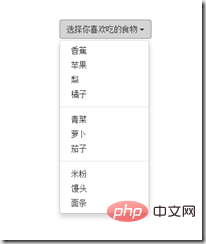
Menu title
In order to make this Grouping is more obvious, and you can also add a header title to each group.
<div class="dropdown"> <button class="btn btn-default dropdown-toggle" type="button" id="dropdownMenu1" data-toggle="dropdown">

下拉菜单

<span class="caret"></span> </button> <ul class="dropdown-menu" role="menu" aria-labelledby="dropdownMenu1"> <li role="presentation" class="dropdown-header">第一部分菜单头部</li> <li role="presentation"><a role="menuitem" tabindex="-1" href="#">下拉菜单项</a></li>

…

<li role="presentation" class="divider"></li> <li role="presentation" class="dropdown-header">第二部分菜单头部</li>

…

<li role="presentation"><a role="menuitem" tabindex="-1" href="#">下拉菜单项</a></li> </ul> </div>
css style:
.dropdown-header {

  display: block;

  padding: 3px 20px;

  font-size: 12px;

  line-height: 1.42857143;

  color: #999;
}The drop-down menu in the bootstrap framework is left aligned by default. If you want the drop-down menu to be right-aligned relative to the parent container, you can add a class to dropdown-menu. dropdown -menu-right, note that starting from v3.1.0, it is no longer recommended to use the .pull-right class for drop-down menus
<div class="dropdown"> <button class="btn btn-default dropdown-toggle" type="button" id="dropdownMenu1" data-toggle="dropdown">

  下拉菜单

<span class="caret"></span> </button> <ul class="dropdown-menu dropdown-menu-right" role="menu" aria-labelledby="dropdownMenu1">

   …

</ul> </div>
.dropdown-menu-right {

  right: 0;

  left: auto;
   }

.dropdown{
float: left;
}Menu item status
Drop-down menu The default states include hover state: hover and focus state: focus
.dropdown-menu > li > a:hover, .dropdown-menu > li > a:focus {

  color: #262626;

  text-decoration: none;

background-color: #f5f5f5; }The drop-down menu also has the current state and the disabled state. To use these two states, you only need to add the corresponding class name to the corresponding menu item
<div class="dropdown"> <button class="btn btn-default dropdown-toggle" type="button" id="dropdownMenu1" data-toggle="dropdown">

  下拉菜单

<span class="caret"></span> </button> <ul class="dropdown-menu" role="menu" aria-labelledby="dropdownMenu1"> <li role="presentation" class="active"><a role="menuitem" tabindex="-1" href="#">下拉菜单项</a></li>

    ….

<li role="presentation" class="disabled"><a role="menuitem" tabindex="-1" href="#">下拉菜单项</a></li> </ul> </div>CSS:
.dropdown-menu > .active > a, .dropdown-menu > .active > a:hover, .dropdown-menu > .active > a:focus {

  color
: #fff;

  text-decoration
: none;

  background-color
: #428bca;

  outline
: 0; }

.dropdown-menu > .disabled > a,
.dropdown-menu > .disabled > a:hover,
.dropdown-menu > .disabled > a:focus
{
  color: #999;
 }

.dropdown-menu > .disabled > a:hover,
.dropdown-menu > .disabled > a:focus
{

  text-decoration: none;

  cursor: not-allowed;

  background-color: transparent;

  background-An in-depth analysis of the drop-down menu component in Bootstrap: none;

  filter: progid:DXImageTransform.Microsoft.gradient(enabled = false);
}For more programming-related knowledge, please visit: Programming Video! !
The above is the detailed content of An in-depth analysis of the drop-down menu component in Bootstrap. For more information, please follow other related articles on the PHP Chinese website!

Hot AI Tools

Undresser.AI Undress
AI-powered app for creating realistic nude photos

AI Clothes Remover
Online AI tool for removing clothes from photos.

Undress AI Tool
Undress images for free

Clothoff.io
AI clothes remover

Video Face Swap
Swap faces in any video effortlessly with our completely free AI face swap tool!

Hot Article
Hot Tools

Notepad++7.3.1
Easy-to-use and free code editor

SublimeText3 Chinese version
Chinese version, very easy to use

Zend Studio 13.0.1
Powerful PHP integrated development environment

Dreamweaver CS6
Visual web development tools

SublimeText3 Mac version
God-level code editing software (SublimeText3)
Hot Topics


 How to use bootstrap in vue
Apr 07, 2025 pm 11:33 PM
How to use bootstrap in vue
Apr 07, 2025 pm 11:33 PM
Using Bootstrap in Vue.js is divided into five steps: Install Bootstrap. Import Bootstrap in main.js. Use the Bootstrap component directly in the template. Optional: Custom style. Optional: Use plug-ins.
 How to get the bootstrap search bar
Apr 07, 2025 pm 03:33 PM
How to get the bootstrap search bar
Apr 07, 2025 pm 03:33 PM
How to use Bootstrap to get the value of the search bar: Determines the ID or name of the search bar. Use JavaScript to get DOM elements. Gets the value of the element. Perform the required actions.
 How to do vertical centering of bootstrap
Apr 07, 2025 pm 03:21 PM
How to do vertical centering of bootstrap
Apr 07, 2025 pm 03:21 PM
Use Bootstrap to implement vertical centering: flexbox method: Use the d-flex, justify-content-center, and align-items-center classes to place elements in the flexbox container. align-items-center class method: For browsers that do not support flexbox, use the align-items-center class, provided that the parent element has a defined height.
 How to set up the framework for bootstrap
Apr 07, 2025 pm 03:27 PM
How to set up the framework for bootstrap
Apr 07, 2025 pm 03:27 PM
To set up the Bootstrap framework, you need to follow these steps: 1. Reference the Bootstrap file via CDN; 2. Download and host the file on your own server; 3. Include the Bootstrap file in HTML; 4. Compile Sass/Less as needed; 5. Import a custom file (optional). Once setup is complete, you can use Bootstrap's grid systems, components, and styles to create responsive websites and applications.
 How to write split lines on bootstrap
Apr 07, 2025 pm 03:12 PM
How to write split lines on bootstrap
Apr 07, 2025 pm 03:12 PM
There are two ways to create a Bootstrap split line: using the tag, which creates a horizontal split line. Use the CSS border property to create custom style split lines.
 How to insert pictures on bootstrap
Apr 07, 2025 pm 03:30 PM
How to insert pictures on bootstrap
Apr 07, 2025 pm 03:30 PM
There are several ways to insert images in Bootstrap: insert images directly, using the HTML img tag. With the Bootstrap image component, you can provide responsive images and more styles. Set the image size, use the img-fluid class to make the image adaptable. Set the border, using the img-bordered class. Set the rounded corners and use the img-rounded class. Set the shadow, use the shadow class. Resize and position the image, using CSS style. Using the background image, use the background-image CSS property.
 How to use bootstrap button
Apr 07, 2025 pm 03:09 PM
How to use bootstrap button
Apr 07, 2025 pm 03:09 PM
How to use the Bootstrap button? Introduce Bootstrap CSS to create button elements and add Bootstrap button class to add button text
 How to resize bootstrap
Apr 07, 2025 pm 03:18 PM
How to resize bootstrap
Apr 07, 2025 pm 03:18 PM
To adjust the size of elements in Bootstrap, you can use the dimension class, which includes: adjusting width: .col-, .w-, .mw-adjust height: .h-, .min-h-, .max-h-
