
 Web Front-end
CSS Tutorial
A brief discussion on the usage of CSS3 Grid grid layout (display: grid)
Web Front-end
CSS Tutorial
A brief discussion on the usage of CSS3 Grid grid layout (display: grid)
A brief discussion on the usage of CSS3 Grid grid layout (display: grid)


[Recommended tutorial: CSS video tutorial]
Let’s learn how to use CSS Grid layout
After reading this article, we will have one more approach when we make our own UI library.
Let’s use CSS Grid to create a cool image grid that changes the number of columns according to the width of the screen. The best part is: all responsive features are added to a single line of CSS code. This means we don't have to clutter HTML with ugly class names like col-sm-2, col-md-4 or create media queries for every screen.
#We first analyze the grid based on this most basic style, and then expand it. Next, I will share the code with you:
html code:
<div>
    <div>1</div>
    <div>2</div>
    <div>3</div>
    <div>4</div>
    <div>5</div>
    <div>6</div>
</div>
css code
* {
margin: 0;
padding: 0;
}
// grid布局的关键代码!!!
// grid布局的关键代码!!!
// grid布局的关键代码!!!
.container {
display: grid;
grid-template-columns: 100px 100px 100px;
grid-template-rows: 50px 50px;
}
.container div {
text-align: center;
line-height: 50px;
border: 2px solid;
margin: 2px;
}
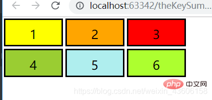
.container div:nth-child(1) {background: yellow;}
.container div:nth-child(2) {background: orange;}
.container div:nth-child(3) {background: red;}
.container div:nth-child(4) {background: yellowgreen;}
.container div:nth-child(5) {background: paleturquoise;}
.container div:nth-child(6) {background: greenyellow;}At this time we open Use the console to analyze it:
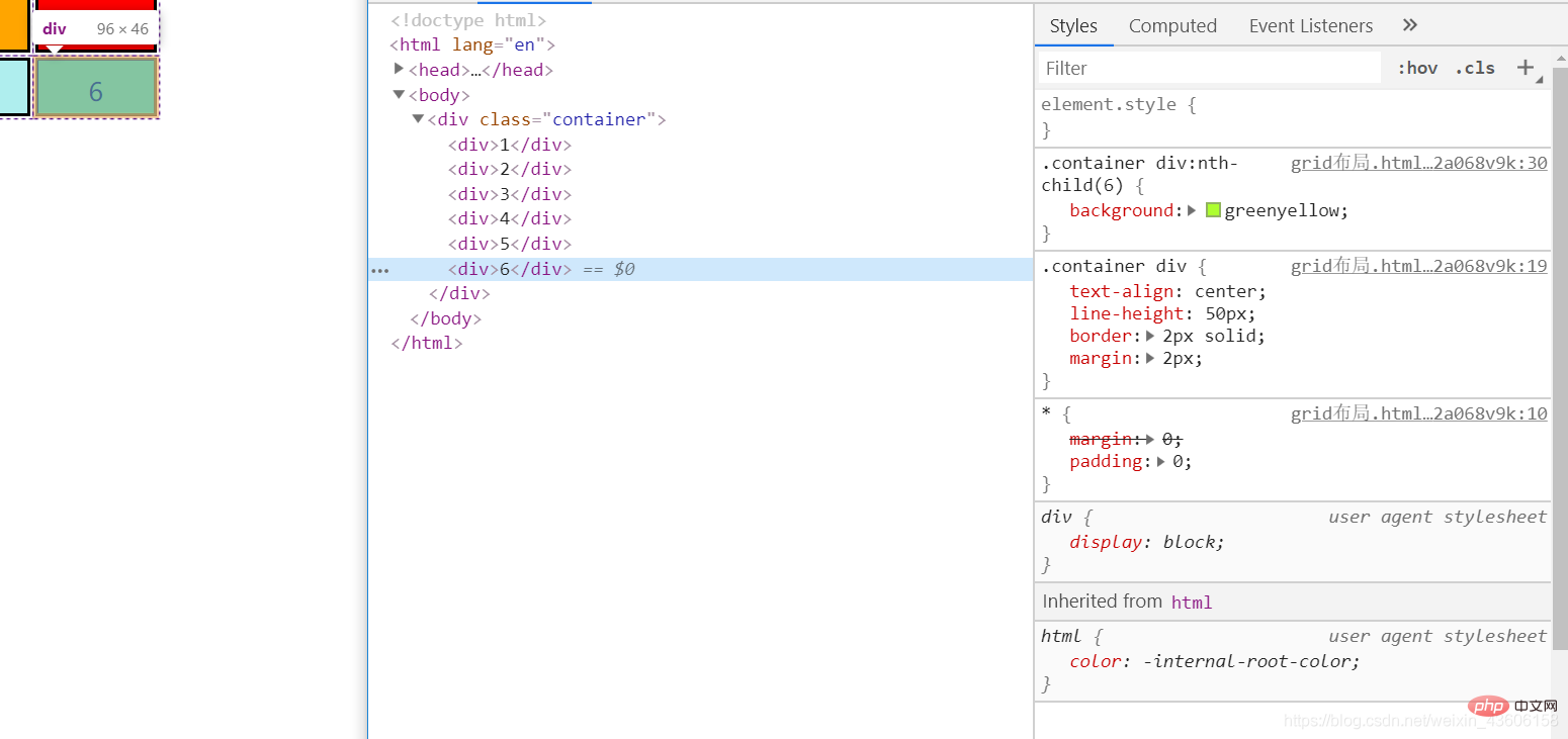
# It is found that the width and height of each child element have become 96px * 46px. But we did not set the width and height for the child elements, so where does this come from? We are looking back at the style of the parent element:
.container {
    display: grid;
    /* 下面句的意思就是这个容器里面的子元素分成三列,每列都是100px宽 */
    grid-template-columns: 100px 100px 100px;
    /* 下面这句的意思就是这个容器里面的子元素分成俩行,每行都是50px的高 */
    grid-template-rows: 50px 50px;
} Since we added a 2px border to the child element, the final display of 96 * 64 is clear. The grid layout will also turn all child elements under the container into Added box-sizing: border-box; Weird box model. If you don’t know much about the weird box model, please go to Baidu. If you want to know more about CSS and HTML, please watch: https://blog.csdn.net/weixin_43606158/article/details/89811189
Let’s demonstrate it What we just guessed.
We now change the css style of the container to this:
.container {
  	display: grid;
    grid-template-columns: 100px 100px 200px 100px;
    grid-template-rows: 80px 50px 20px;
}Rendering: 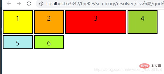
As we guessed, it now becomes four columns, each The third column becomes 200px wide,
but the row does not become three rows, because the columns are arranged first, and if there are no extra rows after the rows are arranged, more rows will not be arranged. Friends, please test it by yourself for various other complex situations. I will not talk nonsense here because I am about to start the awesome grid layout.
The above method just writes a fixed width and height to the child elements. This is not what we want. It will not change as the width and height of the browser change. What we want is Able to adapt.
Let’s make columns adaptive.
CSS Grid layout brings a brand new value: the fraction unit, which is often abbreviated as fr, which allows you to split the container into multiple blocks as needed.
Let us change each column to a fraction unit width:
Change the CSS style of the container to:
.container {
    display: grid;
    grid-template-columns: 1fr 1fr 1fr;
    grid-template-rows: 50px 50px;
}The result is that the grid layout will divide the entire width into three fractions, Each column occupies one fraction unit.
If we change the value of grid-template-columns to 1fr 2fr 1fr, the width of the second column will be twice as wide as the other two columns. The total width is now four fraction units, with the second column occupying two fraction units and the other columns each occupying one fraction unit.
Friends, please watch the effect by yourself. At this time, these sub-elements of yours will change as your screen width changes.
In general, the fraction unit value will allow you to easily change the width of the column.
Advanced Responsiveness:
However, the above example does not give us the responsiveness we want because the grid is always three columns wide. We want the grid to change the number of columns based on the width of the container. To do this, you must learn the following three concepts:
repeat()
First we learn the repeat() function. This is a powerful way to specify columns and rows. Let’s use the repeat() function to change the grid:
The container CSS is changed to:
.container {
    display: grid;
    grid-template-columns: repeat(3, 100px);
    grid-template-rows: repeat(2, 50px);
}In the above code, repeat(3, 100px) is equal to 100px 100px 100px. The first parameter specifies the number of rows and columns, and the second parameter specifies their width, so it will give us exactly the same layout as we started with.
auto-fit
Then comes auto-fit. Let’s skip the fixed number of columns and replace 3 with an adaptive number:
.container {
    display: grid;
    grid-gap: 5px;
    grid-template-columns: repeat(auto-fit, 100px);
    grid-template-rows: repeat(2, 100px);
}Now the grid will adjust its number based on the width of the container. It will try to fit as many 100px wide columns as possible in the container. But if we hard-code all columns to 100px, we'll never get the elasticity we need because they'll hardly fill the entire width.
minmax()
In order to solve the above problem, we need minmax(). We replace 100px with minmax(100px, 1fr) and the code is as follows:
.container {
    display: grid;
    grid-gap: 5px;
    grid-template-columns: repeat(auto-fit, minmax(100px, 1fr));
    grid-template-rows: repeat(2, 100px);
}Please note that all responses occur in one line of css code
Now the effect is perfect. The range defined by the minmax() function is greater than or equal to min and less than or equal to max.
因此,现在每列将至少为 100px。但如果有更多的可用空间,栅格布局将简单地将其均分给每列,因为这些列变成了 fraction 单位,而不是 100px。
如果朋友们要在子元素里面添加图片的话请继续向下看,CSS属性的object-fit: cover;
我们现在可以将你所有子元素当中的数字改成图片了,比如:
<div><img src="/static/imghw/default1.png" data-src="你的图片路径" class="lazy" / alt="A brief discussion on the usage of CSS3 Grid grid layout (display: grid)" ></div>
为了使图片适应于每个条目,我们将其宽、高设置为与条目本身一样,我们使用object-fit:cover。这将使图片覆盖它的整个容器,根据需要,浏览器将会对其进行裁剪。
增加CSS样式
.container > div > img {
    width: 100%;
    height: 100%;
    object-fit: cover;
}ok!现在你已经了解了 CSS Grid 布局中最复杂的概念之一了,请给自己一个赞吧。
浏览器兼容性:
如果您不知道怎么查看浏览器的兼容性,笔者给您推荐:查看前端代码在各浏览器的支持情况的方法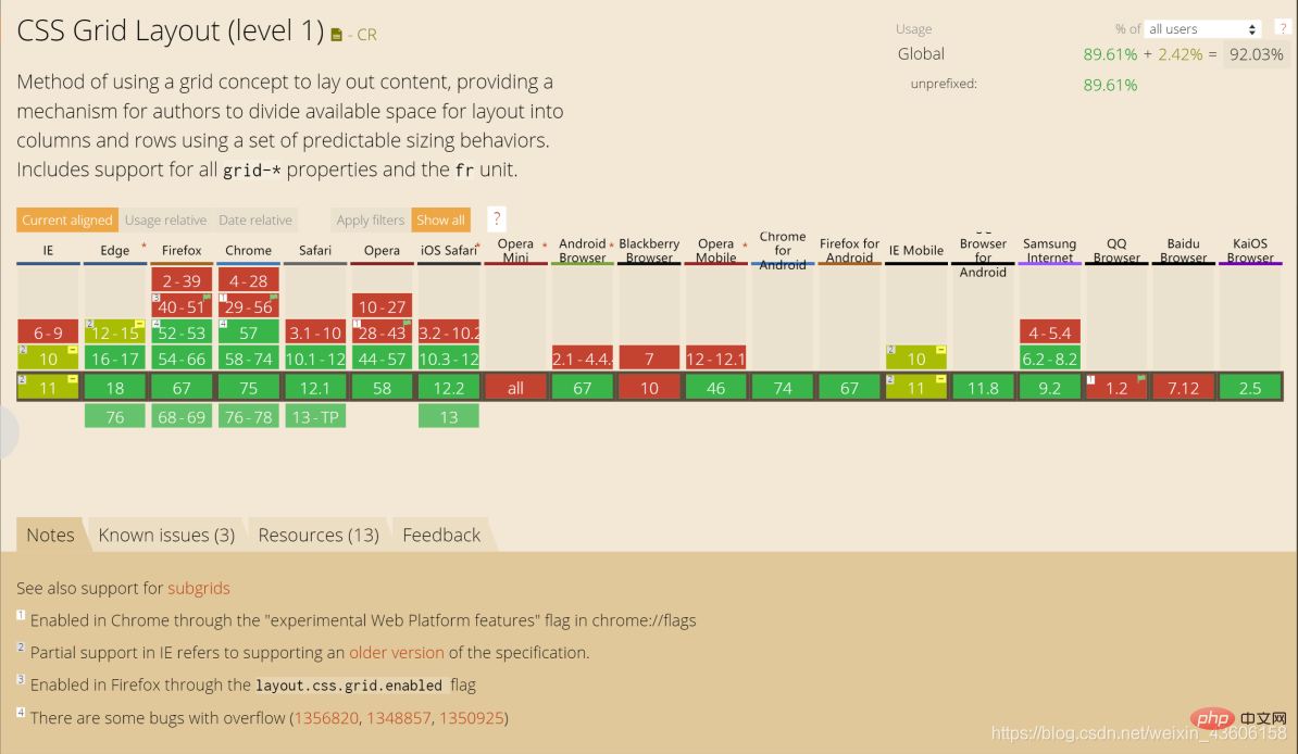
更多编程相关知识,请访问:编程教学!!
The above is the detailed content of A brief discussion on the usage of CSS3 Grid grid layout (display: grid). For more information, please follow other related articles on the PHP Chinese website!

Hot AI Tools

Undresser.AI Undress
AI-powered app for creating realistic nude photos

AI Clothes Remover
Online AI tool for removing clothes from photos.

Undress AI Tool
Undress images for free

Clothoff.io
AI clothes remover

Video Face Swap
Swap faces in any video effortlessly with our completely free AI face swap tool!

Hot Article
Hot Tools

Notepad++7.3.1
Easy-to-use and free code editor

SublimeText3 Chinese version
Chinese version, very easy to use

Zend Studio 13.0.1
Powerful PHP integrated development environment

Dreamweaver CS6
Visual web development tools

SublimeText3 Mac version
God-level code editing software (SublimeText3)
Hot Topics


 How to achieve wave effect with pure CSS3? (code example)
Jun 28, 2022 pm 01:39 PM
How to achieve wave effect with pure CSS3? (code example)
Jun 28, 2022 pm 01:39 PM
How to achieve wave effect with pure CSS3? This article will introduce to you how to use SVG and CSS animation to create wave effects. I hope it will be helpful to you!
 Use CSS skillfully to realize various strange-shaped buttons (with code)
Jul 19, 2022 am 11:28 AM
Use CSS skillfully to realize various strange-shaped buttons (with code)
Jul 19, 2022 am 11:28 AM
This article will show you how to use CSS to easily realize various weird-shaped buttons that appear frequently. I hope it will be helpful to you!
 How to hide elements in css without taking up space
Jun 01, 2022 pm 07:15 PM
How to hide elements in css without taking up space
Jun 01, 2022 pm 07:15 PM
Two methods: 1. Using the display attribute, just add the "display:none;" style to the element. 2. Use the position and top attributes to set the absolute positioning of the element to hide the element. Just add the "position:absolute;top:-9999px;" style to the element.
 How to implement lace borders in css3
Sep 16, 2022 pm 07:11 PM
How to implement lace borders in css3
Sep 16, 2022 pm 07:11 PM
In CSS, you can use the border-image attribute to achieve a lace border. The border-image attribute can use images to create borders, that is, add a background image to the border. You only need to specify the background image as a lace style; the syntax "border-image: url (image path) offsets the image border width inward. Whether outset is repeated;".
 How to enlarge the image by clicking the mouse in css3
Apr 25, 2022 pm 04:52 PM
How to enlarge the image by clicking the mouse in css3
Apr 25, 2022 pm 04:52 PM
Implementation method: 1. Use the ":active" selector to select the state of the mouse click on the picture; 2. Use the transform attribute and scale() function to achieve the picture magnification effect, the syntax "img:active {transform: scale(x-axis magnification, y Axis magnification);}".
 It turns out that text carousel and image carousel can also be realized using pure CSS!
Jun 10, 2022 pm 01:00 PM
It turns out that text carousel and image carousel can also be realized using pure CSS!
Jun 10, 2022 pm 01:00 PM
How to create text carousel and image carousel? The first thing everyone thinks of is whether to use js. In fact, text carousel and image carousel can also be realized using pure CSS. Let’s take a look at the implementation method. I hope it will be helpful to everyone!
 How to set animation rotation speed in css3
Apr 28, 2022 pm 04:32 PM
How to set animation rotation speed in css3
Apr 28, 2022 pm 04:32 PM
In CSS3, you can use the "animation-timing-function" attribute to set the animation rotation speed. This attribute is used to specify how the animation will complete a cycle and set the speed curve of the animation. The syntax is "element {animation-timing-function: speed attribute value;}".
 Take you step by step to implement 3D dice using CSS Flex and Grid layout (with code)
Sep 23, 2022 am 09:58 AM
Take you step by step to implement 3D dice using CSS Flex and Grid layout (with code)
Sep 23, 2022 am 09:58 AM
In front-end interviews, we are often asked how to implement dice/mahjong layout using CSS. The following article will introduce to you how to use CSS to create a 3D dice (Flex and Grid layout implement 3D dice). I hope it will be helpful to you!
