

Several methods to implement nine-square grid layout using CSS

This article will take you through several methods of using CSS to implement a nine-square grid layout. It has certain reference value. Friends in need can refer to it. I hope it will be helpful to everyone.
Tutorial recommendation: css video tutorial
Directory:
Margin negative value realization
The inner and outer harmony of grandfather and biological father
Change the idea-li gave birth to a son to help Very busy.
Use absolute orientation value to achieve adaptive grid layout
cloumn multi-column layout
grid
display: table;
css3 selector nth-child()
Prerequisite
Unless otherwise specified, the general html structure of the following methods is as follows:
<div class="box">
    <ul>
      <li>1</li>
      <li>2</li>
      <li>3</li>
      <li>4</li>
      <li>5</li>
      <li>6</li>
      <li>7</li>
      <li>8</li>
      <li>9</li>
    </ul>
</div>Unless otherwise specified Note that the css reset code used in the layout is as follows:
/* 基础 */
    .box{
      background: #e4f7fd61;
      border: 2px solid #0786ada1;
      border-radius: 8px;
    }
    ul{
      padding: 0;
    }
    .box li{
      list-style: none;
      text-align: center;
      line-height: 200px;
      background: rgba(146, 203, 230, 0.65);
      border-radius: 8px;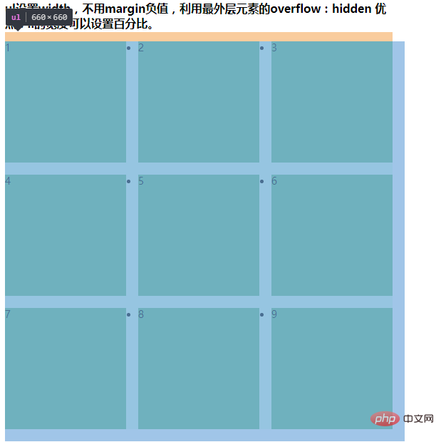
}Method 1. Implementation of negative margin values
Principle
marginNegative margin
Key points
1. Outermost The wrapping element of the layer is equal to: li width*3 li right spacing*2
2. If li is the right spacing, then the margin-right of ul is a negative li spacing value.
3. The parent element ul uses overflow:hidden; to form bfc to clear the impact of floating (parent element collapses).
4. The combination of margin-bottom and margin-top is the same as right. It eliminates the bottom margin of the last row of li.
5. li should be floating. The margin direction is consistent with the margin direction when ul is set to a negative value.
Key code
    .box{
      width: 940px;
    }
    ul{
      overflow: hidden;
      margin-right: -20px;

      margin-bottom: -20px;
      margin-top: 0;
    }
    .box li{
      float: left;
      width: 300px;
      height: 200px;
      margin-right: 20px;
      margin-bottom: 20px;
    }
##Method 2. The inside and outside of the grandfather and biological father
Principle
Outer box boxIn fact, from another angle and idea, it is another solution. Without negative margin, we want li to have an effect on both ends of ul. The reason why we are confused is because li needs margin- right, and the margin of the last li on the right will widen the distance from the father ul, giving us a headache. Since it’s an extraneous branch, can’t we just ask Grandpa to cut off the extra branch? The father ul sets the width and insists that his son occupy his position, while the box grandfather is a bad guy and uses overflow to cut off the extra margin-right distance.overflow
Combined withulelement width dead value
Key points
1. Box uses overflow:hidden; ruthlessly cut off the right margin of li2. ul sings white For the face, set the width so that the three li stand side by side, and do not let the last li stand in the next row because there is no room. 3. li Be your most sincere self
Key code
Because the demo is all in one html to prevent class name overwriting , the box that was originally called box here is now called sec .sec{
width: 640px;
overflow: hidden;
}
ul{
width: 660px;
overflow: hidden;
margin-bottom: -20px;
margin-top: 0;
}
.sec li{
float: left;
width: 200px;
height: 200px;
margin-right: 20px;
margin-bottom: 20px;
}
##Method 3. Change your thinking - li student My son helped me a lot.
 The spacing does not have to be added to the parent element li. The parent element li can only be responsible for the fluid layout, using padding or the first layer of children internally. element to control the spacing between adjacent elements
The red border in the picture is the li element, and the total dark red area of the red border is li Child elements within the element. The white distance between the red border and the child element is generated by the margin of the child element.
Key points
1. The parent element box used to have a padding of 20, but this time it was changed to 10, because the grandchild li>div will Helpful.
Key code2. li no longer sets margin-right to expand the distance between multiple li
3. The div inside the li sets left and right margins to expand li and li and li and parent The distance between elements.
The html structure will be changed here. In addition to the previous structure, an additional div structure will be added inside the li to expand the spacing. .
  <div class="sec02">
    <h3>
      里应外合-li的边距交给孩子们来做,自己只负责一排站三个人的排列工作    </h3>
    <div class="box">
      <ul>
        <li><div>1</div></li>
        <li><div>2</div></li>
        <li><div>3</div></li>
        <li><div>4</div></li>
        <li><div>5</div></li>
        <li><div>6</div></li>
        <li><div>7</div></li>
        <li><div>8</div></li>
        <li><div>9</div></li>
      </ul>
    </div>
</div> box{
padding: 20px 10px;
display: inline-block;
background: #ff000026;
}
ul{
overflow: hidden;
width: 600px;
margin-bottom: -10px;
margin-top: 0;
background: none;
}
li{
list-style: none;
float: left;
width: 198px;/*可以用百分比*/
height: 198px;/*可以用百分比*/
margin-bottom: 10px;
border: 1px solid red;
}
li > div{
background: rgba(255, 0, 0, 0.24);
margin: 0 10px;
border-radius: 8px;
text-align: center;
line-height: 198px;
}The effect after removing the red border
li and the left margin of the eldest son act on the left margin between light red and dark red,
The right margin of the eldest son of li and the left margin of the eldest son of the next li combine to form the spacing between the two li.
方法四、借助absolute方位值,实现自适应的网格布局
自适应?先来一波效果图:
原理
absolute+四个方位值撑开局面、float+宽度百分比实现横向排列。高度百分比实现自适应。
关键点
1. page最外层的父元素使用absolute负责占位,给子元素们把空间拉开。或者用宽高也行
2. 每一个块的父元素list利用浮动和33.33%的宽度百分比实现横向自适应排列
3. 本案例中,list元素内部用了伪元素+absolute的方式做了效果展示,实际项目中,list元素里边就可以填充自己个各式各样的业务代码了。
关键代码
<div class="page">
	<div class="list" data-index="1">
	</div>
	<div class="list" data-index="2">
	</div>
	<div class="list" data-index="3">
	</div>
	<div class="list" data-index="4">
	</div>
	<div class="list" data-index="5">
	</div>
	<div class="list" data-index="6">
	</div>
	<div class="list" data-index="7">
	</div>
	<div class="list" data-index="8">
	</div>
	<div class="list" data-index="9">
	</div>
</div>
html,body{
    height:100%;
    margin:0;
}
 .page{
    position:absolute;
    left:0;
    top:180px;
    right:0;
    bottom:0;
}
 .list{
    float:left;
    height:33.3%;
    width:33.3%;
    position:relative;
}
 .list:before{
    content:'';
    position:absolute;
    left:10px;
    right:10px;
    top:10px;
    bottom:10px;
    border-radius:10px;
    background-color:#cad5eb;
}
 .list:after{
    content:attr(data-index);
    position:absolute;
    height:30px;
    left:0;
    right:0;
    top:0;
    bottom:0;
    margin:auto;
    text-align:center;
    font:24px/30px bold 'microsoft yahei';
}方法五、cloumn多栏布局
原理
cloumn设置三栏布局,这种还是自适应效果的
关键点
1. box依旧做了最严格的祖父,又是宽度限制,又是overflow决绝设卡。
2. ul这次挑了大梁,针对内部的li使用column多栏布局,设置为三栏显示,且每一栏之间
3. 而有了ul的操心,li则美滋滋的做起了公子哥,只管自己的宽高和下边距就好,右边距他爹都给他处理好了。
关键代码
.box{
    width: 640px;
    overflow: hidden;
}
ul {
    /* display: flex; */
    -webkit-column-count: 3;
    -moz-column-count: 3;
    -webkit-column-gap: 20px;
    -moz-column-gap: 20px;
    margin-bottom: -20px;
    margin-top: 0;
}
li {
    width: 200px;
    height: 200px;
    /*margin-right: 20px;*/
    margin-bottom: 20px;
}
方法六、grid
原理
用CSS Grid 创建网格布局,是最简单也是最强大的方法。
关键点
1. 九个单元的父元素wrapper设置display为grid类型(注意兼容写法)
默认九个元素就会堆叠排序。
2. 设置每一行中单个元素的宽度: grid-template-columns,每个宽度值100px根据业务需要设置。
给三个设置了宽度就长这样了。
3. 设置每一列中单个元素的高度: grid-template-rows,每个高度值100px根据业务需要设置。
最后出现我们想要的效果:

关键代码
<div class="wrapper">
	<div class="list list1">
		1
	</div>
	<div class="list list2">
		2
	</div>
	<div class="list list3">
		3
	</div>
	<div class="list list4">
		4
	</div>
	<div class="list list5">
		5
	</div>
	<div class="list list6">
		6
	</div>
	<div class="list list7">
		7
	</div>
	<div class="list list8">
		8
	</div>
	<div class="list list9">
		9
	</div>
</div>
.wrapper{
     display: grid;
     grid-template-columns: 100px 100px 100px;
     grid-template-rows: 100px 100px 100px;
}
 .list{
     background: #eee;
}
 .list:nth-child(odd){
     background: #999;
}方法七、display:table;

原理
其实他是table的css版本处理方式。原谅我只能想到加结构、模拟tr+td的方式实现了。
好处:也是唯一能用来安慰自己的地方就是,不用table标签少了很多reset样式~
关键点
1. 三行li,每个li里三列div(模拟表格的结构)
2. 父元素ul使用display: table(此元素会作为块级表格来显示(类似
),表格前后带有换行符。)
3. li元素使用display: table-row(此元素会作为一个表格行显示(类似
)。) 4. li元素内部三个子元素使用display: table-cell(此元素会作为一个表格单元格显示(类似
和 )) 关键代码
    <ul class="table">
      <li>
        <div>1</div>
        <div>2</div>
        <div>3</div>
      </li>
      <li>
        <div>4</div>
        <div>5</div>
        <div>6</div>
      </li>
      <li>
        <div>7</div>
        <div>8</div>
        <div>9</div>
      </li>
    </ul>
Copy after login.table { display: table; } .table li { display: table-row; background: #beffee; } .disTable li:nth-child(odd) { background: #bec3ff; } .table li div { width: 200px; line-height: 200px; display: table-cell; text-align: center; } .table li:nth-child(odd) div:nth-child(even) { background: #beffee; } .table li:nth-child(even) div:nth-child(even) { background: #bec3ff; }Copy after login方法八、css3选择器nth-child();
原理
利用css的选择器,选择对应个数的li,设置特殊样式。
不足(缺点)
li必须要设置固定的宽高,且ul也要设置固定宽高,以强制似的li“归位”。
关键点
li.nth-child(3n):控制第3以及3的倍数的li的右边距不存在。
关键代码
<ul class="lists">
    <li class="list list1">1</li>
    <li class="list list2">2</li>
    <li class="list list3">3</li>
    <li class="list list4">4</li>
    <li class="list list5">5</li>
    <li class="list list6">6</li>
    <li class="list list7">7</li>
    <li class="list list8">8</li>
    <li class="list list9">9</li>
  </ul>
Copy after loginul,li{ list-style: none; overflow: hidden; } ul{ width: 620px; } li.list{ float: left; width: 200px; height: 200px; margin-right: 10px; margin-bottom: 10px; background: #eee; } li:nth-child(3n){ margin-right: 0; }Copy after login以上,几乎都没有考虑兼容性。因为很多css3方法,掰着脚指头想兼容性也不会如你意。
如果pc求稳,就用前几招。
If you want to move quickly and accurately, use the following moves.
For more programming-related knowledge, please visit: Programming Teaching! !
The above is the detailed content of Several methods to implement nine-square grid layout using CSS. For more information, please follow other related articles on the PHP Chinese website!
Statement of this WebsiteThe content of this article is voluntarily contributed by netizens, and the copyright belongs to the original author. This site does not assume corresponding legal responsibility. If you find any content suspected of plagiarism or infringement, please contact admin@php.cn
Hot AI Tools

Undresser.AI Undress
AI-powered app for creating realistic nude photos
AI Clothes Remover
Online AI tool for removing clothes from photos.
Undress AI Tool
Undress images for free
Clothoff.io
AI clothes remover
Video Face Swap
Swap faces in any video effortlessly with our completely free AI face swap tool!

Hot Article
Roblox: Grow A Garden - Complete Mutation Guide3 weeks ago By DDDRoblox: Bubble Gum Simulator Infinity - How To Get And Use Royal Keys3 weeks ago By 尊渡假赌尊渡假赌尊渡假赌How to fix KB5055612 fails to install in Windows 10?3 weeks ago By DDDNordhold: Fusion System, Explained3 weeks ago By 尊渡假赌尊渡假赌尊渡假赌Mandragora: Whispers Of The Witch Tree - How To Unlock The Grappling Hook3 weeks ago By 尊渡假赌尊渡假赌尊渡假赌Hot Tools
Notepad++7.3.1
Easy-to-use and free code editor
SublimeText3 Chinese version
Chinese version, very easy to use
Zend Studio 13.0.1
Powerful PHP integrated development environment
Dreamweaver CS6
Visual web development tools
SublimeText3 Mac version
God-level code editing software (SublimeText3)
Hot Topics
Java Tutorial1666
14
CakePHP TutorialLaravel TutorialPHP TutorialC# TutorialSee all articlesUsing Bootstrap in Vue.js is divided into five steps: Install Bootstrap. Import Bootstrap in main.js. Use the Bootstrap component directly in the template. Optional: Custom style. Optional: Use plug-ins.
WebdevelopmentreliesonHTML,CSS,andJavaScript:1)HTMLstructurescontent,2)CSSstylesit,and3)JavaScriptaddsinteractivity,formingthebasisofmodernwebexperiences.
HTML defines the web structure, CSS is responsible for style and layout, and JavaScript gives dynamic interaction. The three perform their duties in web development and jointly build a colorful website.
There are several ways to insert images in Bootstrap: insert images directly, using the HTML img tag. With the Bootstrap image component, you can provide responsive images and more styles. Set the image size, use the img-fluid class to make the image adaptable. Set the border, using the img-bordered class. Set the rounded corners and use the img-rounded class. Set the shadow, use the shadow class. Resize and position the image, using CSS style. Using the background image, use the background-image CSS property.
There are two ways to create a Bootstrap split line: using the tag, which creates a horizontal split line. Use the CSS border property to create custom style split lines.
To set up the Bootstrap framework, you need to follow these steps: 1. Reference the Bootstrap file via CDN; 2. Download and host the file on your own server; 3. Include the Bootstrap file in HTML; 4. Compile Sass/Less as needed; 5. Import a custom file (optional). Once setup is complete, you can use Bootstrap's grid systems, components, and styles to create responsive websites and applications.
To adjust the size of elements in Bootstrap, you can use the dimension class, which includes: adjusting width: .col-, .w-, .mw-adjust height: .h-, .min-h-, .max-h-
How to use the Bootstrap button? Introduce Bootstrap CSS to create button elements and add Bootstrap button class to add button text


