

CSS Flex layout space-between last row left aligned

First look at the code and effects
<style>
        .main {
            outline: 1px solid;
            display: flex;
            justify-content: space-between;
            flex-wrap: wrap;
        }
        .main>p {
            width: 100px;
            height: 100px;
            margin-bottom: 10px;
            background-color: lightgreen;
        }

    </style>
    <body>
        <p class="main">
            <p>1</p>
            <p>2</p>
            <p>3</p>
            <p>4</p>
            <p>5</p>
            <p>6</p>
            <p>7</p>
            <p>8</p>
        </p>
    </body>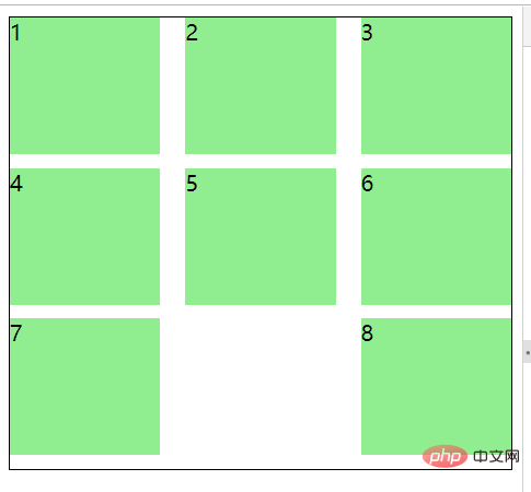
You can see that the last p is not in the middle, but at the end
Because we set justify-content to space-between, which means welting both sides
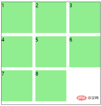
At this time, we can set a pseudo element for the outermost p, and the width is the same as the width of the p inside. Okay
You only need two lines of css
.main:after {
    content: "";
    width: 100px;
}Look at the effect at this time
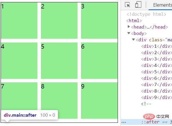
In fact, the principle is that the last pseudo element puts it Squeezed over
Even if there are 9 people, it will not affect it, because his height is 0, see the picture below↓
Recommended tutorial: " CSS tutorial》
The above is the detailed content of CSS Flex layout space-between last row left aligned. For more information, please follow other related articles on the PHP Chinese website!

Hot AI Tools

Undresser.AI Undress
AI-powered app for creating realistic nude photos

AI Clothes Remover
Online AI tool for removing clothes from photos.

Undress AI Tool
Undress images for free

Clothoff.io
AI clothes remover

Video Face Swap
Swap faces in any video effortlessly with our completely free AI face swap tool!

Hot Article
Hot Tools

Notepad++7.3.1
Easy-to-use and free code editor

SublimeText3 Chinese version
Chinese version, very easy to use

Zend Studio 13.0.1
Powerful PHP integrated development environment

Dreamweaver CS6
Visual web development tools

SublimeText3 Mac version
God-level code editing software (SublimeText3)
Hot Topics


 Take you step by step to implement 3D dice using CSS Flex and Grid layout (with code)
Sep 23, 2022 am 09:58 AM
Take you step by step to implement 3D dice using CSS Flex and Grid layout (with code)
Sep 23, 2022 am 09:58 AM
In front-end interviews, we are often asked how to implement dice/mahjong layout using CSS. The following article will introduce to you how to use CSS to create a 3D dice (Flex and Grid layout implement 3D dice). I hope it will be helpful to you!
 What are the commonly used Flex layout properties?
Feb 25, 2024 am 10:42 AM
What are the commonly used Flex layout properties?
Feb 25, 2024 am 10:42 AM
What are the common properties of flex layout? Specific code examples are required. Flex layout is a powerful tool for designing responsive web page layouts. It makes it easy to control the arrangement and size of elements in a web page by using a flexible set of properties. In this article, I will introduce the common properties of Flex layout and provide specific code examples. display: Set the display mode of the element to Flex. .container{display:flex;}flex-directi
 An article explaining in detail the impact of three flex properties on elements
Aug 30, 2022 pm 07:50 PM
An article explaining in detail the impact of three flex properties on elements
Aug 30, 2022 pm 07:50 PM
During development, the flex attribute is often used to act on the child elements of the flexible box, such as: flex:1 or flex: 1 1 auto. So how does this attribute control the behavior of the element? What exactly does flex:1 mean? Let this article take you through a thorough understanding of the flex property!
 Take you through the three attributes of Flex layout: flex-grow, flex-shrink, flex-basis
Dec 06, 2022 pm 08:37 PM
Take you through the three attributes of Flex layout: flex-grow, flex-shrink, flex-basis
Dec 06, 2022 pm 08:37 PM
This article will give you an in-depth understanding of the three properties of CSS Flex layout: flex-grow, flex-shrink, and flex-basis. I hope it will be helpful to you!
 CSS adaptive layout property optimization tips: flex and grid
Oct 21, 2023 am 08:03 AM
CSS adaptive layout property optimization tips: flex and grid
Oct 21, 2023 am 08:03 AM
CSS adaptive layout attribute optimization tips: flex and grid In modern web development, implementing adaptive layout is a very important task. With the popularity of mobile devices and the diversification of screen sizes, it is an essential requirement to ensure that the website can be displayed well on various devices and adapt to different screen sizes. Fortunately, CSS provides some powerful properties and techniques for implementing adaptive layout. This article will focus on two commonly used properties: flex and grid, and provide specific code examples.
 How to achieve sliding menu effect through CSS Flex layout
Sep 26, 2023 pm 02:13 PM
How to achieve sliding menu effect through CSS Flex layout
Sep 26, 2023 pm 02:13 PM
How to achieve the sliding menu effect through CSSFlex elastic layout. In web design, sliding menu is a common interactive effect, which can make the web page more smooth and beautiful. This article will teach you how to use CSSFlex elastic layout to achieve this effect, and provide specific code examples. CSSFlex is a new layout method that can easily achieve various complex layout effects. It controls the layout by setting the properties of the container and child elements, of which the flex property is one of the most important properties. First, we need a
 Detailed explanation of grid spacing and border processing methods in CSS Flex flexible layout
Sep 26, 2023 am 10:31 AM
Detailed explanation of grid spacing and border processing methods in CSS Flex flexible layout
Sep 26, 2023 am 10:31 AM
Title: Detailed explanation of grid spacing and border processing methods in CSSFlex elastic layout Introduction: CSSFlex elastic layout is a modern page layout method that allows web pages to automatically adapt to different screen sizes and is flexible and responsive. When using CSSFlex flexible layout, we often encounter situations where we need to set grid spacing and borders. This article will introduce in detail the grid spacing and border processing methods in CSSFlex flexible layout, and provide specific code examples. 1. Grid spacing
 A detailed explanation of Flex layout in CSS3
Nov 01, 2022 pm 07:29 PM
A detailed explanation of Flex layout in CSS3
Nov 01, 2022 pm 07:29 PM
This article will take you through the Flex layout in CSS3, I hope it will be helpful to you!
