 Web Front-end
 CSS Tutorial
 CSS3 deformation-rotation to achieve 4-color flowers-case analysis (code example)
CSS3 deformation-rotation to achieve 4-color flowers-case analysis (code example)
Goal of this article:
1. Master how to rotate elements in CSS3
Question:
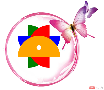
1. Achieve the following effects and use pure DIV CSS

Additional notes:
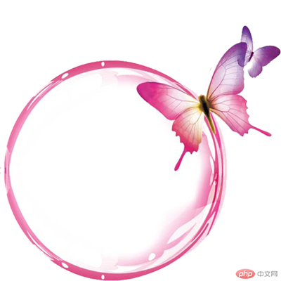
1. The pink circle with the butterfly is a picture
2. The "4-color flower" in the middle is composed of 4 Semicircles are generated by rotation. The diameter of each semicircle is 180px
Now let’s do the specific operation
1. Prepare the material: the material in the current case is a pink circle with a butterfly

2. Create index.html and write the architecture. How to analyze the architecture?
Idea analysis:
1. The target outer layer is a div, div The background picture is a pink circle with a butterfly
2. The div contains a 4-color flower, so the flower is composed of 5 parts, 4 petals and 1 small white hole
Okay, first follow the analysis and write the idea, and ignore the implementation of css for the time being
<!DOCTYPE html>
<html>
<head>
<meta charset="utf-8">
<title>CSS旋转案例</title>
</head>
<body>
<div class="wrapper">
    <div class="bottole">
        <div class="leaf leaf2"></div>
        <div class="leaf leaf3"></div>
        <div class="leaf leaf4"></div>
        <div class="leaf"></div>
        <div class="smallcircle"></div>
    </div>
</div>
</body>
</html>3. Write the style, create the css folder, and create a new index.css in it
Idea analysis:
.container * Public style
1. Define public style
.wrapper *{
    margin:0;
    padding:0;
}.bottole Outer div settings
1. Because we need to ensure that the background image is complete displayed, so it must be larger than the background image
2. The background image cannot be repeated
  .bottole{
    width: 640px;
    height: 420px;
    background-image: url(../images/CSS3 deformation-rotation to achieve 4-color flowers-case analysis (code example));
    background-repeat: no-repeat;
    background-position-x: 40px;
    background-position-y: -35px;
}.leaf semicircle leaf
1. Because the diameter of the semicircle is 180, the height must be 90px, then we can realize the semicircle through border-radius, and the default color is defined as orange. In order to make the four semicircles overlap, you must use position:absolute, and then you need to set margin-left and margin-top to make it The position presents the target effect (here we can get it through continuous debugging)
  .wrapper .leaf {
    width: 180px;
    height: 90px;
    border-radius: 180px 180px 0 0;
    background-color: orange;
    position: absolute;
    margin-left: 100px;
    margin-top: 150px;
}.leaf2 Set the leaves individually
1. The color of the leaf is green and needs to be rotated 90 degrees
.wrapper .leaf2 {
    background: green;
    -webkit-transform: rotate(90deg);
    transform: rotate(90deg);
}.leaf3 Leaves set individually
1. The color of the leaf is blue and needs to be rotated 180 degrees
  .wrapper .leaf3 {
    background: blue;
    -webkit-transform: rotate(180deg);
    transform: rotate(180deg);
}.leaf4 Leaves set individually
1. The color of the leaves is red, and the angle that needs to be rotated is 270 degrees
  .wrapper .leaf4 {
    background: red;
    -webkit-transform: rotate(270deg);
    transform: rotate(270deg);
}Small round hole flower center settings
1. The size of the small round holes is 20. We can make the size of a div 20, Then the border-radius can be made into a circle if it is also 20
2. The background color is white
3. In order to position the hole in the center of the flower, we need to set margin-left, margin-top
  .smallcircle{
    width: 20px;
    height: 20px;
    background-color: white;
    border-radius: 20px;
    position: absolute;
    margin-left: 180px;
    margin-top: 190px;
}Okay, so far, we have written all the styles we thought of. If the specifics are not correct, let’s modify it again
So far, all the css contents are as follows:
.wrapper *{
    margin:0;
    padding:0;
}
.bottole{
    width: 640px;
    height: 420px;
    border-radius: 400px;
    background-image: url(../images/CSS3 deformation-rotation to achieve 4-color flowers-case analysis (code example));
    background-repeat: no-repeat;
    background-position-x: 40px;
    background-position-y: -35px;
  }
  .wrapper .leaf {
    width: 180px;
    height: 90px;
    border-radius: 180px 180px 0 0;
    background-color: orange;
    position: absolute;
    margin-left: 100px;
    margin-top: 150px;
  }
.wrapper .leaf2 {
    background: green;
    -webkit-transform: rotate(90deg);
    transform: rotate(90deg);
  }
  .wrapper .leaf3 {
    background: blue;
    -webkit-transform: rotate(180deg);
    transform: rotate(180deg);
  }
  .wrapper .leaf4 {
    background: red;
    -webkit-transform: rotate(270deg);
    transform: rotate(270deg);
  }
  .smallcircle{
    width: 20px;
    height: 20px;
    background-color: white;
    border-radius: 20px;
    position: absolute;
    margin-left: 180px;
    margin-top: 190px;
}Introduce css into index.html
<!DOCTYPE html>
<html>
<head>
<meta charset="utf-8">
<title>CSS旋转案例</title>
<link href="css/index.css" rel="stylesheet" type="text/css">
</head>
<body>
<div class="wrapper">
    <div class="bottole">
        <div class="leaf leaf2"></div>
        <div class="leaf leaf3"></div>
        <div class="leaf leaf4"></div>
        <div class="leaf"></div>
        <div class="smallcircle"></div>
    </div>
</div>
</body>
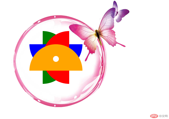
</html>The running effect is as follows:

The above is the detailed content of CSS3 deformation-rotation to achieve 4-color flowers-case analysis (code example). For more information, please follow other related articles on the PHP Chinese website!

Hot AI Tools

Undresser.AI Undress
AI-powered app for creating realistic nude photos

AI Clothes Remover
Online AI tool for removing clothes from photos.

Undress AI Tool
Undress images for free

Clothoff.io
AI clothes remover

Video Face Swap
Swap faces in any video effortlessly with our completely free AI face swap tool!

Hot Article

Hot Tools

Notepad++7.3.1
Easy-to-use and free code editor

SublimeText3 Chinese version
Chinese version, very easy to use

Zend Studio 13.0.1
Powerful PHP integrated development environment

Dreamweaver CS6
Visual web development tools

SublimeText3 Mac version
God-level code editing software (SublimeText3)

Hot Topics
 1664
1664
 14
14
 1422
1422
 52
52
 1316
1316
 25
25
 1268
1268
 29
29
 1242
1242
 24
24
 How to use bootstrap in vue
Apr 07, 2025 pm 11:33 PM
Using Bootstrap in Vue.js is divided into five steps: Install Bootstrap. Import Bootstrap in main.js. Use the Bootstrap component directly in the template. Optional: Custom style. Optional: Use plug-ins.
 Understanding HTML, CSS, and JavaScript: A Beginner's Guide
Apr 12, 2025 am 12:02 AM
WebdevelopmentreliesonHTML,CSS,andJavaScript:1)HTMLstructurescontent,2)CSSstylesit,and3)JavaScriptaddsinteractivity,formingthebasisofmodernwebexperiences.
 The Roles of HTML, CSS, and JavaScript: Core Responsibilities
Apr 08, 2025 pm 07:05 PM
HTML defines the web structure, CSS is responsible for style and layout, and JavaScript gives dynamic interaction. The three perform their duties in web development and jointly build a colorful website.
 How to insert pictures on bootstrap
Apr 07, 2025 pm 03:30 PM
There are several ways to insert images in Bootstrap: insert images directly, using the HTML img tag. With the Bootstrap image component, you can provide responsive images and more styles. Set the image size, use the img-fluid class to make the image adaptable. Set the border, using the img-bordered class. Set the rounded corners and use the img-rounded class. Set the shadow, use the shadow class. Resize and position the image, using CSS style. Using the background image, use the background-image CSS property.
 How to write split lines on bootstrap
Apr 07, 2025 pm 03:12 PM
There are two ways to create a Bootstrap split line: using the tag, which creates a horizontal split line. Use the CSS border property to create custom style split lines.
 How to set up the framework for bootstrap
Apr 07, 2025 pm 03:27 PM
To set up the Bootstrap framework, you need to follow these steps: 1. Reference the Bootstrap file via CDN; 2. Download and host the file on your own server; 3. Include the Bootstrap file in HTML; 4. Compile Sass/Less as needed; 5. Import a custom file (optional). Once setup is complete, you can use Bootstrap's grid systems, components, and styles to create responsive websites and applications.
 How to resize bootstrap
Apr 07, 2025 pm 03:18 PM
To adjust the size of elements in Bootstrap, you can use the dimension class, which includes: adjusting width: .col-, .w-, .mw-adjust height: .h-, .min-h-, .max-h-
 How to use bootstrap button
Apr 07, 2025 pm 03:09 PM
How to use the Bootstrap button? Introduce Bootstrap CSS to create button elements and add Bootstrap button class to add button text


