Summary about positioning in css

The following mainly introduces three common positionings.
1. Position: relative (relative positioning)
Relative positioning means making corresponding changes relative to the original position.
It should be noted that the element will occupy its original position after being moved (this is the most important point of relative positioning)
(Video tutorial recommendation: css video tutorial)
Code:
<style>
        * {
            margin: 0;
            padding: 0;
            /* 这里清除掉所有外边距和内边距,
            没有实质意义,只是方便观察 */
        }

        .pink {
            width: 80px;
            height: 80px;
            background-color: pink;
        }

        .purple {
            width: 80px;
            height: 80px;
            background-color: purple;
        }

        .green {
            width: 80px;
            height: 80px;
            background-color: greenyellow
        }
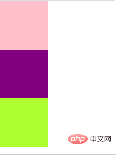
</style>The running results are as follows:

When the following positioning attributes are given to the sub-box:
 .purple {
            position: relative;
            top: 0;
            left: 80px;
            /* 上面给这个盒子添加了相对定位,
            并让它相对原来的自己移动了80px的距离 */
            width: 80px;
            height: 80px;
            background-color: purple;
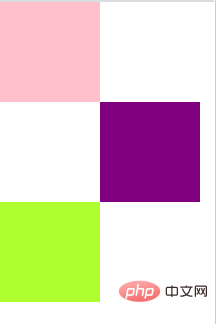
} As shown in the picture:

The page becomes like this, which also verifies the most important point: the element will occupy its original position after being moved, otherwise the green box will Will go up.
2. Position:absolute(absolute positioning)
Absolute positioning is a position change based on its parent element. If the parent element has a position attribute, it is based on the parent element. Make corresponding moves; if the parent element does not have a position attribute (or there is no parent element), make corresponding moves based on the browser.
It should be noted that the element will not occupy its original position after being moved.
Code:
.purple {
            position: absolute;
            top: 160;
            left: 80px;
            /* 这里的紫色盒子没有父级元素
            所以是以浏览器为基准的定位 */
            width: 80px;
            height: 80px;
            background-color: purple;
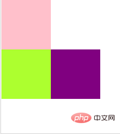
}Picture:

Obviously the green box is pushed up, this result verifies the absolute positioning : The element will not occupy its original position after being moved.
3. Fixed (fixed positioning)
The position of fixed positioning is relative to the position of the entire page, regardless of whether there is a parent element. Similarly, fixed positioning will not retain the position.
Recommended tutorial: css quick start
The above is the detailed content of Summary about positioning in css. For more information, please follow other related articles on the PHP Chinese website!

Hot AI Tools

Undresser.AI Undress
AI-powered app for creating realistic nude photos

AI Clothes Remover
Online AI tool for removing clothes from photos.

Undress AI Tool
Undress images for free

Clothoff.io
AI clothes remover

Video Face Swap
Swap faces in any video effortlessly with our completely free AI face swap tool!

Hot Article

Hot Tools

Notepad++7.3.1
Easy-to-use and free code editor

SublimeText3 Chinese version
Chinese version, very easy to use

Zend Studio 13.0.1
Powerful PHP integrated development environment

Dreamweaver CS6
Visual web development tools

SublimeText3 Mac version
God-level code editing software (SublimeText3)

Hot Topics
 1663
1663
 14
14
 1419
1419
 52
52
 1313
1313
 25
25
 1263
1263
 29
29
 1236
1236
 24
24
 How to use bootstrap in vue
Apr 07, 2025 pm 11:33 PM
Using Bootstrap in Vue.js is divided into five steps: Install Bootstrap. Import Bootstrap in main.js. Use the Bootstrap component directly in the template. Optional: Custom style. Optional: Use plug-ins.
 Understanding HTML, CSS, and JavaScript: A Beginner's Guide
Apr 12, 2025 am 12:02 AM
WebdevelopmentreliesonHTML,CSS,andJavaScript:1)HTMLstructurescontent,2)CSSstylesit,and3)JavaScriptaddsinteractivity,formingthebasisofmodernwebexperiences.
 The Roles of HTML, CSS, and JavaScript: Core Responsibilities
Apr 08, 2025 pm 07:05 PM
HTML defines the web structure, CSS is responsible for style and layout, and JavaScript gives dynamic interaction. The three perform their duties in web development and jointly build a colorful website.
 How to insert pictures on bootstrap
Apr 07, 2025 pm 03:30 PM
There are several ways to insert images in Bootstrap: insert images directly, using the HTML img tag. With the Bootstrap image component, you can provide responsive images and more styles. Set the image size, use the img-fluid class to make the image adaptable. Set the border, using the img-bordered class. Set the rounded corners and use the img-rounded class. Set the shadow, use the shadow class. Resize and position the image, using CSS style. Using the background image, use the background-image CSS property.
 How to write split lines on bootstrap
Apr 07, 2025 pm 03:12 PM
There are two ways to create a Bootstrap split line: using the tag, which creates a horizontal split line. Use the CSS border property to create custom style split lines.
 How to set up the framework for bootstrap
Apr 07, 2025 pm 03:27 PM
To set up the Bootstrap framework, you need to follow these steps: 1. Reference the Bootstrap file via CDN; 2. Download and host the file on your own server; 3. Include the Bootstrap file in HTML; 4. Compile Sass/Less as needed; 5. Import a custom file (optional). Once setup is complete, you can use Bootstrap's grid systems, components, and styles to create responsive websites and applications.
 How to resize bootstrap
Apr 07, 2025 pm 03:18 PM
To adjust the size of elements in Bootstrap, you can use the dimension class, which includes: adjusting width: .col-, .w-, .mw-adjust height: .h-, .min-h-, .max-h-
 How to use bootstrap button
Apr 07, 2025 pm 03:09 PM
How to use the Bootstrap button? Introduce Bootstrap CSS to create button elements and add Bootstrap button class to add button text


