How to use css box-pack attribute

css box-pack attribute definition and usage
1. The box-pack attribute is a new attribute in css3, which is used to specify when the box Larger than the size of the child element, where to place the child element? Currently, mainstream browsers do not support this attribute, but some browsers have their own private attributes to achieve the effect of the box-pack attribute.
2. Internet Explorer 10 can use the -ms-flex-pack property attribute instead of supporting the box-pack attribute. Versions before Internet Explorer 10 do not support this attribute. The Firefox core browser can support the box-pack attribute instead through the private attribute -moz-box-pack attribute. Safari, Opera and Chrome browsers can support the box-pack attribute instead through the private attribute-webkit-box-pack attribute;
css box-pack attribute syntax format
box-pack: start/end/center/justify;
Attribute value description
start: For boxes with normal orientation, the first child element on the left edge is placed on the left (all extra space is placed after the last child element ). For reversed boxes, the right edge of the last child is placed to the right (all extra space is placed before the first child)
end: For normally oriented boxes, the last child is placed to the right The margin is placed on the right side (all extra space is placed before the first child element). For reverse boxes, the left edge of the first child is placed on the left side (all extra space is placed after the last child element)
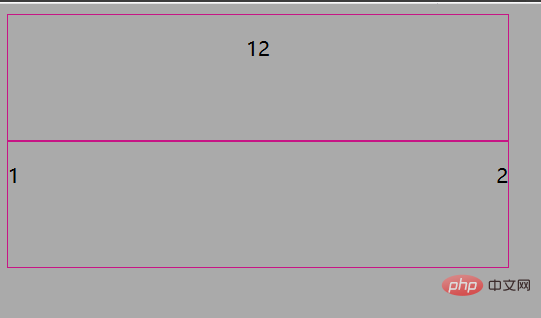
center: The extra space is divided into two even halves, with the first half placed One child element, the other half places the last child element
justify: extra space is distributed equally to each child element
Example
<!DOCTYPE html>
<html>
<head>
<meta charset="utf-8" />
<title>css3 box-pack属性笔记</title>
<style type="text/css">
body{background-color: #aaa;}
div{width: 400px;height: 100px;border:1px solid mediumvioletred;}
.box1{
display:box;/* W3C */
display:-ms-flexbox;/* Internet Explorer 10 */
display:-moz-box;/* Firefox */
display:-webkit-box;/* Safari, Opera, and Chrome */
box-pack:center;/* W3C */
-ms-flex-pack:center;/* Internet Explorer 10 */
-moz-box-pack:center;/* Firefox */
-webkit-box-pack:center;/* Safari, Opera, and Chrome */
}
.box2{
display:box;/* W3C */
display:-ms-flexbox;/* Internet Explorer 10 */
display:-moz-box;/* Firefox */
display:-webkit-box;/* Safari, Opera, and Chrome */
box-pack:justify;/* W3C */
-ms-flex-pack:justify;/* Internet Explorer 10 */
-moz-box-pack:justify;/* Firefox */
-webkit-box-pack:justify;/* Safari, Opera, and Chrome */
}
</style>
</head>
<body>
<div class="box1"><p>1</p><p>2</p></div>
<div class="box2"><p>1</p><p>2</p></div>
</body>
</html>operation result

The above is the detailed content of How to use css box-pack attribute. For more information, please follow other related articles on the PHP Chinese website!

Hot AI Tools

Undresser.AI Undress
AI-powered app for creating realistic nude photos

AI Clothes Remover
Online AI tool for removing clothes from photos.

Undress AI Tool
Undress images for free

Clothoff.io
AI clothes remover

Video Face Swap
Swap faces in any video effortlessly with our completely free AI face swap tool!

Hot Article

Hot Tools

Notepad++7.3.1
Easy-to-use and free code editor

SublimeText3 Chinese version
Chinese version, very easy to use

Zend Studio 13.0.1
Powerful PHP integrated development environment

Dreamweaver CS6
Visual web development tools

SublimeText3 Mac version
God-level code editing software (SublimeText3)

Hot Topics
 Vue 3
Apr 02, 2025 pm 06:32 PM
It's out! Congrats to the Vue team for getting it done, I know it was a massive effort and a long time coming. All new docs, as well.
 Can you get valid CSS property values from the browser?
Apr 02, 2025 pm 06:17 PM
I had someone write in with this very legit question. Lea just blogged about how you can get valid CSS properties themselves from the browser. That's like this.
 Stacked Cards with Sticky Positioning and a Dash of Sass
Apr 03, 2025 am 10:30 AM
The other day, I spotted this particularly lovely bit from Corey Ginnivan’s website where a collection of cards stack on top of one another as you scroll.
 A bit on ci/cd
Apr 02, 2025 pm 06:21 PM
I'd say "website" fits better than "mobile app" but I like this framing from Max Lynch:
 Comparing Browsers for Responsive Design
Apr 02, 2025 pm 06:25 PM
There are a number of these desktop apps where the goal is showing your site at different dimensions all at the same time. So you can, for example, be writing
 Using Markdown and Localization in the WordPress Block Editor
Apr 02, 2025 am 04:27 AM
If we need to show documentation to the user directly in the WordPress editor, what is the best way to do it?
 Why are the purple slashed areas in the Flex layout mistakenly considered 'overflow space'?
Apr 05, 2025 pm 05:51 PM
Questions about purple slash areas in Flex layouts When using Flex layouts, you may encounter some confusing phenomena, such as in the developer tools (d...
 How to select a child element with the first class name item through CSS?
Apr 05, 2025 pm 11:24 PM
When the number of elements is not fixed, how to select the first child element of the specified class name through CSS. When processing HTML structure, you often encounter different elements...


