

How to use the opacity attribute

The opacity attribute is used to set the opacity level of an element. Through this attribute, we can set the transparency of images, text, box models, etc.
CSS3 opacity attribute
Function:Retrieve or set the opacity of the object transparency.
Syntax:
opacity: value|inherit;
value: Specifies opacity. From 0.0 (fully transparent) to 1.0 (fully opaque).
inherit: The value of the opacity attribute should be inherited from the parent element.
Note: For IE browsers that do not yet support the opacity attribute, you can use IE's private filter attributes to achieve the same effect as opacity.
CSS3 opacity property usage example
##Example 1:
<!DOCTYPE html>
<html>
<head>
<meta charset="utf-8" />
<title></title>
<style>
h1 {
margin: 10px 0;
font-size: 16px;
}
.test,
.test2 {
width: 300px;
height: 150px;
padding: 10px;
}
.test {
background:#050;
}
.test2 {
margin: -120px 0 0 50px;
background: #000;
filter: alpha(opacity=50);
opacity: .5;
color: #fff;
}
</style>
</head>
<body>
<h1 id="下例是一个半透明的效果">下例是一个半透明的效果:</h1>
<div>不透明度为100%的box</div>
<div>不透明度为50%的box</div>
</body>
</html>
#Example 2: Using JavaScript to change the opacity of an element.
<!DOCTYPE html>
<html>
<meta charset="UTF-8">
<head>
<style>
.demo{
width: 450px;
height: 200px;
background-color: red;
margin: 10px 0px;
}
</style>
<script>
function ChangeOpacity(x)
{
// 返回被选选项的文本
var opacity=x.options[x.selectedIndex].text;
var el=document.getElementById("box");
if (el.style.opacity!==undefined)
{el.style.opacity=opacity;}
else
{alert("Your browser doesn't support this example!");}
}
</script>
</head>
<body>
<p id="p1">请从下面的例子中选择一个值,以改变此元素的不透明度。</p>
<div id="box" class="demo"></div>
<select onchange="ChangeOpacity(this);" size="5">
<option />0
<option />0.2
<option />0.5
<option />0.8
<option selected="selected" />1
</select>
</body>
The above is the detailed content of How to use the opacity attribute. For more information, please follow other related articles on the PHP Chinese website!

Hot AI Tools

Undresser.AI Undress
AI-powered app for creating realistic nude photos

AI Clothes Remover
Online AI tool for removing clothes from photos.

Undress AI Tool
Undress images for free

Clothoff.io
AI clothes remover

Video Face Swap
Swap faces in any video effortlessly with our completely free AI face swap tool!

Hot Article
Hot Tools

Notepad++7.3.1
Easy-to-use and free code editor

SublimeText3 Chinese version
Chinese version, very easy to use

Zend Studio 13.0.1
Powerful PHP integrated development environment

Dreamweaver CS6
Visual web development tools

SublimeText3 Mac version
God-level code editing software (SublimeText3)
Hot Topics


 How to achieve wave effect with pure CSS3? (code example)
Jun 28, 2022 pm 01:39 PM
How to achieve wave effect with pure CSS3? (code example)
Jun 28, 2022 pm 01:39 PM
How to achieve wave effect with pure CSS3? This article will introduce to you how to use SVG and CSS animation to create wave effects. I hope it will be helpful to you!
 Use CSS skillfully to realize various strange-shaped buttons (with code)
Jul 19, 2022 am 11:28 AM
Use CSS skillfully to realize various strange-shaped buttons (with code)
Jul 19, 2022 am 11:28 AM
This article will show you how to use CSS to easily realize various weird-shaped buttons that appear frequently. I hope it will be helpful to you!
 How to hide elements in css without taking up space
Jun 01, 2022 pm 07:15 PM
How to hide elements in css without taking up space
Jun 01, 2022 pm 07:15 PM
Two methods: 1. Using the display attribute, just add the "display:none;" style to the element. 2. Use the position and top attributes to set the absolute positioning of the element to hide the element. Just add the "position:absolute;top:-9999px;" style to the element.
 How to implement lace borders in css3
Sep 16, 2022 pm 07:11 PM
How to implement lace borders in css3
Sep 16, 2022 pm 07:11 PM
In CSS, you can use the border-image attribute to achieve a lace border. The border-image attribute can use images to create borders, that is, add a background image to the border. You only need to specify the background image as a lace style; the syntax "border-image: url (image path) offsets the image border width inward. Whether outset is repeated;".
 How to enlarge the image by clicking the mouse in css3
Apr 25, 2022 pm 04:52 PM
How to enlarge the image by clicking the mouse in css3
Apr 25, 2022 pm 04:52 PM
Implementation method: 1. Use the ":active" selector to select the state of the mouse click on the picture; 2. Use the transform attribute and scale() function to achieve the picture magnification effect, the syntax "img:active {transform: scale(x-axis magnification, y Axis magnification);}".
 It turns out that text carousel and image carousel can also be realized using pure CSS!
Jun 10, 2022 pm 01:00 PM
It turns out that text carousel and image carousel can also be realized using pure CSS!
Jun 10, 2022 pm 01:00 PM
How to create text carousel and image carousel? The first thing everyone thinks of is whether to use js. In fact, text carousel and image carousel can also be realized using pure CSS. Let’s take a look at the implementation method. I hope it will be helpful to everyone!
 How to set animation rotation speed in css3
Apr 28, 2022 pm 04:32 PM
How to set animation rotation speed in css3
Apr 28, 2022 pm 04:32 PM
In CSS3, you can use the "animation-timing-function" attribute to set the animation rotation speed. This attribute is used to specify how the animation will complete a cycle and set the speed curve of the animation. The syntax is "element {animation-timing-function: speed attribute value;}".
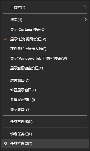 Teach you how to set the transparency of the win10 taskbar
Jul 10, 2023 pm 12:37 PM
Teach you how to set the transparency of the win10 taskbar
Jul 10, 2023 pm 12:37 PM
The win10 system has many relatively new features. Some friends want to make their win10 system more personalized, so they want to set the taskbar transparency to look cooler. So how to set the transparency of the win10 taskbar? The editor below will teach you how to set the transparency of the win10 taskbar. The specific method is as follows: 1. Turn on the computer, move the mouse to the taskbar, then right-click the taskbar, find "Taskbar Settings" in the window and click it. 2. After clicking on the "Taskbar Settings" window, find the "Color" option and click on it. In the "Color" setting interface, you can set the taskbar color you like. You can choose the Windows color or customize the color. Select After choosing the color, find the “Transparency Effect” below.
