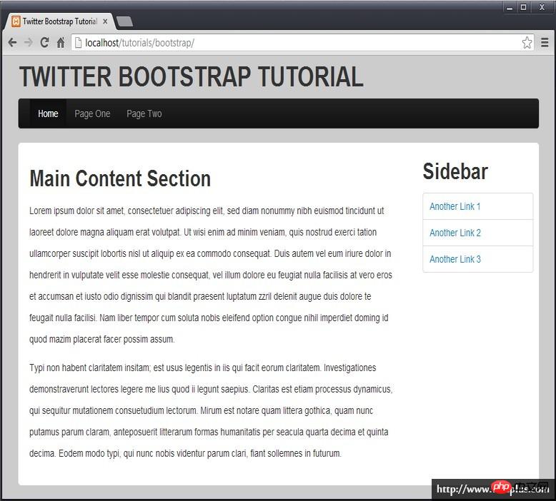
The content of this article is about the implementation process of the basic layout of Bootstrap (code examples). It has certain reference value. Friends in need can refer to it. I hope it will be helpful to you.
In the folder where the index.html file is located, create a css folder to save all style files, and create a folder named bootstrap in the css subfolder to save our bootstrap files.
You can download the bootstrap package from the bootstrap official website, which has a dist folder, which contains three subfolders: css, font and js. Copy these three subfolders into your css/bootstrap folder.
There are two parts of content involved in the page, styles and scripts.
2.1 Add style reference
Add bootstrap style reference in the header. Pay attention to the path.
bootstrap.min.css is the style file of bootstrap, which contains all bootstrap style definitions, and bootstrap-theme.min.css is the theme definition.
2.2 Add script reference
Since bootstrap uses jQuery script, you also need to download the jquery script library.
In the directory where your index.html file is located, create a subdirectory named lib to save the script library for future use, and copy the downloaded jquery.min.js to this directory.
Add jquery and bootstrap script library references immediately between your
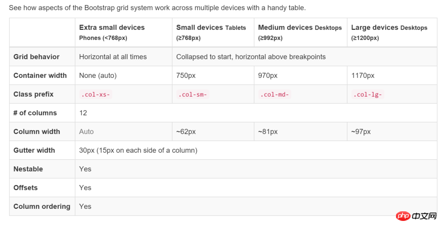
bootstrap’s .container class is very useful. It can create a centered area in the page, and then we can add other The content of the location is placed inside. The container class is equivalent to creating a centered p box with a static width and a magin value of auto. The advantage of twitter bootstrap's container class is that it is responsive, and it will calculate the optimal width based on the width of the current screen and use it.
.container-fluid is a full-width container, using the entire width.
Refresh the page and you should see an eye-catching title. Next we look at navigation.
4.2 Navigation
Use the nav element to create navigation, and we want to create a navigation bar to organize navigation items. In bootstrap, the navigation bar is called navbar, continue Add a navigation bar to the container.
navbar will help us create the navigation bar. The default background color is white. navbar-inverse is set to inverse, so that the background color will be black and the text will be white, which is more eye-catching. Now refresh the page and you will see a black navigation bar without any navigation content.
ul is the actual navigation content, where .nav indicates that this is a set of navigation, and .navbar-nav indicates that it is used for navigation in navbar. li is the actual navigation item, and you can use .active to describe the currently active navigation.
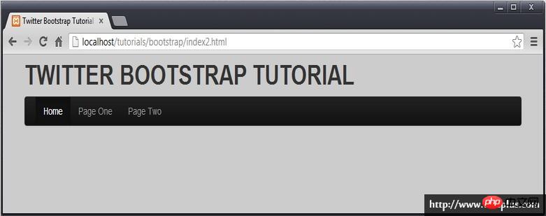
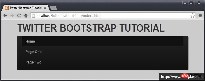
Note .navbar-collapse, which means that when the width of the viewport is less than 768px, the navigation becomes vertical.
Greater than 768px
Less than 768px
##4.3 Sandwich Menu
It is not convenient to turn into vertical navigation. We hope to become a popular style, such as this.
We need to do some extra work. On the one hand, we need to explain that when the viewport is smaller than a certain width, our specific navigation will be displayed and additional navigation will be added. content.
<!-- Brand and toggle get grouped for better mobile display -->
<div class="navbar-header">
<button type="button" class="navbar-toggle collapsed" data-toggle="collapse" data-target="#navbar-menu" aria-expanded="false">
<span class="sr-only">Toggle navigation</span>
<span class="icon-bar"></span>
</button>
<a class="navbar-brand" href="#">Brand</a>
</div>
Copy after login
In fact, it is composed of two parts. The button part looks like a lot, and is used to draw the sandwich button on the right. The following a element is the navigation on the left.
通常它不会显示出来。
然后,我们需要制定点击三明治按钮的时候,需要显示我们原来的导航。button 元素中,我们有一个 attribute ,data-target="#navbar-menu" ,就是用来完成这一步工作的,这个 #navbar-menu 就是我们为原来的导航所起的 id 标识。
<div class="col-md-3">
<h2>Sidebar</h2>
<ul class="nav nav-tabs nav-stacked">
<li><a href='#'>Another Link 1</a></li>
<li><a href='#'>Another Link 2</a></li>
<li><a href='#'>Another Link 3</a></li>
</ul>
</div>
Copy after login
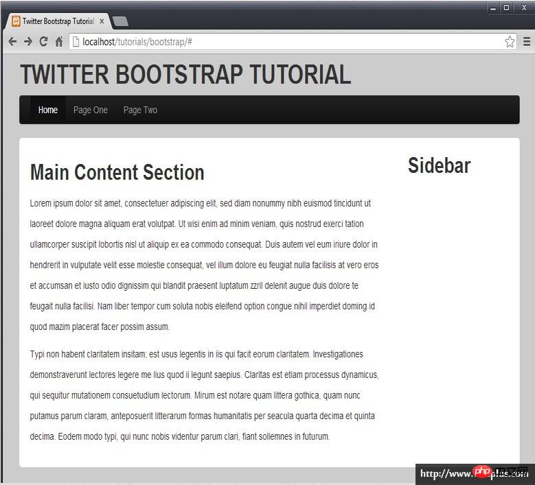
看看最终的效果,一个基于 bootstrap 的响应式布局页面就完成了。
The above is the detailed content of Implementation process of Bootstrap basic layout (code example). For more information, please follow other related articles on the PHP Chinese website!
Statement of this Website
The content of this article is voluntarily contributed by netizens, and the copyright belongs to the original author. This site does not assume corresponding legal responsibility. If you find any content suspected of plagiarism or infringement, please contact admin@php.cn
Using Bootstrap in Vue.js is divided into five steps: Install Bootstrap. Import Bootstrap in main.js. Use the Bootstrap component directly in the template. Optional: Custom style. Optional: Use plug-ins.
How to use Bootstrap to get the value of the search bar: Determines the ID or name of the search bar. Use JavaScript to get DOM elements. Gets the value of the element. Perform the required actions.
Use Bootstrap to implement vertical centering: flexbox method: Use the d-flex, justify-content-center, and align-items-center classes to place elements in the flexbox container. align-items-center class method: For browsers that do not support flexbox, use the align-items-center class, provided that the parent element has a defined height.
There are two ways to create a Bootstrap split line: using the tag, which creates a horizontal split line. Use the CSS border property to create custom style split lines.
To set up the Bootstrap framework, you need to follow these steps: 1. Reference the Bootstrap file via CDN; 2. Download and host the file on your own server; 3. Include the Bootstrap file in HTML; 4. Compile Sass/Less as needed; 5. Import a custom file (optional). Once setup is complete, you can use Bootstrap's grid systems, components, and styles to create responsive websites and applications.
There are several ways to insert images in Bootstrap: insert images directly, using the HTML img tag. With the Bootstrap image component, you can provide responsive images and more styles. Set the image size, use the img-fluid class to make the image adaptable. Set the border, using the img-bordered class. Set the rounded corners and use the img-rounded class. Set the shadow, use the shadow class. Resize and position the image, using CSS style. Using the background image, use the background-image CSS property.
To adjust the size of elements in Bootstrap, you can use the dimension class, which includes: adjusting width: .col-, .w-, .mw-adjust height: .h-, .min-h-, .max-h-