

CSS3 learning page loading animation (1)

This article will share with you four CSS3 page loading animations. It has certain reference value. Friends in need can refer to it. I hope it will be helpful to you.
Two days ago, I saw some good loading animation effects from a website. They were written in pure CSS3. They felt good, so I tried to write them myself according to the effects.
Before starting, let’s review a little knowledge: CSS3’s new keyframe animation can be used to implement many animations. We can use animation-delay to control the delayed execution of animations to achieve rich effects.
When the value of animation-delay is a positive value, the animation will be delayed from the initial state;
When the value of animation-delay is a negative number, the animation will be advanced from the value (The absolute value of a negative number) The corresponding state starts execution.
(The effect picture may not be clear, please understand)
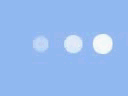
1. The first effect

There are 16 small squares in total. Position the position and change the transparency of the square through key frames.
{animation: ball 2s 0s ease infinite;}
@keyframes ball {
      0%{
        opacity: 1;
      }
      50%{
        opacity: 1;
      }
      51%{
        opacity: 0;
      }
}Set the animation-delay value for each square. My overall animation time here is 2s, dividing 16 squares equally is 0.125s, so the animation-delay value I set starts from -1.875s and increases with a numerical difference of 0.125 until it reaches 0.
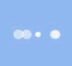
2. The second effect

The position of the big ball in the middle remains unchanged. The small balls are contained in three squares respectively. Set the position of the small ball {top:0;left:0;}, and set the square rotateZ to rotate to form this intersection.
Set the animation process through key frame animation (the writing of key frame animation below is not the best method), and set the animation-delay value for each ball, so that the three balls can move at different times. moment passes from the front.
{animation: turn_atom 1.5s 0s ease infinite;}
@keyframes turn_atom {
      0%{
        height:25px;
        width: 25px;
        top: 0;
        left: 0;
      }
      50%{
        height: 20px;
        width: 20px;
        top: 60px;
        left: 60px;
      }
      51%{
        height: 15px;
        width: 15px;
        top: 60px;
        left: 60px;
      }
      100%{
        height: 20px;
        width: 20px;
        top: 0;
        left: 0;
      }
}In addition, you also need to set the z-index value for the parent container of the three small balls through key frame animation to achieve the visual effect of the small balls rotating around the big ball.
{animation: turn_atomZ 1.5s 0s ease infinite;}
@keyframes turn_atomZ {
      0%{
        z-index: 6;
      }
      50%{
        z-index: 6;
      }
      51%{
        z-index: 4;
      }
}3. The third effect
{animation: light 1.5s 0s ease infinite;}
@keyframes light {
      50%{
        opacity: 0.4;
        height: 15px;
        width: 15px;
      }
}4. The fourth effect
 ##Initially, the four balls are positioned at the same position, and the left value of the ball and the size of the ball can be changed through key frames.
{animation: r_ball 2s 0s ease infinite,r_ballZ 2s 0s ease infinite;}
@keyframes r_ball {
      50%{
        left: 100%;
      }
    }
    @keyframes r_ballZ {
      25%{
        transform: scale(0.5);
      }
      50%{
        transform: scale(1);
      }
}That’s all I’ll write for now, I’ll add more later. (To be continued)
Summary: The above is the entire content of this article, I hope it will be helpful to everyone's study. For more related tutorials, please visit
CSS Basics Video Tutorial, CSS3 Video Tutorial, bootstrap Tutorial!
The above is the detailed content of CSS3 learning page loading animation (1). For more information, please follow other related articles on the PHP Chinese website!

Hot AI Tools

Undresser.AI Undress
AI-powered app for creating realistic nude photos

AI Clothes Remover
Online AI tool for removing clothes from photos.

Undress AI Tool
Undress images for free

Clothoff.io
AI clothes remover

Video Face Swap
Swap faces in any video effortlessly with our completely free AI face swap tool!

Hot Article
Hot Tools

Notepad++7.3.1
Easy-to-use and free code editor

SublimeText3 Chinese version
Chinese version, very easy to use

Zend Studio 13.0.1
Powerful PHP integrated development environment

Dreamweaver CS6
Visual web development tools

SublimeText3 Mac version
God-level code editing software (SublimeText3)
Hot Topics


 How to achieve wave effect with pure CSS3? (code example)
Jun 28, 2022 pm 01:39 PM
How to achieve wave effect with pure CSS3? (code example)
Jun 28, 2022 pm 01:39 PM
How to achieve wave effect with pure CSS3? This article will introduce to you how to use SVG and CSS animation to create wave effects. I hope it will be helpful to you!
 CSS Animation Guide: Teach you step-by-step how to create lightning effects
Oct 20, 2023 pm 03:55 PM
CSS Animation Guide: Teach you step-by-step how to create lightning effects
Oct 20, 2023 pm 03:55 PM
CSS Animation Guide: Teach you step by step how to create lightning effects Introduction: CSS animation is an indispensable part of modern web design. It can bring vivid effects and interactivity to web pages and enhance user experience. In this guide, we’ll take a closer look at how to use CSS to create a lightning effect, along with specific code examples. 1. Create an HTML structure: First, we need to create an HTML structure to accommodate our lightning effects. We can use a <div> element to wrap the lightning effect and provide
 How to use Vue to implement loading animation and progress bar effects?
Jun 27, 2023 pm 04:36 PM
How to use Vue to implement loading animation and progress bar effects?
Jun 27, 2023 pm 04:36 PM
Vue is a popular front-end framework that greatly simplifies website or application development. One of the common features is loading animation and progress bar effects to make the interface more attractive and interactive. In this article, we will explore how to achieve these effects using Vue. Loading animation effect Loading animation effect means that while waiting for data to be loaded, an animation effect will appear on the website or application to indicate that the data is loading. This helps convey the concept of wait time to the user, thus preventing them from getting bored or losing interest. The following is the implementation of the loading action
 Use CSS skillfully to realize various strange-shaped buttons (with code)
Jul 19, 2022 am 11:28 AM
Use CSS skillfully to realize various strange-shaped buttons (with code)
Jul 19, 2022 am 11:28 AM
This article will show you how to use CSS to easily realize various weird-shaped buttons that appear frequently. I hope it will be helpful to you!
 CSS Animation Tutorial: Teach you step-by-step to achieve page turning effects
Oct 24, 2023 am 09:30 AM
CSS Animation Tutorial: Teach you step-by-step to achieve page turning effects
Oct 24, 2023 am 09:30 AM
CSS Animation Tutorial: Teach you step-by-step to implement page turning effects, specific code examples are required CSS animation is an essential part of modern website design. It can add vividness to web pages, attract users' attention, and improve user experience. One of the common CSS animation effects is the page turning effect. In this tutorial, I'll take you step by step to achieve this eye-catching effect and provide specific code examples. First, we need to create a basic HTML structure. The code is as follows: <!DOCTYPE
 How to hide elements in css without taking up space
Jun 01, 2022 pm 07:15 PM
How to hide elements in css without taking up space
Jun 01, 2022 pm 07:15 PM
Two methods: 1. Using the display attribute, just add the "display:none;" style to the element. 2. Use the position and top attributes to set the absolute positioning of the element to hide the element. Just add the "position:absolute;top:-9999px;" style to the element.
 CSS Animation Tutorial: Teach you step-by-step to achieve the special effect of flowing water
Oct 21, 2023 am 08:52 AM
CSS Animation Tutorial: Teach you step-by-step to achieve the special effect of flowing water
Oct 21, 2023 am 08:52 AM
CSS Animation Tutorial: Teach you step-by-step to implement the special effect of flowing water. Specific code examples are required. Foreword: CSS animation is a commonly used technology in web design. It makes web pages more lively and interesting and attracts users' attention. In this tutorial, we will learn how to use CSS to achieve a flowing water effect and provide specific code examples. let's start! Step One: HTML Structure First, we need to create a basic HTML structure. Add a <di to the <body> tag of the document
 How to implement lace borders in css3
Sep 16, 2022 pm 07:11 PM
How to implement lace borders in css3
Sep 16, 2022 pm 07:11 PM
In CSS, you can use the border-image attribute to achieve a lace border. The border-image attribute can use images to create borders, that is, add a background image to the border. You only need to specify the background image as a lace style; the syntax "border-image: url (image path) offsets the image border width inward. Whether outset is repeated;".
