
 Web Front-end
CSS Tutorial
How to draw a circular dynamic clock using css3 (detailed explanation)
Web Front-end
CSS Tutorial
How to draw a circular dynamic clock using css3 (detailed explanation)
How to draw a circular dynamic clock using css3 (detailed explanation)
In this era where time is money, people are becoming more and more aware of time, not only in daily life, but also especially when surfing the Internet. So when developing front-end, learning to use css3 to make a clock is enough It seems necessary. The content this article brings to you is about it and has certain reference value. Friends in need can refer to it. I hope it will be helpful to you.
The principle of using css3 to draw a circular dynamic clock
It is well known that the div shape is a square , then we first need to use the border-radius property to transform it into a circle.
In order to make the pointer rotate, we need to use -webkit-transform-origin:center 100px; to set our rotation base point. Then use -webkit-transform: rotate(0); to let our li rotate the corresponding angle to form the corresponding scale.
After designing the scale, you need to involve an nth-of-type() selector to specify which child element it belongs to the parent element.
In the very center of the circular clock we need to set a div icon for the connection point of the pointer.
Then we use js to obtain the div and render the scale of the dial.
Finally, start a timer and execute the function every second.
Code to draw a circular dynamic clock using css3
<!DOCTYPE html>
<html>
<head>
    <meta charset="UTF-8"/>
    <title>钟表</title>
<style id="css">
        #wrap{width:200px; height:200px; border:2px solid #000; margin:100px auto;border-radius:50%; position:relative;}
        #wrap ul{margin:0; padding:0; height:200px; position:relative; list-style:none;}
        #wrap ul li{width:2px;  height:6px; background:#000; position:absolute; left:99px; top: 0;-webkit-transform-origin:center 100px;}
        /*#wrap ul li:nth-of-type(1){-webkit-transform: rotate(0);}
        #wrap ul li:nth-of-type(2){-webkit-transform: rotate(6deg);}
        #wrap ul li:nth-of-type(3){-webkit-transform: rotate(12deg);}
        #wrap ul li:nth-of-type(4){-webkit-transform: rotate(18deg);}
        #wrap ul li:nth-of-type(5){-webkit-transform: rotate(24deg);}
        #wrap ul li:nth-of-type(6){-webkit-transform: rotate(30deg);}
        #wrap ul li:nth-of-type(7){-webkit-transform: rotate(36deg);}
        #wrap ul li:nth-of-type(8){-webkit-transform: rotate(42deg);}*/
        #wrap ul li:nth-of-type(5n+1){ height:12px;}
        #hour{width:6px;  height:45px; background:#000; position:absolute; left:97px; top:55px;-webkit-transform-origin:bottom ;}
        #min{width:4px;  height:65px; background:#999; position:absolute; left:98px; top:35px;-webkit-transform-origin:bottom ;}
        #sec{width:2px;  height:80px; background:red; position:absolute; left:99px; top:20px;-webkit-transform-origin:bottom ;}
        .icon{width:20px; height:20px; background:#000; border-radius:50%; position:absolute; left:90px; top: 90px;}
    </style>
</head>
<body>
    <div id="wrap">
    <ul id="list">
        <!--<li></li>
        <li></li>
        <li></li>
        <li></li>
        <li></li>
        <li></li>
        <li></li>
        <li></li>-->
    </ul>
        <div id="hour"></div>
        <div id="min"></div>
        <div id="sec"></div>
        <div></div>
    </div>
    <script>
        var oList=document.getElementById("list");//获取到刻度
        var oCss=document.getElementById("css");
        var oHour=document.getElementById("hour");//获取时针
        var oMin=document.getElementById("min");//获取分针
        var oSec=document.getElementById("sec");//获取秒针
        var oLi="";
        var sCss="";
        for (var i=0;i<60;i++) { //一个表盘总共是60个刻度
            sCss+="#wrap ul li:nth-of-type("+(i+1)+"){-webkit-transform: rotate("+i*6+"deg);}";
            oLi+="<li></li>";
        };
        oList.innerHTML=oLi;
        oCss.innerHTML+=sCss;//表盘刻度渲染完成
        toTime();
        setInterval(toTime,1000);
        function toTime(){
            var oDate=new Date();//获取当前时间
            var iSec=oDate.getSeconds();//获取当前秒
            var iMin=oDate.getMinutes()+iSec/60;//获取当前分
            var iHour=oDate.getHours()+iMin/60;//获取当前时
            oSec.style.WebkitTransform="rotate("+iSec*6+"deg)";//秒针转动角度1秒6度 (表盘一圈360度一圈60秒所以一秒6度)
            oMin.style.WebkitTransform="rotate("+iMin*6+"deg)";//分钟转动角度1分6度 (表盘一圈360度一圈60分所以一分6度)
            oHour.style.WebkitTransform="rotate("+iHour*30+"deg)";//时针转动角度一小时30度(表盘一圈360度一圈12小时所以一小时30度)
        };
</script>
</body>
</html>The example effect is as follows As shown in the picture

The above is the detailed content of How to draw a circular dynamic clock using css3 (detailed explanation). For more information, please follow other related articles on the PHP Chinese website!

Hot AI Tools

Undresser.AI Undress
AI-powered app for creating realistic nude photos

AI Clothes Remover
Online AI tool for removing clothes from photos.

Undress AI Tool
Undress images for free

Clothoff.io
AI clothes remover

Video Face Swap
Swap faces in any video effortlessly with our completely free AI face swap tool!

Hot Article
Hot Tools

Notepad++7.3.1
Easy-to-use and free code editor

SublimeText3 Chinese version
Chinese version, very easy to use

Zend Studio 13.0.1
Powerful PHP integrated development environment

Dreamweaver CS6
Visual web development tools

SublimeText3 Mac version
God-level code editing software (SublimeText3)
Hot Topics


 How to achieve wave effect with pure CSS3? (code example)
Jun 28, 2022 pm 01:39 PM
How to achieve wave effect with pure CSS3? (code example)
Jun 28, 2022 pm 01:39 PM
How to achieve wave effect with pure CSS3? This article will introduce to you how to use SVG and CSS animation to create wave effects. I hope it will be helpful to you!
 Clock app missing in iPhone: How to fix it
May 03, 2024 pm 09:19 PM
Clock app missing in iPhone: How to fix it
May 03, 2024 pm 09:19 PM
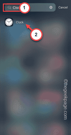
Is the clock app missing from your phone? The date and time will still appear on your iPhone's status bar. However, without the Clock app, you won’t be able to use world clock, stopwatch, alarm clock, and many other features. Therefore, fixing missing clock app should be at the top of your to-do list. These solutions can help you resolve this issue. Fix 1 – Place the Clock App If you mistakenly removed the Clock app from your home screen, you can put the Clock app back in its place. Step 1 – Unlock your iPhone and start swiping to the left until you reach the App Library page. Step 2 – Next, search for “clock” in the search box. Step 3 – When you see “Clock” below in the search results, press and hold it and
 How to use multiple timers on iPhone with iOS 17
Jun 21, 2023 am 08:18 AM
How to use multiple timers on iPhone with iOS 17
Jun 21, 2023 am 08:18 AM
What are multi-timers on iOS17? In iOS17, Apple now offers users the ability to set multiple timers at once on their iPhone. This is a welcome change, one that many have been waiting for for years. The Clock app, which before iOS 16 only allowed users to set one timer at a time, can now be used to activate any number of timers, making it ideal for completing multiple tasks at once. You can set any number of timers in the timer screen. Once the timer is started, all active timers will appear as "Live Activity" notifications on the lock screen and Notification Center. From here, you can view the remaining time until the timer is off, pause, or stop the timer without opening the Clock app. when you are on the clock
 iOS 17: How to change iPhone clock style in standby mode
Sep 10, 2023 pm 09:21 PM
iOS 17: How to change iPhone clock style in standby mode
Sep 10, 2023 pm 09:21 PM
Standby is a lock screen mode that activates when the iPhone is plugged into the charger and oriented in horizontal (or landscape) orientation. It consists of three different screens, one of which is displayed full screen time. Read on to learn how to change the style of your clock. StandBy's third screen displays times and dates in various themes that you can swipe vertically. Some themes also display additional information, such as temperature or next alarm. If you hold down any clock, you can switch between different themes, including Digital, Analog, World, Solar, and Floating. Float displays the time in large bubble numbers in customizable colors, Solar has a more standard font with a sun flare design in different colors, and World displays the world by highlighting
 Use CSS skillfully to realize various strange-shaped buttons (with code)
Jul 19, 2022 am 11:28 AM
Use CSS skillfully to realize various strange-shaped buttons (with code)
Jul 19, 2022 am 11:28 AM
This article will show you how to use CSS to easily realize various weird-shaped buttons that appear frequently. I hope it will be helpful to you!
![How to turn off alarms on iPhone [2023]](https://img.php.cn/upload/article/000/465/014/169259550735100.png?x-oss-process=image/resize,m_fill,h_207,w_330) How to turn off alarms on iPhone [2023]
Aug 21, 2023 pm 01:25 PM
How to turn off alarms on iPhone [2023]
Aug 21, 2023 pm 01:25 PM
Since the advent of smartphones, they have undoubtedly replaced alarm clocks. If you own an iPhone, you can use the Clock app to easily set as many alarms for multiple occasions throughout the day. The app lets you configure the alarm time, the tone, how often it repeats, and whether you want to delay them using the Snooze option. If you want to turn off the alarm you have set, the following post should help you disable and delete regular alarms and wake-up alarms on your iPhone. How to Turn Off a Regular Alarm on iPhone By default, when you add an alarm on the Clock app or ask Siri to add an alarm for you, you're actually creating a regular alarm. You can create as many alarm clocks on your iPhone as you like and put them
 How to hide elements in css without taking up space
Jun 01, 2022 pm 07:15 PM
How to hide elements in css without taking up space
Jun 01, 2022 pm 07:15 PM
Two methods: 1. Using the display attribute, just add the "display:none;" style to the element. 2. Use the position and top attributes to set the absolute positioning of the element to hide the element. Just add the "position:absolute;top:-9999px;" style to the element.
 How to implement lace borders in css3
Sep 16, 2022 pm 07:11 PM
How to implement lace borders in css3
Sep 16, 2022 pm 07:11 PM
In CSS, you can use the border-image attribute to achieve a lace border. The border-image attribute can use images to create borders, that is, add a background image to the border. You only need to specify the background image as a lace style; the syntax "border-image: url (image path) offsets the image border width inward. Whether outset is repeated;".
