本篇文章给大家带来的内容是关于如何使用css和gsap实现有多个关键帧的连续动画(附源码),有一定的参考价值,有需要的朋友可以参考一下,希望对你有所帮助。
效果预览
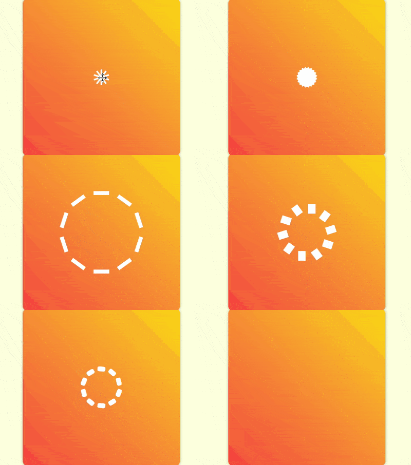
源代码下载
https://github.com/comehope/front-end-daily-challenges
代码解读
定义 dom,容器中包含 10 个 p 子元素,每个 p 中包含 1 个 span 元素:
<figure class="container">
    <div><span></span></div>
    <div><span></span></div>
    <div><span></span></div>
    <div><span></span></div>
    <div><span></span></div>
    <div><span></span></div>
    <div><span></span></div>
    <div><span></span></div>
    <div><span></span></div>
    <div><span></span></div>
</figure>
居中显示:
body {
    margin: 0;
    height: 100vh;
    display: flex;
    align-items: center;
    justify-content: center;
    background-color: lightyellow;
}
定义容器的尺寸和样式:
立即学习“前端免费学习笔记(深入)”;
.container {
    width: 400px;
    height: 400px;
    background: linear-gradient(45deg, tomato, gold);
    border-radius: 3%;
    box-shadow: 0 0 10px rgba(0, 0, 0, 0.3);
}
画出容器里的 1 个元素,它有一个外壳 p,里面是一个白色的小方块 span:
.container {
    position: relative;
}

.container p {
    position: absolute;
    width: inherit;
    height: inherit;
    display: flex;
    align-items: center;
    justify-content: center;
}

.container p span {
    position: absolute;
    width: 40px;
    height: 40px;
    background-color: white;
}
为容器中的元素定义下标变量,并让元素的外壳依次旋转,围合成一个圆形,其中 outline 是辅助线:
.container p {
    outline: 1px dashed black;
    transform: rotate(calc((var(--n) - 1) * 36deg));
}

.container p:nth-child(1) { --n: 1; }
.container p:nth-child(2) { --n: 2; }
.container p:nth-child(3) { --n: 3; }
.container p:nth-child(4) { --n: 4; }
.container p:nth-child(5) { --n: 5; }
.container p:nth-child(6) { --n: 6; }
.container p:nth-child(7) { --n: 7; }
.container p:nth-child(8) { --n: 8; }
.container p:nth-child(9) { --n: 9; }
.container p:nth-child(10) { --n: 10; }
至此,子元素绘制完成,接下来开始写动画脚本。
引入 GSAP 库:
<script src="https://cdnjs.cloudflare.com/ajax/libs/gsap/2.0.2/TweenMax.min.js"></script>
定义一个变量,代表子元素选择器:
let elements = '.container p span';
声明一个时间线对象:
let animation = new TimelineMax();
先设定入场方式为由小(第1帧)变大(第2帧),其中并没有第 2 帧的代码,它是隐含在语义中的:
animation.from(elements, 1, {scale: 0});让子元素变成竖长条,向四周散开(第3帧):
animation.from(elements, 1, {scale: 0})
    .to(elements, 1, {y: '-100px', scaleX: 0.25});
让竖长条旋转着变成小方块(第4帧):
animation.from(elements, 1, {scale: 0})
    .to(elements, 1, {y: '-100px', scaleX: 0.25})
    .to(elements, 1, {scaleY: 0.25, rotation: 180});
让小方块变成横长条,围成一个圆形(第5帧):
animation.from(elements, 1, {scale: 0})
    .to(elements, 1, {y: '-100px', scaleX: 0.25})
    .to(elements, 1, {scaleY: 0.25, rotation: 180})
    .to(elements, 1, {scaleX: 1});
注意,因 scrimba 在录制过多帧时会崩溃,所以第 6 帧至第 11 帧没有在视频中体现。
让圆形向内收敛,同时线条变细(第6帧):

PigX UI Pro 前端开发指南 - Vue 3 + TypeScript + Element Plus。当用户提到 PigX UI、PigX 前端、lgb-mgui 项目、Vue 3 企业级后台开发、Element Plus 后台开发时使用此技能。
animation.from(elements, 1, {scale: 0})
    .to(elements, 1, {y: '-100px', scaleX: 0.25})
    .to(elements, 1, {scaleY: 0.25, rotation: 180})
    .to(elements, 1, {scaleX: 1})
    .to(elements, 1, {y: '-60px', scaleY: 0.1});
让线条向左摆动(第7帧):
animation.from(elements, 1, {scale: 0})
    .to(elements, 1, {y: '-100px', scaleX: 0.25})
    .to(elements, 1, {scaleY: 0.25, rotation: 180})
    .to(elements, 1, {scaleX: 1})
    .to(elements, 1, {y: '-60px', scaleY: 0.1})
    .to(elements, 1, {x: '-30px'});
再让线条向右摆动(第8帧):
animation.from(elements, 1, {scale: 0})
    .to(elements, 1, {y: '-100px', scaleX: 0.25})
    .to(elements, 1, {scaleY: 0.25, rotation: 180})
    .to(elements, 1, {scaleX: 1})
    .to(elements, 1, {y: '-60px', scaleY: 0.1})
    .to(elements, 1, {x: '-30px'})
    .to(elements, 1, {x: '30px'});
再把横线变为竖线,造型与第 3 帧相似,只是线更细,更向内收敛(第9帧):
animation.from(elements, 1, {scale: 0})
    .to(elements, 1, {y: '-100px', scaleX: 0.25})
    .to(elements, 1, {scaleY: 0.25, rotation: 180})
    .to(elements, 1, {scaleX: 1})
    .to(elements, 1, {y: '-60px', scaleY: 0.1})
    .to(elements, 1, {x: '-30px'})
    .to(elements, 1, {x: '30px'})
    .to(elements, 1, {x: '0', scaleX: 0.1, scaleY: 1});
再把竖线变为横线,造型与第 5 帧相似,但线短一些(第10帧):
animation.from(elements, 1, {scale: 0})
    .to(elements, 1, {y: '-100px', scaleX: 0.25})
    .to(elements, 1, {scaleY: 0.25, rotation: 180})
    .to(elements, 1, {scaleX: 1})
    .to(elements, 1, {y: '-60px', scaleY: 0.1})
    .to(elements, 1, {x: '-30px'})
    .to(elements, 1, {x: '30px'})
    .to(elements, 1, {x: '0', scaleX: 0.1, scaleY: 1})
    .to(elements, 1, {scaleX: 0.5, scaleY: 0.1})
横线稍向外扩散,变为圆点(第11帧):
animation.from(elements, 1, {scale: 0})
    .to(elements, 1, {y: '-100px', scaleX: 0.25})
    .to(elements, 1, {scaleY: 0.25, rotation: 180})
    .to(elements, 1, {scaleX: 1})
    .to(elements, 1, {y: '-60px', scaleY: 0.1})
    .to(elements, 1, {x: '-30px'})
    .to(elements, 1, {x: '30px'})
    .to(elements, 1, {x: '0', scaleX: 0.1, scaleY: 1})
    .to(elements, 1, {scaleX: 0.5, scaleY: 0.1})
    .to(elements, 1, {y: '-80px', scaleY: 0.5, borderRadius: '50%'});
让圆点变形为竖线,并向内收缩,这个变化的距离长,所以动画时间也要长一些(第12帧):
animation.from(elements, 1, {scale: 0})
    .to(elements, 1, {y: '-100px', scaleX: 0.25})
    .to(elements, 1, {scaleY: 0.25, rotation: 180})
    .to(elements, 1, {scaleX: 1})
    .to(elements, 1, {y: '-60px', scaleY: 0.1})
    .to(elements, 1, {x: '-30px'})
    .to(elements, 1, {x: '30px'})
    .to(elements, 1, {x: '0', scaleX: 0.1, scaleY: 1})
    .to(elements, 1, {scaleX: 0.5, scaleY: 0.1})
    .to(elements, 1, {y: '-80px', scaleY: 0.5, borderRadius: '50%'})
    .to(elements, 1, {y: '-10px', scaleX: 0.1, scaleY: 0.5, borderRadius: '0%', rotation: 0});
让竖线从中心向外快速扩散,扩散前稍停片刻,好像线条都被发射出一样(第13帧):
animation.from(elements, 1, {scale: 0})
    .to(elements, 1, {y: '-100px', scaleX: 0.25})
    .to(elements, 1, {scaleY: 0.25, rotation: 180})
    .to(elements, 1, {scaleX: 1})
    .to(elements, 1, {y: '-60px', scaleY: 0.1})
    .to(elements, 1, {x: '-30px'})
    .to(elements, 1, {x: '30px'})
    .to(elements, 1, {x: '0', scaleX: 0.1, scaleY: 1})
    .to(elements, 1, {scaleX: 0.5, scaleY: 0.1})
    .to(elements, 1, {y: '-80px', scaleY: 0.5, borderRadius: '50%'})
    .to(elements, 1, {y: '-10px', scaleX: 0.1, scaleY: 0.5, borderRadius: '0%', rotation: 0})
    .to(elements, 1, {y: '-300px', delay: 0.5});
用时间尺度缩放函数让动画播放速度加快一倍:
animation.from(elements, 1, {scale: 0})
    .to(elements, 1, {y: '-100px', scaleX: 0.25})
    .to(elements, 1, {scaleY: 0.25, rotation: 180})
    .to(elements, 1, {scaleX: 1})
    .to(elements, 1, {y: '-60px', scaleY: 0.1})
    .to(elements, 1, {x: '-30px'})
    .to(elements, 1, {x: '30px'})
    .to(elements, 1, {x: '0', scaleX: 0.1, scaleY: 1})
    .to(elements, 1, {scaleX: 0.5, scaleY: 0.1})
    .to(elements, 1, {y: '-80px', scaleY: 0.5, borderRadius: '50%'})
    .to(elements, 1, {y: '-10px', scaleX: 0.1, scaleY: 0.5, borderRadius: '0%', rotation: 0})
    .to(elements, 1, {y: '-300px', delay: 0.5})
    .timeScale(2);
修改声明时间线的代码,使动画重复播放:
let animation = new TimelineMax({repeat: -1, repeatDelay: 1});至此,动画完成。
隐藏容器外的内容,并删掉辅助线;
.container {
    overflow: hidden;
}

.container p {
    /* outline: 1px dashed black; */
}
最后,装饰一下页面的角落:
body {
    overflow: hidden;
}

body::before,
body::after {
    content: '';
    position: absolute;
    width: 60vmin;
    height: 60vmin;
    border-radius: 50%;
    background: radial-gradient(
        transparent 25%,
        gold 25%, gold 50%,
        tomato 50%
    );
}

body::before {
    left: -30vmin;
    bottom: -30vmin;
}

body::after {
    right: -30vmin;
    top: -30vmin;
}
大功告成!
相关推荐: