How to add shadow effect with css? (code example)
How to add shadow effect in css? Can be added using the text-shadow attribute and box-shadow attribute. The following article will introduce to you how the text-shadow attribute and box-shadow attribute add shadow effects. It has certain reference value. Friends in need can refer to it. I hope it will be helpful to you.

Recommended manual:CSS3 latest version reference manual
1: Add Text shadow effect (text-shadow attribute)
1. What is text-shadow?
text-shadow can support adding shadow to text, so that we can use css3 attributes to increase the texture of text during design without using any images. Currently supported browsers include Firefox 3.1, Safari 3, Opera 9.5 and other modern browsers (data There may be deviations). Of course, the IE family cannot support it.
2. The syntax of text-shadow:
text-shadow:color length length length;
color: color;
length: respectively In order, it refers to "X-axis direction length, Y-axis direction length, shadow blur radius", which represents a length value composed of a floating point number and a unit identifier, which can be a negative value (or 0 value), specifying the horizontal extension distance of the shadow.
Positive values on the X-axis mean to the right, negative values mean to the left. In the same way, negative values on the Y-axis mean upward. Any of the values can be zero or empty (will be processed by default)
For example:
text-shadow:0.1em 0.1em 0.3em #333333;
The first value of the text-shadow attribute represents horizontal displacement, the second value represents vertical displacement, positive value means right or downward, negative value means horizontal displacement. The value is left or upper. The third value represents the blur radius (this value is optional). The fourth value represents the color of the shadow (this value is optional). This color value can be placed before the length value of the shadow effect. or after. If no color is specified, the value of the color attribute will be used instead.
The text-shadow attribute accepts a comma-separated list of shadow effects to apply to the text of the element. Shadow effects are applied in the order given, so it is possible to cover each other, but not the text itself. Shadow effects do not change the dimensions of the border, but may extend beyond its bounds.
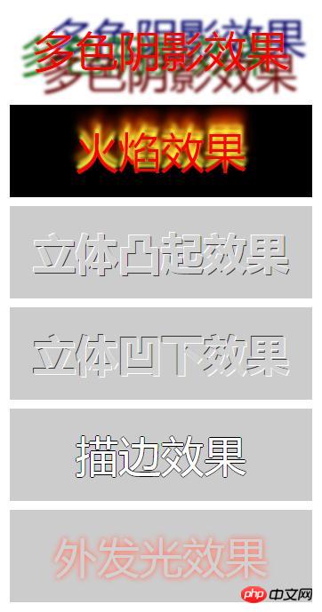
3. Code example
The main use is the shadow list of text-shadow, plus the use of reasonable color matching, we can achieve the desired effect.
<!DOCTYPE html>
<html>
	<head>
		<meta charset="UTF-8">
		<title>文字阴影效果</title>
		<style type="text/css">
		.demo{
			width: 600px;
			overflow: hidden;
			margin: 10px auto;
		}
		p {
			width: 300px;
			font-size: 3em;
			margin: 10px;
			padding: 20px;
			text-align: center;
		}

		.p1 {
			text-shadow: 0.2em 0.5em 0.1em #600, -0.3em 0.1em 0.1em #060, 0.4em -0.3em 0.1em #006;
			color: red;
		}

		.p2 {
			background: black;
			text-shadow: 0 -5px 4px #FF3, 2px -10px 6px #fd3, -2px -15px 11px #f80, 2px -25px 18px #f20;
			color: red;
		}

		.p3 {
			text-shadow: -1px -1px white, 1px 1px #333;
			color: #D1D1D1;
			font-weight: bold;
			background: #CCC;
		}

		.p4 {
			text-shadow: 1px 1px white, -1px -1px #333;
			color: #D1D1D1;
			font-weight: bold;
			background: #CCC;
		}

		.p5 {
			text-shadow: -1px 0 black, 0 1px black, 1px 0 black, 0 -1px black;
			color: #ffffff;
			background: #CCC;
		}

		.p6 {
			text-shadow: 0 0 0.2em #F87, 0 0 0.2em #f87;
			color: #d1d1d1;
			background: #CCC;
		}
		</style>
	</head>

	<body>
		<div class="demo">
			<p class="p1">多色阴影效果</p>
			<p class="p2">火焰效果</p>
			<p class="p3">立体凸起效果</p>
			<p class="p4">立体凹下效果</p>
			<p class="p5">描边效果</p>
			<p class="p6">外发光效果</p>
		</div>

	</body>

</html>Rendering:

##Recommended related articles: 1.
How to achieve a single-sided shadow effect in css2.
How to achieve a box shadow in css3? Shadow effect in css3Related video tutorials:
1.
CSS Video Tutorial-Jade Girl Heart Sutra Edition
2. Add box (border) shadow effect (box-shadow attribute)
1. The syntax of box-shadow
E {box-shadow: inset x-offset y-offset blur-radius spread-radius color};E {box-shadow: projection method X-axis offset Y-axis offset shadow blur radius shadow spread radius shadow color };
1. Shadow type: This parameter is optional. The default projection method is outer shadow; if the only value "inset" is taken, the outer shadow will be turned into an inner shadow;
2. Offset: refers to the vertical offset of the shadow. Its value can also be positive or negative. For positive values, the shadow is at the bottom of the object. For negative values, the shadow is at the top of the object;
4. Shadow blur radius: this parameter It is optional and can only be a positive value. If its value is 0, it means that the shadow does not have a blur effect. The larger the value, the blurr the edge of the shadow;
5. Shadow expansion radius: This parameter is optional, and its value It can be a positive or negative value. If it is a positive value, the entire shadow will be expanded, otherwise it will be reduced;
6. Shadow color: This parameter is optional. When no color is set, the browser will use the default color, but each The default colors of browsers are different, especially Safari and Chrome browsers under the webkit kernel will be colorless, that is, transparent. It is recommended not to omit this parameter.
//Firefox4.0-
-moz-box-shadow: 投影方式 X轴偏移量 Y轴偏移量 阴影模糊半径 阴影扩展半径 阴影颜色;
//Safari and Google chrome10.0-
-webkit-box-shadow: 投影方式 X轴偏移量 Y轴偏移量 阴影模糊半径 阴影扩展半径 阴影颜色;
//Firefox4.0+ 、 Google chrome 10.0+ 、 Oprea10.5+ and IE9
box-shadow:  投影方式 X轴偏移量 Y轴偏移量 阴影模糊半径 阴影扩展半径 阴影颜色;
3. Code example
The above is the detailed content of How to add shadow effect with css? (code example). For more information, please follow other related articles on the PHP Chinese website!<!DOCTYPE html>
<html>
<head>
<meta charset="UTF-8">
<title>box-shadow的用法</title>
<style type="text/css">
.demo {
width: 800px;
overflow: hidden;
margin: 50px auto;
}
.demo * {
width: 150px;
height: 150px;
margin: 40px 20px;
background-color: grey;
display: inline-block;
}
/*右下阴影*/
.box-shadow-1 {
-webkit-box-shadow: 3px 3px 3px;
-moz-box-shadow: 3px 3px 3px;
box-shadow: 3px 3px 3px;
}
/*四边同色阴影*/
.box-shadow-2 {
-webkit-box-shadow: 0 0 10px #0CC;
-moz-box-shadow: 0 0 10px #0CC;
box-shadow: 0 0 10px #0CC;
}
/*四边同色阴影扩展*/
.box-shadow-3 {
-webkit-box-shadow: 0 0 10px 15px #0CC;
-moz-box-shadow: 0 0 10px 15px #0CC;
box-shadow: 0 0 10px 15px #0CC;
}
/*四边同色内阴影*/
.box-shadow-4 {
-webkit-box-shadow: inset 0 0 10px #0CC;
-moz-box-shadow: inset 0 0 10px #0CC;
box-shadow: inset 0 0 10px #0CC;
}
/*四边异色外阴影*/
.box-shadow-5 {
box-shadow: -10px 0 10px red, /*左边阴影*/
10px 0 10px yellow, /*右边阴影*/
-10px 10px blue, /*顶部阴影*/
10px 10px green;
/*底边阴影*/
}
/*叠加异色阴影*/
.box-shadow-6 {
box-shadow: 0 0 10px 5px black, 0 10px 20px red;
}
/*兼容ie*/
.box-shadow {
filter: progid:DXImageTransform.Microsoft.Shadow(color='#969696', Direction=135, Strength=5);
/*for ie6,7,8*/
background-color: #ccc;
-moz-box-shadow: 2px 2px 5px #969696;
/*firefox*/
-webkit-box-shadow: 2px 2px 5px #969696;
/*webkit*/
box-shadow: 2px 2px 5px #969696;
/*opera或ie9*/
}
</style>
</head>
<body>
<div class="demo">
<div class="box-shadow-1">右下阴影</div>
<div class="box-shadow-2">四边同色阴影</div>
<div class="box-shadow-3">四边同色阴影扩展</div>
<div class="box-shadow-4">四边同色内阴影</div>
<div class="box-shadow-5">四边异色外阴影</div>
<div class="box-shadow-6">叠加异色阴影</div>
<div class="box-shadow">兼容ie</div>
</div>
</body>
</html>

Hot AI Tools

Undresser.AI Undress
AI-powered app for creating realistic nude photos

AI Clothes Remover
Online AI tool for removing clothes from photos.

Undress AI Tool
Undress images for free

Clothoff.io
AI clothes remover

Video Face Swap
Swap faces in any video effortlessly with our completely free AI face swap tool!

Hot Article

Hot Tools

Notepad++7.3.1
Easy-to-use and free code editor

SublimeText3 Chinese version
Chinese version, very easy to use

Zend Studio 13.0.1
Powerful PHP integrated development environment

Dreamweaver CS6
Visual web development tools

SublimeText3 Mac version
God-level code editing software (SublimeText3)

Hot Topics
 How to use bootstrap in vue
Apr 07, 2025 pm 11:33 PM
Using Bootstrap in Vue.js is divided into five steps: Install Bootstrap. Import Bootstrap in main.js. Use the Bootstrap component directly in the template. Optional: Custom style. Optional: Use plug-ins.
 The Roles of HTML, CSS, and JavaScript: Core Responsibilities
Apr 08, 2025 pm 07:05 PM
HTML defines the web structure, CSS is responsible for style and layout, and JavaScript gives dynamic interaction. The three perform their duties in web development and jointly build a colorful website.
 Understanding HTML, CSS, and JavaScript: A Beginner's Guide
Apr 12, 2025 am 12:02 AM
WebdevelopmentreliesonHTML,CSS,andJavaScript:1)HTMLstructurescontent,2)CSSstylesit,and3)JavaScriptaddsinteractivity,formingthebasisofmodernwebexperiences.
 How to set up the framework for bootstrap
Apr 07, 2025 pm 03:27 PM
To set up the Bootstrap framework, you need to follow these steps: 1. Reference the Bootstrap file via CDN; 2. Download and host the file on your own server; 3. Include the Bootstrap file in HTML; 4. Compile Sass/Less as needed; 5. Import a custom file (optional). Once setup is complete, you can use Bootstrap's grid systems, components, and styles to create responsive websites and applications.
 How to write split lines on bootstrap
Apr 07, 2025 pm 03:12 PM
There are two ways to create a Bootstrap split line: using the tag, which creates a horizontal split line. Use the CSS border property to create custom style split lines.
 How to insert pictures on bootstrap
Apr 07, 2025 pm 03:30 PM
There are several ways to insert images in Bootstrap: insert images directly, using the HTML img tag. With the Bootstrap image component, you can provide responsive images and more styles. Set the image size, use the img-fluid class to make the image adaptable. Set the border, using the img-bordered class. Set the rounded corners and use the img-rounded class. Set the shadow, use the shadow class. Resize and position the image, using CSS style. Using the background image, use the background-image CSS property.
 How to use bootstrap button
Apr 07, 2025 pm 03:09 PM
How to use the Bootstrap button? Introduce Bootstrap CSS to create button elements and add Bootstrap button class to add button text
 How to resize bootstrap
Apr 07, 2025 pm 03:18 PM
To adjust the size of elements in Bootstrap, you can use the dimension class, which includes: adjusting width: .col-, .w-, .mw-adjust height: .h-, .min-h-, .max-h-


