

Echarts line chart sets gradient background color
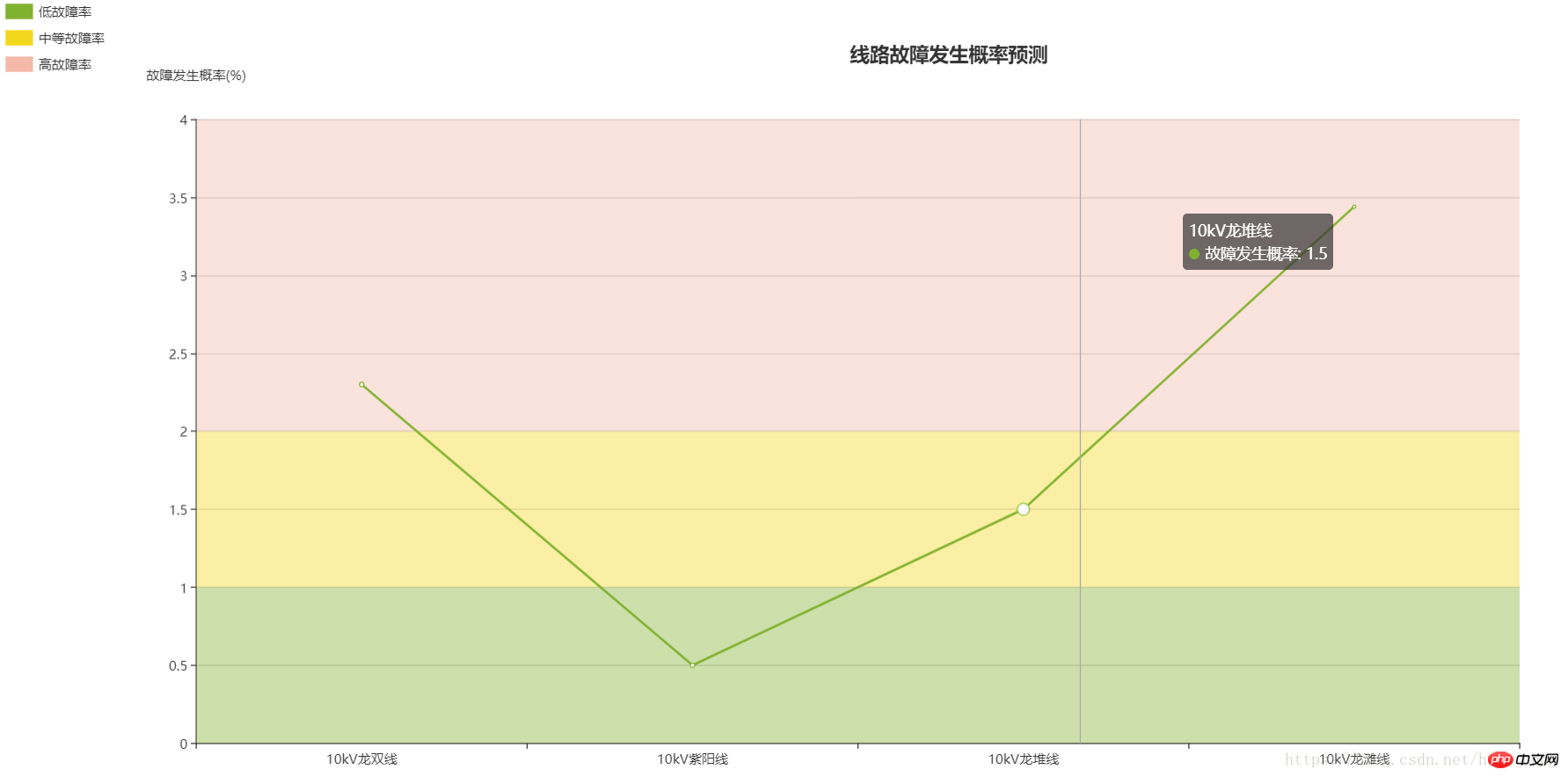
In the process of predicting the fault probability of the line, the line chart of Echarts is designed to display the predicted value of the probability. According to the prediction results, the background color of the line chart is divided into three layers. From bottom to top, the probability value is from low to high, and the color becomes darker in turn. The effect is as follows:
var dom = document.getElementById("container");
var myChart = echarts.init(dom);
var app = {};
option = null;
option = {
title: {
text: '线路故障发生概率预测',
left:'50%',
top:'5%'
},
tooltip : {
trigger: 'axis',
axisPointer : { // 坐标轴指示器,坐标轴触发有效
type : 'line' // 默认为直线,可选为:'line' | 'shadow'
}

},
legend: {
orient: 'vertical',
left: 'left',
data:[{name:'低故障率',icon : 'bar'}, {name:'中等故障率',icon : 'bar'}, {name:'高故障率',icon : 'bar'}],
selected: {
'低故障率' :true,
'蒸发量':true,
'中等故障率' :true,
'高故障率' :true,
//不想显示的都设置成false
}
},
color:['#81b22f','#f3d71c','#f4b9a9'],
xAxis: {
nameLocation:'center',
type: 'category',
boundaryGap:true,
data:['10kV龙双线','10kV紫阳线','10kV龙堆线','10kV龙滩线'],
show:true,
axisTick: {
show: true
},

},
grid: {
top: '15%',
bottom: '5%',
containLabel: true
},
yAxis :{
nameGap:35,
name:'故障发生概率(%)',
min:0,
max:4,
splitNumber:10,
type : 'value',
axisLabel : {
formatter : '{value}',
},

},

series: [          //就是从这个地方开始的    主要用的是markArea 和legend
{
name:'低故障率',
type:'line',
animation: false,
areaStyle: {
normal: {}
},
lineStyle: {
normal: {
width: 1
}
},
markArea: {
data: [[{
yAxis: '0'
}, {
yAxis: '1'
}]]
},

},{
name:'中等故障率',
type:'line',
animation: false,
areaStyle: {
normal: {}
},
lineStyle: {
normal: {
width: 1
}
},
markArea: {
data: [[{
yAxis: '1'
}, {
yAxis: '2'
}]]
}
},{
name:'高故障率',
type:'line',
animation: false,
areaStyle: {
normal: {}
},
lineStyle: {
normal: {
width: 1
}
},
markArea: {
data: [[{
yAxis: '2'
}, {
yAxis: '4'
}]]
}
},
{
    name:'故障发生概率',
    type:'line',
    data:[2.3, 0.5, 1.5, 3.44]
},


],
}Two tree array constructors without recursion
Convert HTML to Excel, and realize printing and downloading functions
The above is the detailed content of Echarts line chart sets gradient background color. For more information, please follow other related articles on the PHP Chinese website!

Hot AI Tools

Undresser.AI Undress
AI-powered app for creating realistic nude photos

AI Clothes Remover
Online AI tool for removing clothes from photos.

Undress AI Tool
Undress images for free

Clothoff.io
AI clothes remover

Video Face Swap
Swap faces in any video effortlessly with our completely free AI face swap tool!

Hot Article
Hot Tools

Notepad++7.3.1
Easy-to-use and free code editor

SublimeText3 Chinese version
Chinese version, very easy to use

Zend Studio 13.0.1
Powerful PHP integrated development environment

Dreamweaver CS6
Visual web development tools

SublimeText3 Mac version
God-level code editing software (SublimeText3)
Hot Topics
 1664
1664
 14
1423
52
1317
25
1268
29
1248
24
14
1423
52
1317
25
1268
29
1248
24

 ECharts and Java interface: How to quickly implement statistical charts such as line charts, bar charts, pie charts, etc.
Dec 17, 2023 pm 10:37 PM
ECharts and Java interface: How to quickly implement statistical charts such as line charts, bar charts, pie charts, etc.
Dec 17, 2023 pm 10:37 PM
ECharts and Java interface: How to quickly implement statistical charts such as line charts, bar charts, and pie charts. Specific code examples are required. With the advent of the Internet era, data analysis has become more and more important. Statistical charts are a very intuitive and powerful display method. Charts can display data more clearly, allowing people to better understand the connotation and patterns of the data. In Java development, we can use ECharts and Java interfaces to quickly display various statistical charts. ECharts is a software developed by Baidu
 How to use php interface and ECharts to generate visual statistical charts
Dec 18, 2023 am 11:39 AM
How to use php interface and ECharts to generate visual statistical charts
Dec 18, 2023 am 11:39 AM
In today's context where data visualization is becoming more and more important, many developers hope to use various tools to quickly generate various charts and reports so that they can better display data and help decision-makers make quick judgments. In this context, using the Php interface and ECharts library can help many developers quickly generate visual statistical charts. This article will introduce in detail how to use the Php interface and ECharts library to generate visual statistical charts. In the specific implementation, we will use MySQL
 Steps to draw dashboard using ECharts and Python interface
Dec 18, 2023 am 08:40 AM
Steps to draw dashboard using ECharts and Python interface
Dec 18, 2023 am 08:40 AM
The steps to draw a dashboard using ECharts and Python interface require specific code examples. Summary: ECharts is an excellent data visualization tool that can easily perform data processing and graphics drawing through the Python interface. This article will introduce the specific steps to draw a dashboard using ECharts and Python interface, and provide sample code. Keywords: ECharts, Python interface, dashboard, data visualization Introduction Dashboard is a commonly used form of data visualization, which uses
 ECharts and golang technical guide: practical tips for creating various statistical charts
Dec 17, 2023 pm 09:56 PM
ECharts and golang technical guide: practical tips for creating various statistical charts
Dec 17, 2023 pm 09:56 PM
ECharts and golang technical guide: Practical tips for creating various statistical charts, specific code examples are required. Introduction: In the field of modern data visualization, statistical charts are an important tool for data analysis and visualization. ECharts is a powerful data visualization library, while golang is a fast, reliable and efficient programming language. This article will introduce you to how to use ECharts and golang to create various types of statistical charts, and provide code examples to help you master this skill. Preparation
 How to use histogram to display data in ECharts
Dec 18, 2023 pm 02:21 PM
How to use histogram to display data in ECharts
Dec 18, 2023 pm 02:21 PM
How to use histograms to display data in ECharts ECharts is a JavaScript-based data visualization library that is very popular and widely used in the field of data visualization. Among them, the histogram is the most common and commonly used chart type, which can be used to display the size, comparison and trend analysis of various numerical data. This article will introduce how to use ECharts to draw histograms and provide code examples. First, we need to introduce the ECharts library into the HTML file, which can be introduced in the following way
 How to use map heat map to display city heat in ECharts
Dec 18, 2023 pm 04:00 PM
How to use map heat map to display city heat in ECharts
Dec 18, 2023 pm 04:00 PM
How to use a map heat map to display city heat in ECharts ECharts is a powerful visual chart library that provides various chart types for developers to use, including map heat maps. Map heat maps can be used to show the popularity of cities or regions, helping us quickly understand the popularity or density of different places. This article will introduce how to use the map heat map in ECharts to display city heat, and provide code examples for reference. First, we need a map file containing geographic information, EC
 How to use ECharts and php interface to generate statistical charts
Dec 18, 2023 pm 01:47 PM
How to use ECharts and php interface to generate statistical charts
Dec 18, 2023 pm 01:47 PM
How to use ECharts and PHP interfaces to generate statistical charts Introduction: In modern web application development, data visualization is a very important link, which can help us display and analyze data intuitively. ECharts is a powerful open source JavaScript chart library. It provides a variety of chart types and rich interactive functions, and can easily generate various statistical charts. This article will introduce how to use ECharts and PHP interfaces to generate statistical charts, and give specific code examples. 1. Overview of ECha
 Does ECharts depend on jQuery? In-depth analysis
Feb 27, 2024 am 08:39 AM
Does ECharts depend on jQuery? In-depth analysis
Feb 27, 2024 am 08:39 AM
Does ECharts need to rely on jQuery? Detailed interpretation requires specific code examples. ECharts is an excellent data visualization library that provides a rich range of chart types and interactive functions and is widely used in web development. When using ECharts, many people will have a question: Does ECharts need to rely on jQuery? This article will explain this in detail and give specific code examples. First, to be clear, ECharts itself does not rely on jQuery;
